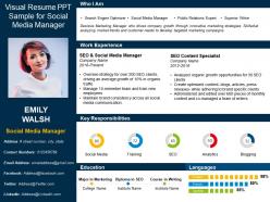
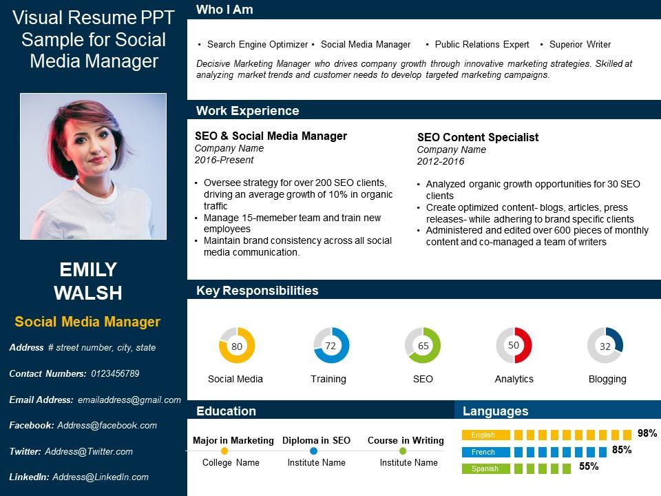
Visual resume ppt sample for social media manager
Try Before you Buy Download Free Sample Product
Audience
Editable
of Time
Our Visual Resume Ppt Sample For Social Media Manager get folks going with full fervor. They will definitely pep up your audience.
People who downloaded this PowerPoint presentation also viewed the following :
Visual resume ppt sample for social media manager with all 6 slides:
Create color combinations that attract the eye with our Visual Resume Ppt Sample For Social Media Manager. Be able to highlight the interplay.
FAQs for Visual resume ppt sample for
Put your best posts right up top with screenshots - that's what they actually want to see. Show off those engagement numbers or campaign wins too. For colors, match your personal brand but don't go crazy (learned that the hard way with a purple-on-black disaster). Toss in platform icons and maybe some before/after follower charts. Your own handles should be on there if they look professional. Oh, and keep everything super scannable since most hiring managers are rushing through these. The whole thing should scream "I know social media" without them having to hunt for proof.
Honestly, infographics are perfect for social media resumes because you're literally showing off your design skills while talking about your experience. Smart move, right? You can throw in charts showing follower growth you've driven, use icons for different platforms, maybe a visual timeline of campaign wins. The whole thing just makes way more sense than a boring text resume - I mean, you're applying to create visual content so why not prove you can actually do it? Just don't go overboard with the graphics. Keep it clean so hiring managers can actually read the thing without getting a headache.
Honestly, go with Canva first - it's so much easier than wrestling with Adobe stuff. The templates don't look like garbage either, which is a win. If you're already decent with design tools though, InDesign gives you way more control over everything. Figma's pretty cool too and it's free, plus hiring managers see it and think "oh they know actual design software." Just make sure whatever you create actually matches the vibe of companies you're targeting. Like, don't make some minimalist black and white thing if you want to work for a fun lifestyle brand. Start with a template but definitely tweak the colors and fonts to feel more "you."
Dude, color choices actually matter a ton for social media roles - you're applying to do visual stuff all day! Blues work great for that trustworthy vibe, greens show creativity and growth. Maybe throw in an accent color that fits your personal brand. Black and white feels kinda lazy for this job, honestly. You want to prove you understand how colors mess with people's heads and grab attention. Though don't go overboard - I've seen some truly horrific neon disasters. Stick to 2-3 colors max and make sure everything's still readable. Your resume should basically scream "I get visual psychology."
Focus on engagement rate, follower growth, and reach - that's what hiring managers actually look at. Throw in specific wins like "boosted Instagram engagement 150% in 6 months" or "grew TikTok from 5K to 50K followers." Don't go crazy with numbers though (nobody wants a resume that looks like a spreadsheet exploded). Any viral posts? Mention those. Big brand collabs too. Here's the thing - connect your metrics to real business results when you can. Like how your content actually drove website traffic or sales. That stuff matters way more than just follower counts.
Break it into clear before/after sections with actual screenshots of your best posts and engagement graphs. Honestly, nothing makes me cringe more than social media resumes with zero proof - like, show me the numbers! Use Canva or whatever to make clean layouts highlighting follower growth and conversion rates. Each campaign should tell a story: what sucked, your strategy, how you fixed it, results. Oh and make sure it looks good on mobile since most hiring managers are probably scrolling through these on their phones anyway.
Honestly, go with Montserrat or Poppins for your headings - they look super clean and modern. Then pair it with something basic like Open Sans for the regular text. Don't get crazy with script fonts or anything too trendy (you're not a boutique coffee shop lol). Two fonts max, and make sure the contrast is good so it's easy to scan. The whole point is showing you get visual hierarchy and branding, which is basically half the job anyway. Oh, and definitely check how it prints out too - some managers are still old school about that.
Honestly, think of your visual resume like telling a story about your career journey. Start with why you got into social media in the first place - your little origin story. Then show off your best campaigns like mini case studies with before/after numbers and screenshots. I'm obsessed with resumes that actually feel like stories instead of boring bullet points! Create a timeline that shows how you've grown audiences or solved problems over time. Add context to your content examples - what was the strategy behind that viral post? Make recruiters feel like they're following along with your professional growth, not just scanning through random achievements.
Dude, don't go overboard with colors - I've seen some that literally hurt my eyes. Stick to 2-3 max and give everything room to breathe with white space. Make sure your font's readable on phones too since everyone checks stuff on mobile now. The key is visual hierarchy - put your best stuff where it'll get noticed first. Honestly, a simple grid layout beats fancy design tricks every time. You want hiring managers scanning your experience, not getting distracted by weird formatting choices. Oh, and test it out before sending!
Don't just throw random user photos in there - that looks so amateur! Show UGC as actual campaigns you ran. Create those visual grids with before/after numbers, like how your hashtag went from 50 to 5K submissions. Tell the whole story: your original brief, some sample posts users made, plus the engagement results you got. Screenshots work great for showing how you actually got people to participate. The thing is, you've gotta prove two things - that you can get users excited enough to create stuff AND that you know what to do with it once they post.
Yeah definitely! Switch up your visual resume for each platform. LinkedIn should look super clean and corporate - focus on strategy stuff and metrics. Instagram's where you can get creative though, show off your design skills and visual storytelling. Twitter's tricky because everything's so short, so highlight copywriting and how you jump on trends. Facebook is all community vibes, so pump up those engagement numbers. Honestly, Facebook feels kinda outdated for resumes but whatever. The main thing is matching each platform's energy while keeping your actual accomplishments the same everywhere. Don't overthink it too much.
Your resume is basically your first portfolio piece, so make it count! Pick consistent colors and fonts that show off your style - think of it as proving you actually know design basics. Honestly, I've seen way too many bland resumes from people applying for creative roles. Keep things clean but add some personality through your visual choices. Start with a simple brand guide for yourself (nothing fancy, just your colors and fonts), then apply it. The goal? Hiring managers should look at it and think "okay, this person gets branding." Just don't go crazy with it - readable always wins.
Hover effects on your campaign results look sick, honestly. You could do clickable portfolio thumbnails or those animated charts that show follower growth you've hit. Progress bars for skill levels work great too. I've seen people embed actual campaign videos - way more impressive than just screenshots. Interactive timelines are cool but maybe overkill? Start with basic CSS hover stuff first. Adobe XD's good for testing ideas before you go nuts with complex animations. Just don't make it so flashy that people miss your actual accomplishments, you know?
Don't cram too much text or crazy design elements together - looks messy as hell. Also, skip the random stock photos that have nothing to do with your actual work. I swear everyone does this and it screams "downloaded template." Your color scheme should match throughout. Make fonts readable (seriously, nobody can read that swirly script stuff). Proofread twice because typos are killer. The whole thing should tell your story, not distract from it. Oh, and test it on your phone first since that's probably how people will see it anyway.
Honestly, visual quote boxes with client logos look super clean. I'd also do a whole "What People Say" section - headshots make it feel more legit. Scattered pull quotes throughout your resume are way better than those boring bullet points everyone uses. Since you're going for social media manager stuff, why not screenshot actual client feedback? Makes it feel real. Keep quotes short though - like 1-2 lines max. They should actually relate to skills you need, like growing engagement or nailing brand voice. Oh, and definitely play with fonts/colors to make them pop visually.
-
It looks cool. I like this kind of style.
-
The Designed Graphic are very professional and classic.
-
Really like the color and design of the presentation.