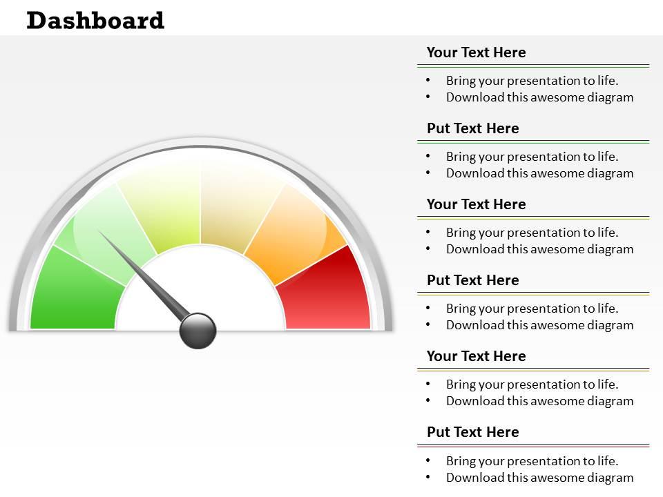
0314 dashboard visual iinformation design

0314 dashboard visual iinformation design
Slide 1 of 3

You must be logged in to download this presentation.

Favourites Favourites

Try Before you Buy Download Free Sample Product

Audience Impress Your
Audience
Editable 100%
Editable
Time Save Hours
of Time
The Biggest Sale is ending soon in
0
0
:
0
0
:
0
0
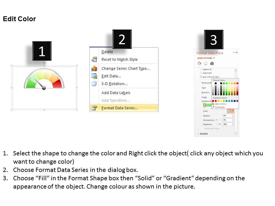
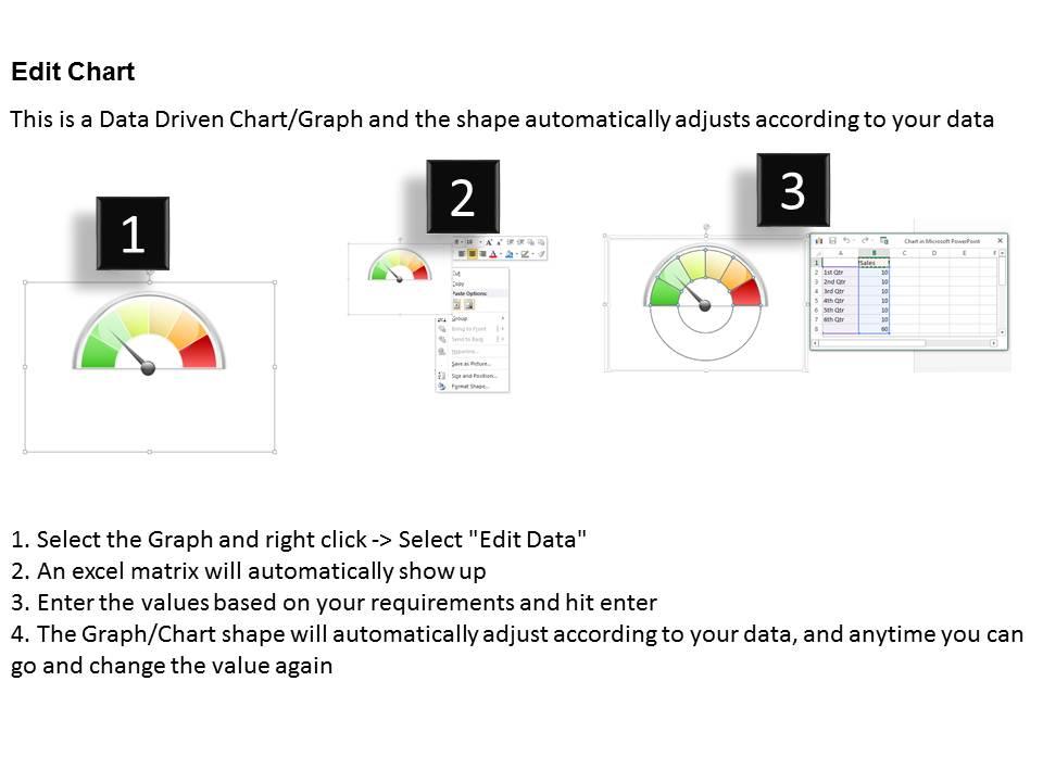
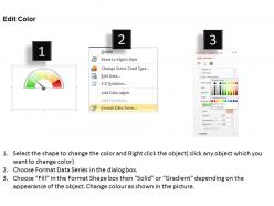
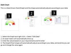
Quick and basic download presentation slides. Completely editable PowerPoint template content according to your need. Totally modifiable PPT infographics-change colors, differentiation, size and introduction. Embed your own organization logo, slogan, trademark and so on to give a customized look. No adjustment in unique determination of PPT pictures in the wake of altering. Include flawlessly anyplace between your slides. Excel linked design so you can make changes in the excel sheet and the design will change accordingly.

People who downloaded this PowerPoint presentation also viewed the following :

FAQs for 0314 dashboard

Focus on what decisions your users actually need to make first. Then build around that. Put your critical metrics up front - too many dashboards look like someone threw data at a wall to see what sticks. Use consistent colors and fonts that don't hurt people's eyes. White space isn't wasted space, it helps everything breathe. Don't try cramming everything onto one screen either. Test with real users before going live. Oh, and always add context like time periods or benchmarks so people know if that number's good or terrible.

Color theory is a game changer for dashboards - it guides people's eyes to what matters most. Use contrasting colors to make important metrics pop, but keep your palette consistent so it doesn't look messy. Red/green works great for alerts (just remember colorblind users exist). I swear, some dashboards look like someone threw up Skittles all over them. Stick with neutral backgrounds and add strategic color pops. Start with maybe 2-3 colors max and test them together first. Trust me, less is more here.

UX is everything when it comes to dashboards. People won't use something that's confusing, no matter how nice it looks. Make your most important metrics super obvious - like, front and center obvious. Nobody wants to dig around for basic info when they're trying to make decisions quickly. I always tell people to figure out what questions users ask most, then build around that. Keep your layout logical and don't bury the good stuff. Oh and visual hierarchy matters way more than you'd think - guide their eyes to what actually matters first.

Start with what users actually need to do - that's your baseline. Put the critical stuff front and center, then hide the detailed bits in expandable sections. It's like a newspaper (yeah, old school reference but whatever) - headlines first, full story when you want it. Show summary data upfront, let people drill down from there. Don't underestimate white space either. Cramming everything together just stresses people out. Short sentences help. Then mix in some longer ones that actually flow naturally. Test it with real users though - you'll be surprised what trips them up versus what actually works.

Honestly, just pick whatever chart actually makes sense for your data story. Bar charts are solid for comparing stuff, line charts for trends over time. Pie charts? They're okay for simple breakdowns, but bars usually work better anyway. Don't get fancy unless you have to - I've seen too many dashboards where people can't figure out what they're looking at. Stick with what people already know how to read. Actually test it with real users and see where they get stuck. You want them to get it instantly, not spend five minutes deciphering your masterpiece.

Focus on what your users actually need to do their job - dump the rest. I have this 5-second test I swear by: if they can't get the main point that fast, you're cramming too much in there. Group similar stuff together and make the important bits pop visually. Honestly, most people just want to know "okay, what do I do next?" Save all those detailed analytics for when they click through. Your main screen should basically shout the answer at them. Otherwise they'll just stare at it confused, which defeats the whole point.

Dude, responsive design is a must-have. People hit your dashboard from literally everything - phones while they're grabbing coffee, tablets in meetings, laptops at their desk. Charts that don't resize properly? Your users will be doing that annoying pinch-and-zoom dance trying to read tiny numbers. Mobile users especially need the key stuff front and center, not buried under a million data points. Honestly, I'd start with mobile design first then work your way up to desktop - it's way easier than cramming a huge desktop layout into a phone screen later.

Honestly, interactive dashboards are way better than static ones because people actually want to click around and explore stuff. You know that feeling when you can filter data or hover over charts? That's what keeps users engaged instead of just staring at a boring report. It's kinda like the difference between watching TV versus playing a game - one makes you want to participate. Plus, filters help people zero in on what matters to them without getting overwhelmed by everything at once. I'd say start with basic stuff like tooltips and simple filters, then build up based on how people actually use it.

Tableau and Power BI are probably your best bet if you don't mind the learning curve - they're pretty powerful. Looker Studio's free though, so that's worth checking out first. Excel can actually work decent for simpler stuff, but it gets ugly fast with big datasets. D3.js is amazing if someone on your team codes, gives you total creative control. Honestly depends on your budget and how tech-savvy everyone is. I'd probably start with Looker Studio just to mess around and see what you need, then upgrade if it's not cutting it.

So you'll want to hook up APIs or WebSocket connections to pull fresh data automatically. Tableau and Power BI both handle this pretty well - you can set refresh intervals based on what you need. Trading stuff might update every few seconds, but sales reports could be hourly or whatever. The annoying part is balancing speed with performance since constant updates will bog everything down. I'd start by figuring out what actually needs to be live versus what can wait. Honestly, most executives don't need second-by-second updates on everything anyway. Then just configure your data sources to match those needs.

Honestly, start with your data pipeline - that's where most dashboard disasters begin. Get validation rules and quality checks running before anything touches your viz. Set up alerts for weird data or outages so you're not blindsided. Document everything about your sources and how you transform stuff. Sounds boring but you'll be so grateful when your boss questions why the numbers look funky. Keep calculations consistent across all charts (obvious but people mess this up constantly). Oh, and timestamps! Show when data was last refreshed. Users need to know what they're actually looking at.

Honestly, just figure out what each person actually needs to see day-to-day. Sales managers obsess over pipeline stuff and conversion rates. Marketing folks? They want campaign metrics and lead quality data. I'd build separate dashboard tabs for each role - way better than dumping everything on one messy page. Also think about detail levels. Executives want the quick overview, but analysts need all the nitty-gritty numbers. Oh, and definitely test this with real people from each team before you launch it. They'll catch things you missed and probably have strong opinions about layout.

Honestly, the worst thing you can do is jam everything onto one screen. People just nope out immediately. Too many colors and random chart types? Total visual mess. I've watched so many teams wonder why their dashboards sit unused - it's usually this stuff. Put your key metrics where people see them first. Make sure it actually loads fast (obvious but whatever). Test it on your phone too. Here's what really helps though: for every single thing on there, ask "what decision does this actually help someone make?" Can't answer? Delete it. Trust me on this one.

Think of dashboards like telling a story - you're walking someone through the data so it actually makes sense. Put your big KPIs up top, then break down what's driving those numbers underneath. I always map out what questions people are trying to answer first, then build around that. Short attention spans are real, so don't just throw charts everywhere (seriously, some dashboards look like someone sneezed visualizations all over the screen). Make it flow logically. What decisions does your audience need to make? Structure everything to guide them through that thinking process naturally.

Honestly, start with white space and visual hierarchy - those two will save your life. Group similar stuff together so people aren't playing hide and seek with your data. I'd stick with the same colors and fonts throughout (boring but it works). Show the big picture first, then let users dig deeper if they want. Way too many dashboards are just metric vomit - everything crammed in there looking important but nobody can actually use it. Your critical KPIs should be right up top where people see them first. Skip the jargon, test with real users, and honestly? Just sketch it out on paper before you touch any software.

Ratings and Reviews

0% of 100
Review Form
Write a review
Most Relevant Reviews

No Reviews