


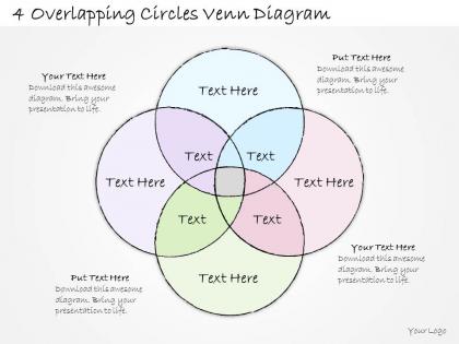
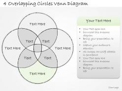
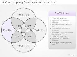
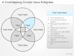
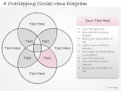
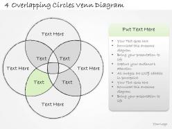
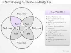
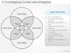
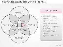
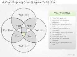
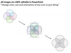
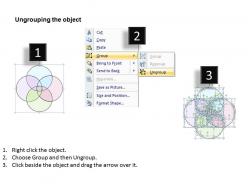
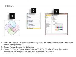
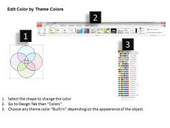
2014 business ppt diagram 4 overlapping circles venn diagram powerpoint template




Try Before you Buy Download Free Sample Product
 Impress Your
 Audience
 100%
100% Editable
 Save Hours
 of Time


Brighten the environment with our 2014 Business Ppt Diagram 4 Overlapping Circles Venn Diagram Powerpoint Template. Your brilliant views will heighten the mood.
People who downloaded this PowerPoint presentation also viewed the following :
2014 business ppt diagram 4 overlapping circles venn diagram powerpoint template with all 17 slides:
Discover a new moment with our 2014 Business Ppt Diagram 4 Overlapping Circles Venn Diagram Powerpoint Template. Do not just see it, but experience it.

FAQs for 2014 business ppt diagram 4 overlapping circles venn
The primary components of a Venn diagram include overlapping circles or shapes, labels for each set, elements or data points, intersection areas, and a universal set boundary. These visual elements work together by clearly displaying relationships between datasets, highlighting commonalities and differences, and enabling quick analysis of complex information, ultimately delivering enhanced comprehension and strategic decision-making capabilities.
Venn diagrams effectively illustrate overlapping concepts, shared characteristics, market segments, competitive advantages, and strategic alignments in business presentations. They streamline complex relationships by visually demonstrating intersections between products, services, or market opportunities, with many organizations finding that these diagrams enhance stakeholder understanding, accelerate decision-making processes, and ultimately deliver clearer strategic communications.
Common pitfalls include using disproportionate circle sizes that misrepresent data relationships, overcrowding diagrams with excessive text, creating unclear overlapping regions, and failing to properly label intersections and distinct areas. These visualization errors can mislead stakeholders during presentations and strategic planning sessions, with many organizations finding that clean, proportional designs enhance comprehension and decision-making effectiveness.
Venn diagrams enhance educational understanding by visualizing relationships between concepts, simplifying complex comparisons, and enabling students to identify similarities and differences across subjects. Through interactive analysis, educators in mathematics, science, and literature help students grasp abstract concepts more effectively, while fostering critical thinking skills that ultimately improve comprehension and academic performance.
PowerPoint, Lucidchart, Canva, Venngage, and Creately offer excellent interactive Venn diagram capabilities, with features like real-time collaboration, customizable templates, and dynamic data integration. These platforms streamline visual communication by enabling drag-and-drop functionality, automated formatting, and seamless sharing across teams, ultimately delivering enhanced presentations and clearer data storytelling for organizations.
Industries that frequently use Venn diagrams include healthcare for patient symptom analysis, marketing for audience segmentation, education for curriculum planning, finance for risk assessment, and technology for feature comparisons. These visual tools streamline complex data relationships by identifying overlaps, gaps, and shared characteristics, with many organizations finding that Venn diagrams enhance decision-making processes and strategic planning across departments.
Venn diagrams can be adapted for complex data sets through interactive digital tools, hierarchical layering, proportional sizing based on data volume, color-coding for multiple variables, and integration with statistical software. These enhanced approaches enable organizations to visualize intricate relationships in customer segmentation, market analysis, and operational data, ultimately delivering clearer insights and strategic decision-making capabilities.
Colors and styles significantly enhance Venn diagram effectiveness by improving visual clarity, distinguishing overlapping sections, and guiding audience attention to key relationships. Strategic use of contrasting colors, consistent fonts, and clean borders enables presenters to communicate complex data comparisons more effectively, with many organizations finding that well-designed diagrams increase audience comprehension and engagement rates.
The right number of sets depends on your analysis complexity and audience comprehension, with 2-3 sets being optimal for clear communication, while 4+ sets can become visually overwhelming. Most business presentations, educational materials, and strategic analyses use two-set comparisons for competitor analysis or three-set diagrams for market segmentation, ultimately delivering maximum clarity and actionable insights.
Best practices for labeling Venn diagram elements include using concise, descriptive text, positioning labels clearly within each circle, ensuring readable font sizes, and placing intersection labels strategically to avoid overcrowding. These labeling techniques enhance comprehension by maintaining visual clarity, enabling quick data interpretation, and supporting effective presentations across business sectors, with many organizations finding that well-labeled diagrams significantly improve stakeholder understanding and decision-making processes.
Venn diagrams facilitate brainstorming by visually organizing overlapping ideas, identifying common themes across different concepts, and revealing unexpected connections between seemingly unrelated topics. These visual tools streamline collaborative thinking sessions by enabling teams to systematically explore intersections, prioritize shared opportunities, and develop comprehensive solutions, with many organizations finding enhanced creativity and strategic alignment.
Storytelling techniques with Venn diagrams include narrative progression through overlapping elements, character development showing shared traits, conflict resolution highlighting common ground, thematic exploration, and visual metaphors. These approaches transform static comparisons into compelling narratives by guiding audiences through intersections strategically, with many presenters finding that progressive revelation of overlaps creates memorable stories while delivering clearer insights.
Venn diagrams improve decision-making by visually mapping overlapping factors, identifying common ground between options, and revealing gaps in analysis that might otherwise be missed. Through clear visual representation, teams can streamline complex comparisons, enhance stakeholder alignment during strategic discussions, and ultimately deliver more informed choices, with many organizations finding that this approach significantly reduces decision-making time while improving outcomes.
**INPUT**: Are there specific audiences that respond better to Venn diagrams than to other visual tools? **OUTPUT**: Analytical professionals, educators, consultants, and strategic decision-makers typically respond better to Venn diagrams due to their logical, relationship-focused nature. These audiences appreciate visual tools that clearly demonstrate overlaps, intersections, and comparative analysis, with many finding that Venn diagrams streamline complex decision-making processes more effectively than traditional charts or graphs.
Cultural differences affect Venn diagram interpretation through varying visual processing patterns, reading directions, color associations, and symbolic meanings across societies. Western audiences typically read left-to-right while East Asian cultures may process information more holistically, with many international organizations finding that standardized color coding, universal symbols, and culturally-neutral examples enhance comprehension and decision-making across diverse teams.
-
Very unique, user-friendly presentation interface.
-
Amazing product with appealing content and design.