


4 circular puzzle pieces diagram interrelated departments powerpoint graphics




Try Before you Buy Download Free Sample Product
 Impress Your
 Audience
 100%
100% Editable
 Save Hours
 of Time


Be the current buzz with our 4 Circular Puzzle Pieces Diagram Interrelated Departments Powerpoint Graphics. Get folks discussing your abilities.
People who downloaded this PowerPoint presentation also viewed the following :
Content of this Powerpoint Presentation
Description:
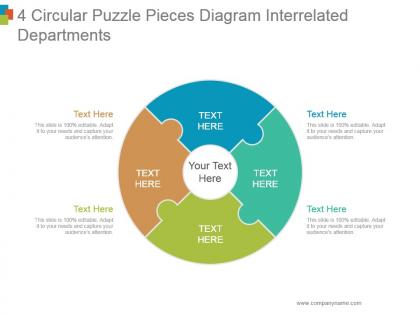
The image displays a PowerPoint slide titled "4 Circular Puzzle Pieces Diagram Interrelated Departments". It represents a circular puzzle with four interconnected pieces, each in a different color, designated for text input. The design suggests that each puzzle piece is a critical part of a larger integrated system, which in this case refers to interrelated departments. The central circular area prominently says "Your Text Here", indicating the place for a summary or title of the overall diagram. Surrounding each puzzle piece are additional areas for text, marked "Text Here", where details specific to each department or segment can be provided. Each text region is followed by a note stating "This slide is 100% editable. Adapt it to your needs and capture your audience's attention.", emphasizing the customizable nature of the template.
Use Cases:
This template is suitable for a variety of industries where illustrating interconnectivity or interdepartmental relationships is vital:
1. Management Consulting:
Use: To show how different business functions are interconnected.
Presenter: Management Consultant.
Audience: Corporate Executives.
2. Healthcare:
Use: To display the synergy between various medical departments for patient care.
Presenter: Hospital Administrator.
Audience: Medical Staff and Department Heads.
3. Education:
Use: To present the integrated approach of different academic departments.
Presenter: University Dean.
Audience: Faculty Members.
4. Technology:
Use: To explain the relationship between different technical teams in product development.
Presenter: Project Manager.
Audience: Development Teams.
5. Retail:
Use: To outline the collaboration between sales, marketing, procurement, and logistics.
Presenter: Retail Operations Manager.
Audience: Team Leaders.
6. Government:
Use: To demonstrate the interlinking between various government agencies.
Presenter: Policy Advisor.
Audience: Government Officials.
7. Nonprofit:
Use: To describe how various programs and initiatives support each other.
Presenter: Nonprofit Director.
Audience: Stakeholders and Donors.
4 circular puzzle pieces diagram interrelated departments powerpoint graphics with all 5 slides:
Be handsomely applauded with our 4 Circular Puzzle Pieces Diagram Interrelated Departments Powerpoint Graphics. Folks will be generous with their appreciation.


FAQs for 4 circular puzzle pieces diagram interrelated
Honestly, mapping your departments is a game changer - you'll finally see where everything's actually breaking down. Those weird handoff points that always cause issues? They become super obvious. I was shocked when we first did ours at how many redundancies we had going on. You can spot bottlenecks way easier too, which helps tons with deciding where to put resources. The visual aspect makes it click in a way that just talking about it never does. My advice though - start small with maybe 3-4 core departments. We tried mapping everything at once our first time and it was just chaos.
So basically it's like a map showing how all your teams connect and rely on each other. No more "wait, who deals with this??" confusion. You can spot where info gets stuck, see who actually needs to be in the loop for decisions, and figure out your real stakeholders. Honestly, most people just work in their own bubble without seeing the bigger picture. Try sketching out your current project with all the connection points - I bet you'll find communication gaps you never noticed. It's pretty eye-opening once you map it all out.
Honestly, just go with draw.io first - it's free and does everything you need. Lucidchart and Miro are solid too if you want more bells and whistles. All of them let you map out department connections with arrows and colors pretty easily. Your team can jump in and edit stuff together which is nice. I'd skip Visio unless you're already drowning in Microsoft tools - it's way more complicated than it needs to be for this kind of thing. Oh, and draw.io changed their name to Diagrams.net or something, but everyone still calls it draw.io.
So basically these diagrams show you where work gets stuck between teams. You'll see which departments are drowning in requests and where stuff just vanishes into thin air for weeks (happens more than you'd think). Look for those ridiculous approval chains that go through like 5 people. The visual makes it super obvious when teams are working in bubbles or getting skipped entirely. Start by mapping what you have now - it's usually messier than expected. Then you can actually fix the worst bottlenecks instead of just complaining about them.
So basically you map out how all your different teams connect and depend on each other - honestly it's such a lifesaver for avoiding those awkward "wait who's doing what?" moments. You can spot bottlenecks before they happen and see exactly who needs stuff from who. I'd start by just sketching your main departments first, then draw lines between teams that collaborate or share resources. It gives you this overview of the whole project that makes handoffs way smoother. Plus you'll catch conflicts early instead of scrambling later when someone drops the ball.
Honestly, the worst thing you can do is cram every single relationship into one diagram. Total spaghetti mess. Nobody will understand it. Pick the most important connections first. Keep your department names super simple too - skip all the fancy job titles and corporate jargon. I learned this the hard way when my first org chart looked like a phone book. Before you call it done, definitely run it by real people from those departments. Can't tell you how many times I've seen diagrams that made perfect sense on paper but completely missed how teams actually collaborate day-to-day. Build it simple, then only add more if it actually helps.
Just drop them right into whatever reports you're already doing - like your monthly updates or quarterly stuff. Pick one project first, something cross-functional, and use the diagram to track who's waiting on who. Most teams I know just stick them in their dashboards or email them with regular status updates. Way simpler than it sounds, trust me. The trick is syncing the diagram flow with how you actually report things, so when one team finishes their part, the next teams automatically get pinged. Honestly beats those endless "where are we on this?" Slack threads.
Color coding totally changes the game with these diagrams. You'll instantly see which departments connect instead of squinting at a bunch of labels. I always use different colors for operations, support, customer-facing stuff - makes everything pop. Trust me, black and white diagrams look like complete chaos. When you're showing this to your boss or whoever, they get the flow right away. Oh and stick to maybe 4-6 colors tops or it gets messy. Throw in a simple legend too so people aren't confused about what purple means.
Honestly, those department diagrams get crazy complicated once you start growing. You'll go from maybe 3-4 clean boxes to this messy web of overlapping stuff everywhere. Marketing suddenly has to loop in Sales, Product, Customer Success, AND Legal for one stupid campaign - it's wild how fast the connections multiply. New specialized teams pop up, old ones split or merge. The trick is actually updating the thing regularly instead of letting it collect digital dust like every other org chart (we've all seen those ancient ones, right?). I'd say review it every quarter or so to keep it somewhat useful.
Walk through the logic first before getting into weeds - org charts confuse people fast. Point to each department systematically and explain connections as you go. Don't make everyone stare at a tangled mess for 20 minutes though! Hit the critical relationships first, then add secondary stuff. Make it big enough so people in back can actually read it. Have real examples ready - like how marketing and sales team up on campaigns or whatever. That's honestly the part people remember most. End by asking what connections you missed. Oh, and test your laser pointer beforehand because there's always that awkward moment when it dies mid-presentation.
Start by talking to department heads about their main touchpoints before you draft anything. Once you have an initial diagram, show it to them - people are way better at spotting missing pieces when they can actually see something visual. Honestly, meetings where everyone just talks in circles are pretty useless for this stuff. Run workshops where they can draw directly on your diagram or make changes in real time. Don't just present a finished product and expect useful feedback. Digital tools where multiple people can comment at once will save you from endless email chains. Make it collaborative from the start.
Okay so those department diagrams are like having a map of who talks to who around the office. New people can actually see how teams connect instead of just guessing. Honestly, it saves everyone from that painful thing where someone keeps emailing the wrong department for weeks. Your new hire won't have to wonder "wait, who handles this stuff?" because they'll have a visual guide. It's basically a cheat sheet for navigating company politics and workflows - which, let's be real, every new person desperately needs. Hand it over during their first week so they can reference it when random questions pop up.
Honestly, track a few things to see if it's actually working. Test whether people get the relationships - like, do they understand who reports to who? Time how fast decisions get made now vs before. Count fewer "wait, who do I talk to about this?" emails (those are the worst). During presentations, notice if people ask smarter questions about how departments work together. That's usually a good sign. Also check project timelines - interdepartmental stuff should move faster if your diagram's doing its job. The whole point is making org structure click instantly for people, so they stop wasting time figuring out basic workflow stuff.
Honestly, it's just about how messy things get as you grow. Small businesses are pretty straightforward - maybe 5-8 departments all talking to each other directly. Sales calls finance, operations bugs HR, whatever. Enterprise org charts? Total nightmare. You've got regional offices, subsidiaries, departments within departments. It looks like someone threw spaghetti at a wall. I swear some of these Fortune 500 diagrams need their own navigation system. Rule of thumb - your diagram complexity matches your headcount. 50 people fits on one page, but big companies need multiple linked charts just to make sense of who reports where. Start simple though. Don't overcomplicate until you actually have the chaos to match it.
You should totally look at Toyota's lean system - they basically revolutionized manufacturing by mapping how production, quality, and supply chain talk to each other in real-time. Game changer. Spotify did something similar with their "squads" and "tribes" setup when they were scaling up. Even Mayo Clinic uses department diagrams to coordinate patient care, which honestly makes so much sense when you think about it. My advice? Start by drawing out where your teams currently connect and figure out where info gets bottlenecked between departments.
-
Professional and unique presentations.
-
Unique and attractive product design.