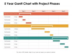
5 year gantt chart with project phases ppt powerpoint presentation file icon
Try Before you Buy Download Free Sample Product
Audience
Editable
of Time
Begin the high jinks with our 5 Year Gantt Chart With Project Phases Ppt Powerpoint Presentation File Icon. Get folks to indulge in fun and frolic.
People who downloaded this PowerPoint presentation also viewed the following :
5 year gantt chart with project phases ppt powerpoint presentation file icon with all 2 slides:
Get folks to indulge in fun and frolic with our 5 Year Gantt Chart With Project Phases Ppt Powerpoint Presentation File Icon. Be able to begin the high jinks.
FAQs for 5 year gantt chart with project phases ppt powerpoint
So Gantt charts are basically horizontal bars on a timeline showing when your tasks happen. Way different from Kanban boards or regular to-do lists because you can actually see how tasks connect to each other. Honestly, they look intimidating at first - all those overlapping bars and lines everywhere. But they're amazing for catching scheduling problems before they blow up your project. You can spot the critical path and see which delays will actually matter. I mean, if you're juggling anything with real deadlines or tasks that depend on each other finishing first, you'll probably love them once you get the hang of it.
Honestly, Gantt charts are game-changers for team communication. Your people can actually see who's doing what instead of playing email tag all day asking for updates. The visual thing really works - everyone spots bottlenecks early and understands how their stuff connects to other people's work. I've seen teams waste so much time on status meetings that could've been avoided. Put your chart somewhere everyone actually looks at (not buried in some folder) and watch how it becomes their first stop for checking progress. The accountability thing happens naturally when everything's transparent like that.
So for your Gantt chart, start with task names down the left side and your timeline across the top - could be days, weeks, whatever works. Then add those horizontal bars showing when each task runs and how long it takes. Dependencies are crucial (those connecting lines between tasks) - seriously, this is where everyone screws up but they make or break your schedule. Oh, and throw in some milestones marked as diamonds or little flags. Makes it way easier to track progress. Don't forget to assign someone to each task too. Keep it simple at first - your team can handle the fancy stuff later once they're not squinting at it confused.
Honestly, just break everything down into the tiniest tasks that still make sense. Then estimate based on stuff you've done before or ask your team what they think. Dependencies are annoying but you gotta map them out - like what can't start until something else wraps up. I always pad my estimates because literally everything takes longer than you think it will. Factor in people's PTO, holidays, random meetings that pop up. Oh and don't go too granular or you'll spend half your day just updating the stupid thing instead of actually getting work done.
So for Gantt charts, Microsoft Project is like the gold standard but honestly it's way too much unless you're running massive projects. Asana and Monday.com are both solid - way cleaner interfaces that people actually enjoy using. Smartsheet's pretty cool too, kind of like if Excel had a baby with proper project management software. TeamGantt's decent if you need something free to start with. Oh, and Google Sheets works fine with templates if you're really just testing things out. Just don't overthink it - pick whatever matches your team size and won't make everyone groan when they have to use it.
Yeah, definitely! Gantt charts are actually perfect for remote work since everyone can see the whole project timeline and who's doing what. We use Asana at my company but Monday and Microsoft Project work great too - basically anything where your team can update stuff in real-time. The tricky part is getting people to actually keep their tasks current. I've seen too many gorgeous charts that are completely useless because nobody updates them. Honestly, just pick whatever tool feels easiest for your team and do quick weekly check-ins. Makes a huge difference when you can't physically see what everyone's working on.
So basically you just draw arrows between the task bars to show what depends on what. Most Gantt tools have this built in - just click and drag between tasks. Yeah, some software gets all fancy with different arrow types for various dependencies, but honestly? Regular arrows do the job just fine. Color coding helps too if you want to group stuff together. I sometimes throw in a quick legend so people don't get confused. The whole point is making it dead obvious which tasks are blocking others. Your team should look at it and instantly know what's holding things up without having to think too hard about it.
Honestly? Don't go crazy with detail right away - I learned this the hard way when I spent hours tweaking every little subtask. The chart shows timeline but not actual workload, so that "2-week task" might need your whole team grinding nonstop. I've seen people (myself included) get so wrapped up in making the visual perfect that they forget to actually talk to their teammates. Dependencies shift constantly anyway. Keep stakeholder versions simple, update regularly without it eating your life, and treat it more like a conversation starter than some holy document you can't question.
Honestly, I'd go with weekly updates for most projects - that's usually enough. But if you're dealing with something crazy complex or you're in crunch mode, maybe bump it up to every few days. The real trick is updating whenever big stuff changes. New deadlines, team changes, scope creep - all that needs to get reflected right away or your chart becomes totally useless. I learned this the hard way on a project last year, actually. Set up a calendar reminder though, seriously. Otherwise you'll only remember to update it when everything's already falling apart. Short bursts work better than marathon catch-up sessions.
Honestly, Gantt charts are pretty flexible once you start messing around with them. Software teams usually break things into sprints and color-code by features or who's working on what. Construction is perfect for this - foundation, framing, electrical phases look so clean when mapped out (maybe I'm weird but I love watching those bars fill up). Marketing campaigns get messy with everything running at once, while manufacturing is more straightforward since it's mostly sequential. You can switch between daily or weekly views, add dependencies, throw in budget stuff. Just make it match how your team actually works, not some textbook version.
Honestly, Gantt charts are lifesavers for seeing who's swamped and who's free. Like if Sarah's juggling three projects at once - major red flag! You'll spot these conflicts way before they blow up. The timeline shows everything clearly, so when the design team has downtime next week, boom - perfect time for that delayed project. I do a weekly check of mine (probably should do it more often tbh). Makes reshuffling assignments super easy when priorities inevitably change. Trust me, it beats those panicked "wait, who's handling this?" conversations with your boss.
Honestly, Gantt charts are lifesavers for catching problems early. You can see which tasks depend on others and where things might get jammed up. If one thing gets delayed, you'll spot exactly what else gets screwed over. The critical path becomes super obvious too - those are your make-or-break tasks. I love using them for "what if" planning. Like, what happens if this deadline slips? Plus they're great for showing your boss or clients why certain areas are risky without getting into weedy explanations. Pro tip: always pad extra time around your sketchiest deliverables.
Yeah, you can totally do this! Agile purists might roll their eyes, but whatever works for your team, right? Focus on sprint-level stuff instead of massive project timelines. Map out your backlog for the two-week sprint, track dependencies between user stories - that kind of thing. Jira and ClickUp let you flip between Kanban and Gantt views pretty easily. The trick is keeping everything flexible since you'll be updating constantly. Agile's whole thing is adapting when priorities shift. I'd try it for one sprint first and see if it actually helps or just adds extra work.
Ugh, timeline changes are the worst but you gotta update that Gantt chart ASAP. Drag the task bars around or just edit the dates directly - most software makes this pretty easy. Check your dependencies though because one delayed task can mess up like five others (learned this the hard way). Save a baseline version first so you can see how much everything shifted later. Oh, and tell your team immediately! Nothing worse than someone working off old dates. Actually, I always screenshot the old version too just in case the software glitches.
Don't clutter your Gantt chart with finished tasks unless they actually matter. Bright colors work great for highlighting risky milestones or critical stuff. I've watched so many people zoom in way too much during presentations - nobody can read tiny text from across the room! Walk through it left to right, hit the big phases first, then get into specifics. Callout boxes are your friend for delays or dependencies instead of stuffing everything into task names. Oh and definitely export a PDF version afterward. People will bug you for dates later and you'll thank yourself for having it ready.
No Reviews