81236416 style hierarchy 1-many 3 piece powerpoint presentation diagram infographic slide

Slide 1 of 6
Favourites Favourites

Try Before you Buy Download Free Sample Product

Audience Impress Your
Audience
Editable 100%
Editable
Time Save Hours
of Time
The Biggest Sale is ending soon in
0
0
:
0
0
:
0
0
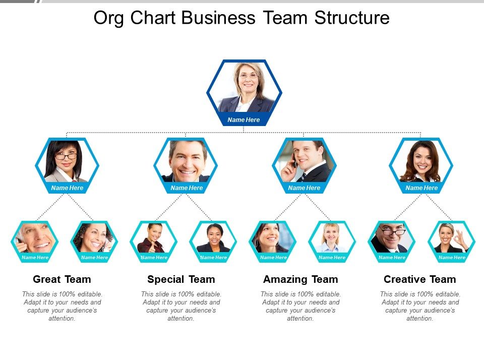
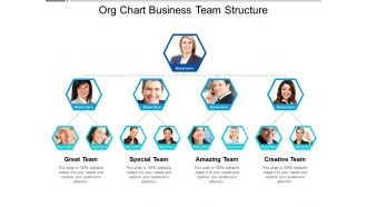
Presenting, org chart business team structure PPT deck. This PPT Template can be used by business-related executives for representing their workforce and employees. Alter the colors and position of the elements shown in the slide. This PowerPoint template is also be converted into pdf or jpeg format as per the need. Can be instantly downloaded with just a click, saves time.

FAQs for 81236416 style hierarchy 1-many 3 piece powerpoint presentation

Okay so for org charts - you definitely need the obvious stuff like who reports to who, actual job titles, and current names (sounds basic but you'd be surprised how many are outdated). Contact info is clutch too. Photos help but honestly some people hate having their face on there, so maybe check first? Group departments together visually so it's not just a random mess of boxes. The whole point is someone new should be able to glance at it and immediately know who to bug for help. Oh and show the real hierarchy, not whatever looks prettiest - nobody's fooled by that anyway.

Honestly, org charts are lifesavers. They show who reports to who so you're not stuck wondering whether to bug Sarah or her manager about approvals. Super helpful for new people too - they can actually map out the company instead of awkwardly asking "so... who's your boss again?" every week. You'll spot decision-makers faster and see how departments connect. My old job never updated theirs though, which was useless. Keep it current and somewhere people can find it. Saves everyone from those weird email chains where nobody knows who should respond.

Honestly, just keep it super simple and flat - fancy hierarchies are pointless when everyone's doing like 5 different jobs anyway. Show who reports to who and what people actually do, not their made-up titles that'll change in 3 weeks. Make it visual so you can update it easily (because you will, constantly). Throw in contact info and who owns what so new hires know who to bug about different stuff. I'd just use Lucidchart or even Google Docs - don't get crazy with expensive tools yet. You'll be tweaking this thing every few months as you grow and figure things out.

Honestly, modern org chart tools are a game changer compared to those awful static PowerPoint diagrams we used to suffer through. You can sync directly with your HR system now, so updates happen automatically when someone gets promoted or moves teams. The interactive features are actually useful too - clickable employee photos, contact info, the whole deal. I've seen companies embed live versions right into Slack which is pretty smart since that's where people actually hang out anyway. Plus you can track changes over time, which sounds boring but is surprisingly helpful during reorganizations. Definitely check out Lucidchart or similar tools - way better than manually updating charts every month.

Don't overthink it - complex charts become total messes nobody can follow. Skip the minor reporting lines and focus on the main structure. Oh, and include important people even if they don't manage anyone (learned that one the hard way). The worst thing? Leaving dead weight on there - old employees, outdated titles, that kind of stuff. Makes your whole company look disorganized. Clean design helps too. But honestly, the real key is getting someone to actually update it regularly. Trust me, a stale org chart just screams "we don't have our act together."

Honestly, it starts super flat - everyone just reports to you or the CEO. Once you're at like 15-20 people though, that stops working. Communication gets weird and decisions take forever. That's when you add your first managers and department heads. Then boom - suddenly you need VPs, directors, team leads, the whole nine yards. I learned this the hard way at my last place. Don't just add layers because other companies do it. Only restructure when things actually break down. Check in on it every few months as you grow because what works at 30 people definitely won't at 100.

Dude, definitely give new hires an org chart on day one. I was so confused my first week at my last job - kept asking random people basic questions because I had no clue who did what. Walk them through it so they know their manager, teammates, and how everything fits together. Remote people especially need this since they can't just peek around corners to figure out team dynamics. Honestly saves everyone time when new folks know who to bug for different stuff instead of just... wandering around lost. Trust me, it's worth the five minutes to explain it properly.

Dude, colors are a game changer for org charts. Use different ones for each department so you're not staring at identical boring boxes forever. Make the CEO's box bigger than everyone else's - visual hierarchy actually works. Photos help too since faces are way easier to remember than names (though some people look weird in corporate headshots, let's be real). Your brain picks up on visual stuff instantly. Different line styles show who reports to who. Bold fonts for managers, regular for everyone else. Spacing matters too - cramped charts are the worst.

Honestly, it totally depends on what kind of business you're running. Traditional companies? Go hierarchical - clear boss-to-employee lines work. Startups though, they need flat or circular charts since everyone's collaborating anyway. Matrix structures are solid when people report to multiple managers (which happens more than you'd think). For remote teams, network charts make way more sense because relationships trump formal reporting. The key is matching your chart to how your team actually talks and makes decisions - not some textbook structure that looks pretty but doesn't reflect reality.

Honestly, org charts are super helpful for big decisions because you can see who actually calls the shots and controls what resources. Look for bottlenecks before they bite you. Are the right people in key spots? Is your team too thin for what you're planning? I always check for weird overlaps or gaps that'll mess things up later. When you're doing cross-team projects, it shows exactly who needs to sign off on stuff. Saves you from those awkward "wait, who approved this?" moments. Definitely map it out before launching anything major.

Honestly, ditch PowerPoint for this stuff - dedicated org chart tools are so much better. They've got drag-and-drop features and templates that don't look like garbage. The real game-changer though? Most sync with HR systems, so you're not constantly updating when people leave or get hired. You can add photos, contact details, all that. Some even let employees update their own info which is kinda nice. I'd mess around with a few free options first - you'll figure out what actually matters for your team size pretty quick.

Dude, org charts are actually super helpful for project planning! You can see who's in charge of what and avoid that awkward thing where you accidentally skip someone's boss. When I'm starting something new, I always check it first to map out who needs to be involved. Saves me from those "wait, who approved this?" moments later. Plus you can spot where things might get stuck - like if there's only one person who can sign off on your budget or whatever. Honestly wish I'd figured this out sooner when I was new!

Oh man, remote work is totally reshaping how companies are structured. Middle management is getting squeezed out - you'll see way more direct reporting now. Teams form around projects instead of who sits where geographically. Matrix structures are everywhere, which honestly feels chaotic at first but you get used to it. Individual contributors have more power since bosses can't just hover over your shoulder all day. Your manager might be three time zones away, and people collaborate across departments without all that formal hierarchy BS. Here's the thing though - focus on building influence networks, not just climbing the official ladder.

Honestly, org charts are like X-rays for your team - they show you exactly where things are broken. I'd start by scanning for anyone who's completely swamped versus areas where nobody owns the work. Missing skills jump out pretty fast too. Here's what I always do though - map your actual workflow next to the "official" chart because they never match up. You'll catch bottlenecks and stuff falling through cracks immediately. Those problem spots? That's where you need to hire or shuffle people around. Works every time.

Honestly, your org chart is like a window into what your company actually cares about versus all the BS they put in emails. Super rigid hierarchy with a million layers? Yeah, they don't really want collaboration despite what they say. Flat structures usually mean you'll get more freedom and decisions happen faster. I always check who's actually in leadership roles too - tells you if they're serious about diversity or just talking. And look at whether teams work together or stay in their own bubbles. It's kinda wild how much you can figure out just from some boxes and lines.

Ratings and Reviews

0% of 100
Review Form
Write a review
Most Relevant Reviews

No Reviews