83523553 style essentials 1 roadmap 5 piece powerpoint presentation diagram template slide
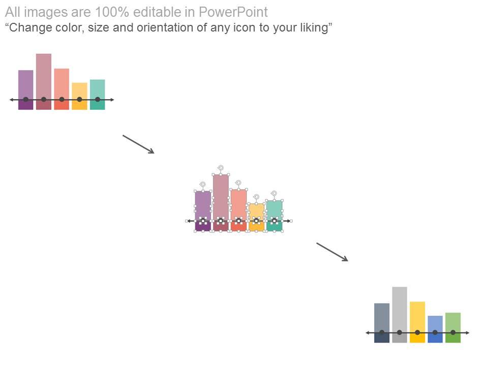
Impress your management with data based on actual performance of your business unit using this PowerPoint slide which has a bar graph to depict the timeline with percentage and respective years. All those figures related to sales volume, market research data outputs, customer base growth, number of units sold, market capitalization, revenue growth etc. need not be banal digits with our PowerPoint presentation design in which you can give them a life of their own through visually arresting bar graphs which help in easy comprehension of yearly progress and enable decision making to be data oriented even as it is tempered according to subjective inputs from all the stakeholders in the planning process. Give your business strategy a consequential push through discussions based on financial accounting, auditing, impact assessment of various initiatives, sales growth figures and actionable data received from various departments and key stakeholders which can be represented through this PPT slide design. Create a feeling of balance with our Bar Graph Timeline With Percentage And Years Powerpoint Slides. They encourage a level headed approach.
Impress your management with data based on actual performance of your business unit using this PowerPoint slide which has a..
- Google Slides is a new FREE Presentation software from Google.
- All our content is 100% compatible with Google Slides.
- Just download our designs, and upload them to Google Slides and they will work automatically.
- Amaze your audience with SlideTeam and Google Slides.
-
Want Changes to This PPT Slide? Check out our Presentation Design Services
- WideScreen Aspect ratio is becoming a very popular format. When you download this product, the downloaded ZIP will contain this product in both standard and widescreen format.
-

- Some older products that we have may only be in standard format, but they can easily be converted to widescreen.
- To do this, please open the SlideTeam product in Powerpoint, and go to
- Design ( On the top bar) -> Page Setup -> and select "On-screen Show (16:9)” in the drop down for "Slides Sized for".
- The slide or theme will change to widescreen, and all graphics will adjust automatically. You can similarly convert our content to any other desired screen aspect ratio.
Compatible With Google Slides

Get This In WideScreen
You must be logged in to download this presentation.
PowerPoint presentation slides
Fast and simple download. Alter the text to suit the context of your presentation. Insert your own company logo, tagline, trademark, brand name, client’s name etc. Fully modifiable PPT icons- modify the color scheme and contrast to your liking. No change in resolution of PPT images after editing. Change the size and orientation of presentation infographics as per your requirement.
Content of this Powerpoint Presentation
Description:
The image displays a bar graph timeline titled "Bar Graph Timeline With Percentage And Years," designed to visually represent data changes over a five-year period, from 2015 to 2019. Each bar on the graph represents a percentage value for a specific year, allowing for a clear comparison of values across the timeline. The data points show a trend or change over time and can be used to track various performance metrics or growth indicators.
The text in the image emphasizes the slide's adaptability and user-friendliness for presentations, encouraging the presenter to "Capture your audience's attention." It also mentions that the diagram is downloadable and fully editable in PowerPoint, making it a versatile tool for creating impactful presentations.
Use Cases:
Here are seven industries where this bar graph timeline can be effectively applied:
1. Marketing:
Use: Show year-over-year changes in market share, campaign effectiveness, or customer acquisition rates.
Presenter: Marketing Analyst or Strategist
Audience: Marketing team, stakeholders, and executives
2. Finance:
Use: Illustrate annual growth rates, investment returns, or financial performance metrics.
Presenter: Financial Advisor or Analyst
Audience: Investors, management, and financial teams
3. Healthcare:
Use: Display patient satisfaction statistics, improvements in health outcomes, or changes in healthcare service utilization.
Presenter: Healthcare Administrator or Quality Improvement Specialist
Audience: Healthcare staff, policy makers, and administrators
4. Education:
Use: Exhibit changes in graduation rates, student test scores, enrollment trends, or educational program effectiveness.
Presenter: Education Researcher or Administrator
Audience: School board members, educators, and educational stakeholders
5. Manufacturing:
Use: Demonstrate production efficiency, quality control percentages, or manufacturing process improvements.
Presenter: Operations Manager or Quality Assurance Specialist
Audience: Production team, quality assurance staff, and management
6. Real Estate:
Use: Present trends in property values, rental occupancy rates, or real estate market fluctuations.
Presenter: Real Estate Analyst or Agent
Audience: Investors, real estate agents, and property owners
7. Retail:
Use: Visualize customer retention rates, sales growth, or the expansion of loyalty programs over time.
Presenter: Retail Manager or Sales Analyst
Audience: Retail employees, corporate management, and marketing teams
83523553 style essentials 1 roadmap 5 piece powerpoint presentation diagram template slide with all 4 slides:
Give them a defining experience with our Bar Graph Timeline With Percentage And Years Powerpoint Slides. Allow them a glimpse of your essential brand.
-
Use of different colors is good. It's simple and attractive.
-
The content is very helpful from business point of view.


