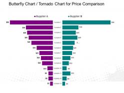
Butterfly chart tornado chart for price comparison powerpoint slide
Try Before you Buy Download Free Sample Product
Audience
Editable
of Time
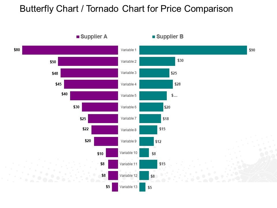
Butterfly chart tornado chart PowerPoint template is a common statistical tool to depict the sensitivity of a result to change in selected variables. Our tornado chart for price comparison PowerPoint template can be used to show the effect on the output of varying each input variable at a time, keeping all the other input variables at their nominal values. The result of this is then displayed as a special type of bar graph referred over here in this butterfly chart presentation graph, with bars of each input variable displaying the variation from the initial values. Unlike the standard practice to plot the bars horizontally, where the data is categorized and listed vertically In this tornado chart PPT model the data is sorted such that the widest bar is placed at the top so that the diagram appearance as a tornado. Tornado diagram PPT graphic as shown here is also used to show the population pyramid and population structure and dynamics. Epitomize excellence with our Butterfly Chart Tornado Chart For Price Comparison Powerpoint Slide. Consistently function at your best.
People who downloaded this PowerPoint presentation also viewed the following :
Butterfly chart tornado chart for price comparison powerpoint slide with all 5 slides:
Our Butterfly Chart Tornado Chart For Price Comparison Powerpoint Slide encourage everyone to contribute their bit. They will agree to come on board.
FAQs for Butterfly chart tornado chart for price
Okay so butterfly charts are basically horizontal bar charts where data spreads out from the center like wings. Positive values go right, negative go left - or you can compare two datasets side by side. They're honestly way better than regular bars when you're doing "this vs that" comparisons. Like male/female demographics or before/after stuff. Stacked bars get cluttered real quick, but these stay clean. The whole thing just clicks for people immediately. I'd definitely use one next time you need to show any comparison data - way more intuitive than cramming everything into a regular chart.
Use butterfly charts when you're comparing two related groups that split from the same center point. Population pyramids are the classic example - male vs female by age groups. They're also great for survey data (agree/disagree responses) or comparing actual vs projected budgets. The mirrored setup lets you spot patterns instantly, which is honestly pretty satisfying when it clicks. Your audience can quickly see magnitudes across categories while keeping that central relationship visible. Just don't force it though - if the mirror effect isn't adding value, stick with regular bars instead.
Honestly, butterfly charts are perfect when you need that instant "wow, look at the difference" moment. Your audience sees the before/after or group comparisons right away - no squinting required. I use them all the time for survey data or demographic shifts. There's something about that symmetrical layout that just works with how our brains process info (maybe we're wired to like balance?). The data basically tells its own story instead of you having to walk through every single point. Perfect for when you want people to immediately get it without overthinking your slide.
You'll need a center axis splitting your two data categories, with bars going out horizontally in opposite directions. Make sure both sides use the same scale or comparisons get weird. Stick clear labels at the top or bottom of each side - and honestly, skip the red/green combo since colorblind folks can't tell them apart. Pick distinct colors that actually pop. Don't go crazy with gridlines, they just make it messy. Oh, and definitely sketch it out first before you dive into whatever software you're using. Gets the proportions right from the start. Add a solid title explaining what you're comparing and you're good to go.
Okay so with butterfly charts you basically read from the center outward - positive values on one side, negative on the other. Bar length shows you how big each value is, and all your categories run down the middle. It's kinda like someone took a regular bar chart and split it in half (which is actually pretty smart). Look for the biggest bars first on each side, then see what patterns emerge. Are things balanced or does one side totally dominate? I usually scan for outliers first - makes it way easier to spot the real trends. The categories are right there on that center line so you won't get lost.
Honestly, Excel's your best starting point - you probably already have it anyway. You can hack together butterfly charts using clustered bar charts with some data tweaks. Tableau's cleaner if you've got access to it, makes the whole process way smoother. Power BI works too. Google Sheets is... fine, I guess, if that's all you have. R with ggplot2 is super powerful but totally overkill unless you're doing something complex. I'd just YouTube some Excel tutorials first - there's like a million of them. Way easier than you'd think once you see someone do it.
Don't make your categories super long - they get messy quick. Also, line up that zero baseline properly or people will get confused. Stick to maybe two colors max, trust me on this one. Your axis labels need to be crystal clear since folks read from both directions. I'd say cap it at 5-7 categories tops, otherwise it's just chaos. Slap the actual data values right on the bars if you can fit them. Start with whatever's most important at the top and work your way down. Makes way more sense that way and honestly saves everyone time trying to figure out what you're showing them.
Dude, colors and labels will make or break your butterfly chart. Pick different colors for each group you're comparing - just avoid red-green combos since colorblind people can't tell them apart. Label everything clearly so people know what they're looking at. I'm obsessed with putting actual numbers right on the bars because everyone wants to see exact values anyway. Oh, and throw in a legend if it gets complicated. Honestly, if someone can't figure out your chart in like 10 seconds, you've probably overcomplicated it.
You'll want butterfly charts when your data splits into two opposing sides. Population pyramids are the classic example - male vs female by age groups. Budget stuff works great too, like comparing what you planned to spend versus reality. Honestly, they're pretty specialized compared to regular bar charts, but man do they shine for the right situation. Before/after survey results? Perfect. The trick is that symmetrical layout around the middle - it makes contrasts super obvious. Just ask yourself: does my data tell two sides of the same story? If it does, you're set.
Yeah totally! Just stack multiple categories on each side and use different colors to tell them apart. Some people call them "multi-wing" charts which... honestly sounds pretty dramatic for what's basically a fancy bar chart lol. But here's the thing - it gets messy real quick once you hit 3-4 datasets per side. The readability just tanks. I'd say give it a shot with your data first, see how it looks. Worst case? You can always fall back to a regular grouped bar chart if things get too cluttered.
Honestly, butterfly charts are perfect for comparing two groups side by side. The mirrored layout makes differences jump out immediately - way clearer than regular bar charts where you're constantly looking back and forth. I used one recently for male/female survey data and it was so obvious where the gaps were. They're great for before/after stuff too. Bar graphs just feel clunky in comparison. Your audience gets it instantly without having to work for it. Also they look pretty polished in presentations, which is always nice. Next time you've got opposing datasets, try it out!
Honestly, butterfly charts are pretty hit or miss. Your audience needs to immediately grasp they're looking at two mirrored bar charts sharing a center line. Otherwise? Total confusion. I've watched people squint at these things for way too long in meetings - it's painful. Once they get it though, spotting differences between the two sides becomes super easy. The comparison jumps right out. My advice? Run it by someone first. Or just slap a quick explanation at the top. Better safe than having everyone look lost while you're presenting.
Honestly, butterfly charts are perfect for survey stuff - like when you've got positive vs negative feedback on product features. Population pyramids use them too (male/female demographics by age). Political polling does this constantly with approval/disapproval ratings across different voter groups. Market research teams are obsessed with them for "agree/disagree" data since neutral responses can sit right in the middle. Financial folks use them for budget variances - over/under spending branches out from baseline. Trust me, when you've got opposing datasets, this format makes patterns way more obvious than those boring side-by-side bar charts. Worth trying next time.
Your audience gets way more invested when they can actually play with the data instead of just watching you present. Start simple - maybe add hover tooltips so people can see exact numbers. Then you could let them toggle between different time periods or filter by whatever they care about. People literally lean forward when they can control what they're seeing, it's wild. Just don't go crazy with features that distract from your main point. I'd honestly rather see one really smooth interactive element than five clunky ones. Build up gradually based on how tech-savvy your crowd is.
Ok so for butterfly charts, you'll want everything balanced with that center line and matching sides. Use colors that actually contrast - trust me, I made that mistake once and my boss couldn't tell anything apart during a presentation lol. Gridlines help people read the data faster. Don't cram everything together either, give it room to breathe. Oh and make sure your labels are clear and the title actually explains what you're comparing. Honestly, nail these basics and you won't run into the usual mess that makes these charts unreadable.
-
Professional and unique presentations.
-
Very unique, user-friendly presentation interface.