


Company background powerpoint images

You must be logged in to download this presentation.


Try Before you Buy Download Free Sample Product
 Impress Your
 Audience
Editable
of Time


Indulge in carefree celebration with our Company Background Powerpoint Images. Generate a bit of joie-de-vivre.
People who downloaded this PowerPoint presentation also viewed the following :
Company background powerpoint images with all 5 slides:
Get folks to display consistent focus with our Company Background Powerpoint Images. Be able to handle intermittent attention.
FAQs for Company
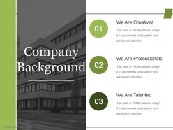
So for the company background slide - definitely include when you started, major milestones, and what you're actually about. Team size and locations matter too. If you've got big-name clients or partnerships, show those off (but skip the random small local stuff unless it's super relevant). Any legit awards are worth mentioning. Revenue or funding details can help if they make you look stronger. Honestly, most people zone out during this part, so make it visual - timeline, icons, whatever keeps it from being a wall of text. You want to come across as established without putting everyone to sleep. The whole point is just proving you're not some sketchy startup that'll disappear next month.
Your company story needs visuals or it'll just be boring facts nobody cares about. Timelines work great for showing your journey. Before/after pics are perfect for transformations. I'd throw in some icons for your values too - keeps things visual without being too heavy. Growth charts are solid, but honestly don't dump a ton of data on people. Match each image to what you're actually talking about. Like founder photos when you're discussing how it all started, customer shots for impact stories. The whole point is making people *feel* something, not just get it intellectually. That's what sticks.
Honestly, 1-2 minutes tops for company background or you'll lose them. Hit the basics - what you do, maybe a cool founding story if you've got one, key wins. I've watched so many presentations where someone spends like 5 minutes on company history and everyone's just... gone. Focus on stuff your audience actually cares about. Why should they give a damn about your company? Then transition smoothly into your real content - that's what they're really there for anyway.
Pick milestones that actually back up what you're trying to accomplish right now. Major product launches, solid partnerships, funding rounds - stuff that shows you can grow and adapt when things get tough. I made this mistake early on where I'd throw in every little achievement because it felt important historically, you know? But honestly, your audience just wants to see if those moments prove you've got the chops for whatever you're pitching today. Does this milestone show you can execute or that you understand your market? Skip random founder backstory and stick to maybe 3-5 things that build real credibility.
Your brand identity makes or breaks those company slides, honestly. First impressions matter so much! Everything needs to feel cohesive - your colors, fonts, how you talk about your values. I've sat through way too many presentations that just blend together because they look so generic. Short sentences work. But you also want some flow when describing your achievements and what makes you different from competitors. Don't forget the small details either - they add up. Actually, consistency is probably the biggest thing here. When every slide feels authentically "you," people remember your story way better.
Don't just slap your values on a slide with some cheesy stock photo - honestly, those make me want to skip ahead immediately. Instead, bake them into actual stories. Like, show how your "innovation" value created that one product everyone loves, or how being "customer-first" totally transformed your support team. Employee quotes work great for this stuff. So do quick case studies or customer testimonials that prove these values aren't just pretty words on the break room wall. The whole point is making it stick in people's heads, so get specific with real examples they'll actually remember.
Ugh, the worst thing you can do is dump your entire company history on there like it's Wikipedia. Nobody cares about every single milestone! Focus on what actually matters to your audience instead. Use readable fonts - I can't tell you how many times I've squinted at tiny text over some chaotic background. Those generic stock photos of people shaking hands? Total waste of space. Tell a story about your impact rather than just listing boring dates and facts. Break it up with bullet points so people can actually scan it, and don't be afraid of white space. Cramped pages make my eyes hurt.
Honestly, infographics are a lifesaver for those awful data dumps nobody wants to read. Charts and icons make stuff like revenue growth or market share way easier to digest than endless bullet points. Pick your format based on what you're showing - timelines work great for company milestones, pie charts for market breakdowns. I always start with the most important data first, then build everything else around that. Way more engaging than watching people zone out during presentations (been there). Just don't overthink the design - clean and simple beats fancy every time.
Honestly, just pick 3-5 big moments - people's eyes glaze over if you throw everything at them. Start with when you founded it, then hit the stuff that actually mattered. Big funding round? Product launch that changed everything? Partnership that opened doors? Those are your winners. I've seen so many companies list every tiny milestone like it's their diary or something. Don't do that! Keep each description super short - like a few words max. Oh, and try to space things out proportionally on your timeline. Ten years shouldn't look the same as one year, you know? Always end with something recent so you don't look stuck in the past.
So here's the thing - investors want all the money stuff. Show them your revenue growth, user numbers, market size, basically anything that screams "you'll make bank on this." But customers? Totally different game. They couldn't care less about your latest funding round. Talk about your mission, how you actually solve their problems, share some solid testimonials. I swear, you need to swap out like 70% of your pitch depending on who's listening. The "why we exist" story stays the same core idea, just told through their lens. Makes sense, right?
Honestly, just go with Arial or Calibri - they're boring but that's the point. Your slides need to be readable from the back row, so don't get fancy with decorative fonts. Sans-serif works way better on screens than Times New Roman (save that for Word docs). Keep body text at least 24pt or people will be squinting the whole time. Only use 2-3 different font sizes total: big for headers, normal for regular text, small for footnotes. Oh and definitely test everything on an actual projector first - fonts look totally different projected than they do on your laptop screen.
Honestly, just throw those wins right into your timeline section - feels way more natural than awkwardly shoehorning them elsewhere. I'd make a little "Recent Highlights" box or save the end of your company story slide for awards, funding, partnerships, whatever you've scored in the last year or so. Here's the thing though - don't just dump a list on them! Connect each win back to what you're actually trying to accomplish as a company. Shows you're not just lucky. Oh, and if you've got tons of stuff, pick maybe 2-3 that'll actually matter to whoever you're pitching. Nobody wants to sit through your entire trophy collection.
Honestly, just go with PowerPoint or Google Slides - everyone knows how to use them and you won't get stuck with compatibility issues. Canva's actually pretty great too if you want templates that don't look like they're from 2005. I've been using it way more lately. Keep your company colors and fonts consistent throughout, that's the biggest thing. Your logo should go in the same spot every time. Adobe or Figma will make things look super polished but they're kind of a pain to learn if you're in a rush. Start with a decent template and you're basically done.
Honestly, less is more with animations. I stick to basic fade-ins for text and smooth slides between sections - maybe add some movement to charts if it actually helps. But seriously, I've sat through presentations where every logo spins like a washing machine and it's painful. Pick 2-3 animation types tops and time them with how you actually speak. Nothing worse than animations that race ahead of you or lag behind awkwardly. Oh, and definitely do a practice run first - you'll catch anything that feels weird or distracting before it matters.
Focus on 3-4 metrics that actually tell your growth story. Revenue growth year-over-year is the obvious one. Customer acquisition and market expansion numbers work great too. Employee headcount can be surprisingly powerful - doubling your team size really shows you're scaling fast. Throw in major milestones like funding rounds or new offices if they happened recently. Just keep your timeframes consistent so people can follow along easily. Honestly, pick whatever makes you look most impressive and weave it into one solid narrative. The key is making sure everything connects rather than just throwing random numbers at them.
-
Awesome presentation, really professional and easy to edit.
-
The Designed Graphic are very professional and classic.
-
wonderful ideas!!!