Comparing 2 companies management of business statistics ppt slides

Rating:
90%
Slide 1 of 5
Favourites Favourites

Try Before you Buy Download Free Sample Product

Audience Impress Your
Audience
Editable 100%
Editable
Time Save Hours
of Time
The Biggest Sale is ending soon in
0
0
:
0
0
:
0
0
Rating:
90%
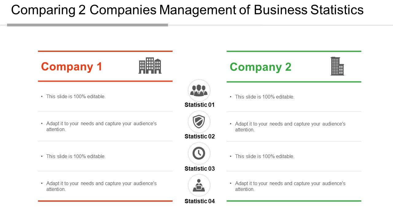
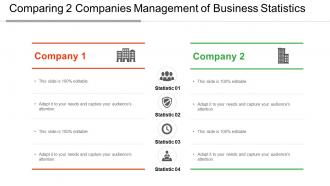
Presenting Comparing 2 Companies Management Of Business Statistics PPT Slides. Get this completely customizable template and make changes in this according to your needs. Change the colors of this template and adjust the font type and font size as per the requirement. You can also add a suitable icon in this template. This is completely compatible with the Google Slides and you can convert this in various formats including JPG and PDF formats. This template can be downloaded and viewed on standard screen and widescreen.

FAQs for Comparing 2 companies management of business

Hey! So descriptive stats are basically what already happened - your averages, percentages, all that past data stuff. Inferential stats? That's when you're trying to predict what's coming next or test if something will actually work. Like, last quarter's sales numbers = descriptive. Using those same numbers to guess next quarter or see if your new marketing thing is worth it = inferential. Honestly, the prediction stuff is way more fun to mess around with. You'll probably use descriptive for tracking day-to-day performance, inferential for bigger strategic calls.

Start with the basics - grab customer behavior data, sales numbers, operational stuff. Most companies go crazy with fancy analytics when simple comparisons work just fine (seriously, I've seen teams spend months on tools they don't need). Ask yourself specific business questions first, then hunt for data to answer them. Descriptive stats show you what's happening right now. After that, try predictive stuff for forecasting. Set up some dashboards so your team can actually make quick decisions instead of just winging it based on hunches.

Honestly, visuals are everything when you're presenting data. People's eyes glaze over the second you start throwing around spreadsheets and raw numbers. But throw up a clean chart? Now they're paying attention. Executives especially - they want the story, not your regression analysis (learned that the hard way). Charts help people catch patterns and weird outliers they'd totally miss otherwise. I always start with the visual first, then dive into the actual numbers when someone asks. Way more effective than drowning them in stats upfront.

So here's what I'd do - grab your past sales data and customer behavior stuff, then feed it into some ML models along with seasonal trends. These algorithms catch patterns we'd totally miss, which is honestly kind of crazy when you see it work. Focus on leading indicators though, not the stuff that already happened. Track website traffic shifts, social sentiment, early adoption rates - that kind of thing. Oh and definitely start with just one product line first. Test your predictions against what actually happens, then expand once you know the model isn't garbage.

Honestly, keep it simple with performance evaluations. Descriptive stats are your best friend - just track means, medians, and standard deviations of your main metrics. Correlation analysis is super helpful too because it shows what actually affects performance (and trust me, managers are usually wrong about this). Regression helps predict who's gonna improve. Oh, and percentile rankings are great for comparing people across different teams fairly. I learned this the hard way, but don't try doing like 10 different analyses. Pick maybe 2-3 methods and actually understand them instead of drowning in data.

Honestly, start with baseline measurements before you do anything else - that's the part everyone skips. Track a few key metrics that actually connect to revenue, not just random vanity stuff. A/B testing is your friend here, way simpler than it sounds. Google Analytics handles most web traffic tracking. Set up control groups so you can compare what worked versus what didn't. Customer lifetime value calculations show the real long-term picture too. ROI math and regression analysis help you figure out which channels are actually driving sales. Oh, and don't try measuring everything at once - pick one or two metrics first.

Look, bigger samples = way more trustworthy data. It's pretty straightforward math honestly. If you ask 10 people about your product vs 1,000 people, you'll get wildly different confidence in those results. Small samples get wrecked by outliers too - one weird response can throw off your whole analysis. You need at least 30 data points for most stuff to mean anything, but go higher if you can swing it. Oh, and figure out your sample size before you start collecting data, not after. Otherwise you might end up with results that don't actually help you make decisions.

Ugh data quality is such a pain but you've gotta build checks from the start. Set up automated stuff first - type validation, range checks, duplicate catching. Super boring but way better than fixing garbage later. Have someone actually eyeball samples regularly too because automation misses weird edge cases. Oh and lock down who can mess with your datasets, seriously. People love to "fix" things and break everything. Document your collection process clearly - future you will thank present you when things inevitably go sideways. The whole point is catching problems early instead of cleaning up disasters afterward.

Monte Carlo simulations are your best friend here - run thousands of scenarios to see what could actually happen. Always give confidence intervals instead of exact numbers because honestly, anyone claiming perfect precision is lying to themselves. Time series analysis catches trends and seasonal stuff (markets still do whatever they want though lol). Regression helps you understand how different variables connect. But here's the thing - never put all your eggs in one basket with just one method. Mix techniques and always present ranges to people, not single predictions. That way when things go sideways, you're covered.

So basically you split your users into groups and show each group different versions of the same thing. Like maybe group A sees a red button, group B sees blue. Then track which one gets more clicks or conversions or whatever metric matters to you. Only test one thing at a time though - otherwise you won't know what actually made the difference. I'd start with stuff that really matters, like your signup flow or main landing page. Oh and prepare to be shocked sometimes - I've seen the weirdest things win tests that made no logical sense! The data doesn't lie though.

Ugh, honestly the worst part is dealing with people who refuse to give up Excel - I swear some folks act like you're asking them to learn ancient Greek or something. Your data's gonna be way messier than you think too. Missing stuff everywhere, formats that don't match, the usual nightmare. Training gets expensive fast, especially if you want the fancy features. But here's what worked for me: pick one small team first, get them some quick wins so you can prove it's worth it. Once you've got a few people excited about it, rolling it out to everyone else gets way easier.

So basically, correlation and regression are game-changers for figuring out what actually makes customers tick. Price sensitivity vs. how often people buy? Customer satisfaction predicting who sticks around? This stuff reveals patterns you'd never guess at. When I first ran these on real data, honestly blew my mind how wrong some of my assumptions were. Regression's the real MVP though - it shows exactly how much each factor moves the needle. Don't overthink it to start. Just grab one customer metric you're curious about and see what connects to it strongest.

Honestly, Bayesian stats are a game-changer for business stuff. You get to build on what you already know instead of pretending you're clueless every time new data shows up. Way more realistic, right? The cool part is how you can actually put numbers on uncertainty - like saying there's a 75% chance sales will jump 10-15% rather than just "things look good." Stakeholders love that kind of clarity. Oh, and it feels way more natural once you mess around with it a bit. I'd start with something low-stakes first though, maybe forecasting office coffee consumption or whatever. Get a feel for it.

Honestly, hypothesis testing is a total game-changer for making decisions with actual data instead of just guessing. You can finally figure out if that new process really boosts productivity or if your marketing campaign is actually working. No more endless meetings where everyone argues about what "might" work - you get real evidence instead. Quality issues? Test whether they're genuine problems or just random stuff happening. I was skeptical at first, but once you start doing it, you'll wonder how you made decisions before. Pick something small you're dealing with right now and just test it. Way better than going with gut feelings and wasting money on things that don't work.

Okay so first things first - you gotta get proper consent before grabbing anyone's personal data. Strip out the identifying stuff whenever you can too. Being transparent is huge here, like people should actually know what you're doing with their info (wild concept, right?). Just because your company CAN analyze something doesn't mean you should - make sure there's a real business reason, not just creepy data mining. Oh and definitely set up some clear policies with your team about what's cool and what's not.

Ratings and Reviews

90% of 100
Review Form
Write a review
Most Relevant Reviews
  1. 80%

    by O'Connor Collins

    Designs have enough space to add content.
  2. 100%

    by Donny Elliott

    Use of different colors is good. It's simple and attractive.

2 Item(s)

per page: