Iq standard chart with index score and percentile rank
Our IQ Standard Chart With Index Score And Percentile Rank are topically designed to provide an attractive backdrop to any subject. Use them to look like a presentation pro.
You must be logged in to download this presentation.
PowerPoint presentation slides
Presenting this set of slides with name IQ Standard Chart With Index Score And Percentile Rank. This is a one stage process. The stages in this process are Extremely, Average, Scores. This is a completely editable PowerPoint presentation and is available for immediate download. Download now and impress your audience.
People who downloaded this PowerPoint presentation also viewed the following :
Content of this Powerpoint Presentation
Description:
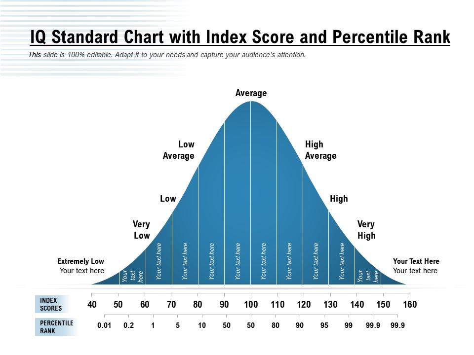
The image displays an IQ (Intelligence Quotient) Standard Chart with Index Score and Percentile Rank, typically used for illustrating the distribution of IQ scores in a population. The chart is a bell curve graph that represents the normal distribution of IQ scores, categorized into several ranges: Extremely Low, Very Low, Low, Low Average, Average, High Average, High, and Very High.
The horizontal axis of the chart shows the IQ index scores, which typically range from a score of 40 to 160. Below the IQ scores, the corresponding percentile ranks are indicated, starting from 0.01 percentile to 99.9 percentile. The percentile rank shows the percentage of scores that fall below a particular IQ score in the general population.
For instance, an IQ score of 100 is labeled as "Average" and is positioned at the peak of the bell curve, indicating that this score is at the 50th percentile, meaning it is higher than 50% of the population's IQ scores. As the curve tapers off to the left or right, representing the lower and higher extremes of IQ scores, the percentile ranks decrease and increase, respectively.
The shaded area under the curve is divided into sections with various shades of blue, each labeled with different categories of IQ scores. These categories are used to quickly identify the range in which an individual's IQ score falls.
On the left and right extremes of the bell curve, placeholders are saying "Your text here," allowing the presenter to add additional information or context to the extreme values of the chart.
Use Cases:
IQ distribution charts are utilized across various fields to analyze cognitive capabilities about normative data. Here's how different industries can use them:
1. Education:
Use: Assessing student cognitive abilities for tailored educational programs.
Presenter: Educational Psychologist.
Audience: Teachers, Special Education Coordinators.
2. Human Resources:
Use: Evaluating cognitive assessments for recruitment or development purposes.
Presenter: HR Manager.
Audience: Recruitment Team, Management.
3. Psychology and Counseling:
Use: Interpreting IQ test results for diagnostic and counseling processes.
Presenter: Clinical Psychologist.
Audience: Clients, Mental Health Professionals.
4. Research and Development:
Use: Analyzing cognitive data for psychological research studies.
Presenter: Research Scientist.
Audience: Academics, Research Participants.
5. Government Agencies:
Use: Informing policy on educational and social programs.
Presenter: Policy Analyst.
Audience: Legislators, Education Officials.
6. Healthcare:
Use: Diagnosing cognitive conditions and planning patient care.
Presenter: Neuropsychologist.
Audience: Medical Staff, Patients' Families.
7. Neuroscience:
Use: Studying brain function and intelligence correlations.
Presenter: Neuroscientist.
Audience: Fellow Scientists, Medical Students
Iq standard chart with index score and percentile rank with all 2 slides:
Use our IQ Standard Chart With Index Score And Percentile Rank to effectively help you save your valuable time. They are readymade to fit into any presentation structure.
-
Graphics are very appealing to eyes.
-
Awesome presentation, really professional and easy to edit.
-
Very unique and reliable designs.


