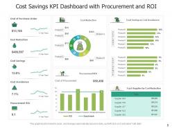
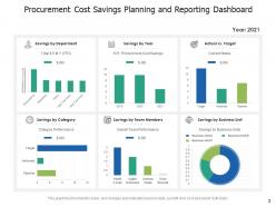
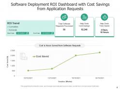
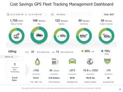
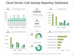
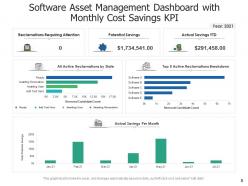
Cost Savings Dashboard Procurement Planning Deployment Management
Try Before you Buy Download Free Sample Product
Audience
Editable
of Time
Our Cost Savings Dashboard Procurement Planning Deployment Management are topically designed to provide an attractive backdrop to any subject. Use them to look like a presentation pro.
People who downloaded this PowerPoint presentation also viewed the following :
Cost Savings Dashboard Procurement Planning Deployment Management with all 12 slides:
Use our Cost Savings Dashboard Procurement Planning Deployment Management to effectively help you save your valuable time. They are readymade to fit into any presentation structure.
FAQs for Cost Savings Dashboard Procurement
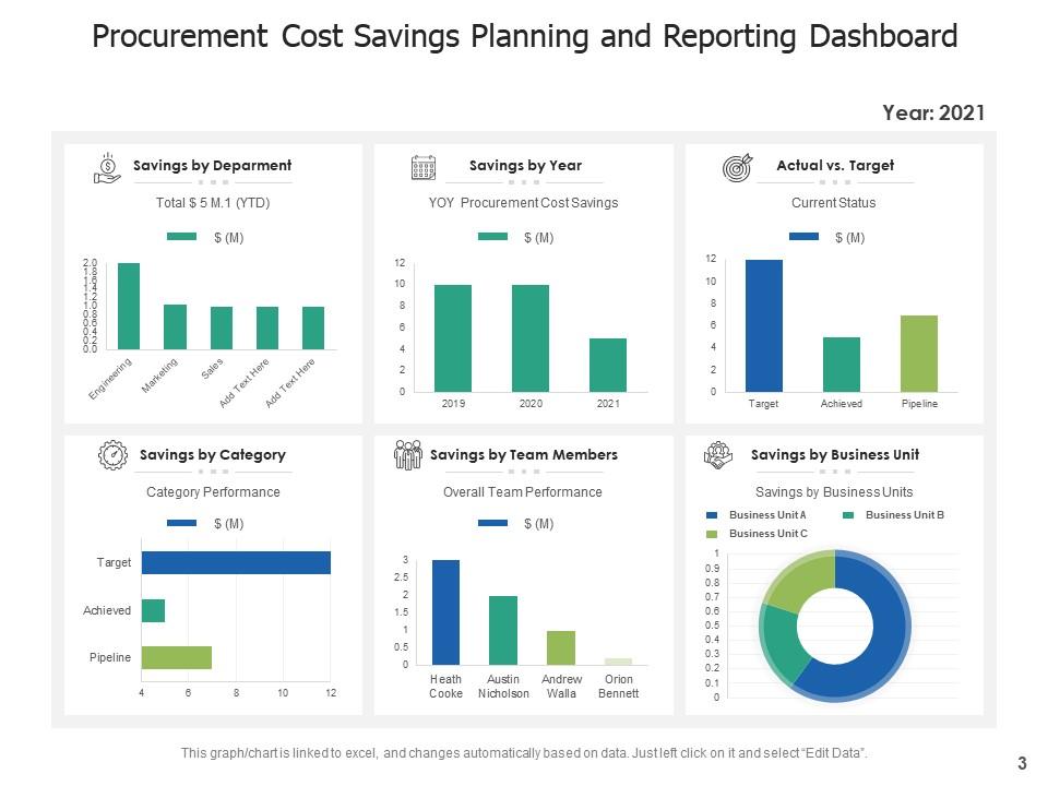
Track these four main things: total savings, savings broken down by department, how much of your target you've hit, and cost avoidance vs actual reductions. Year-over-year comparisons are super helpful too. The pipeline forecast is honestly the part everyone forgets, but finance will ask for it eventually. Keep hard savings (real budget cuts) separate from soft savings - trust me on that one. Start simple with these basics first. You can always add more detailed breakdowns later once people actually start using the dashboard regularly.
Honestly, just focus on what actually breaks the bank in your specific field. Retail? Track inventory turnover and supplier costs. Manufacturing is all about production efficiency and cutting waste. Healthcare has to obsess over patient-to-cost ratios and compliance stuff - no choice there. But here's the thing: skip those cookie-cutter dashboard templates entirely. They're pretty useless. Instead, go bug your department heads about what costs are driving them crazy. That conversation becomes your blueprint. Build around those real pain points, not some generic metrics that look impressive but don't move the needle.
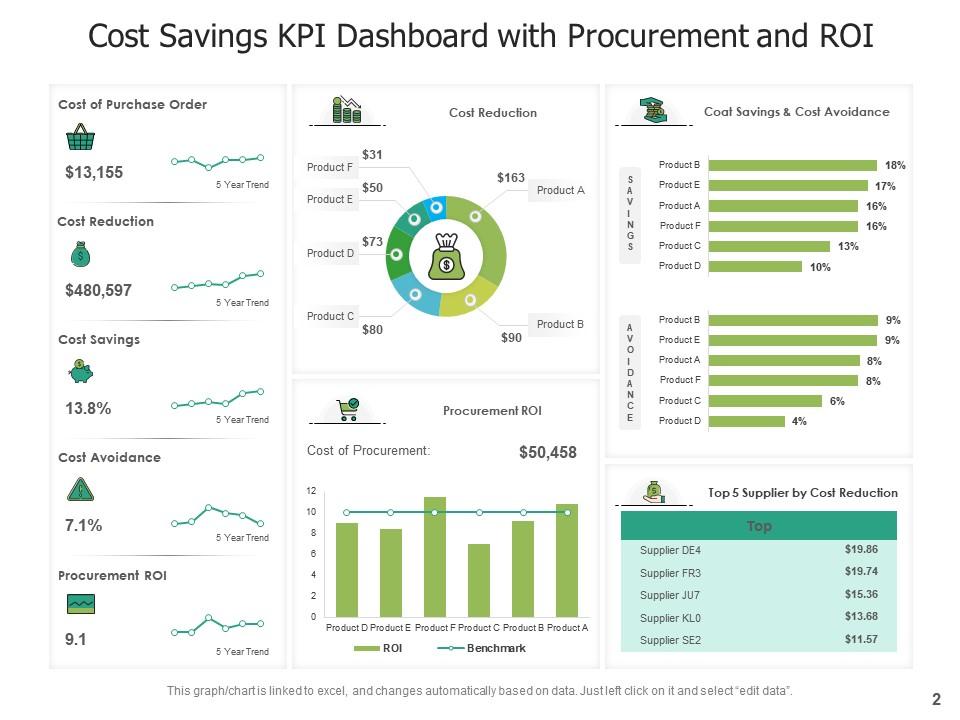
Big, bold numbers work best - total savings, ROI percentages, that kind of thing. Before/after comparisons and trend lines over time tell the real story. Green for good stuff, red for problems. I swear, half the dashboards I see are just metric overload - like someone threw every number they could find at a wall. Your execs need to get it in 30 seconds max. Keep it dead simple and focus on what actually matters for decisions. Oh, and always include benchmarks or targets so the numbers aren't just floating in space meaninglessly.
I'd go with weekly updates minimum, but daily is way better if you can manage it. Old data is pretty much worthless - like, who wants to make calls based on numbers from three weeks back? How often you update really depends on how quickly your costs shift and whether people actually look at the thing. Daily makes sense if your team's actively watching spend or you're in crunch mode trying to cut costs. Honestly, I've seen too many dashboards that just sit there gathering dust. Start weekly and bump it up if folks keep asking for newer info.
Honestly, real-time data is what separates useful dashboards from those monthly reports that just collect dust. You'll catch spending spikes as they happen instead of finding out weeks later when it's too late. Budget overruns? You can actually do something about them before they get crazy. Plus you can see which cost-saving ideas are bombing right now vs waiting for quarterly reviews. I probably sound like a broken record about this, but set up alerts for your biggest metrics. That way the dashboard actually pings you when stuff goes sideways instead of you forgetting to check it constantly.
So most of these dashboards connect through APIs or plug straight into your database - works with ERP systems, accounting software, whatever. First thing you'll do is map out your data fields (expense categories, departments, budgets, that stuff). Honestly, if you're already using something like SAP, QuickBooks, or Tableau, you're in luck - they've got pre-built connectors that'll save you a headache. Your IT folks can set up automated feeds so everything updates live. I'd start by figuring out where your most important cost data lives, then see what integration options your vendor actually offers.
Don't cram everything onto one screen - people will just get overwhelmed. The biggest mistake though? Not defining what "savings" actually means upfront. Trust me, you'll have executives arguing whether cost avoidance is real money or not. Show the big picture but make sure they can drill down when something looks weird (and it always will). Your data needs to be solid and update regularly, otherwise what's the point? Oh, and skip the tiny charts - nobody's got time to squint. Start with maybe 3-5 key metrics, then add more based on what people actually ask for.
Get feedback from your users through surveys and interviews - that's where the real insights are. Analytics show you what people actually click on too. Users will straight up tell you when metrics don't make sense or if they're missing something crucial. I've watched entire dashboards get rebuilt because everyone hated the drill-down features lol. Monthly check-ins work great for staying on top of complaints and requests. Look for patterns in what people mention most. Short feedback loops let you fix stuff fast and keep the dashboard actually useful instead of just pretty.
Honestly, these dashboards are game-changers for tracking where your money actually goes. Instead of guessing, you'll see spending patterns in real-time and catch inefficiencies way faster. The best part? Everyone gets access to the numbers, not just finance people hoarding all the data. Teams can finally compare performance and make smarter decisions together. No more department silos! You should definitely set up weekly reviews with your team leads - that's where the magic happens. It's crazy how much alignment you get when everyone can see the same budget picture.
So definitely track your actual savings against what you projected - that's the big one. ROI calculations will tell you if you're wasting time on stuff that doesn't move the needle. I'd also watch cost reduction percentages by department and how long it takes to actually see the savings kick in. Oh, and this is key - some "quick wins" disappear after a few months, so track sustainability too. Monthly dashboard reviews are clutch because you can course-correct fast when things aren't panning out. Honestly, the time-to-realize metric catches most people off guard.
Your ERP system's gonna be your best friend here - that's where the real financial data lives. Pull from procurement platforms too for vendor spending and contracts. Utility bills are actually goldmines for tracking operational savings, plus HR systems show labor cost cuts. Oh, and don't forget expense management tools - you'd be shocked what patterns show up in travel spending. The whole thing works way better when you connect everything through APIs so it updates automatically. Trust me, you don't want to be doing manual exports every single month.
Honestly, mobile access is huge for cost dashboards. People won't bother firing up their laptop just to check if they're over budget - that's asking too much. But when they can quickly peek at spending trends or get budget alerts on their phone? Game changer. Your team starts checking it naturally throughout the day instead of treating it like some weekly desktop task they dread. Real-time notifications keep cost stuff front of mind too. I've seen dashboards fail hard because they weren't mobile-friendly. Don't make that mistake - it's literally what separates tools people ignore from ones that actually change behavior.
Interactive stuff is a game changer - users can actually click around and explore instead of just looking at boring static charts. They'll drill into cost categories, filter by dates, hover for details. Trust me, this saves your butt when someone's grilling you about numbers in meetings. People stop asking for custom reports every five minutes because they can just dig around themselves. Plus they trust the data more since they found it on their own. Honestly, just adding basic filters and tooltips makes your dashboard infinitely better than some sad PDF report.
Dude, most cost savings dashboards are straight up painful to look at - like someone just dumped Excel cells everywhere. Here's the thing: you gotta make it tell a story. Start with color progression showing growth over time, then add icons so people instantly know what they're looking at. The layout should flow logically, big picture first, then dive into specifics. I always sketch mine out first (sounds nerdy but it works). When you arrange everything like a story instead of random data chunks, stakeholders actually understand it without you having to walk them through every single number.
Think of benchmarking as your BS detector for cost savings. Sure, you saved 5% - but is that actually good? Compare your numbers to industry standards or what competitors are doing. Otherwise you might be celebrating while everyone else is crushing 15% reductions. Honestly, I've seen so many companies get excited over weak performance because they had no reference point. Your dashboard needs both your actual savings AND how you stack up against others. Find 2-3 solid benchmark sources that fit your business and you'll know if you're winning or just treading water.
-
Use of icon with content is very relateable, informative and appealing.
-
Nice and innovative design.
-
Best Representation of topics, really appreciable.