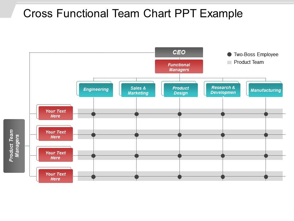
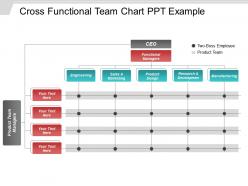
Cross functional team chart ppt example

Rating:
80%
Cross functional team chart ppt example
Slide 1 of 5

or

Favourites Favourites

Try Before you Buy Download Free Sample Product

Audience Impress Your
Audience
Editable 100%
Editable
Time Save Hours
of Time
The Biggest Sale is ending soon in
0
0
:
0
0
:
0
0
Rating:
80%
Exhibiting template on “Cross Functional Team Chart Ppt Example”. The slides are totally editable.Content, color, text and shape can be easily amended.It is very easy to insert company logo, icon or image and there are different icons given to choose from. The picture or graphic is of high quality and can be seen in both screen types without any pixelation. Presentation template can be shared with Google Slides. Easy and quick download with saving options.

FAQs for Cross functional team

So for your chart, definitely grab a project manager and product owner first - those are non-negotiable. Then you'll need your devs, a designer for the UX stuff, and QA to catch bugs. Marketing should probably be there too if customers will see this thing (trust me, they'll want input whether you ask or not). A stakeholder who can actually make decisions fast is huge - nothing worse than waiting weeks for approvals. DevOps might be overkill initially unless it's a big technical project. Honestly, start lean with these basics and add people later rather than cramming everyone in from the start.

Honestly, it all comes down to matrix vs dedicated teams. Matrix is messier - people still report to their usual boss (like engineering director) but get marching orders from the project lead. Dedicated teams are cleaner since everyone reports directly to the project lead, but good luck getting leadership to actually restructure for that. I'd figure out decision ownership first, then work backwards to reporting. Like, does someone need their home department's blessing for priorities? Or can the project lead call those shots? That's where things get sticky and you'll want clarity upfront.

Definitely go with color-coding - different colors for each department so you can tell who's doing what at a glance. I'd add swim lanes too, keeps everything organized. Use the same icons throughout for similar activities. Oh, and please don't make it look like a rainbow threw up everywhere (seen way too many of those). White space is your friend - nobody wants to squint at cramped text. Throw a simple legend at the top. Trust me, when you're presenting this thing to your boss, you'll be glad people can actually follow it without getting lost.

First thing - write down every department that'll touch your project. Then grab the key person from each one for your chart. Here's what I learned the hard way: those "background" people like IT support or compliance are actually super important, even though they're easy to miss. I always bounce my list off a couple different people because I guarantee you'll forget someone obvious. Oh, and do a stakeholder analysis first if you can - makes the whole chart thing way easier. Short sentences help too. You'll catch way more people that way than just winging it.

Dude, unclear roles are a total nightmare. People end up doing the same work twice or nobody does it at all because everyone thinks someone else has it covered. Deadlines get missed left and right. Then when stuff goes wrong, it's just finger-pointing chaos since no one actually knows who was supposed to handle what. Honestly, I've seen teams implode over this exact thing - it gets pretty ugly. Before you start anything, just hammer out who's doing what. Sounds basic but you'd be amazed how many teams skip this step.

Honestly, those tech tools are a game changer for org charts. Lucidchart and Miro are my go-to picks - way better than fighting with PowerPoint boxes that never line up right. Just drag and drop people's roles, and when someone inevitably switches teams or quits, you update it once and boom, everyone sees it. The real-time collaboration thing is clutch too. No more of that "which version are we using" nightmare. I'd start with whatever template looks closest to your setup, then tweak it. Oh, and Visio works fine if you're stuck in the Microsoft ecosystem.

So from your cross-functional chart, I'd focus on cycle time first - basically how fast work actually moves between teams. Communication frequency is massive too (seriously, most projects die here). You can also track handoff quality by counting how many times teams have to go back and forth for clarification. Resource utilization and hitting delivery milestones matter obviously. The visual bottlenecks on your chart will jump out at you. Honestly though? Don't overcomplicate it. Pick 2-3 metrics that actually matter for your project and stick with those consistently.

Definitely do a RACI matrix - sounds boring but it actually saves so much drama later. Map out who's responsible for what, who makes final calls, and who just needs updates. The "accountable" vs "responsible" thing trips people up sometimes but whatever, just pick one person to own each thing. Post it in your team chat and go through it during kickoff. Trust me, you want everyone seeing their name next to their actual job in writing. Otherwise you'll get those fun moments where everyone's staring at each other like "so... who's doing this?" Nothing's worse than unclear ownership when deadlines hit.

Honestly, the worst thing you can do is overcomplicate it. Too many lines and boxes everywhere? People will check out instantly. Define what each role actually does - I can't tell you how many charts I've seen that just say "Marketing" and leave it at that. Like, what does Marketing actually DO on this project? Oh, and update the thing regularly because teams shift constantly. Keep it visual but simple. Here's what I always do - show it to someone random who wasn't involved in making it. If they're confused after 10 seconds, you've got work to do.

Yeah, absolutely update that chart as you go! People come and go, roles shift around, and honestly stakeholders love disappearing right when you need them most. Add folks when the scope creeps (because it always does), drop people once their piece is done. I'd say check it monthly in your regular meetings - maybe even just a quick "hey, is this still accurate?" Works way better than discovering three months later that half your contact info is wrong. Think of it more like a group chat roster than some official document.

Honestly, start by getting everyone in a room to hash out what "success" actually looks like - and make sure all departments agree on the same metrics. Monthly check-ins are a lifesaver because I've watched teams completely implode when they only communicate during emergencies. Set up shared dashboards so people can actually see how their work affects other teams, not just their own numbers. The transparency thing is huge for priorities and trade-offs. Oh, and those "alignment reviews" I mentioned? Game changer for catching conflicts before they blow up into major roadblocks.

Oh, so it's basically a visual breakdown of everyone's skills on your agile team - like who codes, who designs, who tests, all that stuff. Really handy for sprint planning because you can spot if you're missing key expertise before you're halfway through and panicking. Helps balance the workload too, so you're not stuck with one person drowning while someone else has nothing to do. I honestly think most teams skip this step and regret it later. You'll want to check it during planning sessions to avoid those awkward moments where nobody knows React or whatever tech you suddenly need.

Honestly, mixed skill sets are what make these teams actually work. You get way better problem-solving because everyone's approaching stuff from different angles. Complex projects become way more manageable when you're not constantly waiting around for outside experts or hitting walls because nobody knows X or Y. Team members pick things up from each other too, which is pretty cool to watch happen. Just don't stack your team with people who all do the same thing - that's pointless. Map out what expertise you actually need first, then figure out who brings what. Trust me, complementary skills beat overlapping ones every time.

Set up monthly check-ins where people can actually suggest changes to the chart - roles, who reports to who, all that stuff. Maybe use a shared doc too. Trust me, nothing's worse than an org chart that's totally wrong because someone switched teams months ago. During team meetings, go through the feedback and make updates right away. Show people you're actually listening - like if Sarah's now doing project management stuff that wasn't in her original role, update it. Keep the changes visible so everyone knows their input isn't just disappearing into the void. Makes the whole thing way more useful.

Honestly, without solid leadership backing you up, those cross-functional charts just end up being useless paper on the wall. Leaders need to actually break down silos and get departments talking to each other. When conflicts pop up (and they will), someone has to step in and sort out competing priorities. Your executives need to model the collaboration they're preaching - I've seen too many companies where leadership talks teamwork but still operates in total isolation. They've got to remove the stupid barriers that prevent real cross-functional work. Don't even bother rolling this out unless leadership is genuinely all-in.

Ratings and Reviews

80% of 100
Review Form
Write a review
Most Relevant Reviews
  1. 80%

    by Coleman Henderson

    Visually stunning presentation, love the content.
  2. 80%

    by Delmer Black

    Excellent design and quick turnaround.

2 Item(s)

per page: