


Dissertation Data Presentation Structure And Analysis Powerpoint Presentation Slides




Try Before you Buy Download Free Sample Product
 Impress Your
 Audience
 100%
100% Editable
 Save Hours
 of Time


Data analysis is important for every business to decide major moves and decisions. The Dissertation Data Presentation Structure And Analysis PowerPoint Presentation Slides showcase the graphical representation of data collection and result analysis. This Data presentation and analysis content ready PowerPoint template help presenter to justify his research approach. Desertion Outline complete deck provides PPT slides in a sequential flow such as agenda, outline, project title, introduction, literature review, purpose statement, hypothesis, methods, statically analysis, results, Bar graph, pie chart, discussion, study limitations, conclusion findings, the implications for future research, reference, etc. Data research presentation slide commonly used to display outcomes of surveys and data experiments and to identify patterns and predict behaviors. Additionally, Thesis Proposal Presentation Outline goes well with concepts like survey results, data analysis, and interpretation, dissertation structure, statistical consulting, research structure and many more. Download our Professional statistical analysis PPT slide to make an appealing presentation. Be faster at it with our dissertation ppt Slides. They assist you to gain time.
People who downloaded this PowerPoint presentation also viewed the following :
Content of this Powerpoint Presentation
Slide 1: This slide introduces Dissertation Data Presentation Structure and Analysis. State Your company name and begin.
Slide 2: This slide showcases Agenda. You can add the agenda and get started.
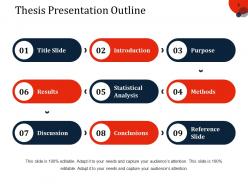
Slide 3: This slide presents Thesis Presentation Outline with these points- Title Slide, Introduction, Purpose, Results, Statistical Analysis, Methods, Discussion, Conclusions, Reference Slide.
Slide 4: This slide showcases Title Slide with these points to be consider- Your Title Project, Your Name, Degrees/Certification, Thesis Advisor Name.
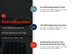
Slide 5: This slide presents Introduction with these three categories we have taken- Provide Background On Topic, Cite With Supporting Literature, Establish The Need For Your Research (Point Out The Gap).
Slide 6: This slide showcases Literature Review. You can add the as per you want.
Slide 7: This slide presents Purpose Statement.
Slide 8: This slide showcases Hypothesis. You can add the the three points.
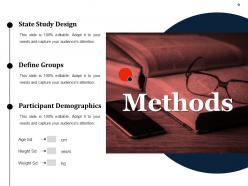
Slide 9: This slide showcases methods, You can add the three categories- State Study Design, Define Groups, Participant Demographics.
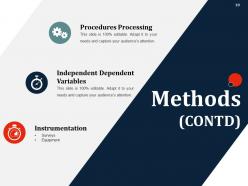
Slide 10: This slide presents Methods with the three important points- Procedures Processing, Independent Dependent Variables, Instrumentation.
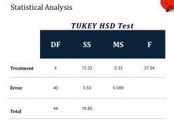
Slide 11: This slide showcases Statistical Analysis. You can add the tukey HSD test.
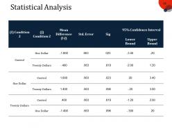
Slide 12: This slide displays Statistical Analysis table. You can add the information.
Slide 13: This slide shows Results. You can add the results as you want.
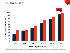
Slide 14: This is a Column Chart slide for product/entity comparison
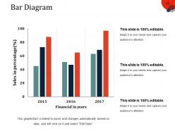
Slide 15: This is a Bar Graph image slide to show product comparison, growth etc.
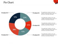
Slide 16: This slide presents Pie Chart. You can use it for comparison and make it useful.
Slide 17: This slide showcases Discussion.
Slide 18: This slide presents Limitation. Add the limitations and use it.
Slide 19: This slide showcases Conclusions. Add the company conclusions and use it.
Slide 20: This slide presents Research.
Slide 21: This slide showcases References. Add the references and use it as per need.
Slide 22: This slide is for Any Questions.
Slide 23: This slide shows Coffee Break image.
Slide 24: This slide is titled Additional slides.
Slide 25: This is a Vision, Mission and Goals slide. State them here.
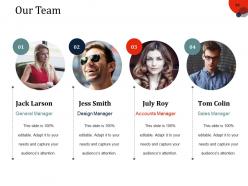
Slide 26: This is an Our Team slide with name, image&text boxes to put the required information
Slide 27: This is an About Us slide showing Our Company, Value Client, and Premium services as examples
Slide 28: This is an Our Goal slide. State them here.
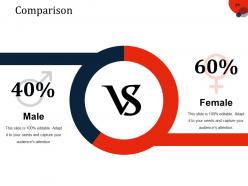
Slide 29: This slide shows Comparison of Positive Factors v/s Negative Factors with thumbsup and thumb down imagery.
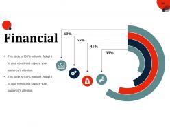
Slide 30: This is a Financial Score slide to show financial aspects here.
Slide 31: This is a Quotes slide to convey message, beliefs etc.
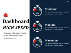
Slide 32: This is Dashboard slide to show information in percentages etc.
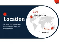
Slide 33: This slide showcases Global Project Locations with a World map and text boxes to make it explicit.
Slide 34: This slide shows Project Events Timeline with icons and text boxes.
Slide 35: This slide shows an image with text boxes titled Business Person with Post It notes.
Slide 36: This slide presents a Newspaper image with text boxes to flash company news, position etc
Slide 37: This is a Puzzle image slide to show information, specification etc.
Slide 38: This slide displays Our Target with a background image.
Slide 39: This is a Circular image slide to show information, specifications etc.
Slide 40: This is a Venn diagram image slide to show information, specifications etc.
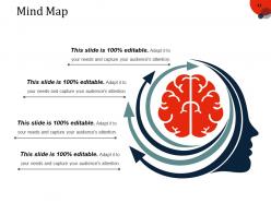
Slide 41: This slide shows a Mind map for representing entities.
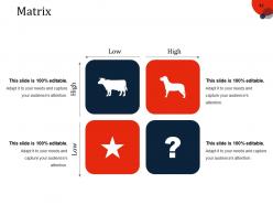
Slide 42: This slide shows a Matrix in terms of High and Low.
Slide 43: This is a Bulb or Idea slide to state a new idea or highlight specifications/information etc.
Slide 44: This is a Thank You slide with Address# street number, city, state, Contact Number, Email Address.
Dissertation Data Presentation Structure And Analysis Powerpoint Presentation Slides with all 44 slides:
Ensure individual differences cease to exist with our Dissertation Data Presentation Structure And Analysis Powerpoint Presentation Slides. Bring dichotomy to an end.






FAQs for Dissertation Data Presentation Structure And Analysis
Honestly, just pick charts that actually back up what you're saying - don't get distracted by the fancy ones that look cool but don't help your argument. Bar charts are solid for comparing stuff, line graphs work for showing changes over time, and scatter plots are good when you want to show how two things relate. Keep your titles and labels super clear because nobody wants to squint at tiny text trying to figure out what they're looking at. Oh, and put each chart right after you talk about it in your writing - I hate flipping back and forth hunting for figures. Most important thing though? Every single chart should actually prove a point you're making.
Pick the right chart for what you're showing - bar charts work great for comparisons, line graphs for trends, pie charts for parts of a whole (though seriously, everyone uses pie charts way too much). Your visuals should actually help explain something, not just look pretty. Simple is better - if someone needs a whole paragraph to understand your chart, you messed up. Oh, and always label your axes clearly and add legends. Reference each figure in your text too, with a quick note about what people should pay attention to. The whole point is making your data easy to understand.
Honestly, infographics are a lifesaver when you're dealing with dense research stuff. Nobody wants to wade through endless tables and stats – your readers will thank you for turning that mess into something visual they can actually understand. I'd focus on whatever part of your dissertation always confuses people (there's probably at least one, right?). Maybe start there and see how it looks as a chart or diagram. The trick is keeping it simple without dumbing down your actual research. Like, don't sacrifice the academic quality just to make it pretty. But seriously, a good visual can explain complex processes way faster than three paragraphs of methodology ever could.
Write like you're talking to your grandma, honestly. Skip the fancy jargon - if she wouldn't get it, your committee might not either. Charts paired with plain summaries work great since everyone's brain is different. Good contrast and readable fonts are clutch, plus don't forget alt text. Define those acronyms too (I learned this the hard way). Maybe test a section on your roommate first? If they look confused, you've got some tweaking to do. Oh, and think about international readers who might miss cultural references.
Honestly, thematic analysis templates are your best bet for qual data - you can organize everything around key themes and back it up with actual participant quotes. If you're showing progression or telling a story, narrative templates work great too. Visual stuff like concept maps are amazing because... I mean, who wants to read through walls of text when you can see relationships mapped out? Also try tables that compare themes across different groups. Oh, and don't force your data into some random format just because it looks fancy. Pick whatever actually showcases how your findings answer your research questions. Start there and you'll be fine.
Start with making your data tell a clear story - looks come second. Stick to the same fonts and colors throughout so it feels cohesive. White space is seriously underrated, don't just fill every inch because you can. Simple charts with obvious labels work way better than those awful 3D pie charts that hurt your eyes. I swear professors hate those gradient effects too. Show a page to someone who doesn't know your topic - if they look confused, you need to simplify. It's better to be crystal clear than fancy.
Ugh, the worst thing you can do is jam way too much stuff onto one chart - nobody can follow it. Also those rainbow color schemes? Total nightmare for readability. Skip the cheesy 3D effects (seriously, what is this, 2005?) and start your axes at zero unless you've got a solid reason not to. Oh, and match your chart type to what you're actually trying to show. Sometimes a boring bar chart works way better than some fancy pie thing that confuses everyone. Label everything clearly too - your committee shouldn't be playing guessing games with your data.
Yeah, your field totally dictates this stuff. STEM dissertations are all about clean tables and graphs - let the data do the talking, you know? Social sciences mix charts with more explanation and analysis. Humanities? They're mostly using quotes and textual evidence instead of numbers. Psychology sits in this weird middle ground with mixed methods (honestly, they can't seem to pick a side). But here's what I'd actually do - grab a few recent dissertations from your department and see what they look like. Department expectations trump whatever generic advice you'll find online.
Honestly? If you can code at all, go with R and ggplot2 or Python with matplotlib - the control you get is insane and they look way more professional. Tableau's pretty sweet for interactive stuff too, especially with the student discount. I mean, Excel works for basic charts but... yeah, it kinda shows lol. The main thing is keeping your visuals clean and focused on your actual argument rather than getting crazy with effects. I've seen people make amazing dissertations with all these tools. Start simple first, then add complexity only if it actually helps tell your story better.
Think of yourself as a tour guide walking people through your findings! Don't just throw charts at them - give context first. What problem are you tackling? Then highlight the key insights that build your story. I'm big on using callout boxes to point out those "holy shit" moments in the data. Make sure every single graph actually supports your argument (otherwise why include it?). Oh, and connect back to your main point at the end of each section. People get lost fast if you don't remind them where this is all heading. You're basically weaving a narrative, not creating a chart graveyard.
Don't cherry-pick your results or hide stuff that doesn't fit your argument - show everything as it actually is. Be super clear about your methods so people can replicate what you did. I've honestly seen so many dissertations get called out for "forgetting" to mention their tiny sample sizes! Avoid misrepresenting your stats or using sketchy visualizations that make patterns look different than they really are. Also be upfront about limitations and biases in your data. Your readers need to trust you're showing them reality, not just what you wanted to find.
Just ask them straight up what they want - don't try to guess. Some professors are obsessed with having all the raw data tucked away in appendices, while others want everything visual right in the main chapters. Definitely find out if anyone has weird hang-ups about certain chart styles or how you present stats. I'd also peek at recent dissertations from your department to see what actually gets the green light. Your advisor probably knows all the committee members' random preferences anyway, so pick their brain about it. Oh, and maybe prep a couple different formats just in case someone changes their mind last minute.
Yeah so definitely stick raw data in appendices - nobody wants to scroll through endless spreadsheets in your actual chapters. My advisor literally told me "no one cares about 200 survey rows!" which was... harsh but true lol. Focus your main sections on the good stuff - charts, summaries, trends that actually support your argument. Include enough detail so someone could replicate what you did, but lead with insights that answer your research questions. The raw numbers are just there for reference. Short version: tell the story with your findings, don't make readers dig through data dumps.
Pick colors that actually mean something and stick with them - blues for one thing, greens for another. Don't go crazy with the rainbow approach (though I'll admit, it's tempting when you first discover all those color options!). Three or four colors tops. Make sure there's enough contrast so colorblind people can follow along too. Here's what saved me: print everything in grayscale first. If you can still tell your categories apart, you're good to go. Way too many dissertations look like someone had fun with the color picker but forgot readers need to understand the data.
Make your key findings impossible to miss with bold headings and color highlights. Charts beat walls of text every time - seriously, nobody wants to decode paragraphs of raw numbers. Put summary sections at each chapter's end where you straight-up say what you discovered. Don't make people dig for the good stuff. Use bullet points for your top 3-5 findings per section (makes scanning way easier). Oh, and start results chapters with a quick "here's what I found" before jumping into details. Your committee will actually read it this way.
-
Unique design & color.
-
Easily Editable.