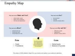
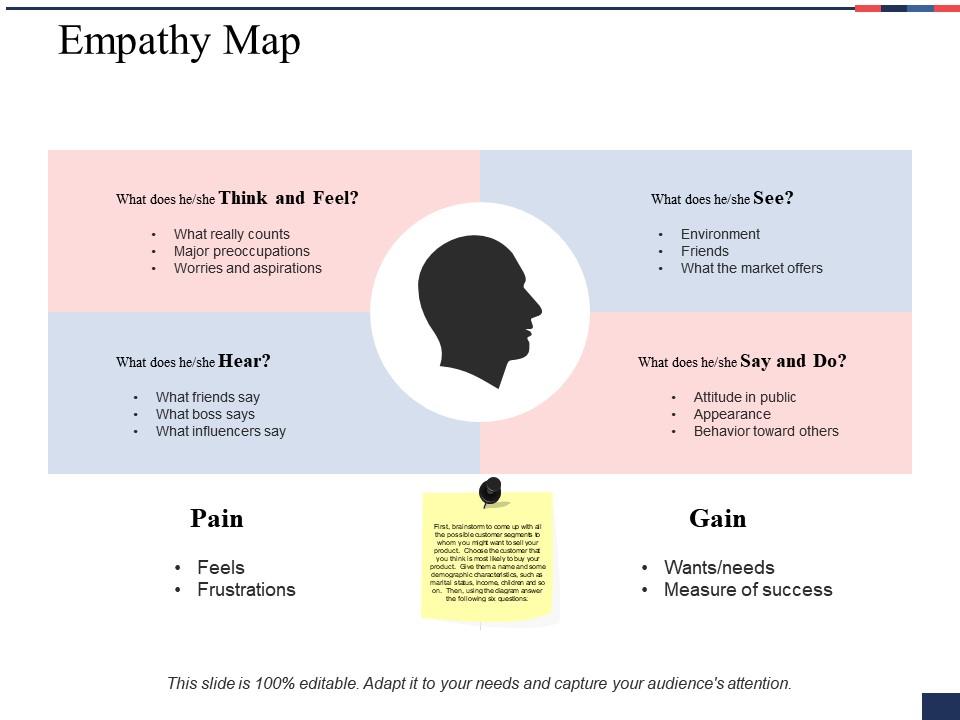
Empathy map ppt styles designs download
Try Before you Buy Download Free Sample Product
Audience
Editable
of Time
Be given due credit because of our Empathy Map Ppt Styles Designs Download. Acquire the acclaim that you cherish.
People who downloaded this PowerPoint presentation also viewed the following :
Empathy map ppt styles designs download with all 5 slides:
Our Empathy Map Ppt Styles Designs Download ensure your every effort is beneficial. They discourage any haste.
FAQs for Empathy map ppt
Okay so definitely hit those four main areas - what users say, think, feel, and do. Open with a quick intro about who you're designing for. Then dive into each section with actual quotes from your research, not just generic stuff. Honestly, the most interesting part is always where people contradict themselves - like when they say price doesn't matter but then only buy the cheapest option. Those moments are pure gold for insights. Don't just read your sticky notes out loud either. Connect the dots and tell the real story behind the data. Wrap up with maybe 2-3 concrete takeaways that'll actually guide your design choices moving forward.
Bigger fonts for headers, bold text for key insights, color coding for groupings - that's your starting point. I swear I always screw this up initially and end up with a jumbled mess. Once you nail the flow though, people's eyes naturally move from broad categories down to specific quotes. Make your biggest pain points pop with bright colors or callout boxes. Honestly, stakeholders get cranky when they have to dig for the important stuff. Short version: guide their eyes to what matters most and you're golden.
Start with lots of white space - cramped emotions look awful. Warm colors work way better than those cold corporate blues (seriously, when has anyone felt "enterprise software blue"?). Make your fonts bigger than normal since people always end up presenting these things in meetings. Icons beat walls of text every time for emotional stuff. Actually, try sketching first before going digital - there's something about hand-drawn that feels more human. Short sections you can scan quickly. The whole point is making insights feel approachable, not like homework. Trust me on the sketching thing.
Oh totally! Colors make a huge difference with empathy maps. I always go for blues and greens when showing pain points - they keep things calm instead of making everyone feel attacked. Red's tricky though. Great for frustrations but don't go overboard or you'll stress people out (been there!). Pick colors that match the vibe you want. Softer tones work best when you're discussing user struggles - keeps the room feeling safe. Brighter stuff is perfect for positive insights. Honestly, I just ask myself: does this make people want to lean in or back away?
Honestly, the best empathy maps tell actual stories. Walk through a full "day in the life" of your persona - from their morning frustrations to what they're trying to achieve. Real quotes from user interviews are gold here (way better than made-up generic stuff). I always throw in little scenario snippets for each section of the map. The trick is highlighting where people say one thing but do something totally different - that tension is everything. You want your team to feel like they actually know this person, not just have facts about them. Oh, and end with a "what if" scenario that ties back to whatever you're building. Makes the whole thing click.
Don't cram everything onto one slide - it becomes a hot mess nobody can read. Also avoid those useless "busy mom" personas that say literally nothing. Base it on real research, not what you think users are like. Make your quadrants big enough that people can actually see the text. I see so many that are basically unreadable. Skip the fancy graphics too - clean beats pretty every time. One persona per slide works way better. Oh and use actual user quotes when you can! Makes everything feel more real instead of just made-up assumptions.
Throw some charts and graphs right into each quadrant - it makes such a difference! Instead of just bullet points about what users say, add survey percentages or sentiment analysis visuals. Heat maps are honestly my favorite for showing pain point intensity. Bar graphs work great for response frequency too. Oh, and those little icons for different behaviors? Super helpful. You can even add mini dashboards to back up your qualitative stuff with real numbers. Just don't go overboard though - the human story still needs to shine through all the data you're cramming in there.
Getting people engaged is honestly the make-or-break part. You want them actively discussing the insights, not just sitting there nodding. I've watched so many empathy maps die after one presentation - total waste of time. The real win happens when your audience starts owning those findings and bringing them up in random meetings later. Make it interactive somehow. Ask them to share customer stories they've heard or push back on what you found. Short tangent - I once had someone completely derail the discussion arguing about one tiny detail, but it actually got everyone way more invested. That's how you get genuine buy-in instead of polite head-nodding.
Honestly, digital tools are a game changer for this stuff. You can grab templates from Miro or Figma that already have all the sections mapped out - saves you from building everything from scratch. Real-time collaboration is clutch too since you don't have to decode anyone's terrible handwriting (mine included lol). Moving sticky notes around digitally is so much cleaner than physical ones. Canva works too if you want something simpler. Just dump your research into a template and you're basically done. Takes like 10 minutes versus hours of manual setup.
Check out Airbnb's empathy maps - they're amazing because they use real user photos and quotes instead of boring personas. IDEO does this cool thing where they color-code emotional intensity, so pain points jump out immediately. Honestly, Spotify's approach is my favorite though - they structure theirs like "day in the life" stories rather than those typical quadrant layouts. Nielsen Norman Group has solid templates if you need something clean for presentations. Oh, and Medium has tons of real case studies if you search "empathy map examples." Just pick whatever style won't make your stakeholders' eyes glaze over.
Honestly, less is more with these things. Stick to 2-3 bullet points per section tops and let visuals do the heavy lifting - real user photos, emotion icons, simple sketches that show how people actually feel and behave. I've seen way too many that are just walls of text (total nightmare to look at). The goal is someone glances at it and immediately gets what you're trying to say. Skip the paragraphs - use workflow diagrams or icons instead. Your whole team should understand it in under 30 seconds. Quick test: show it to someone for 10 seconds and see what sticks.
Honestly, role-playing workshops are amazing for this stuff - have people actually act out being the user persona. Sticky note "empathy walls" work too, where everyone can walk around and add thoughts. I'm obsessed with "day in the life" storytelling sessions because they're so much better than boring bullet points. Digital whiteboards are clutch for real-time collab. Journey mapping workshops are solid too - the empathy map basically becomes this living thing that grows as people chip in. Just pick whatever will get your team actually talking about user needs instead of zoning out.
So I usually just draw curved arrows connecting the different sections - like from "Says" back to "Thinks" when outside feedback changes what they're thinking internally. Color-coding helps a ton (green for good loops, red for bad ones). Honestly, the trick is not going overboard with arrows everywhere. Your map'll look like a mess! I stick to maybe 2-3 major cycles that actually matter. Oh, and those little callout boxes along the arrows? Super helpful for explaining what sets off each loop. Start simple though - you can always add more later.
Oh this is tricky stuff! Different cultures handle emotions totally differently - some are super direct about feelings, others way more subtle. I'd switch up your language and examples based on that. Colors are weird too... like red screams "danger" to some people but means good luck to others. Individual vs group mindset is huge when you're framing insights. Honestly, the best thing you can do is run it by teammates from different backgrounds first. They'll catch stuff that might come across wrong way before you present it. Much better to awkward-laugh about it in prep than during the actual meeting, you know?
You gotta tailor this stuff depending on your audience. Executives want the big picture - show them business impact, skip the weeds. Product teams are the opposite though, they eat up all those detailed user behaviors and pain points since that's what drives their roadmap. Marketing gets weirdly excited about the emotional bits - seriously, they love those "says" and "feels" sections more than anyone. Developers? Focus on the functional stuff and what's breaking for users. Don't dump everything on everyone at once. Pull out what matters most for each group or you'll just confuse people.
No Reviews