Helpdesk dashboard illustrating first response time and current open ticket status powerpoint template
Our Helpdesk Dashboard Illustrating First Response Time And Current Open Ticket Status Powerpoint Template are topically designed to provide an attractive backdrop to any subject. Use them to look like a presentation pro.
You must be logged in to download this presentation.
PowerPoint presentation slides
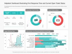
This slide Illustrates the Graphical Representation of Helpdesk ticket. Data covered in this dashboard includes key stats related to ticket handling, top 10 accounts by number of tickets, and major support KPIs. This is a Helpdesk Dashboard Illustrating First Response Time And Current Open Ticket Status Powerpoint Template drafted with a diverse set of graphics, that can be reformulated and edited as per your needs and requirements. Just download it in your system and make use of it in PowerPoint or Google Slides, depending upon your presentation preferences.
People who downloaded this PowerPoint presentation also viewed the following :
Content of this Powerpoint Presentation
Description:
The image represents a comprehensive Helpdesk Dashboard designed to provide an overview of key performance indicators (KPIs) related to helpdesk operations and customer support. The slide features a combination of graphs, charts, and metrics that offer insights into various aspects of customer service performance. Here's a breakdown of the key elements on the slide:
1. % Handled Tickets:
The left-hand side of the slide displays the "% Handled Tickets" metric, showing an actual performance of 88.50% compared to a goal of 76%. This indicates that the helpdesk has exceeded its target in handling customer tickets.
2. First Response Time and Time to Resolve:
Below the "% Handled Tickets" section, the slide provides data on first response time, time to resolve, and the number of new tickets. Additionally, it includes median response and resolution times, along with the growth percentage compared to the previous quarter. These metrics help in evaluating the efficiency of ticket handling and customer inquiry resolution times.
3. Donut Charts:
Current Open Tickets and Created Tickets by Nature: The central and right sections of the slide feature two donut charts. The first one, labeled "Current Open Ticket Per Status," visualizes the distribution of ticket statuses, providing an overview of the current workload. The second donut chart, titled "Created Tickets by Nature," highlights the reasons for ticket creation, categorizing them by nature or type.
4. Support KPIs Over Time:
The bottom left graph, "Support KPIs Over Time," presents a trend analysis of KPI metrics across several quarters. This allows for tracking performance trends and identifying areas of improvement or concern over time.
5. Noisy Customer :
Top 10 Accounts by Tickets in Last 30 Days: The bottom right bar chart ranks customer accounts based on the volume and severity of their tickets within the last 30 days. This can help identify high-impact customers and their support needs.
Use Cases:
This Helpdesk Dashboard is versatile and applicable across various industries that aim to maintain and enhance their customer service quality and efficiency. Here are the industries, use cases, presenters, and target audiences where this dashboard can be beneficial:
1. Information Technology:
Use: Monitoring and improving helpdesk operations and response times.
Presenter: Customer Support Manager.
Audience: Support Team Members, IT Staff, Management.
2. Telecommunications:
Use: Evaluating support service levels and identifying issues in customer technical support.
Presenter: Service Operations Manager.
Audience: Customer Service Representatives, Operational Directors.
3. E-commerce:
Use: Tracking customer service performance for online transactions and inquiries.
Presenter: E-commerce Support Coordinator.
Audience: Customer Service Agents, E-commerce Managers.
4. Healthcare:
Use: Management of patient support services and inquiry resolution times.
Presenter: Patient Services Administrator.
Audience: Healthcare Providers, Support Staff.
5. Financial Services:
Use: Assessing response times and ticket resolution efficiency for customer financial inquiries.
Presenter: Customer Service Lead.
Audience: Financial Advisors, Customer Relations Staff.
6. Education:
Use: Tracking and improving support services for students and faculty members.
Presenter: IT Support Team Lead.
Audience: Educational Administrators, Support Staff.
7. Retail:
Use: Monitoring customer service queries and product-related issues.
Presenter: Retail Support Manager.
Audience: Store Managers, Customer Support Teams.
Helpdesk dashboard illustrating first response time and current open ticket status powerpoint template with all 2 slides:
Use our Helpdesk Dashboard Illustrating First Response Time And Current Open Ticket Status Powerpoint Template to effectively help you save your valuable time. They are readymade to fit into any presentation structure.
-
Use of icon with content is very relateable, informative and appealing.
-
Enough space for editing and adding your own content.
-
Great designs, really helpful.
-
Visually stunning presentation, love the content.
-
Use of different colors is good. It's simple and attractive.


