
Key business driver diagram ppt slide


Try Before you Buy Download Free Sample Product
 Impress Your
 Audience
Editable
of Time


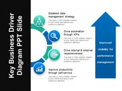
Drive the operational and financial results of your business with the help of key business driver diagram PPT slide. A business driver is a resource, process or condition that is vital for the continued success and growth of a business. Ensure your company’s achievement with this business value drivers PPT template. Help your company recognize and monitor the key business drivers. The key value drivers for business drivers for a company can be in the form of cutting edge technology, superior products, excellent marketing and ongoing customer satisfaction. Easily plan and prepare a document after full analysis. Put forth your agendas to boost your business easily with this business growth PPT design. Give a visually appealing representation of your complex data to your audience. With high quality graphic and content, this market growth drivers PPT slide is readily available. Invest less time to prepare an impressive business presentation. Create a PowerPoint presentation which is impactful with the help of this drivers of economic growth PPT slide. Ease the passage of your thoughts. Lubricate them with our Key Business Driver Diagram Ppt Slide.
People who downloaded this PowerPoint presentation also viewed the following :
Key business driver diagram ppt slide with all 5 slides:
Control the floor with our Key Business Driver Diagram Ppt Slide. Dominate the environment with your views.
FAQs for Key business driver
So business driver diagrams have three parts. Your main goal goes at the top - could be revenue, customer happiness, whatever you're chasing. Below that are your key drivers, like 2-4 big things that actually move the needle on your goal. Then supporting metrics feed into each driver. Honestly, I always think of it like a family tree but for business stuff. Lower-level activities connect up to show how they impact your big objective. Just start with figuring out what you're really trying to accomplish, then work backwards to map what drives it. Way easier than starting from the bottom up.
So a key business driver diagram is basically a visual map showing what actually moves your business forward - plus how everything connects. You can finally see the big picture instead of just guessing or looking at random metrics in isolation. Honestly, I wish more people used these before jumping into new projects. The diagram reveals dependencies you'd probably miss otherwise. Short sentences work too. You'll spot which initiatives actually align with what matters most. Next time you're planning something, try sketching out your main drivers first - saves you from wasting time on stuff that looks good but doesn't really drive results.
Manufacturing, healthcare, and finance get the most out of these - basically any industry with tons of moving pieces. You're figuring out what actually drives results, not just the surface-level stuff everyone already knows about. Tech companies are obsessed with them too since they're always trying to connect user behavior to money. My old boss was weirdly into these analyses, but honestly they work. Pick one big business outcome first. Then work backwards to find what really influences it. Don't overcomplicate it right away - you need enough complexity in your business to make it worth the effort though.
Just drop those driver diagrams right on top of whatever framework you're already using - Business Model Canvas or whatever. They're basically the wiring that shows how your value props actually connect to customer results. Honestly, most teams overthink this part. Start with your top 3-5 drivers and map them onto your existing model. Show how each one flows down to hit revenue or customer satisfaction. Pick one section first though - don't try to diagram everything at once. You'll just confuse yourself. Think of it like adding the "why this works" layer to what you've already built.
For business driver diagrams, I'd probably go with Lucidchart or Visio first - they're built for this stuff and have decent templates. Miro's pretty solid if your team needs to jump in and edit together. PowerPoint works too if you just need something quick (though it's kinda clunky for complex diagrams). My buddy at work swears by Mural but I haven't tried it yet. Start with whatever your company already pays for, then test out Lucidchart's free version. You'll know pretty fast if you need the premium features.
Honestly, these diagrams are game-changers for getting your team aligned. You know those painful meetings where everyone's talking about different things? This fixes that. Everyone looks at the same visual map showing how stuff connects to your actual goals. Makes spotting knowledge gaps way easier too. I mean, I used to think they were kind of silly until I tried one - now I'm convinced. Your discussions get so much more focused when people aren't working toward completely different things. Definitely sketch one out before your next strategy session. Trust me, it'll save you from hours of going in circles.
Don't overcomplicate it - that's the main thing. Too many arrows and drivers will just confuse everyone. Stick to maybe 3-5 drivers that actually matter. And honestly, avoid generic stuff like "increase revenue." What specific levers can you actually pull? That's what counts. I'd also validate your assumptions with real data or ask stakeholders. You might think you know what drives things, but there's usually something you're missing. Oh, and work backwards from your main goal - it helps you figure out what really moves the business instead of getting lost in all the noise.
Quarterly updates are the bare minimum, but monthly is way better when things get crazy. Trust me on this one. You'll want to spot changes in customer habits or new competition before they mess up your whole strategy. I've watched teams get completely blindsided because they stuck with old data too long - their framework just didn't match what was actually happening anymore. Just set up a monthly 30-minute meeting with your main people to look at the diagram together. Sometimes nothing changes and that's fine, but at least everyone stays on the same page and you won't get hit with any awful surprises later.
Honestly, focus on the metrics that actually matter for where you're at right now. Customer acquisition cost and monthly recurring revenue are huge - plus your burn rate vs runway (that one keeps me up at night lol). User retention and daily actives tell you if people actually want your product. If you've got a freemium model, track those free-to-paid conversions religiously. Development velocity matters too since you need to ship fast. Oh, and don't try tracking everything at once - pick like 3-5 key ones that directly tie to revenue. You can always add more later as you scale.
So basically, these diagrams show you which metrics actually move the needle vs. just look pretty on a dashboard. You map out how your day-to-day KPIs connect to bigger business goals - like connecting the dots backwards from revenue to website traffic or whatever. Super helpful for cutting through all the noise honestly. Without one, you're just staring at random numbers hoping something makes sense. The cool part is you can see exactly how tweaking one thing should affect everything else down the line. Start with your top 3 goals and trace back what drives them. Trust me, it'll save you from metric overload.
Honestly, visual storytelling makes all the difference with these diagrams. People zone out when they see random boxes and arrows, but show them how one driver connects to the next? Now they're following along. Color coding helps a ton - I usually make related drivers the same shade so it's obvious they're connected. Each driver should feel like it's building toward your main goal, kind of like plot points in a story. The flow matters too - use arrows that actually guide people's eyes where you want them to go. I've watched entire meetings shift when someone finally "gets it" from a well-designed diagram.
So business driver diagrams are way more useful than regular business models, honestly. Traditional models just map out the basics - how you make money, who your customers are, that stuff. But driver diagrams? They show what's actually moving the needle. Like, you can see how fixing one thing creates this domino effect through your whole operation. Regular models are basically snapshots - here's your structure. Driver diagrams reveal the actual engine underneath. I'd use them when you need to figure out which buttons to push for real results, not just pretty charts.
Those business driver diagrams are honestly game-changers for marketing. They show you what actually moves the needle instead of just guessing. You can figure out which customer segments or product features deserve the spotlight based on real impact. Perfect for justifying budget decisions too - leadership loves when you can connect campaigns back to core drivers. I'd start by comparing your current stuff against the diagram to spot gaps. Way better than throwing marketing dollars at random tactics and hoping something sticks. Plus your messaging becomes way more focused when you know what really drives results.
Skip the generic templates and start with what actually matters in your industry. I'd focus on the stuff that really moves the needle - customer retention, efficiency, whatever drives your business. Map out those cause-and-effect relationships that are specific to you. Get different departments involved too since they'll have insights you're missing. Honestly, I've watched so many teams waste time on gorgeous diagrams that don't match reality at all. Keep it simple at first - maybe 5-7 key drivers. You can always build from there once you see what's working.
Honestly, less is more here. Stick to 3-5 main drivers or you'll lose people fast. Put the biggest one at the top and make your arrows super obvious - I can't tell you how many messy diagrams I've sat through that made zero sense. Color coding helps a lot too, just stay consistent with it. When you're actually presenting, don't dump everything on them at once. Walk through it step by step so they can follow your thinking. Oh, and definitely test it on someone fresh first - if they're squinting at it trying to figure out what connects to what, you need to simplify more.
-
Illustrative design with editable content. Exceptional value for money. Highly pleased with the product.
-
Graphics are very appealing to eyes.