
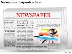
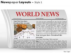
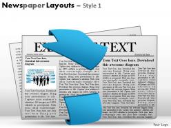
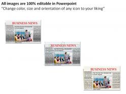
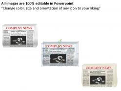
Newspaper layouts style 1 powerpoint presentation slides


Try Before you Buy Download Free Sample Product
 Impress Your
 Audience
Editable
of Time


In your presentations design can help take you the extra mile. High quality Newspaper Layouts Style 1 Powerpoint Presentation Slides are available 24/7.
People who downloaded this PowerPoint presentation also viewed the following :
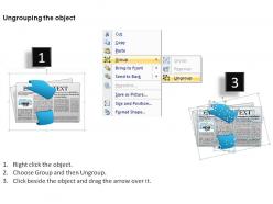
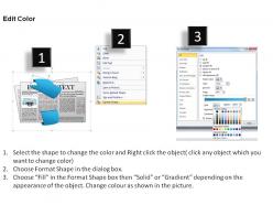
Newspaper layouts style 1 powerpoint presentation slides with all 17 slides:
Your thoughts will become shining diamonds. Shape their cut with our Newspaper Layouts Style 1 Powerpoint Presentation Slides.


FAQs for Newspaper layouts style 1
Start with your grid system - seriously, sketch it out first before you do anything else. You'll want a solid headline hierarchy and don't crowd everything together. White space is your friend here. Make the masthead pop without it screaming at people, and break up sections so it's not just one giant text blob. Oh, and if you're doing print, that fold line matters way more than people think! Give your images room to breathe and let them guide readers through the layout. Typography-wise, stick to maybe 2-3 fonts tops. Then just drop your content into the grid you made.
Dude, typography is HUGE for newspapers - like, it literally decides if people read or just flip past your stuff. For body text, go with serif fonts because they help your eyes follow the lines better. Headlines though? Sans-serif all the way. Don't go below 9pt font unless you hate anyone over 40 lol. Line spacing and column width matter way more than people think. Honestly, just grab some folks from different age groups and watch them try to read your layout - you'll spot the problems real quick. Character spacing is another thing to mess with too.
Honestly, color makes such a difference for newspaper layouts. Use it to make your main stories pop - like a bold color for big headlines while keeping body text easy to read. I've noticed papers that add strategic color blocks or tinted sections just look way more professional. Don't go crazy though, be purposeful about it. Photos definitely stand out more against colorful backgrounds than boring black and white layouts. Maybe start with section headers or pull quotes? That way you can see what actually works before going all-in.
Honestly, white space is a game changer. I used to pack everything together thinking more stuff = better, but it just looks messy. Give your elements room to breathe and suddenly people can actually scan through your content without getting overwhelmed. The funny thing is, when there's less competing for attention, your important stuff stands out way more. Plus readers don't get that tired feeling from processing cramped text. Try bumping up your margins and spacing between sections by like 20% - you'll be shocked how much cleaner it feels.
So most papers go with 6-8 columns, though you'll see 5 or 9 sometimes. Headlines can stretch across multiple columns while body text stays in one - works really well for organizing everything. Makes scanning super easy for readers too. I actually think it's pretty brilliant how flexible the system is. You get this clean structure that prevents total chaos but you can still break the rules when you need impact. My old design prof was obsessed with grids, kinda annoying but he had a point. If you're starting fresh, just go with 6 columns - it's the sweet spot.
So basically, your layout needs to match what people expect from different article types. News stories? Bold headlines, clean formatting - readers want info quick. Opinion pieces get more breathing room though. You can use bigger fonts, pull quotes, maybe add headshots for that personal vibe. Features are honestly my favorite to design because readers expect that immersive experience. Go wild with bigger images, mix up your text layouts, add some design flourishes. The whole thing is just matching your design energy to what readers are mentally prepared for when they click.
Yeah, newspapers are totally shifting to mobile-first layouts now. Bigger fonts, tons of white space, cleaner grids. Visual storytelling is huge - infographics, data stuff, photo-heavy designs that actually work on phones. Those cramped old-school columns? Dead. Gone. Good riddance honestly. Interactive elements are popping up everywhere, plus QR codes linking print to digital. Everything's gotta be scannable since people's attention spans are basically nonexistent these days. Check out how NYT and WashPost redesigned their stuff - they're crushing it right now and worth stealing ideas from.
QR codes are honestly your best bet - just link them to videos or audio stuff and people can scan with their phones. Way easier than you'd think. Infographics work amazing too, especially when you're dealing with boring data that nobody wants to read in paragraph form. You could also throw in photo galleries or even some AR elements if you're feeling ambitious (though that might be overkill). The main thing is making sure whatever you add actually helps tell your story better. I'd start with simple QR codes linking to related videos first - test what your readers actually use before going crazy with fancy features.
Oh man, headlines are literally everything! If yours suck, people just scroll right past - doesn't matter how good your actual content is. You want something specific that makes people curious, not some boring generic title. Subheadings are clutch too because honestly? Nobody reads giant blocks of text anymore (myself included lol). They're like little roadmaps that keep readers moving through your piece. I always think of them as rest stops - gives people a chance to breathe and decide if they want to keep going. Try testing different headline styles and see what actually works with your readers.
Start with your biggest story at the top-left - that's where people look first. Make that headline huge. Then work down by how important stuff is, kind of like that inverted pyramid thing they teach in journalism school. Break up your stories with different sized headlines and leave some white space so it doesn't look cluttered. Photos should back up your main stories, not fight them for attention. Honestly, the whole layout should feel like it flows naturally - readers' eyes moving from one thing to the next without getting confused. Think of it like building layers, but don't overthink it.
Okay so basically you want to create a visual hierarchy that pulls readers through the story naturally. Use photo sizing, white space, and typography to build that flow - like breadcrumbs but for news. Infographics are total lifesavers for those soul-crushing budget stories (trust me on this one). Pull quotes work great for highlighting the emotional bits. Here's the thing though - your images need to complement the text, not just sit there looking pretty. Map out your story's emotional beats first, then match visuals to those moments. Short sentences punch harder. Longer ones let you build momentum and really draw people in.
Definitely go single-column instead of that old newspaper layout - way better on phones. Font size matters big time, nobody's got patience for pinch-to-zoom anymore. Buttons and links need to be thumb-sized or people will get frustrated clicking the wrong thing. Speed's huge since mobile data can be sketchy. Oh and break up long articles with subheadings so readers can scan easily. Navigation should work with thumbs, not tiny mouse clicks. Here's the thing though - test on real phones, not just your browser's mobile view. It's honestly shocking how different the actual experience feels compared to desktop testing.
Yeah, newspapers totally look different everywhere! Western ones love that clean, minimal vibe with tons of white space. Asian papers? They cram SO much onto each page - kinda chaotic but that's what people want there. Hebrew and Arabic papers read right-to-left, which throws off the whole visual flow. Even colors and fonts change based on what locals are used to. Oh, and photo placement too - that varies more than you'd think. Definitely check out local papers first if you're designing for different countries. You'll quickly see what feels "right" to people there.
Adobe InDesign is what you want - most newsrooms use it and the text flow tools are amazing. QuarkXPress works too but feels kinda dated now. InDesign's grid system makes laying out pages way faster, especially when you're doing the same format over and over. There's also Scribus if money's tight, though honestly it's a pain to learn. Oh, and if your company already pays for Creative Cloud, definitely go with InDesign. The templates they have will literally save your life when you're on deadline.
Your readers are basically your best consultants - surveys and focus groups tell you what's actually broken. I always check which articles people abandon halfway through, that's usually a layout issue. Small fonts drive people crazy, trust me on this one. Website analytics show you exactly where readers bail out. Try dropping QR codes in your content that link to quick polls about readability - sounds geeky but it works. The brutal feedback usually stings the most and helps the most. Don't forget to tell people when you've fixed something they complained about.
-
Innovative and attractive designs.
-
Wonderful templates design to use in business meetings.