Per employee productivity dashboard abandon rate ppt powerpoint presentation styles format

Rating:
80%
Per employee productivity dashboard abandon rate ppt powerpoint presentation styles format
Slide 1 of 2
Favourites Favourites

Try Before you Buy Download Free Sample Product

Audience Impress Your
Audience
Editable 100%
Editable
Time Save Hours
of Time
The Biggest Sale is ending soon in
0
0
:
0
0
:
0
0
AI-Ready
Upload this template to AI and ask it to make any changes to content or color
100% editable Powerpoint Template for AI-assisted presentations. Finish your work in less time. ​
Works with
Microsoft PowerPoint
Microsoft 365
Claude for PowerPoint
ChatGPT
Google Slides
Microsoft Copilot
Rating:
80%
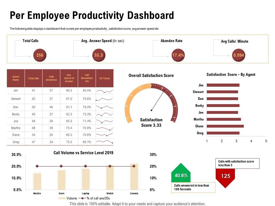
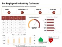
The following slide displays a dashboard that covers per employee productivity , satisfaction score, avg answer speed etc. Presenting this set of slides with name Per Employee Productivity Dashboard Abandon Rate Ppt Powerpoint Presentation Styles Format. The topics discussed in these slides are Satisfaction Score, Service, Trend. This is a completely editable PowerPoint presentation and is available for immediate download. Download now and impress your audience.

FAQs for Per employee productivity dashboard abandon rate ppt powerpoint

Employee productivity dashboards should include task completion rates, time tracking metrics, goal achievement percentages, quality scores, and collaboration indicators like team interaction frequency. These metrics enable managers to assess individual and team performance through quantitative outputs, deadline adherence, and qualitative assessments, while providing employees with transparent feedback loops that drive engagement and ultimately deliver improved organizational efficiency and strategic workforce optimization.

Employee productivity dashboards can be customized through department-specific metrics, role-based access controls, personalized KPI selections, and tailored reporting frequencies that align with each team's unique workflows. For example, sales teams benefit from conversion rates and pipeline tracking, while IT departments focus on ticket resolution times and system uptime metrics, ultimately enabling managers to make data-driven decisions that enhance operational efficiency across diverse organizational functions.

Employee productivity dashboards typically utilize tools like Microsoft Power BI, Tableau, Google Analytics, Salesforce Einstein Analytics, and specialized HR platforms such as BambooHR or Workday. These technologies streamline data visualization, automate performance tracking, and integrate multiple data sources, with many organizations finding that combining business intelligence software with HR management systems delivers enhanced operational efficiency and strategic workforce insights.

Visualizations in productivity dashboards enhance performance data understanding by transforming complex metrics into intuitive charts, graphs, and heat maps that reveal patterns, trends, and outliers at a glance. These visual elements enable managers to quickly identify top performers, bottlenecks, and improvement opportunities across departments, ultimately delivering faster decision-making and more targeted interventions that boost overall organizational efficiency.

Real-time data tracking enhances productivity decision-making by providing immediate visibility into performance metrics, identifying bottlenecks instantly, and enabling swift resource reallocation when needed. Through live dashboards, managers can spot declining output patterns, address workflow issues proactively, and optimize team assignments dynamically, ultimately delivering faster problem resolution and improved operational efficiency across departments.

Employee engagement serves as a foundational driver for most productivity metrics displayed on dashboards, influencing attendance rates, task completion times, quality scores, collaboration frequency, and goal achievement percentages. Engaged employees typically demonstrate higher output consistency, fewer errors, and stronger cross-team collaboration, with many organizations finding that engagement levels directly correlate with overall productivity trends and operational efficiency.

Organizations ensure accuracy and reliability by implementing automated data collection systems, establishing clear data validation protocols, conducting regular audits, and integrating multiple data sources for cross-verification. Through real-time synchronization and standardized metrics, companies like manufacturing firms and financial services streamline data integrity processes, ultimately delivering consistent insights that enhance decision-making and operational efficiency.

Setting benchmarks provides essential reference points for measuring productivity improvements, identifying performance gaps, and establishing realistic goals across teams and departments. These standards enable organizations to track progress over time, compare individual performance against team averages, and make data-driven decisions about resource allocation, ultimately delivering measurable improvements in operational efficiency and employee development outcomes.

Employee productivity dashboards reveal training needs by tracking performance metrics, skill gaps, task completion rates, quality scores, and learning progress across team members. Through data visualization and trend analysis, managers can identify underperforming areas, compare individual capabilities against benchmarks, and pinpoint specific competencies requiring development, ultimately enabling targeted training programs that enhance overall team efficiency and competitive advantage.

Employee feedback shapes productivity dashboard design by identifying key metrics, preferred visualization formats, workflow integration needs, and usability requirements through surveys, focus groups, and pilot testing. This collaborative approach ensures dashboards align with actual work patterns, with many organizations finding that employee-informed designs increase adoption rates, enhance user engagement, and ultimately deliver more accurate productivity insights and improved performance outcomes.

Common pitfalls include over-monitoring employees, focusing solely on quantity metrics, lacking transparency about measurement purposes, ignoring employee feedback, and creating competitive rather than collaborative environments. These challenges can undermine trust and morale, with many organizations finding that successful implementations require balanced metrics, clear communication, and employee involvement in dashboard design, ultimately enhancing rather than hindering workplace culture.

Integrating employee feedback enhances productivity dashboards by identifying relevant metrics, addressing usability gaps, and ensuring alignment with actual workflow needs. This collaborative approach creates more accurate performance indicators and user-friendly interfaces, with many organizations finding that employee-informed dashboards generate higher adoption rates, better data accuracy, and ultimately more actionable insights for management decisions.

Remote work significantly transforms productivity dashboards by emphasizing outcome-based metrics, digital collaboration tracking, and flexible time management indicators rather than traditional presence-based measurements. These enhanced dashboards integrate project completion rates, virtual meeting effectiveness, and asynchronous communication patterns, with many organizations finding that remote-focused metrics deliver better employee engagement, clearer performance visibility, and ultimately stronger competitive advantage.

Data privacy concerns can be addressed through anonymization techniques, role-based access controls, aggregated reporting instead of individual tracking, and transparent communication about data usage policies. Organizations like financial services and healthcare institutions find that implementing these privacy-first approaches while focusing on team performance rather than individual surveillance ultimately delivers better employee trust, regulatory compliance, and more meaningful productivity insights.

Best practices include establishing automated data feeds, scheduling regular review cycles, validating data accuracy, updating relevant KPIs, and ensuring user access permissions remain current. These maintenance protocols streamline dashboard reliability by minimizing manual errors, enhancing real-time insights, and sustaining user engagement, with many organizations finding that consistent updates ultimately deliver more accurate performance assessments and strategic decision-making capabilities.

Ratings and Reviews

80% of 100
Review Form
Write a review
Most Relevant Reviews
  1. 80%

    by Dion Dunn

    Understandable and informative presentation.

1 Item

per page: