Process Update Powerpoint Ppt Template Bundles

Rating:
100%
Process Update Powerpoint Ppt Template Bundles Process Update Powerpoint Ppt Template Bundles
Slide 1 of 28

or

Favourites Favourites

Try Before you Buy Download Free Sample Product

Audience Impress Your
Audience
Editable 100%
Editable
Time Save Hours
of Time
The Biggest Sale is ending soon in
0
0
:
0
0
:
0
0
Rating:
100%
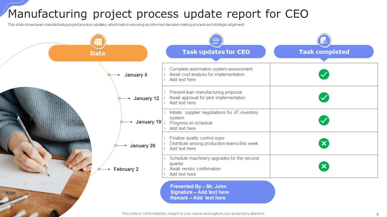
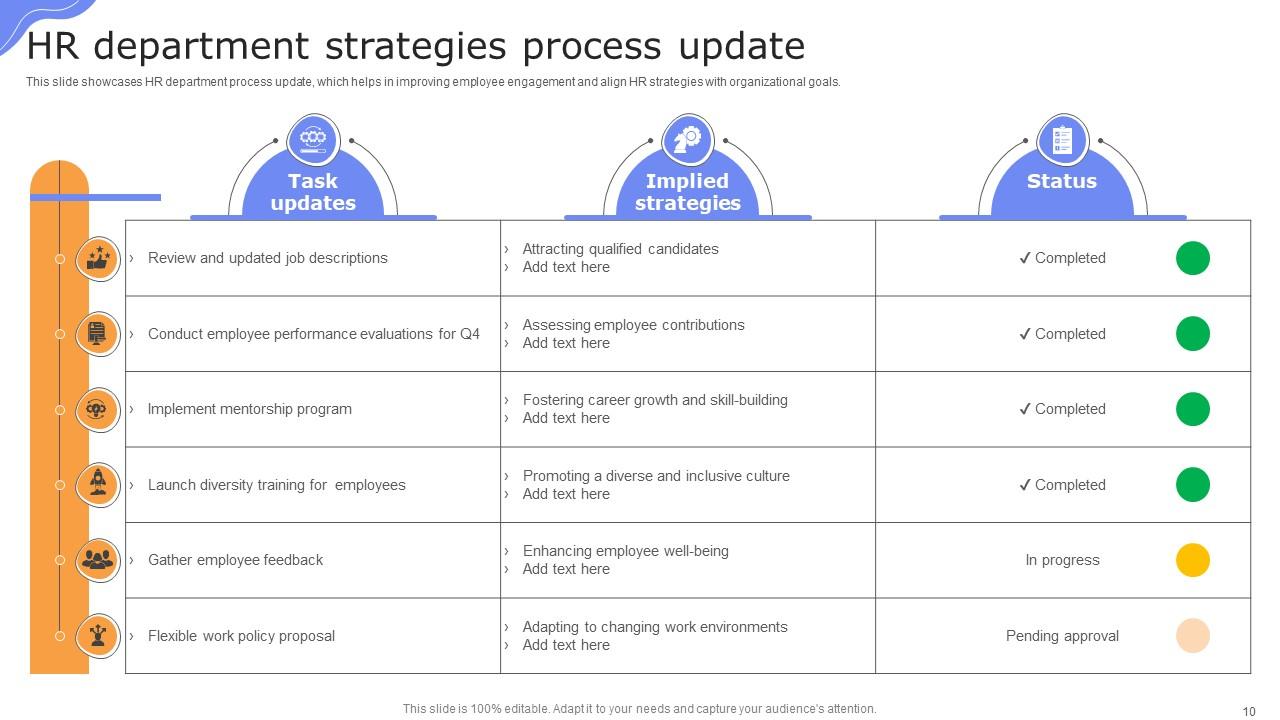
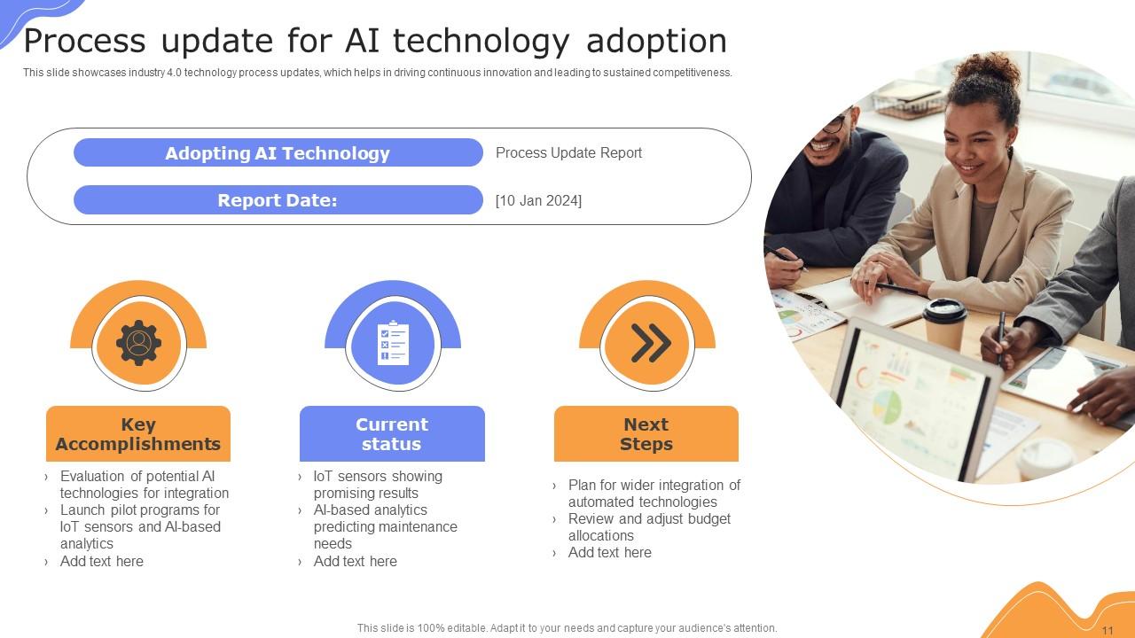
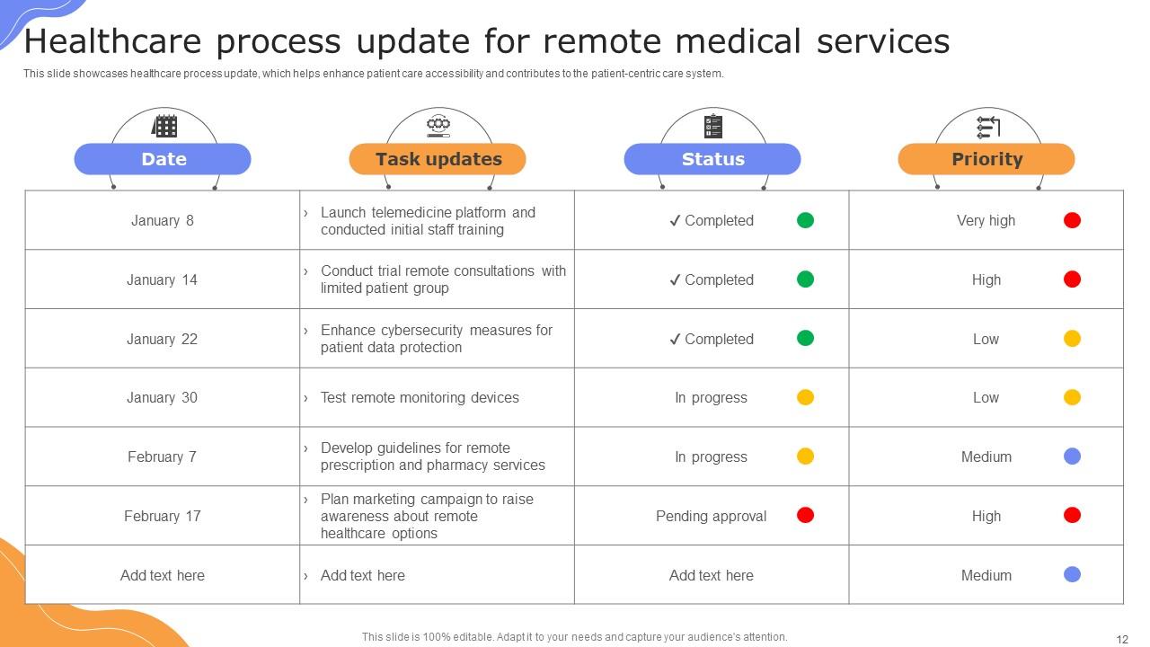
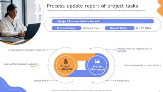
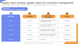
Deliver a lucid presentation by utilizing this Master Data Management Powerpoint Ppt Template Bundles Use it to present an overview of the topic with the right visuals, themes, shapes, and graphics. This is an expertly designed complete deck that reinforces positive thoughts and actions. Use it to provide visual cues to your audience and help them make informed decisions. A wide variety of discussion topics can be covered with this creative bundle such as Progress Report, Status Update, Performance Metrics, Actions Items, Task Completion. All the Twenty slides are available for immediate download and use. They can be edited and modified to add a personal touch to the presentation. This helps in creating a unique presentation every time. Not only that, with a host of editable features, this presentation can be used by any industry or business vertical depending on their needs and requirements. The compatibility with Google Slides is another feature to look out for in the PPT slideshow.

FAQs for Process Update Powerpoint

Honestly, just hit the basics first - what changed and why. Then tell people exactly who this affects and what they actually need to do about it. Timeline is huge too... I can't tell you how many times I've gotten these vague updates where nobody knows if the change already happened or what. Include contact info for questions and maybe throw in a link to full docs if you have them. Oh, and use bullet points! Makes it way easier to scan instead of having to dig through paragraphs. The real trick is being super specific about next steps rather than just dropping news and running.
Templates save your sanity, trust me. People actually have to include the important stuff - what they're doing, what's blocking them, deadlines. No more useless updates like "still working on it" that make you want to scream. You can scan through everything fast and catch problems before they explode. New people know exactly what format to use too, which is honestly a huge time-saver. I'd start simple - just status, roadblocks, and what's next. The difference is immediate once everyone's speaking the same language.

Progress bars are a game changer - people love seeing percentages at a glance. Break everything up with clear headers so it's not just a giant block of text (seriously, those are the worst). I'm a big fan of color coding: green for done, yellow for working on it, red for roadblocks. Throw in some bullet points or icons to make scanning super easy. If you've got deadlines, add a simple timeline thing. The whole point is someone should get the gist in like 20 seconds max. Oh, and definitely run it by a coworker first to see if they actually understand what's happening.

Quarterly is probably your sweet spot to start with. Though honestly, it really depends on how much stuff changes in your world. Monthly updates work better if you're in something that moves super fast. Just don't do weekly - I've watched teams completely burn themselves out that way. Start with those templates every three months, then see if that's actually enough. Maybe you'll need more frequent check-ins, maybe less. Set up a calendar reminder right now or you'll totally forget about it (trust me on this one). The whole point is keeping things current without making it feel like a second job.

So for process metrics, I'd focus on timeline stuff first - like how much you've completed or if you're ahead/behind schedule. Quality numbers work well too, especially error rates or customer satisfaction. Volume metrics are honestly the easiest to track though. Think completion rates or how fast you're processing things. Cost savings always look good to stakeholders too - they love seeing budget efficiency. But here's the thing - don't go overboard with data. Pick maybe 2-3 metrics that actually matter to whoever you're reporting to. I've seen people kill presentations by throwing everything at the wall. Choose ones that clearly show if you're crushing it or need backup.

Yeah, so it really depends on what field you're in. Healthcare has all this crazy compliance stuff and patient safety protocols they have to track. Manufacturing is more about quality control and supply chain updates. Tech companies do those agile sprint reviews - way more chill and flexible. Finance though? They're obsessed with audit trails and risk assessments for everything. The basic template structure is pretty similar across the board, but the specific fields change a lot. Oh, and approval workflows can be totally different too. I'd start with whatever regulations your industry has, then just tweak from there.

Colors are honestly a game-changer for process updates. I always tell people to pick a consistent system - maybe green for done stuff, yellow for ongoing work, red for things that are stuck. Your team will start scanning way faster instead of reading everything line by line. It's like creating your own little visual language that just clicks after a while. Obviously don't go crazy with rainbow templates - 3 or 4 colors tops. And definitely check that colorblind folks can still tell things apart (learned that one the hard way). The whole thing just looks more professional too.

Honestly, just throw together a shared doc or quick form where people can dump their thoughts after using your templates. Make it dead simple or nobody will use it. I peek at mine once a month - you'd be shocked at the random stuff people get tripped up on that seems totally obvious to you. Then every few months, go through all the comments and actually fix the templates based on what keeps coming up. The whole thing falls apart if giving feedback feels like work, so keep it casual.

So for process update templates, Word or Google Docs work great for basic stuff. PowerPoint/Slides if you need something more visual. Actually, Notion is pretty amazing for this - you can set up template databases that auto-fill and track changes easily. Canva's solid too when you need things to look nice for higher-ups. Honestly though? I've watched people go way overboard building fancy systems when a simple Google Doc template would've been fine. Just start with whatever your team's already using every day. You can always make it fancier later if you really need to, but most of the time you won't.

Honestly, these templates are game-changers for keeping everyone on the same page. No more digging through endless email threads trying to figure out what's actually happening with a project. Your team stops wasting time writing updates from scratch every week - they just fill in the blanks. Stakeholders love it because they know exactly where to look for info. I swear, some teams I know cut their status meetings in half once they started using them. The trick is keeping it stupid simple at first. Don't go crazy with fancy fields or people won't bother using it.

Honestly, the worst thing you can do is cram too much detail into your template. Nobody's reading a 3-page status update, trust me. Bullet points are your friend here - way better than chunky paragraphs. Oh and definitely add an "impact" section because managers lose their minds without it. I've seen so many templates that just... end abruptly? Like, what am I supposed to do with this info? Always include next steps. Test it out first too - I learned this the hard way when my "perfect" template confused the hell out of everyone.

Honestly, templates are a lifesaver for keeping everyone updated without losing your mind. Your stakeholders get consistent info - progress, what's stuck, next steps, timelines. No more random "hey what's going on?" messages flooding your inbox (which is honestly the worst). Plus your team can actually contribute since the format's already laid out for them. I'd start simple - maybe a weekly thing covering status, wins, and whatever's blocking you. People really do appreciate knowing what to expect and when. Makes everyone's life easier.

Oh man, these templates are a game changer! Your team won't be guessing what to include anymore since everyone follows the same format. Comparing updates between projects becomes super quick too - like, you can actually spot patterns and issues without squinting at random formats. New people especially love them because they don't have to bug everyone with basic questions about what goes where. I'd say start by building one together as a group, then tweak it as you go. Honestly took our team way too long to figure this out, but once we did it was so obvious.

Check out Spotify's squad updates - they're honestly the cleanest I've seen. Simple format: what we shipped, what's blocked, what's next. Done. Amazon does this PR/FAQ thing that starts with customer impact before diving into metrics. Google's more structured with their OKR templates using red/yellow/green status indicators (though sometimes feels a bit rigid). All of them ditch corporate BS for actual clarity. I'd probably steal Spotify's approach first since it's easiest to customize for whatever you're working on.

Honestly, remote teams need way more explicit process templates because you lose all those random hallway chats. I'd add sections for timezone stuff, async communication preferences, and super clear handoff points. We totally botched this once - people kept missing updates buried in endless Slack threads, it was a mess. Include specific channels for sharing updates and deadlines that actually work across timezones. Short version: be way more deliberate about info flow than you'd ever need in person. Start by looking at your current templates and figure out where remote people are getting lost.

Ratings and Reviews

100% of 100
Review Form
Write a review
Most Relevant Reviews
  1. 100%

    by Dominick Pierce

    “One of the best experiences with SlideTeam for my presentation.Everything on time, communication is efficient and price is reasonable. All good in one place.”
  2. 100%

    by Darnell Tucker

    Designs have enough space to add content.

2 Item(s)

per page: