


Project management planning design development and testing dashboard





Try Before you Buy Download Free Sample Product
 Impress Your
 Audience
 100%
100% Editable
 Save Hours
 of Time


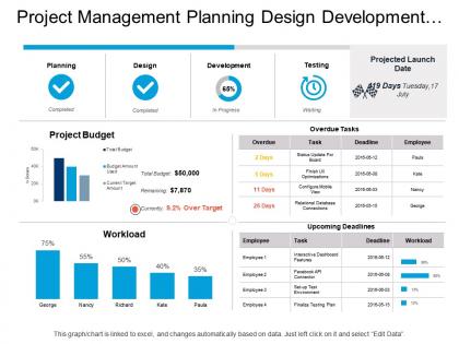
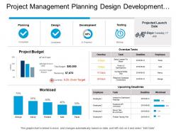
Planning is the crucial part of any work whether you are working in a leading corporate industry or as a start-up. Our project management planning design development and testing PowerPoint template has been crafted to manage the project in the most efficient manner. You need to come up with the project design where you should mention key features, layout and criteria for achieving success and deliverables in a planned manner. Our presentation slide has been designed with complete research for your use. The purpose of this template is to provide you the resources to meet your objectives. Some key aspects that are shown in the PPT diagram are planning, design, development and testing, these are the four phases through which a project is completed, and it is important that you share information about them with your team mates. Deciding the project budget and assign the task are some ways to manage your work in the organized way. Plan your next project with the professional approach using our PowerPoint graphic. Enlighten individuals on how to avoid errors with our Project Management Planning Design Development And Testing Dashboard. Get them to focus on contributory factors.
People who downloaded this PowerPoint presentation also viewed the following :
Project management planning design development and testing dashboard with all 6 slides:
Our Project Management Planning Design Development And Testing Dashboard allow you to jog along. Continue to advance in a consistent fashion.
FAQs for Project management planning design development
Okay so I'd stick with five main metrics. Schedule and budget variance are huge - they'll tell you if things are going sideways before it's too late. Resource utilization is clutch too because nobody wants their team burning out or sitting around bored. Milestone completion rates give you the big picture view. Risk indicators are the last one - though honestly I sometimes forget to check those until it's almost too late lol. The key thing? Don't get caught up in fancy metrics that look cool but won't actually help you make decisions this week.
Color-coded indicators are honestly a game changer - you'll spot problems instantly without squinting at tiny text. Progress bars give you that quick visual of where things stand. Nobody wants to dig through spreadsheet rows when they need a fast project update, right? Charts help you actually digest complex data fast. Icons guide your eye to the important stuff first. The whole point is making your data tell a clear story visually. Otherwise your team will just... not use it. And then what's the point of building a dashboard anyway?
Honestly, most people go with Microsoft Project, Asana, Monday.com, or Trello if it's straightforward stuff. Power BI and Tableau are solid for dashboards - Excel works too but gets chaotic quick with bigger projects (learned that the hard way). Smartsheet's nice, sits right between spreadsheets and full project software. Really depends what you actually need though. Just basic task stuff? Gantt charts? Resource tracking? Figure that out first and it'll point you toward the right tool. Budget matters too obviously.
Honestly, daily updates are your best bet for most projects. Real-time is cool if your tools can handle it, but I've watched teams burn out when dashboards change every hour - people just stop looking. Short bursts work better anyway. Critical stuff with crazy deadlines? Maybe bump it to hourly during work hours. The trick is keeping data fresh without creating total noise (learned that one the hard way). Automate whatever you can so it's consistent. You want that sweet spot where everyone actually uses the thing instead of ignoring constant pings.
Dude, you've gotta talk to your users first - seriously. What executives want to see is completely different from what project managers or regular team members need. I've watched so many dashboards crash and burn because they looked amazing but showed totally useless info. Interview your main people before you even think about which tool to use. Ask them about their key metrics, what kinds of charts they like, how often they want updates. Oh and make sure the whole thing fits into how they actually work - don't force them to change their process for your dashboard.
Progress bars and Gantt charts are your best friends for showing timelines. Burndown charts work great too - they track what's left to finish. But honestly? Traffic light systems are clutch. Red/yellow/green is so simple that even executives who barely look at project stuff can instantly get it. Milestone markers help celebrate wins along the way (people love seeing achievements). Percentage widgets give you quick numbers when you need them. Don't go crazy with your dashboard though - pick 2-3 clean visuals that actually make sense for whoever's looking at them. Less is definitely more here.
Dude, start with the critical stuff right at the top - project status, deadlines, any fires that need putting out ASAP. I made this mistake once and buried a budget crisis at the bottom... not fun explaining that to my boss later. Group similar stuff together so you're not scanning all over the place. Stick with simple colors: red = problems, green = good, yellow = watch out. Honestly? Less clutter is always better. Your dashboard should tell the whole story in like 5 seconds max. People don't have time to dig through tons of data. Keep it simple first, then add fancy stuff later if you actually need it.
Figure out what your stakeholders actually care about first - that's the whole game. Construction folks want budget burn rates and milestone tracking. Software teams? Sprint velocity and bug reports. Most tools let you drag and drop different charts around, customize fields, whatever. The color scheme stuff is honestly kind of fun once you get into it (maybe too fun lol). Don't try to build everything at once though. Pick one role-specific dashboard that'll actually get used. Build that, see how it goes, then expand. Way less overwhelming that way.
Honestly, data integration is gonna be your biggest headache - connecting all those random tools your team uses is such a pain. People also hate changing how they work, which I totally get. Start small though! Pick like 2-3 main data sources instead of going crazy trying to connect everything day one. Get your team involved in picking what metrics actually matter to them. The dashboard needs to save them time, not create another stupid thing they have to check. Find a few people who are actually excited about it first and let them be your guinea pigs.
So dashboards are clutch because you can see everything at once instead of digging through a million spreadsheets. Red flags pop up immediately - budget issues, delayed tasks, resource problems. Way better than finding out about disasters during your weekly check-in, you know? The visual stuff makes it obvious when things are going wrong. Set up alerts for your important metrics so they'll ping you right away. I learned this the hard way after missing a major deadline once. Charts showing trends over time are pretty helpful too for spotting patterns before they become real problems.
So traditional dashboards are all about tracking your original plan - budget, timelines, milestones, that stuff. Agile ones? Completely different game. They're focused on sprint velocity, burndown charts, story points. Way more real-time too - you'll see blockers, standup notes, team capacity metrics. Honestly, I find Agile dashboards way more useful for most projects these days. The big difference is traditional ones measure you against what you planned months ago, while Agile helps you pivot when things change. Pick traditional if you're following a strict plan, Agile if you need flexibility.
Dude, real-time data is a game changer for projects. You catch problems way earlier instead of finding out about budget overruns three weeks too late. Having live updates on your timeline and resources means you can actually do something about issues - honestly, it's night and day compared to working with old spreadsheets. Your team stays way more on track too since everyone's looking at the same current info. You'll spot scope creep faster and move people around when needed. Oh, and you'll actually hit your deadlines more often. Start with whatever metrics matter most to your project first.
Honestly, start with real-time stuff - live editing and instant notifications so everyone sees changes immediately. Built-in chat and @mentions are clutch because then you're not switching between Slack and your project tool constantly. Time zone displays save your sanity with remote teams. Visual progress tracking is surprisingly helpful too, cuts down on those annoying "where are we at?" meetings. Oh, and comment threads that stick to specific tasks instead of getting buried in group chats. The main thing? Pick tools that replace multiple apps rather than adding more to your stack. Trust me on that one.
So basically you take all your old project data and feed it into ML models to spot patterns. The dashboard tracks stuff like task completion rates, resource usage, milestone delays - then predicts budget overruns, delivery dates, bottlenecks, whatever. With enough data it gets scary accurate tbh. Focus on metrics that actually move the needle for your projects: timeline variance, scope creep, team velocity. I'd start with simple forecasting first, then get fancier as your data gets cleaner. Oh and don't overthink the initial setup - you can always iterate later.
Mobile dashboards are pretty clutch for keeping projects moving when you're not glued to your computer. You can approve stuff, check updates, and catch problems while grabbing coffee or whatever. Remote teams especially love this since decisions don't get stuck waiting for someone to get back to their desk. Plus stakeholders can pull up real-time data on their phones, so everyone stays on the same page. One thing though - make sure it actually works smoothly on mobile, not just loads poorly on a tiny screen. Nothing's more frustrating than trying to squint at a desktop layout crammed onto your phone.
No Reviews