Project status kpi dashboard snapshot showing delivery roadmap and resource allocation
Try Before you Buy Download Free Sample Product
Audience
Editable
of Time
Evaluate how effectively project is performing with our project status KPI dashboard snapshot showing delivery roadmap and resource allocation. This presentation slide of project status dashboard has been designed by our professional team members and will help you ensure that projects get completed on time. Our project show key performance indicator PPT slide can be used by project managers to display project related information and make their team to understand work process to lead the project towards long-term goals. This project roadmap planning layout allows you to focus on your vision, direction, and strategic initiative and to create a comprehensive and actionable project dashboard. Our project management KPI dashboard slideshow is data driven layout and help your measure the project metrics and provides actionable and visually understandable approach. Our project management dashboard PPT slide can be used to exhibit information like project lag time, resource utilization, cost overhead, maximum risk and cost performance index range. Build greater credibility with our Project Status Kpi Dashboard Showing Delivery Roadmap And Resource Allocation. Illustrate your expertise beyond all doubt.
People who downloaded this PowerPoint presentation also viewed the following :
Content of this Powerpoint Presentation
Description:
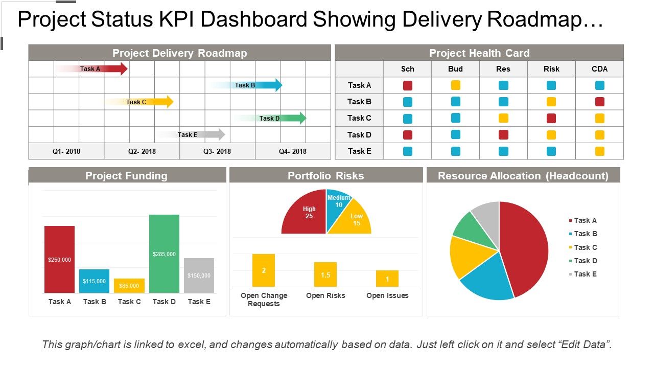
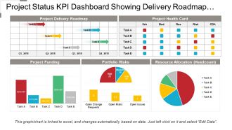
This image displays a comprehensive Project Status KPI Dashboard designed to showcase key performance indicators for project management. The dashboard is divided into several sections, each presenting vital project metrics:
1. Project Delivery Roadmap:Â
This section depicts a Gantt-like chart showing the timeline of tasks (Task A to Task E) across four quarters of the year 2018. It provides a visual representation of the project's progression, scheduling, and milestones.
2. Project Health Card:Â
Situated to the right of the roadmap, the health card uses a color-coded system to represent the status of several project parameters such as Schedule (Sch), Budget (Bud), Resources (Res), Risks, and Contract Delivery Agreement (CDA) for each task.
3. Project Funding:Â
Below the roadmap, this bar chart illustrates the funding allocated to each task. Colored bars represent the total budget while superimposed gray bars show the amount spent.
4. Portfolio Risks:Â
This pie chart outlines the distribution of risks categorized as high, medium, and low within the project portfolio.
5. Resource Allocation (Headcount):Â
Next to the risks chart, a colorful pie chart provides a visual breakdown of the human resources allocated per task.
The footer of the image mentions that the graph/chart is linked to Excel and can automatically update when data is changed, indicating a live data feature that provides real-time updates.
Use Cases:
Below are seven industries where these types of slides can be highly applicable:
1. Consulting:
Use: To display project timelines and resource allocation for client projects
Presenter: Project Manager or Consultant
Audience: Clients or Executive Management
2. Information Technology:
Use: Tracking software development milestones and resource management
Presenter: IT Project Coordinator or Team Lead
Audience: Stakeholders or Development Team
3. Construction:
Use: Monitoring construction progress, financial expenditure, and risk assessment
Presenter: Construction Manager or Site Supervisor
Audience: Investors or Project Sponsors
4. Finance:
Use: Representing portfolio management, funding allocation and risk analysis
Presenter: Financial Planner or Analyst
Audience: Clients or Internal Management Team
5. Healthcare:
Use: Managing healthcare initiative rollouts and associated risks
Presenter: Healthcare Administrator or Project Lead
Audience: Hospital Board Members or Department Heads
6. Education:
Use: Planning educational programs and tracking budgetary commitments
Presenter: Program Director or Education Coordinator
Audience: Academic Committee or Funding Bodies
7. Marketing:
Use: Overseeing campaign delivery, budgeting, and workforce deployment
Presenter: Marketing Manager or Campaign Strategist
Audience: Marketing Team or Executives
Project status kpi dashboard snapshot showing delivery roadmap and resource allocation with all 6 slides:
Make your mark with our Project Status Kpi Dashboard Snapshot Showing Delivery Roadmap And Resource Allocation. Create an impression that will endure.
FAQs for Project status kpi dashboard snapshot showing delivery roadmap
Start with what decisions people actually need to make - then work backwards. You want maybe 5-7 metrics max that connect to real business goals, not some random vanity numbers. Make the data visual so trends jump out immediately. Real-time feeds are clutch, but honestly near real-time works fine too. Include targets and benchmarks so people know if they're winning or losing. I've seen too many dashboards that look like someone threw up Excel charts everywhere - total nightmare. Keep it clean and focused on what actually moves the needle for your specific team.
Good design makes dashboards actually useful instead of just pretty. Use red for problems, green for wins - people get that instantly. Don't cram everything together; white space helps your brain process stuff. I swear, some dashboards look like someone threw up data everywhere and called it a day. Simple icons work best. Keep your fonts consistent so there's a clear flow from big important metrics to smaller details. Quick test: can you understand the main points in 10 seconds? If not, time to simplify. Nobody wants to decode a rainbow spreadsheet when they're trying to make decisions.
Start with the money stuff - monthly recurring revenue, sales velocity, conversion rates through your funnel. Lead metrics matter too, like cost per lead and how many actually turn into real opportunities. Track your team's quota attainment and average deal sizes. Pipeline health is absolutely critical (I've seen so many companies mess this up). Days in each stage, pipeline coverage ratios - that kind of thing. Honestly, stick to maybe 6-8 metrics tops when you're starting out. More than that and people just tune out completely.
So it really depends on what actually makes or breaks each business. Retail guys are constantly watching conversion rates and how much people spend per order. SaaS companies? They're all about churn and monthly recurring revenue - lose customers and you're toast. Manufacturing gets super nerdy with OEE and defect tracking (some of those dashboards are honestly insane). Healthcare focuses on patient satisfaction and readmission rates, while banks track approval times and compliance stuff. The trick is figuring out what actually moves the needle for YOUR business, then build around that instead of random metrics that just look impressive.
Honestly, the worst thing you can do is jam like 20 different metrics on there - nobody knows where to look. Skip the vanity stuff that makes you feel good but doesn't help anyone decide anything. Your data better be fresh too, because stale numbers just make you look amateur. C-suite wants different info than your ops people, obviously. I'd stick to maybe 5-7 really important ones max. For each metric, ask yourself "okay so what does this actually tell us?" If you can't answer that clearly, cut it.
Weekly updates are usually the sweet spot, but it really depends on what you're measuring. Sales teams probably need daily checks since things move so fast - missing a trend for a week could hurt. Monthly works fine for bigger picture stuff though. Honestly, I'd worry more about being consistent than perfect frequency. Your team needs to actually follow through, you know? Start weekly and see how it feels. If your numbers barely budge day to day, maybe scale back. But if you're constantly playing catch-up, bump it to daily. Just don't overthink it too much.
So for KPI dashboards, Tableau and Power BI are the big names but they'll cost you. Google Data Studio is free and actually pretty decent - I'd start there honestly. Looker Studio works great if you're already in the Google world. Excel can work too but gets messy quick with big datasets (been there). Oh, and if you're doing time-series stuff, Grafana isn't bad. My advice? Start with whatever your team already knows how to use, then move up when you outgrow it. No point learning something fancy if basic gets the job done.
Honestly, turning your KPIs into visuals is a game changer. Raw spreadsheet data makes my eyes glaze over, but charts? You'll instantly see what's going wrong. Heat maps show problem areas, line graphs track if you're actually getting better over time. Bar charts work great for comparing stuff side by side. I'm obsessed with color coding - makes it super obvious what needs fixing first. Pick your most important KPIs and just mess around with different chart types. Once you find the right fit, the data basically tells its own story. Way better than squinting at endless rows of numbers.
Honestly, getting stakeholder feedback early is make-or-break for dashboards. Without it, you'll build something that looks nice but tells them absolutely nothing useful. Talk to them upfront about which KPIs actually matter and how they prefer seeing data laid out. What decisions are they trying to make? That stuff shapes everything. I've watched so many beautiful dashboards get ignored because nobody asked the right questions first. Their input tells you what deserves the spotlight versus what can sit in the background. Oh, and don't stop gathering feedback once you start building - what makes perfect sense to you might completely confuse them.
Oh totally, they're actually better for remote teams than in-person ones. Everyone can see the same data without hunting down updates in Slack threads or whatever. Real-time updates are crucial though - nobody wants to look at yesterday's numbers. Remote teams I know use them to spot problems early since you can't just peek over someone's shoulder anymore. Plus people can check progress whenever instead of waiting for the weekly standup (which honestly saves everyone time). Just pick metrics that actually matter for how your team works - I've seen too many dashboards tracking vanity numbers that don't help anyone.
Know your audience first - execs want the big picture, analysts need the nitty-gritty details. Put your 3-5 most critical KPIs front and center, then let people drill down for more context. Honestly, the biggest mistake I see? Making dashboards look like a casino with everything flashing at once. It's distracting as hell. Use progressive disclosure so the main view stays clean but users can dig deeper when they want. Test early with real people - if they're squinting or asking "what's this number mean?" you've overcomplicated it.
So real-time dashboards show you exactly what's happening this second - super useful when you need to jump on problems fast or make quick calls. Historical ones are better for the big picture stuff, like spotting trends over time and planning ahead. Most teams honestly end up needing both (sorry, I know that's not the clean answer you want). You'll react faster with real-time data, but historical gives you context for smarter decisions down the road. I'd probably start with whatever's causing you the biggest headache right now.
Having mobile access to your KPIs is honestly a lifesaver. You can check metrics during meetings, handle issues while you're traveling, or do a quick scan from bed (guilty). The best part? Getting alerts the second something goes wrong instead of finding out hours later at your computer. Just make sure the dashboard isn't a nightmare to use on your phone – I've seen some where you need a magnifying glass to read anything. Quick responses when problems pop up can save you so much headache later.
Start with impact stuff - how many people you're helping, completion rates, actual outcomes. That's what matters most, right? Then track the money side: fundraising efficiency, keeping donors around, program costs. Don't overthink it with fancy metrics that look good but don't mean much. Volunteer hours and staff productivity are solid too. Honestly, most boards only care about like 5-7 key things anyway. Pick those first. The trick is balancing mission results with staying financially healthy - easier said than done sometimes.
Honestly, KPI dashboards are game-changers because they show you what's actually working vs what's just wasting money. You'll catch problems before they blow up. Real-time data beats guessing every time. The trick is picking the right metrics - not just impressive-looking numbers that don't actually matter. I learned this the hard way when I first started tracking everything under the sun. Stick to maybe 5-7 key ones that tie to your actual goals. Any more than that and you won't even look at the thing.
-
Excellent work done on template design and graphics.
-
Helpful product design for delivering presentation.