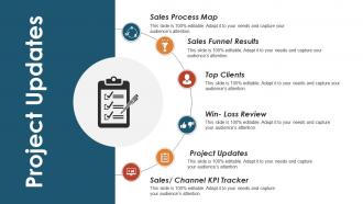
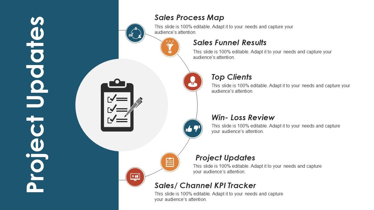
Project updates ppt visual aids layouts
Try Before you Buy Download Free Sample Product
Audience
Editable
of Time
Generate impressive gains for all concerned with our Project Updates Ppt Visual Aids Layouts. Capitalize on your acumen.
People who downloaded this PowerPoint presentation also viewed the following :
Project updates ppt visual aids layouts with all 5 slides:
Convey your intentions with our Project Updates Ppt Visual Aids Layouts. Acquaint folks with the course you will follow.
FAQs for Project updates ppt
You've got so many ways to keep people engaged! Clean slides with minimal text are clutch, and infographics make boring data way more digestible. Videos totally change the energy in the room - honestly, anything that moves just hits different than static slides. Interactive stuff like polls gets everyone actually participating instead of zoning out. Props work surprisingly well too, especially for technical presentations (who knew?). Charts and graphs are obvious but effective. Just don't go overboard - you want everything to support your message, not distract from it. Pick what fits your content best.
Yeah, colors totally affect how people absorb info! Red and orange are attention-grabbers but can come off aggressive. Blues and greens help people focus and stay calm. Just don't go crazy with high contrast - those neon combos will make everyone's eyes hurt. I learned the hard way that about 8% of guys are colorblind, so test your slides in grayscale first. Stick to maybe 2-3 colors tops, and definitely use your brand colors if you've got them. Pro tip: if too much blue makes you sleepy (happens to me!), mix in some warmer tones.
Honestly, less is more with charts. Pick one clear point per graph and stick to it - I've sat through way too many presentations where someone dumps like 15 data points on one slide and nobody knows where to look. Super annoying. Use the same colors throughout your deck, label everything so it's obvious, and tell people exactly what they should notice. Don't make them guess. Oh, and here's something that actually works: make your chart title the actual insight instead of something boring like "Sales Data Q3."
Honestly, mix it up with different visuals - that's what works. Charts and graphs are great for analytical people, but throw in some images and videos too. Interactive stuff is clutch for hands-on learners who get bored easily. I'm a sucker for adding storytelling elements because, let's be real, everyone loves a good story. Oh and don't skip text summaries alongside your visuals. Some people just process written info way better. The whole point is layering different formats so everyone can find what clicks for them and actually stay tuned in.
Honestly, infographics are such a game-changer for presentations. Instead of drowning people in bullet points, you can turn boring data into something they'll actually pay attention to. Charts and icons make complex stuff way easier to digest - I've watched entire rooms perk up when someone swaps text-heavy slides for good visuals. People process relationships between numbers so much faster when it's laid out graphically instead of buried in paragraphs. My old boss used to love cramming everything into lists, but sketching out the info visually works way better. Next time you've got a bunch of stats or process steps, try mapping it out instead.
Only use visuals that actually explain your points - like, does this chart make something clearer than just saying it? If not, ditch it. I made this mistake once and stuffed my presentation with random graphics that added nothing. Stick to one color scheme so it doesn't look like a mess. Make sure people can read your text over backgrounds too. Give everything room to breathe with white space. Honestly, cramped slides are the worst. Quick test: if you're squinting or second-guessing whether something belongs, it probably doesn't.
Honestly depends what you're trying to do! Canva's super easy for graphics, or Adobe if you want to get fancy. Prezi and Genially are cool for interactive stuff that actually keeps people awake during presentations. Got data? Tableau and Power BI make charts that don't suck. For videos, I'd just use Loom or Camtasia - screen recordings work too if you're being lazy about it. Figure out what you actually need first though, then match it to what you can afford and won't make you want to throw your laptop.
Honestly? Less is more with animations. Fade-ins work great - just avoid those spinning, bouncing effects (seriously, they're like the Comic Sans of PowerPoint). Time things so each point shows up when you're actually talking about it, not randomly before. Pick one style and stick with it throughout your whole presentation. Here's the thing though - if people walk away talking more about your fancy transitions than your actual content, you've totally missed the mark. Oh and definitely practice the timing beforehand! Tech loves to fail at the worst moments, so have a backup ready.
Okay so biggest thing - don't cram a million words on each slide with microscopic font. People in back can't see anything! One main point per slide max. Those weird stock photos are so cringe, just use a simple chart or screenshot instead. Oh and please don't make your text fly in from 12 different directions - I've sat through too many of those presentations lol. Simple colors work best, just make sure there's good contrast so text actually shows up. Test it on the real screen first because stuff always looks different than on your laptop.
Honestly, just watch people's faces while you're presenting. If they're squinting at your slides, your font's way too small. Leaning in and nodding? Good sign. But those blank stares after what you thought was your best visual? Oof, that stings every time. Questions afterward are huge tells too - when someone asks about basic stuff you're sure your chart explained, that's your cue to simplify next time. Oh, and don't be weird about asking directly: "Did those graphs actually help or just confuse things?" Most people will give you honest feedback if you ask.
Photos are great when you want people to trust what you're saying - like for testimonials or case studies. Real faces just hit different, you know? But illustrations? Way better for explaining complicated stuff or showing things that don't actually exist yet. With illustrations, you control exactly what people look at without random backgrounds messing things up. Honestly, I think photos work best when you need that authentic vibe, while illustrations shine when you're trying to teach something. Just depends what you're going for really.
Okay so this is huge - colors and symbols mean totally different things depending where people are from. Red screams "danger" to us but it's lucky in China. And don't even get me started on hand gestures... thumbs up can actually offend people in some Middle Eastern countries. Your audience might read right-to-left too, which throws off your whole layout. Honestly, I'd just test your visuals with actual people from whatever cultures you're targeting first. Way better than guessing and accidentally insulting someone's grandma.
Dude, there's so much cool stuff you can do instead! Interactive whiteboards are amazing - your audience actually gets to jump in and contribute. Physical props work really well too, especially for making weird abstract stuff make sense. I've been seeing people crush it with Prezi or even those short TikTok-style videos lately. Mind maps grab attention way better than boring bullet points. Live sketching is pretty fun to watch too. Oh, and infographics obviously. The trick is just matching whatever format to your specific crowd and message. Maybe try one new thing next time and see what happens?
Honestly, visuals beat text slides every time because they stick in people's heads way better. You're basically hitting two parts of their brain - the logical side AND the emotional side. I mean, we all know attention spans are garbage now, so anything that keeps people actually looking at your presentation is gold. The trick is making sure your images and charts actually tell your story instead of just sitting there looking pretty. Oh, and try sketching out your whole presentation like a storyboard first - sounds nerdy but it works. Then you can pick visuals that actually move things forward instead of just filling space.
Hey! So for accessible slides, bigger fonts are your friend - like 24pt minimum. High contrast colors work best, and honestly? Skip the red-green combos since so many people can't distinguish those. White space is clutch - don't cram everything together. Always add alt text to images and captions for videos. Here's a good test: sit in the back row. Can't read it? Your audience can't either. Bullet points beat walls of text every time. Oh, and send the slides out beforehand! People love following along on their phones. Design for whoever needs the most help - everyone wins that way.
-
Use of different colors is good. It's simple and attractive.
-
Nice and innovative design.