


Property and facility kpi dashboard showing sales trend and sales performance




Try Before you Buy Download Free Sample Product
 Impress Your
 Audience
 100%
100% Editable
 Save Hours
 of Time


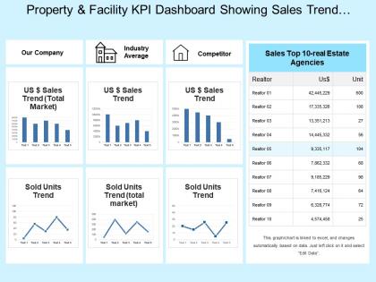
The property and facility KPI dashboard Template is a 4 stage process which incorporates features like property and facility, property and talent, and goods and facility. The Template shows a majority of factors which are very important and reliable for real estate industry. The property and facility dashboard Slide puts forth key aspects like our company(description of the company), industry average, competitors(the other real estate companies which are a tough competition), US sales trend, and sold units trend(units of property sold). The sales trend shows a pattern build by joining the numbers that show the sales price in different years. This beautiful Template also shows the top 10 real estate companies that are holding different prestigious ranks in the property consultancy market. It is very important for the real estate companies to know that what rank they are holding in hand and this only gives them more scope of improvement. This Template is very effective in showing the property sales trend in different corners of the world. Download the Template to be aware of the sales trend and performance across the world and that too in a very short span of time. Financial assistance flows in with our Property And Facility Kpi Dashboard Showing Sales Trend And Sales Performance. Folks agree to give generous grants.
People who downloaded this PowerPoint presentation also viewed the following :
Property and facility kpi dashboard showing sales trend and sales performance with all 6 slides:
Green is more than just a color with our Property And Facility Kpi Dashboard Showing Sales Trend And Sales Performance. They are committed to an eco friendly attitude.
FAQs for Property and facility kpi dashboard showing sales trend
Essential KPIs for business analysis dashboards include revenue growth, customer acquisition costs, conversion rates, operational efficiency metrics, and profitability margins. These indicators enable organizations to monitor performance across sales, marketing, and operations simultaneously, with many companies finding that strategic KPI combinations deliver enhanced decision-making capabilities and competitive advantage.
Organizations tailor KPI dashboards by selecting department-specific metrics, customizing visual layouts, establishing relevant benchmarks, and implementing role-based access controls that match each team's priorities and responsibilities. Sales teams focus on conversion rates and pipeline metrics, while HR departments track recruitment costs and employee satisfaction, ultimately enabling targeted performance management and strategic alignment across organizational functions.
Best practices for KPI dashboard design include clear visual hierarchy, consistent color coding, intuitive navigation, real-time data integration, and mobile responsiveness. These elements enhance user experience by reducing cognitive load, enabling quick decision-making, and ensuring accessibility across devices, with many organizations finding that well-designed dashboards significantly improve operational efficiency and strategic insights.
Real-time data integration transforms KPI dashboards by delivering immediate insights, eliminating data lag, enabling instant decision-making, and providing continuous performance monitoring across all business operations. Through live data feeds, organizations can respond to market changes, operational issues, and customer trends as they happen, while maintaining competitive advantage and operational efficiency, ultimately delivering faster responses and better business outcomes.
Data visualization transforms raw KPI data into intuitive charts, graphs, heat maps, and trend indicators that enable instant pattern recognition and decision-making. Through strategic visual design, executives and managers can quickly identify performance gaps, spot emerging trends, and communicate insights across departments, ultimately accelerating response times and enhancing organizational alignment in increasingly data-driven business environments.
KPI dashboards should be updated based on business needs and data velocity, with financial metrics typically refreshed daily or weekly, operational KPIs updated hourly or in real-time, and strategic indicators reviewed monthly or quarterly. Many organizations find that automated updates combined with scheduled reviews ensure data accuracy while preventing information overload, ultimately delivering timely insights that enable faster decision-making and maintain competitive advantage in dynamic market conditions.
Effective KPI dashboard tools include Tableau, Power BI, Google Analytics, Klipfolio, and Looker, each offering distinct visualization capabilities and integration features. These platforms streamline data management by automating reporting, enhancing real-time monitoring, and delivering customizable interfaces, with many organizations finding that cloud-based solutions provide greater scalability and collaborative access across departments.
Organizations ensure actionable KPI dashboards by incorporating contextual benchmarks, trend analysis, drill-down capabilities, automated alerts for threshold breaches, and clear correlation indicators between metrics. These features transform raw data into strategic intelligence by highlighting performance gaps, identifying root causes, and suggesting specific interventions, with many companies finding that role-based customization and real-time commentary ultimately drive faster decision-making and measurable business improvements.
Common KPI dashboard pitfalls include overwhelming users with too many metrics, choosing vanity metrics over actionable ones, poor visual hierarchy, lack of real-time data integration, and ignoring user-specific needs. These design flaws significantly reduce dashboard effectiveness, with many organizations finding that streamlined, role-based dashboards with 5-7 key metrics ultimately deliver better decision-making outcomes.
KPI dashboards drive accountability by providing real-time visibility into individual and team performance metrics, establishing clear benchmarks, and creating transparent progress tracking across all organizational levels. Through automated reporting and regular performance reviews, departments can identify underperformers quickly, celebrate achievements publicly, and adjust strategies proactively, ultimately fostering a results-driven culture where teams take ownership of their outcomes.
Customer satisfaction KPIs include Net Promoter Score (NPS), Customer Satisfaction Score (CSAT), Customer Effort Score (CES), retention rates, and complaint resolution times. These metrics enable organizations to streamline service delivery, enhance customer experiences, and boost loyalty, with many businesses finding that combining quantitative scores with qualitative feedback delivers comprehensive insights for strategic improvements.
Historical data can be effectively incorporated into KPI dashboards through trend lines, comparative period analysis, rolling averages, year-over-year metrics, and seasonal adjustment features. These analytical tools enable organizations to identify performance patterns, predict future outcomes, and make data-driven strategic decisions, with many companies finding that historical context significantly enhances their ability to optimize operations and maintain competitive advantage.
Essential components include revenue metrics, profit margins, cash flow indicators, expense ratios, and budget variance analysis. These financial KPIs streamline performance monitoring by providing real-time visibility, identifying trends early, and enabling data-driven decisions, with many organizations finding that comprehensive dashboards ultimately deliver faster financial insights and enhanced strategic planning capabilities.
Mobile-friendly KPI dashboards enhance accessibility by enabling real-time data access from any location, supporting touch-based interactions, and delivering instant notifications for critical metrics. These platforms streamline decision-making for executives traveling between offices, field managers monitoring operations remotely, and healthcare administrators reviewing patient data, ultimately delivering faster responses and improved operational efficiency across organizations.
User feedback enhances KPI dashboards by identifying visualization gaps, reporting inefficiencies, and data accessibility issues that developers might overlook. Through direct input from finance teams, operations managers, and executives, organizations can streamline interface design, automate critical metrics, and customize filtering options, ultimately delivering more intuitive dashboards and faster decision-making capabilities.
-
Presentation Design is very nice, good work with the content as well.
-
Great quality product.