Status Summary Powerpoint Ppt Template Bundles

Rating:
100%
Status Summary Powerpoint Ppt Template Bundles
Slide 1 of 17
Favourites Favourites

Try Before you Buy Download Free Sample Product

Audience Impress Your
Audience
Editable 100%
Editable
Time Save Hours
of Time
The Biggest Sale is ending soon in
0
0
:
0
0
:
0
0
Rating:
100%
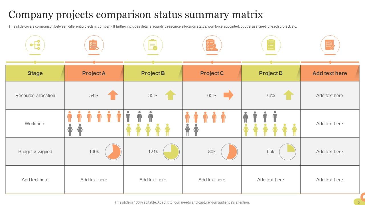
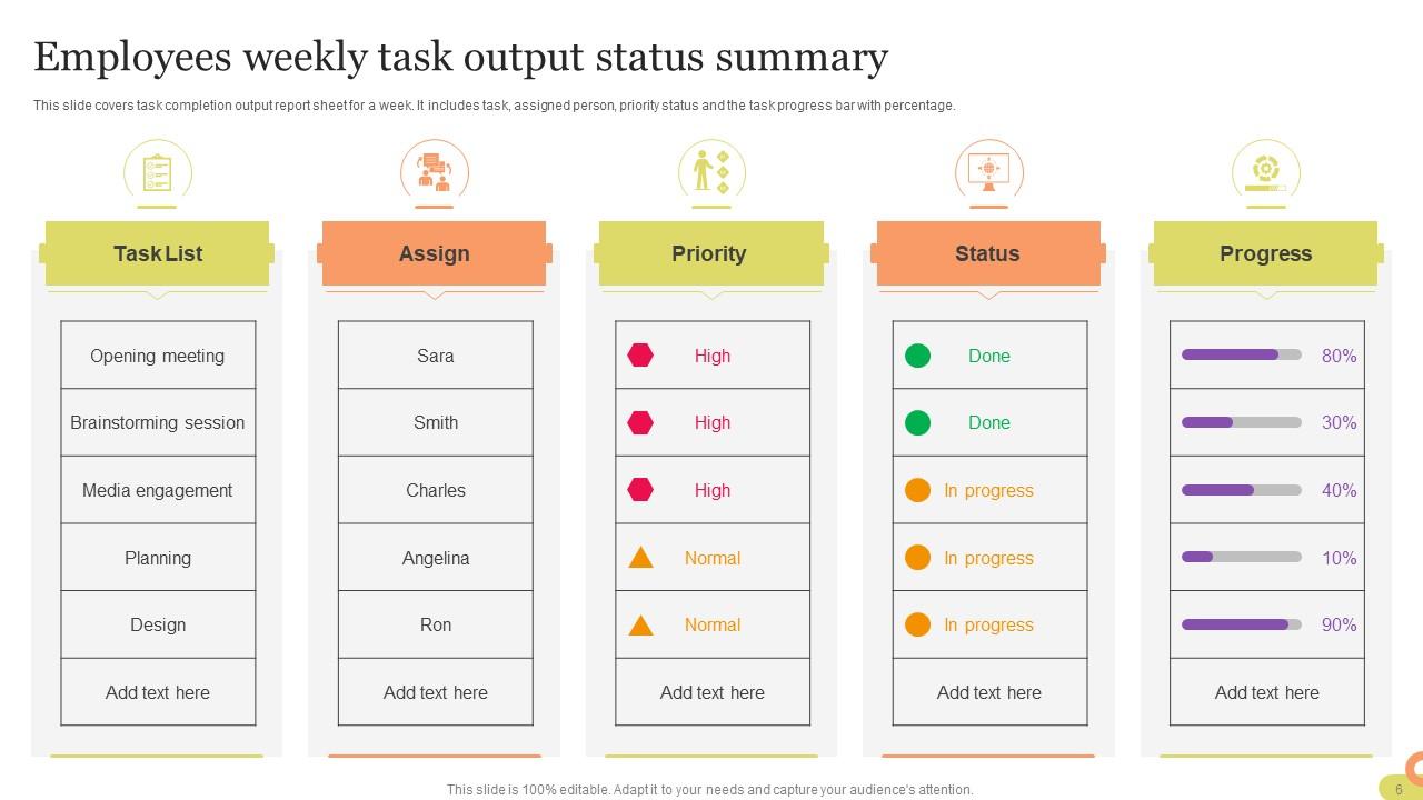
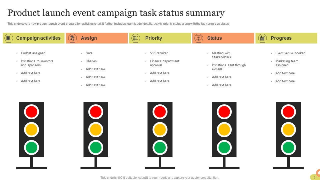
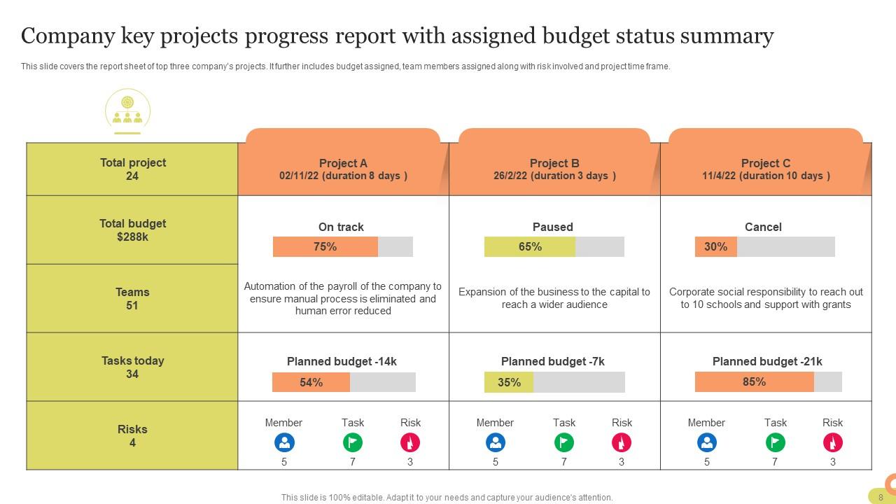
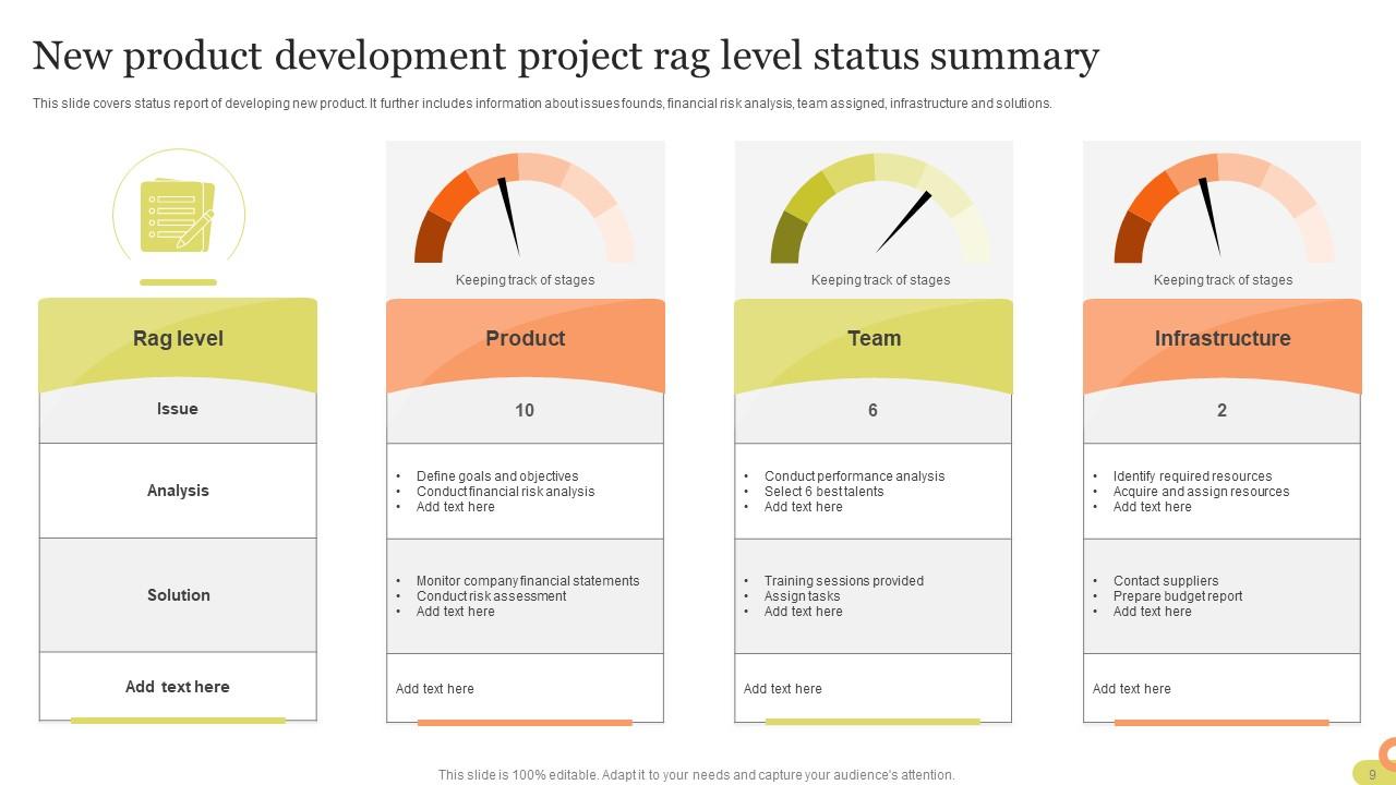
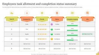
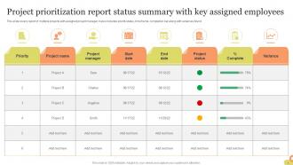
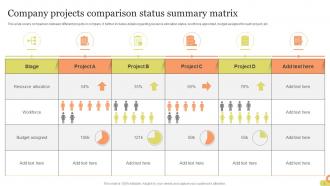
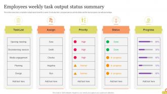
If you require a professional template with great design,then this Status Summary Powerpoint Ppt Template Bundles is an ideal fit for you. Deploy it to enthrall your audience and increase your presentation threshold with the right graphics,images,and structure. Portray your ideas and vision using twelve slides included in this complete deck. This template is suitable for expert discussion meetings presenting your views on the topic. With a variety of slides having the same thematic representation,this template can be regarded as a complete package. It employs some of the best design practices,so everything is well-structured. Not only this,it responds to all your needs and requirements by quickly adapting itself to the changes you make. This PPT slideshow is available for immediate download in PNG,JPG,and PDF formats,further enhancing its usability. Grab it by clicking the download button.

People who downloaded this PowerPoint presentation also viewed the following :

FAQs for Status Summary Powerpoint

So for status updates, you'll want the project name, progress percentage, what you've knocked out recently, and what's coming next. Blockers are huge too - call out anything that's gonna slow you down. I always add deadlines because honestly, people have zero memory for dates. Keep it punchy but detailed enough that your boss isn't confused. Oh, and make sure you say WHO is doing what in the next steps part. Nothing worse than everyone assuming someone else will handle the follow-up. Trust me on that one.

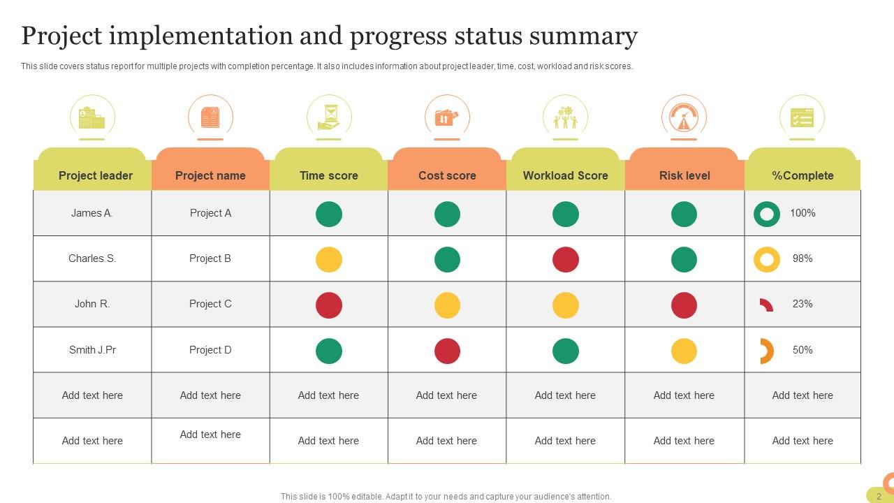
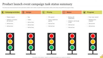
Honestly, visuals are a game changer for status updates. People can actually scan them instead of trudging through walls of text. I'm obsessed with those red/yellow/green traffic light systems - they instantly show if things are going well or totally sideways. Charts beat paragraphs every time for showing trends. Tables are perfect when you need to compare stuff side by side. Even simple icons help highlight the big wins or problems. Don't overthink it though - you're not trying to win a design award. Just pick one visual thing and watch how much faster people "get" your summary. Trust me on this one.

Honestly, it's all about giving people what they actually want to hear. Executives? Just hit them with the big picture stuff - metrics, risks, decisions that need their input. They'll zone out if you get too technical. Your team needs the opposite - all the messy details about blockers and who's handling what. Other departments... they mostly just want to know if your stuff will mess with theirs. I keep different versions of the same template, which sounds extra but trust me, it saves tons of time later. Figure out why each group reads your updates in the first place. Then cut everything else. Way less overwhelming for everyone.

Honestly, weekly works fine for most stuff, but every two weeks is totally reasonable too. Don't go crazy with daily updates unless everything's on fire - I've watched teams completely burn themselves out doing that. You'll just create a ton of busywork nobody wants to deal with. The trick is finding what keeps people in the loop without making it feel like a chore. Oh, and definitely shoot out a quick message if something major changes between your regular updates. Otherwise just stick to whatever schedule you pick. Set a calendar reminder though, because you'll totally forget otherwise.

Put the big stuff first - nobody wants to dig for what matters. Don't sugarcoat everything either. People see right through the "all good here!" updates when clearly things are messy. Skip the essay-length explanations too. Use bullet points so people can actually scan it quickly. Here's the thing though - you gotta mention what's actually stuck or where you need backup. I mean, that's literally the whole point, right? Nobody reads these things just for fun. Make it stupid easy for someone to figure out what's happening and jump in to help if they can.

Status summaries are honestly game-changers - you'll spot trends and bottlenecks super fast without drowning in detailed reports. They're perfect for those chaotic Monday meetings when everyone's demanding updates (you know the ones). High-level view helps you figure out if you need to shift budget around or escalate stuff to leadership. Key metrics show what's urgent vs. what can wait. Oh, and definitely include clear action items in your template. That's where stakeholders actually make decisions instead of just... talking about making decisions.

Honestly, just use whatever you're already comfortable with first. Word and Google Docs work fine for basic table layouts. PowerPoint's actually pretty solid if you want to throw in some charts or visual stuff. I've been using Canva a ton lately though – their business templates look way more polished than anything I could design myself lol. Notion and Airtable are cool if your team wants something interactive where everyone can jump in and update things live. But seriously, start with the simple option you know best and see how it goes.

Honestly, status templates are a game changer for keeping your team aligned. Everyone knows exactly what info to share instead of sending random updates that nobody can make sense of. Your meetings will actually be productive for once. The template should cover the basics - what got done, what's blocking you, what's next. Don't overthink it though, like 3-4 sections max. People won't have to guess how to format things anymore. I'd probably throw in a quick wins section too since teams love celebrating small victories. Trust me, once you start using one consistently, you'll wonder how you survived those chaotic update meetings before.

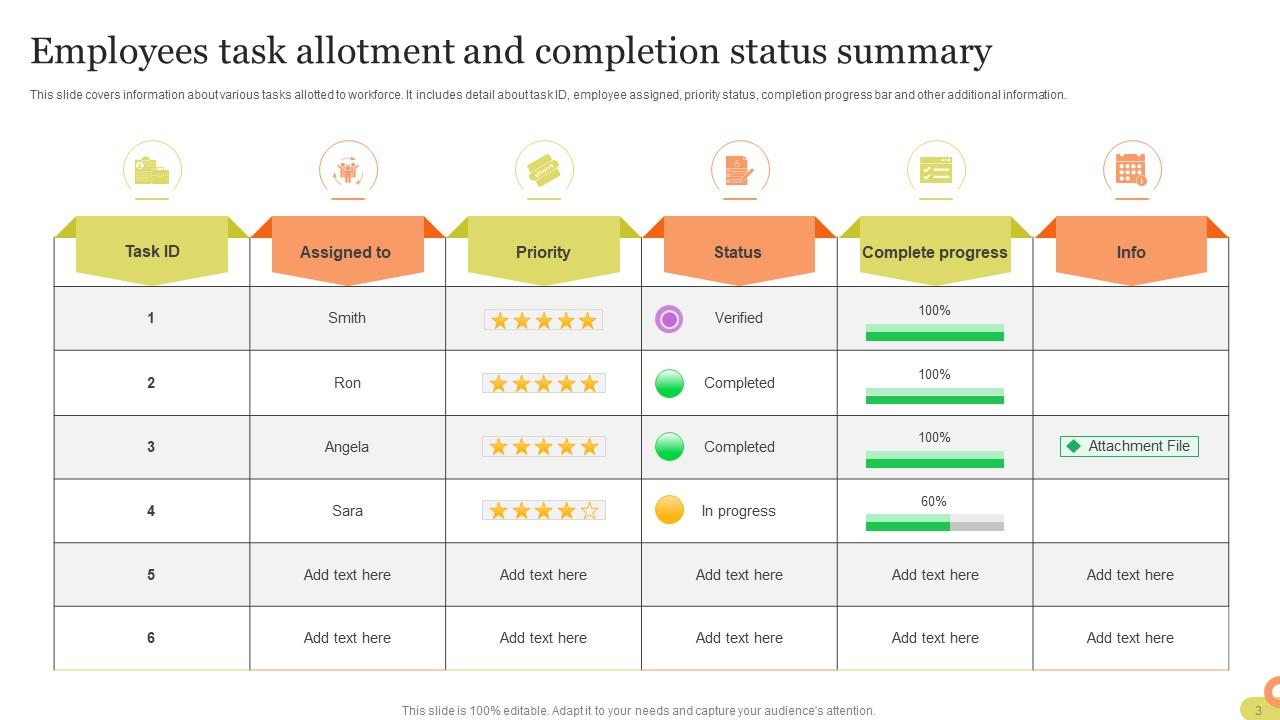
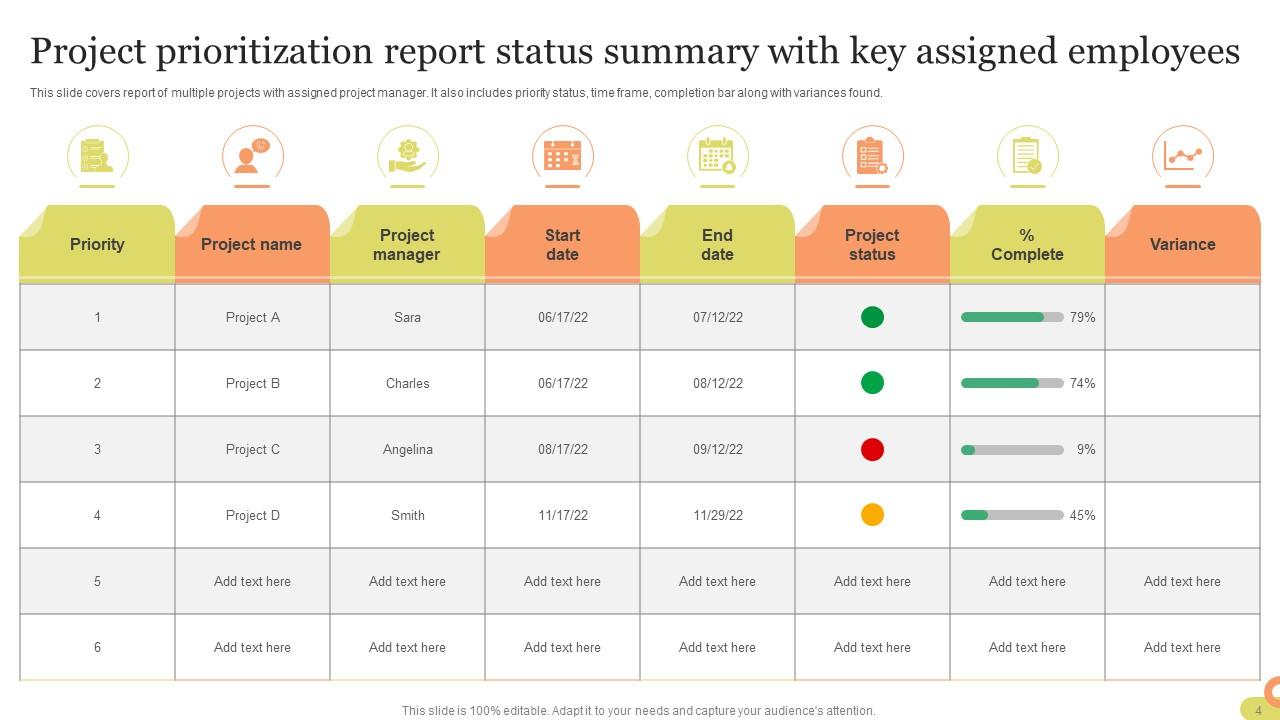
Honestly, charts and graphs are a game-changer for status updates. People's eyes just glaze over when they hit walls of text. But show them a progress bar? Boom - they instantly get where things stand. Your exec probably loves this stuff too since they can scan everything in like 30 seconds during meetings. Way better than making them dig through "Project A is 73% complete, Project B is 45% complete" - that's painful to read. Even simple traffic lights work great. Red, yellow, green and you're done. Makes it super easy to spot what's behind schedule or needs help.

So I'd build feedback right into your template - like a dedicated "Key Feedback Received" section where you summarize what people told you. Then add an "Actions Taken" part showing how you responded. I stick these right after the main status update because it keeps everything connected. People really notice when you're actually listening to them, honestly. Be specific about who said what and what you changed because of it. Oh, and try adding a simple status tag like "Addressed/In Progress/Pending" to track if you're following through. Makes the whole thing way more organized.

So basically project status is about your specific project - are we hitting deadlines, staying on budget, that kind of thing. Performance status is way broader. It's tracking how your whole team or department is doing against goals. Project summaries go to your stakeholders asking "will we finish on time?" Performance ones are more like quarterly reviews - sales numbers, customer happiness scores, whatever metrics matter. Honestly they blur together sometimes which is annoying. But think of it this way: project status has an end date, performance tracking never really stops. You'll use project summaries for launches or campaigns, performance for ongoing stuff like monthly sales targets.

Skip the boring task lists - nobody cares what you did, they want to know what decisions got made and what's blocking you. Bullet points are your friend here (trust me, paragraphs just get ignored). Keep it to 3-5 main points and ask yourself if your boss would actually care about each one. Routine stuff? Just one line. The trick is adding specific dates and who's doing what for next steps. Honestly, if someone can't figure out whether your project is on track within 30 seconds, you're doing it wrong. Make the "so what" obvious.

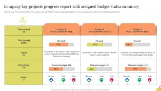
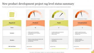
Focus on the big three first: budget vs actual spend, timeline progress, and whether you're delivering what was promised. Resource utilization matters too, plus any blockers slowing you down. Scope changes are sneaky - definitely track those! Quality stuff like defect rates help, but honestly your stakeholders just want to know if you're on time and on budget. Use those red/yellow/green indicators instead of making people read paragraphs. Nobody has time for that. Call out anything that needs their decision or they'll ignore it completely.

Honestly, you want a template that's flexible - not some rigid thing you're stuck with forever. Pick 3-4 sections that'll always stay (like timeline and budget), then build out optional chunks you can swap around. Planning phase? Focus on resources and deadlines. Execution gets all about progress tracking and what's blocking you. I've watched people force the same format through every phase and it's painful to watch. Once you're wrapping up, ditch the milestone stuff and highlight what actually got done plus lessons learned. Think modular - like building blocks you can rearrange depending on where you're at.

Honestly, digital templates are a lifesaver. Instead of starting from zero every time, you just fill in the blanks. Copy-paste data straight from other apps too. Your team can actually share stuff without those messy email threads where files get buried. Version control keeps everything organized. Plus - and this might just be me - but my handwriting looks like a third-grader's, so digital wins there. You can search through old updates later, which is clutch. Set up reminders so you don't forget deadlines. Try a basic template this week and watch your status updates get way faster.

Ratings and Reviews

100% of 100
Review Form
Write a review
Most Relevant Reviews
  1. 100%

    by Drew Alvarado

    If you are looking for satisfactory PowerPoint services, SlideTeam is your go-to place. I am fully contented with their research and development team.
  2. 100%

    by Donn Hart

    Wonderful ideas and visuals. I'm really pleased with the templates, which are unique and up to date.

2 Item(s)

per page: