Success criteria checklist ppt diagrams
Try Before you Buy Download Free Sample Product
Audience
Editable
of Time
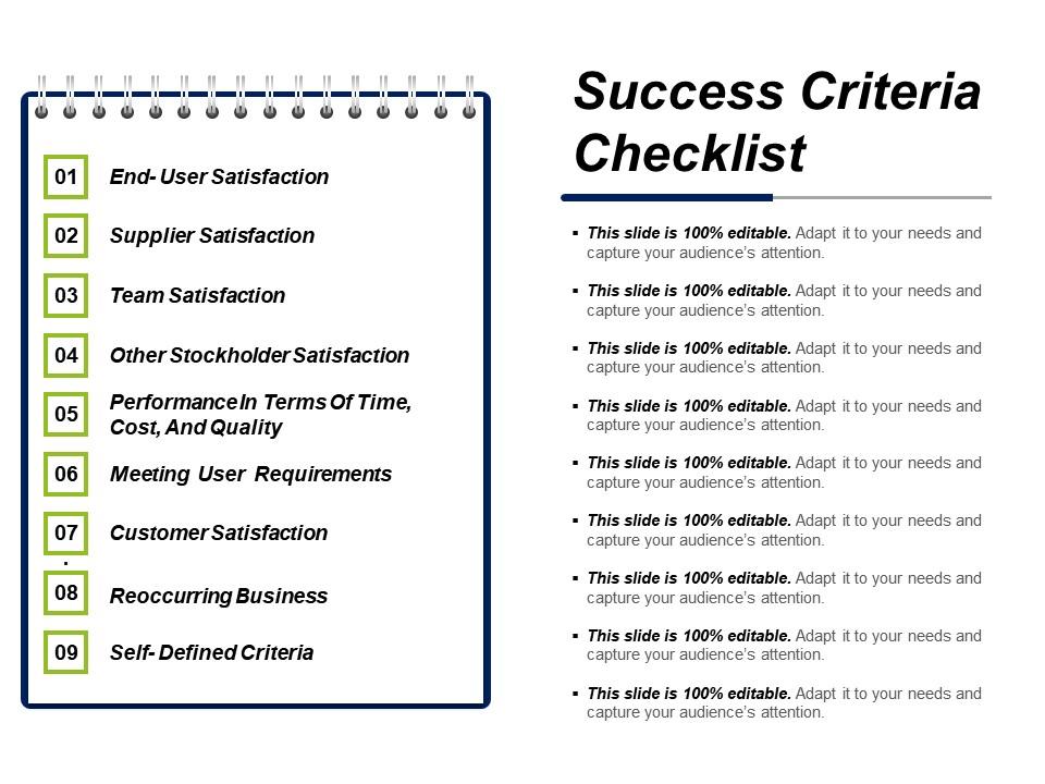
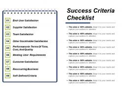
Avail the success criteria checklist PPT diagrams slideshow which is used to demonstrate the factors which reduces the failure by compensating the potential limits of human memory and attention. The internal assessment view Powerpoint shape helps the user to ensure the consistency and completeness in carrying out a task. The more advanced characteristics of this performance indicators PPT slide lays out your tasks which are to be done according to the need of hour and / or other factors. Accomplish your primary tasks in the checklist with the help of this template that is; the documentation of the task, auditing against the documentation and evaluate the success of your organization and / or of a particular activity such as projects, programs, products and other initiatives in which it is engaged. Realize it well that what is important that is; the various techniques to assess the present state of the business and its key activities which are associated with the selection of performance indicators by using the PPT which will lead you to the identification of potential improvements and performance indicators which are routinely associated with the performance improvement initiatives. Associates agree to make a bigger contribution due to our Success Criteria Checklist Ppt Diagrams. They begin to feel highly activated.
People who downloaded this PowerPoint presentation also viewed the following :
Success criteria checklist ppt diagrams with all 5 slides:
Our Success Criteria Checklist Ppt Diagrams guard against introduction of bias. It allows you to judge fairly.
FAQs for Success criteria
Okay so presentations basically boil down to three things. First, you need structure that actually makes sense - intro, main points, wrap-up. Don't just word-vomit information at people. Tell stories, ask questions, use examples they'll actually care about. Here's the thing though - even amazing content dies if you're mumbling into your slides. Practice saying it out loud beforehand (seriously, do this). Your voice and body language carry way more weight than you'd think. Make eye contact, stand up straight. Most people are rooting for you anyway, so focus on connecting with them instead of being some perfect presenter robot.
Test your presentation against three things: clarity, engagement, and impact. Can someone immediately get your main message? Do the visuals actually help or just take up space? Here's my weird trick - squint at each slide. If it's blurry mess, you've got too much stuff crammed in there. Practice out loud too, because you'll catch where you stumble or race through parts. Oh, and definitely get someone else to look at it who wasn't involved. They'll spot confusing bits you can't see anymore since you've been staring at it forever.
Honestly, if your audience is scrolling through their phones, you've already lost - doesn't matter how good your content is. Eye contact and questions mean they're actually absorbing what you're saying. I've watched brilliant speakers bomb because they ignored the room's vibe completely. Watch their body language and adjust your pace. Create space for interaction too. Oh, and here's the thing - measuring success isn't about cramming in every slide you made. It's whether people stayed tuned in the whole time. Sometimes less content with better engagement beats everything else.
Honestly, just watch people's faces and body language - that'll tell you everything. Are they leaning in, taking notes, making eye contact? Or scrolling their phones and looking bored? For virtual stuff, check if people are actually responding to polls and staying till the end (dropout rates are brutal but useful). Q&A participation is huge too. After your presentation, look at follow-up questions and whether people actually do what you asked them to. Oh, and feedback surveys help, though everyone says they're "satisfied" anyway. Pick like 2-3 things to focus on so you don't overthink it.
Dude, visual clarity will literally make or break your whole presentation. I've watched amazing speakers completely tank because their slides looked like garbage - people just sit there squinting instead of actually listening to what you're saying. Keep your fonts readable and graphics simple. Your visuals need to back up your story, not fight against it. Here's what I always do: stand at the back of the room and see if you can actually read your slides. If you're struggling to see them, your audience definitely won't be able to either.
Okay so three things that actually work: Tell your story with a beginning, middle, and end instead of just throwing data at people. Use real examples too - like actual case studies where stuff happened. People remember stories way better than boring concepts (learned this when I bombed a presentation once lol). Also create some kind of emotional connection. Show how your work affects real humans or what happens if nothing gets done. Practice your transitions so it doesn't sound choppy. Oh and pick one main story that proves your point - that's honestly the most important part.
Dude, timing is everything with presentations. Going over makes people zone out on their phones even if your stuff's good. But finishing way early? That's almost worse - looks like you didn't prepare enough or just rushed through. Aim for like 90-95% of your slot. Shows you respect everyone's time but actually covered what you needed to. I totally bombed this in a meeting last month lol. Practice with a timer! And maybe build in some wiggle room so you can slow down or speed up as needed.
Ugh, tech issues are the absolute worst - your slides crash, mic dies, whatever. Always have backup plans ready. Also don't jump straight into boring details right away or you'll lose people immediately. Time management kills presentations too - either you're racing through slides or going way over. Here's the thing though: if you see people checking phones and looking dead inside, pivot! Don't just keep reading your script. Start with something that actually grabs attention, then watch faces throughout. Trust me, body language tells you everything you need to know.
Getting feedback after your presentation is honestly a game-changer. You want to ask people while everything's still fresh - like what worked, what didn't make sense, when they mentally checked out. Way better than wondering later what went sideways. I always do a quick survey or just grab a few people afterward for honest takes. Don't ask "how was it?" though - that gets you nowhere. Ask specific stuff. You'll start seeing patterns in what people say, which shows you exactly where to improve next time. Trust me, it beats flying blind.
Honestly, it's all about knowing your crowd ahead of time. Execs want the big picture stuff - ROI, outcomes, skip the weeds. Technical folks are the opposite - they're gonna want all your data and methodology. Mixed audiences are brutal though, you basically have to layer everything so the non-techy people don't get lost. Swap your examples for stuff they'll actually relate to from their industry. I always keep backup slides ready at different detail levels because you never know. Oh, and research beforehand - sounds obvious but people forget to do this and then wing it.
Honestly, templates are pretty clutch for presentations. You're not staring at a blank slide wondering where to start, and they keep everything looking consistent - which matters more than you'd think. Nobody wants to watch slides that look like a hot mess. But here's the thing: don't just slap your content into a template and call it done. That screams lazy. Switch up the colors, maybe tweak the fonts a bit. Make it yours somehow. Otherwise you'll end up with the same boring presentation as everyone else who downloaded that template. It's about finding that sweet spot between structure and personality.
First thing - figure out who you're actually talking to and what they need from you. I usually structure mine with the main point right at the top because nobody has time to guess what you're getting at. Here's something that sounds obvious but works: cut your content in half, then do it again. Honestly, most presentations are way too long. Back up your points with real examples and data - vague stuff doesn't stick. Oh, and run it by someone else first if you can. Every slide should have a reason for existing, otherwise ditch it.
Okay so here's what I always do - figure out your most important info first, then add design stuff around it. Don't let the visuals compete with your actual message, you know? Clean layouts work way better than cluttered ones. Use white space and stick to consistent fonts. I swear I've seen gorgeous designs where you couldn't even find the main point! Try this weird trick: squint at your design. Can you still spot the key info? If not, you need to simplify. Also ask yourself if someone could quickly grab what they need. Sometimes boring actually works better than fancy.
Figure out your main point first - like, the ONE thing you want people to remember. Everything else should back that up. I see so many presentations that try to cram in every possible detail and honestly? Nobody retains any of it. Stick to 2-3 key points max. Rank your supporting stuff by how well it reinforces your core message. If someone walked out mid-presentation (rude but whatever), what would you want them to already know? That's your anchor. Build around it and you'll actually have impact instead of just... information overload.
Okay so rehearsal is basically your safety net - helps you nail the timing and catch any weird gaps before showtime. You wouldn't just wing a dinner party recipe, right? Same deal here. Do at least one full run-through out loud (seriously, you'll be shocked what you notice when you actually say the words). Look for spots where you're rushing through explanations or where slides don't flow smoothly. Oh and check if you're actually hitting those success criteria you mapped out - sometimes we think we covered something but didn't really. It's way better to find problems now than mid-presentation.
-
Designs have enough space to add content.
-
Topic best represented with attractive design.