

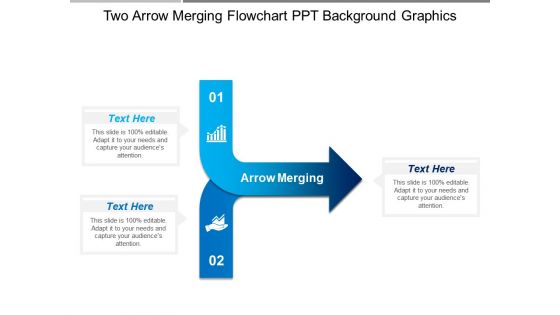
Two arrow merging flowchart ppt background graphics





Try Before you Buy Download Free Sample Product
 Impress Your
 Audience
 100%
100% Editable
 Save Hours
 of Time


Our Two Arrow Merging Flowchart Ppt Background Graphics are an effective glue. They ensure excellent bonding.
People who downloaded this PowerPoint presentation also viewed the following :
Two arrow merging flowchart ppt background graphics with all 5 slides:
Our Two Arrow Merging Flowchart Ppt Background Graphics have many educative features. They can be an academic boon.
FAQs for Two arrow merging flowchart
You want clear start/end points and stick to standard shapes - rectangles for processes, diamonds for decisions. Keep your text short inside each box because reading tiny text sucks. Flow should make sense with arrows connecting everything properly. Honestly, spacing matters more than people think - sloppy alignment makes the whole thing look amateur. Don't create dead ends or weird loops that confuse people. Test it out on someone first. If they can't follow it easily, you'll need to fix it before presenting. The whole point is making complex stuff simple to follow.
Honestly, flowcharts are lifesavers for breaking down complicated stuff into steps people can actually digest. Your audience won't have to wade through paragraphs of dense text – they can just follow the visual path from point A to B. Most people learn better visually anyway (I know I do). Plus you can point to specific boxes when someone asks a question later. The sequential layout helps folks stay oriented too. Oh, and definitely use colors or little icons to make different step types pop – makes the whole thing way easier to scan quickly.
Honestly, the worst thing you can do is cram too much text into each box - nobody wants to read a novel in your flowchart. Stick with the basic shapes everyone knows: rectangles for steps, diamonds for yes/no decisions. Keep your arrows clean too, not zigzagging everywhere like some maze. I learned this the hard way when my boss couldn't follow mine at all lol. Spacing matters more than you'd think. Oh, and walk through it yourself first - if you can't follow your own logic smoothly, it's back to the drawing board.
Oh man, consistency is everything with flowchart colors and shapes! I stick to the same color for similar stuff - like blue for user actions, green for system responses. Standard shapes too: rectangles for processes, diamonds for decisions, ovals for start/end. Trust me, I made this crazy rainbow flowchart once that nobody could follow. People need predictable choices so they're not sitting there wondering what your random purple hexagon means, you know? Just make a simple legend and you're set. Short sentences work better than long ones anyway.
Honestly, Lucidchart and Microsoft Visio are your best bets - they're made for this stuff and have everything built in. Draw.io is completely free though, which is clutch if you don't want to spend anything right now. I actually use it for most of my basic flowcharts. Miro and Figma work too if you're already on those platforms, and PowerPoint works for super simple ones (though it's kind of annoying for anything complex). Start with Draw.io since it won't cost you anything, then maybe upgrade later if you need fancier features.
Just swap out the symbols and terminology to match whatever industry you're working with. Healthcare? Use medical icons and patient flow language. Manufacturing gets process symbols and quality checkpoints instead. The basic structure stays the same though - it's literally like putting new clothes on the same framework. Make sure you're using symbols people in that field actually recognize (nothing worse than confusing your audience). Adjust colors to look professional for that industry. Honestly, I'd just grab a basic template and customize it from there - way easier than starting from scratch.
Think of flowchart symbols as your visual shorthand - each shape has a job. Ovals mark where things start and end. Rectangles? That's where the actual work happens. Diamonds are for decisions (yes/no, this or that). Parallelograms handle input/output stuff. Honestly, there's like a million other symbols out there, but these four will handle most situations. I've never needed the fancy ones tbh. Just pick your symbols and stick with them - nothing's worse than confusing your teammates because you randomly switched from diamonds to circles halfway through.
Honestly, flowcharts are game-changers for breaking down messy processes. Your brain can actually follow the visual steps without getting totally lost in the weeds. Way better than slogging through walls of text, you know? You'll spot bottlenecks and missing pieces way faster when everything's mapped out visually. It's like having a roadmap for complicated stuff - you always know what's next. I probably should've started using them years ago for work presentations. Next time something feels too complex to explain, just sketch out a quick flowchart first. Makes everything so much clearer.
Flowcharts are perfect for messy processes with lots of decision points - like troubleshooting stuff or approval workflows. Basically anything with "if this, then that" logic. They're amazing for training new people too (way better than those boring manual docs everyone ignores). I'd start with whatever process drives you most crazy right now. Make sure it has clear beginning and end points though. The branching paths are where flowcharts really shine - people can actually follow the logic instead of getting lost. Trust me, once you map out one gnarly process, you'll want to flowchart everything.
Just copy-paste them as images into your existing templates, or rebuild them using the shape tools in PowerPoint/Google Slides. Grouping all the flowchart pieces together is clutch - otherwise you'll go crazy trying to move everything one by one. Match your colors and fonts to whatever branding you've got going on. Oh, and create one master flowchart slide first, then duplicate it when you need different versions. Trust me, it's way faster than starting from scratch each time. The built-in tools are honestly better than most people think.
Honestly, the trick is revealing boxes one by one instead of dumping everything on screen at once. Those "draw-on" arrow effects are super satisfying - they trace the path while you talk. I always highlight the current step in bright blue or whatever, keeps people focused. Oh and the zoom-in thing works great for decision points, though don't go overboard or it gets dizzy. Match your animation timing to how fast you actually speak - sounds obvious but tons of people mess this up. Start with basic fade-ins first. You can get fancy later once you figure out what feels right.
Dude, flowcharts are honestly a game-changer for messy problems. You sketch out each step and decision point, and suddenly you can actually see where your logic breaks down. I swear by them now - probably overuse them tbh. What's cool is you can trace different paths and see how they play out. Your team will thank you too since everyone's looking at the same visual roadmap instead of guessing. My manager's obsessed with them which is... whatever. But seriously, next time you're stuck just grab some paper and start mapping it out. Makes everything so much clearer.
Start/end points should be bigger and bolder - they're your anchor points. Decision diamonds and process boxes can be smaller. Honestly, cramming everything together is the fastest way to make it look like garbage. White space actually helps people follow the flow. I'd stick with maybe 2-3 colors tops, and save your brightest one for the most important paths. Keep your fonts consistent too - bigger text for main stuff, smaller for details. Quick tip: sketch it on paper first. If your eye doesn't naturally follow the path, neither will anyone else's.
Okay so three big things - alt text, color contrast, and labeling. Don't just write "flowchart image" for alt text (honestly, that drives me crazy). Screen readers need you to actually describe the flow process. High contrast colors are crucial, but here's the thing - never rely on color alone to show connections. Add text labels or different shapes too. Make your text big enough! I always do the squint test from across the room. Can't read it? Neither can anyone else. Oh, and definitely include a text version listing all the steps as backup. Trust me on this one.
Make your flowchart labels short and punchy - verbs work way better than nouns. Like "Review document" instead of just "Document review." Decision points should be simple yes/no questions. I swear, half the flowcharts I see are just confusing word salad. Keep fonts consistent throughout (sounds boring but it actually helps). Don't go crazy with annotations - only add them when you really need extra context. Here's the real test though: grab someone and walk them through it. If they're scratching their head, your labels aren't clear enough.
-
Really like the color and design of the presentation.
-
Enough space for editing and adding your own content.