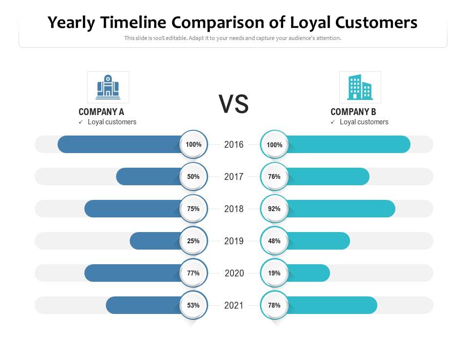
Yearly timeline comparison of loyal customers

Rating:
89%
Yearly timeline comparison of loyal customers
Slide 1 of 2

or

Favourites Favourites

Try Before you Buy Download Free Sample Product

Audience Impress Your
Audience
Editable 100%
Editable
Time Save Hours
of Time
The Biggest Sale is ending soon in
0
0
:
0
0
:
0
0
Rating:
89%
Introducing our premium set of slides with Yearly Timeline Comparison Of Loyal Customers. Ellicudate the two stages and present information using this PPT slide. This is a completely adaptable PowerPoint template design that can be used to interpret topics like Company A, Company B. So download instantly and tailor it with your information.

People who downloaded this PowerPoint presentation also viewed the following :

FAQs for Yearly timeline comparison

Make sure your branding looks clean and consistent - customers need to feel like they're working with a legit company. Always use their name in presentations and tailor everything to their specific problems. Generic decks are honestly the worst for building loyalty. Keep slides simple with lots of white space so your message actually gets through. Oh, and always include clear next steps at the end with follow-up timelines. Your design should help tell the story, not dump a bunch of data on them. I'd create templates for different customer types - saves time but still feels personal.

Look, customer feedback is basically your secret weapon for building templates that actually work. When clients say they need clearer pricing or more visuals, just build that stuff directly into your standard deck. Why guess when they're literally telling you what converts? Also pay attention to which slides always trip people up - that's gold for knowing what to fix. I've been doing this wrong for years honestly, making new presentations from scratch each time. Way smarter to use what you already know works. Start with your last 10 feedback sessions and find the top 3 things people keep asking for.

Pretty templates make a huge difference, honestly. People actually read stuff that looks good - ugly emails get deleted instantly. I mean, we're all shallow when it comes to design, right? Good templates make you look legit and professional, plus customers start recognizing your brand. There's research showing branded emails get 30% higher click rates, which is wild. Oh, and consistent design builds trust too - nobody wants to deal with companies that look sketchy. I'd start with maybe 2-3 template versions for your main customer emails and see how it goes.

Dude, stories just hit different than throwing numbers at people. When you tell a real customer success story instead of rattling off features, suddenly your boring product demo becomes something they actually care about. People remember stories way longer because they can picture themselves in that situation. Honestly, I've watched this work so many times - abstract benefits become crystal clear when there's a human element. Next time you're presenting, open with how you solved the exact same problem for another client. Trust me, it works.

Honestly, case studies with solid before/after numbers work best. Like "boosted revenue 40%" instead of fluffy praise nobody cares about. Video testimonials are gold - you can actually see if someone's being genuine or just reading a script. Quote cards with photos and logos are solid too, just keep them simple. Oh, and those "day in the life" stories? They're surprisingly effective because people can picture themselves using your stuff. Just make sure everything's specific to who you're targeting. Don't forget to get permission first - learned that one the hard way!

Honestly, consistent branding in your presentation templates makes a huge difference for keeping clients around. People trust companies that look put-together - same fonts, colors, layouts every time. I've watched businesses tank their credibility with messy, all-over-the-place slide decks. It's like wearing mismatched shoes to a job interview, you know? Plus your whole team ends up looking way more professional when everyone's using the same format. Oh, and it actually saves time too since people aren't reinventing the wheel each presentation. Just make 2-3 solid templates everyone can grab and you're golden.

Track customer satisfaction right after presentations - that's your first move. Then watch follow-up engagement like email opens and meeting requests. Honestly, the retention rate comparison is huge - customers who got solid presentations vs those who didn't. I'd also measure time-to-churn and renewal rates. Presentation quality gets tricky since it's kinda subjective, but a basic internal scoring system works. Cross-reference with revenue per customer and expansion sales. Don't go crazy though - pick 2-3 metrics that match what you're already tracking. You'll burn out trying to measure everything.

Honestly, segment your templates around what each group actually cares about. Finance folks want ROI numbers, while tech teams get excited about innovation stuff. Match your messaging and case studies to their specific headaches - I've watched this approach absolutely crush it when done right. People engage way more when content feels like it was made just for them, which sounds obvious but most companies still send generic garbage. Start with your biggest 3-4 segments and build around their real problems. Short sentences work. Then mix in longer ones that actually flow naturally when you're explaining the strategy.

Honestly, the worst thing you can do is dump way too much info on them. People zone out instantly. Generic slides are another killer - customers know when you're using the same boring deck for everyone. Those cheesy stock photos with people pointing at graphs? Cringe. Keep your slides clean and readable. Make it about THEIR problems, not your company's features. Actually listen to what they told you beforehand, then customize at least 30% of your content to their specific industry. Shows you actually care instead of just going through the motions.

Honestly, your presentation analytics are like a goldmine for figuring out what actually keeps customers around. Pay attention to which slides people engage with most - that's your sweet spot content right there. When clients consistently skip your pricing slides, it tells you something interesting about their priorities (cost might not be the dealbreaker you think it is). Notice where they ask tons of questions or linger longer than usual. Then use all that info to craft better follow-up materials and tailor your retention efforts. The patterns don't lie - they'll show you what genuinely hooks people long-term.

Honestly, interactive stuff works wonders - throw in clickable hotspots or polls to keep them engaged. Personalization is where you'll really win though. Pull in their company info, past successes, maybe upcoming renewal dates. Video testimonials from similar clients are gold (we actually started doing this last quarter and wow). Oh, and try gamifying sections where they unlock content as they go. Each deck should feel custom-built for them, not some cookie-cutter thing. Progress bars showing their journey milestones help too. I'd switch up your templates every few months so things don't get boring. Short version: make it feel personal and interactive.

Getting feedback on your templates is honestly a game-changer for keeping customers around. You'll see exactly what's bugging people before they bail. Quick fixes based on their input can save tons of churn. People also get weirdly attached when they feel like you actually listen to them - it's psychology or whatever. The trick is showing them you made changes based on what they said. Don't just collect feedback and ghost them. Add a simple feedback widget to your template library. Review responses weekly and actually do something with them. Your retention will thank you.

So here's the thing - better presentation skills literally help your team show customers their actual ROI during renewals and check-ins. Customers need to *see* the value they're getting, not just hear about it. Your people will handle pricing objections way more smoothly too. Honestly, I think the confidence boost alone is worth it - nobody likes stumbling through tough stakeholder questions. When your team can tell a good story with their data, it builds way more trust than just rattling off numbers. I'd start with teaching them how to handle objections during customer meetings.

Yeah, seasonal templates totally work for keeping customers around when you do them right. People love feeling like you actually get what they're dealing with - whether it's holiday stress or back-to-school chaos. I've watched companies nail this with their timing. Just don't go so hard on the trends that you lose your brand identity, you know? That's where people mess up. Keep your main message consistent while switching up the design and seasonal stuff. Your customers should still recognize you underneath all the pumpkins and snowflakes or whatever.

Dude, this is actually backed by real data. Salesforce saw renewal rates jump 23% just from cleaning up their presentation templates - apparently messy decks made customers doubt their skills. Wild, right? HubSpot tracked this too and found 31% better retention when clients got polished quarterly reviews vs basic ones. Microsoft's enterprise team noticed something similar - good-looking customer presentations linked to 18% longer contracts. Honestly, I never thought slide design mattered that much for keeping clients around, but the numbers don't lie. Worth putting effort into those decks.

Ratings and Reviews

89% of 100
Review Form
Write a review
Most Relevant Reviews
  1. 80%

    by Charlie Jones

    Excellent work done on template design and graphics.
  2. 80%

    by Darnell Tucker

    Great product with effective design. Helped a lot in our corporate presentations. Easy to edit and stunning visuals.
  3. 100%

    by Dale Tran

    Great product with effective design. Helped a lot in our corporate presentations. Easy to edit and stunning visuals.
  4. 80%

    by Edmond Estrada

    Awesome use of colors and designs in product templates.
  5. 80%

    by Columbus Vasquez

    Excellent Designs.
  6. 100%

    by James Lee

    The Designed Graphic are very professional and classic.
  7. 80%

    by Edmond Estrada

    Great product with effective design. Helped a lot in our corporate presentations. Easy to edit and stunning visuals.
  8. 100%

    by Denny Salazar

    Unique and attractive product design.
  9. 100%

    by Dominique Vazquez

    Awesomely designed templates, Easy to understand.
  10. 80%

    by Smith Gomez

    Easy to edit slides with easy to understand instructions.

Items 1 to 10 of 11 total

    Page:
  • You're currently reading page 1
  • Page 2
  • Next
per page: