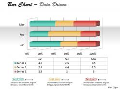
Data driven 3d chart to represent quantitative differences powerpoint slides
Our Data Driven 3D Chart To Represent Quantitative Differences Powerpoint Slides have a unique quality. They imprint themselves in the mind in an everlasting way.
You must be logged in to download this presentation.
 Impress your
 audience
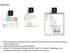
Editable
of Time
PowerPoint presentation slides
We are proud to present our data driven 3d chart to represent quantitative differences powerpoint slides. Our Data Driven 3D Chart To Represent Quantitative Differences Powerpoint Slides Power Point Templates Will Generate And Maintain The Level Of Interest You Desire. They Will Create The Impression You Want To Imprint On Your Audience. Our Data Driven 3D Chart To Represent Quantitative Differences Powerpoint Slides Power Point Templates Are Effectively Color Coded To Priorities Your Plans. They Automatically Highlight The Sequence Of Events You Desire.
Data driven 3d chart to represent quantitative differences powerpoint slides with all 3 slides:
Be the Dean with our Data Driven 3D Chart To Represent Quantitative Differences Powerpoint Slides. Your thoughts will prove their supremacy.
-
Best way of representation of the topic.
-
Thanks for all your great templates they have saved me lots of time and accelerate my presentations. Great product, keep them up!


