


Compliance And Legal Kpi Dashboard Showing Cases By Due Date





Try Before you Buy Download Free Sample Product
 Impress Your
 Audience
 100%
100% Editable
 Save Hours
 of Time


Generate effervescence with our Compliance And Legal Kpi Dashboard Showing Cases By Due Date. Get your audience bubbling with enthusiasm.
People who downloaded this PowerPoint presentation also viewed the following :
Content of this Powerpoint Presentation
Description:
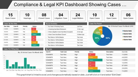
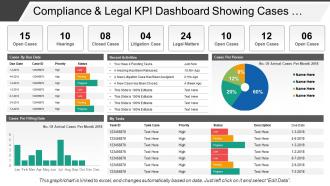
This image displays a "Compliance & Legal KPI Dashboard" that is likely used to track and monitor various legal activities and cases within an organization. The dashboard is segmented into different panels with the following key text elements:
1. Open Cases, Hearings, Closed Cases, Litigation Case, Legal Matters:
These headline figures provide a clear count of ongoing, upcoming, and concluded legal engagements.
2. Cases By Due Date:
A table listing cases sorted by due dates with corresponding case IDs, priority, and statuses such as late, pending, or progress. It's meant to highlight urgent tasks and help prioritize work.
3. Recent Activities:
A list showing the most recent updates, like pending tasks or concluded events, with a timestamp indicating how recent the activity took place.
4. Cases Per Person:
This shows an individual breakdown of the open cases attributed to specific personnel or departments.
5. Cases Per Filing Date:
A bar graph comparing the number of cases filed each month, providing insight into work volume and trends over the year.
6. My Tasks:
A personalized task list with IDs, descriptions, priorities, statuses, and due dates, meant for the individual user's action items.
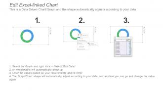
At the bottom of the dashboard, there's a short note highlighting that the graph and chart data are linked to an Excel file and can be edited automatically based on the data when the user selects "Edit Data".
Use Cases:
This type of dashboard could be applied to numerous industries where legal and compliance monitoring is crucial.
1. Law Firms:
Use: Manage caseloads and monitor legal task progress
Presenter: Legal Operations Manager
Audience: Lawyers and Legal Assistants
2. Corporate Legal Departments:
Use: Track corporate compliance, hearings, and legal matter statuses
Presenter: Chief Legal Officer
Audience: Corporate Executives and In-House Counsel
3. Government Agencies:
Use: Oversight of legal proceedings and compliance metrics
Presenter: Department Head or Compliance Officer
Audience: Agency Employees and Oversight Committees
4. Healthcare:
Use: Monitor compliance with healthcare regulations and patient cases
Presenter: Compliance Director or Healthcare Administrator
Audience: Healthcare Staff and Management
5. Banking & Finance:
Use: Ensure adherence to financial regulations and manage legal matters
Presenter: Compliance Manager
Audience: Financial Analysts and Risk Officers
6. Environmental Agencies:
Use: Track environmental litigation and compliance with regulations
resenter: Environmental Compliance Specialist
Audience: Environmental Scientists and Policy Makers
7. Education Institutions:
Use: Oversee compliance with educational laws and handle legal cases
Presenter: Legal Affairs Director
Audience: School Administrators and Education Board Members
Compliance And Legal Kpi Dashboard Showing Cases By Due Date with all 6 slides:
Our Compliance And Legal Kpi Dashboard Showing Cases By Due Date are genuinely inexpensive. You will find the cost extremely easy to bear.
FAQs for Compliance And Legal Kpi Dashboard Showing Cases
Focus on five main things for your compliance dashboard. Violation rates and trends first - shows you exactly where things are breaking down. Audit scores matter too, obviously. Don't forget upcoming regulatory deadlines because those sneak up fast. Training completion is actually huge since most people mess up because they genuinely don't know the rules. Track how long it takes to fix issues when they happen. Risk exposure metrics are good if you can swing it. Keep everything visual though - when auditors show up, the last thing you want is everyone scrambling through endless spreadsheets trying to find answers.
Pick 3-5 core metrics that everyone can actually track - completion rates, audit scores, incident counts work well. Each department uses the same basic framework but measures their own risk stuff (legal compliance is totally different than safety, right?). Monthly rollups are your sweet spot for getting the big picture without getting buried in data. A centralized dashboard helps, but honestly the hardest part is just getting buy-in from all the departments first. Once you've got that working smoothly, then you can add more sophisticated metrics. Start simple though - I've seen too many people try to boil the ocean on this.
Honestly, good data visualization is what saves your compliance dashboard from being totally useless. Charts and heat maps let people actually see problems right away instead of staring at endless spreadsheet rows - which nobody has time for anyway. Those red/yellow/green indicators? Game changer for spotting risk areas fast. You'll want different chart types for different metrics though. The best dashboards let you zoom out for the big picture, then drill down when something looks off. Trust me, your stakeholders will actually use it if they can understand it at a glance.
Honestly, monthly reviews are the bare minimum but quarterly deep dives work way better. Pick a schedule and actually stick to it - don't just do random panic reviews when stuff hits the fan (though yeah, those still happen). If you're in something heavily regulated or dealing with major changes, you might need to check dashboard metrics more often. I do monthly for tracking trends, then quarterly for tweaking the actual KPIs. Put it on everyone's calendar now and assign specific people to own it. Otherwise it'll just get pushed off forever.
Oh man, data silos are the worst - nothing talks to each other and you're stuck with messy, inconsistent info everywhere. Plus everyone wants their pet metrics on the dashboard, so it becomes this cluttered nightmare. Honestly, half the battle is just getting people to care about compliance stuff since it's not exactly thrilling. Don't even get me started on picking KPIs that actually matter instead of just what's easy to track. My take? Keep it stupid simple at first. Pick maybe 3-5 things that really move the needle, prove it works, then add more later.
Dude, automation just cuts out all those stupid manual errors we always make. No more copy-pasting wrong numbers or using last month's data by accident - been there way too many times! Your systems talk directly to each other now, so KPIs update automatically. Calculations stay consistent, which honestly makes your trending reports actually useful for once. You can set alerts too, so when something hits a threshold you'll know right away. Way better than scrambling to fix problems after they've already blown up.
Honestly, just tackle whatever's giving your legal team nightmares first. SOX if you're dealing with financial stuff, GDPR for data privacy, HIPAA if healthcare's your thing. Go for the ones with brutal penalties and frequent reporting - those are your auditors' favorites anyway. Don't get caught up building some perfect system right away though. Pick your top 3-5 regs that actually impact daily operations, not just compliance theater. You can always add more later once you've got the heavy hitters locked down.
So these dashboards basically let you watch your compliance stuff in real-time, which is pretty clutch. You can catch problems early instead of getting blindsided later. All your key metrics live in one spot - audit results, who's done their training, policy screw-ups, whatever. The cool part is tracking trends over time. Like maybe accounting always misses their deadlines or your onboarding process keeps getting flagged. Once you see those patterns, you know exactly where to focus your efforts (and budget). Leadership loves seeing actual proof that compliance spending works too. I'd start with whatever keeps you up at night first - your riskiest areas.
Put your most critical stuff right at the top - violation rates, audit scores, regulatory deadlines. Honestly, I've seen way too many dashboards that look like someone threw up a box of crayons on them. Stick with simple colors: green for good, red for urgent, yellow for watch closely. Group related KPIs together so they actually make sense. Use labels that don't require a compliance degree to understand. Your data needs to refresh often enough to be useful, and design this thing for the people who'll actually use it. If compliance officers can't instantly spot problems, you've basically wasted everyone's time.
Map those compliance KPIs to actual business pain points - revenue protection, efficiency gains, risk mitigation. "Number of audits completed" means nothing to executives. Show them "revenue at risk from non-compliance" instead. Most dashboards look pretty but miss the point entirely. Ask leadership what's keeping them awake, then reverse-engineer your metrics to address exactly those fears. Your quarterly reviews will actually matter once you're speaking their language. Oh, and run those alignment sessions every quarter - keeps everyone honest about priorities.
Look at your employee reporting rates first - that's where you'll see if people actually trust the system. Training completion matters, but only if you're testing real comprehension, not just clicking through slides. Survey data on whether folks feel safe speaking up? That's gold right there, way better than just counting violations after the fact. Quick escalation and resolution times show your process actually works. Oh, and definitely track repeat violations by department - shows you exactly where managers aren't doing their job reinforcing this stuff. Focus on behaviors over raw numbers since violations are already too late.
So basically, these dashboards catch problems before they blow up into bigger issues. You'll spot weird patterns - like training rates dropping off or one department racking up way more violations than others. The visual stuff makes it super obvious when something's off. Instead of finding out during your yearly audit that things went sideways six months ago (which sucks), you can actually fix problems as they happen. Honestly, beats the hell out of playing catch-up. Plus you can see trends across regions and figure out which processes are consistently breaking down.
Start with role-based training - no point overwhelming everyone with stuff they don't need. Compliance people get the full breakdown on alerts and trends. Executives just need high-level dashboards and how to dig deeper when something looks off. Most folks freak out seeing tons of charts initially, which is totally normal. Focus each person on their actual job KPIs. Run workshops with real data, not those cheesy demo scenarios. Oh, and definitely pick department champions who can field random questions - saves you from being the go-to person for every little thing.
Honestly, Power BI is probably your best choice here - integrates really well with Microsoft stuff most companies already have. Tableau and Qlik Sense are solid too if you need fancy visualizations. Google Data Studio's decent on a budget, though kinda limited. Actually, before picking anything, figure out exactly which KPIs you're tracking first. That'll save you headaches later. Oh, and if you're dealing with heavy compliance stuff, maybe check out GRC platforms like MetricStream or ServiceNow - they've got dashboards built right in, which is pretty convenient.
Honestly, your past violations and close calls are like a crystal ball for future problems. Pull up the last year's worth of data and hunt for patterns - maybe accounting always screws up in Q4, or safety incidents spike during summer months. Once you spot these trends, you can get ahead of them. Schedule extra training before those messy quarters hit, or throw more oversight at departments that keep messing up. Your dashboard probably makes this super obvious since it's all laid out visually. The trick is using that historical stuff as a heads-up instead of just beating yourself up over old mistakes.
-
Visually stunning presentation, love the content.
-
Informative presentations that are easily editable.
-
very good