


Covid 19 template powerpoint presentation slides


Try Before you Buy Download Free Sample Product
 Impress Your
 Audience
Editable
of Time


Our COVID 19 Template Powerpoint Presentation Slides are topically designed to provide an attractive backdrop to any subject. Use them to look like a presentation pro.
People who downloaded this PowerPoint presentation also viewed the following :
Content of this Powerpoint Presentation
Slide 1: This slide introduces COVID 19 Template. State your Company Name and begin.
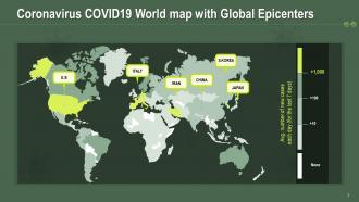
Slide 2: This slide highlights the Coronavirus COVID19 World map with Global Epicenters that are U.S., Italy, China, Iran, South Korea, Japan.
Slide 3: This slide talks about the symptoms of Novel Coronavirus COVID 19, such as Dry Cough, Fever, Respiratory Diseases, Shortness of breath, or fatigue.
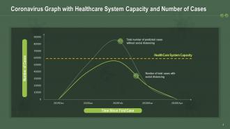
Slide 4: The purpose of this slide is to showcase the Coronavirus Graph with Healthcare System Capacity and Number of Cases with or without social distancing.
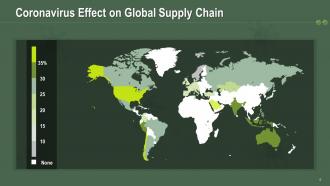
Slide 5: This slide shares the Coronavirus Effect on Global Supply Chain.
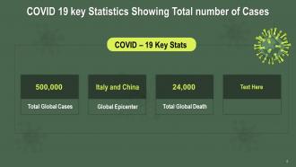
Slide 6: This slide is to help you determine and display the COVID 19 key Statistics for Showing the Total number of Cases.
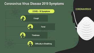
Slide 7: This is another slide to go into details of the Coronavirus Virus Disease 2019 Symptoms.
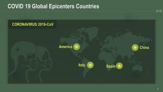
Slide 8: This slide informs you about the COVID 19 Global Epicenters Countries, including America, Italy, Spain, and China.
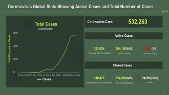
Slide 9: This slide is designed to study the Coronavirus Global Stats Showing Active Cases and Total Number of Cases.
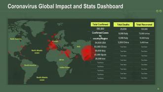
Slide 10: This slide displays the Coronavirus Global Impact and Stats Dashboard for North Atlantic oceanEuropeAsiaAfricaSouth America, Indian Ocean, South Atlantic ocean, North America.
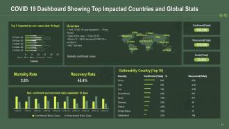
Slide 11: The following slide illustrates the COVID 19 Dashboard Showing Top Impacted Countries and Global Stats, including mortality rate, recovery rate, new cases, globally confirmed cases.
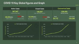
Slide 12: This slide is for COVID 19 Key Global figures and Graph depicting active cases, currently infected patients, MD conditions, deaths, recovered and closed cases.x
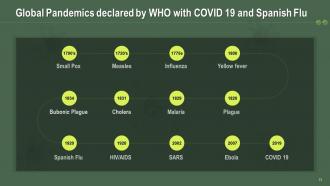
Slide 13: This slide provides information on the Global Pandemics declared by WHO and COVID 19 and Spanish Flu, i.e., Small Pox, Measles, Influenza, Yellow fever, Bubonic Plague, Cholera, Malaria, Plague, Ebola, SARS, HIV/AIDS.
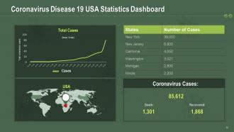
Slide 14: This slide particularly exhibits the Coronavirus Disease 19 USA Statistics Dashboard.
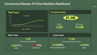
Slide 15: This slide particularly displays the Coronavirus Disease 19 China Statistics Dashboard.
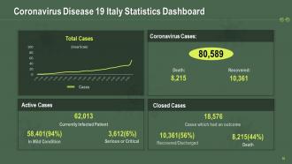
Slide 16: This slide highlights the Coronavirus Disease 19 Italy Statistics Dashboard.
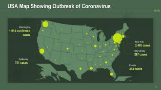
Slide 17: This slide incorporates the USA Map Showing Outbreak of Coronavirus in various parts like Washington, California, New York, New Jersey, Florida.
Slide 18: This is a slide that includes COVID 19 Icon Showing Crown-shaped Virus.
Slide 19: This is a slide showing a Man Coughing Icon to depict the Spread of COVID 19.
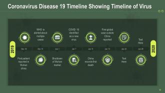
Slide 20: The purpose of this slide is to track the Coronavirus spread using the Timeline of Virus.
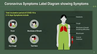
Slide 21: This slide contains a well-structured Coronavirus Symptoms Label Diagram to show its Symptoms.
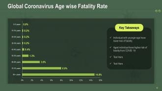
Slide 22: This slide talks about the Global Coronavirus Age-wise Fatality Rate and its key takeaways.
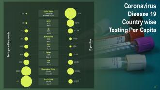
Slide 23: This slide gives a detailed Coronavirus Disease 19 Country-wise Testing Per Capita.
Slide 24: This slide cautions the audience about coronavirus by illustrating a Woman Wearing Repertory Protective Mask.
Slide 25: This slide displays the COVID 19 Virus with a Crown-like Membrane.
Slide 26: This slide is for highlighting the Multiple COVID 19 Pandemic Virus with Eye.
Slide 27: This slide cautions the audience about coronavirus by illustrating a Woman Wearing Repertory Protective Mask.
Slide 28: This slide informs about the to-dos for Coronavirus safety with Hand wash Image.
Slide 29: This slide explains the global outreach of the coronavirus pandemic.
Slide 30: This slide informs about the to-dos for Coronavirus safety with the Mouth Guard Sign.
Slide 31: This slide cautions the audience about coronavirus by illustrating a Person Holding N95 Coronavirus Repertory Protection Mask.
Slide 32: This slide displays the COVID 19 Virus with Pink and Blue Membrane.
Slide 33: This slide informs about the to-dos for Coronavirus safety with Person Holding Coronavirus Temperature Testing Device.
Slide 34: This slide informs about the to-dos for Coronavirus safety by displaying Women Holding Hand Sanitizer for Protection against COVID 19.
Slide 35: This slide illustrates a Doctor Holding Stethoscope and N95 Repertory Protection Mask.
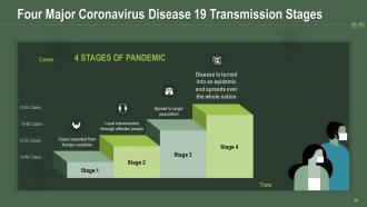
Slide 36: This slide elaborates on the Four Major Coronavirus Disease 19 Transmission Stages that are: Stage 1- Cases imported from foreign countries Stage 2- Local transmission through affected people Stage 3- Spread to a larger population Stage 4- Disease is turned into an epidemic and spreads over the whole nation Cases.
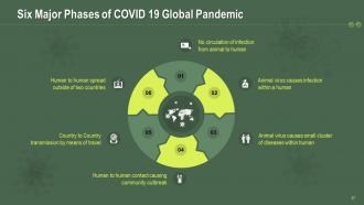
Slide 37: This slide further delves into Six Major Phases of the COVID 19 Global Pandemic that is: 01. No circulation of infection from animal to human 02. Animal virus causes infection within a human 03. Animal virus causes a small cluster of diseases within human 04. Human to human contact causing community outbreak 05. Country to the Country transmission through travel 06. Human to human spread outside of two countries
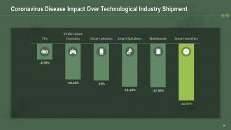
Slide 38: This slide mentions the Coronavirus Disease Impact Over Technological Industry Shipment.
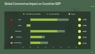
Slide 39: This slide dives into the Global Coronavirus Impact on Countries GDP and the Q1 2020 new estimate.
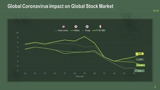
Slide 40: Global Coronavirus Impact on Global Stock Market 40
Slide 41: This slide shows the negative impact of Coronavirus on Over the Global Aviation Industry, such as the Decline in International flights.
Slide 42: This slide illustrates a Man Wearing PPE and Spraying COVID 19 Medicine.
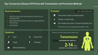
Slide 43: This slide provides you with Key Coronavirus Disease 2019 Facts regarding its Transmission and Prevention Methods.
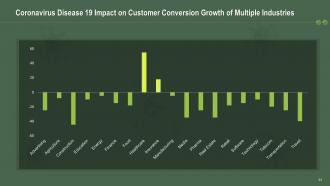
Slide 44: Coronavirus Disease 19 Impact on Customer Conversion Growth of Multiple Industries
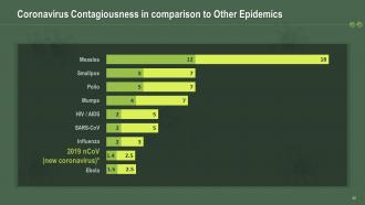
Slide 45: This slide analyzes the Coronavirus Contagiousness in comparison to Other Epidemics.
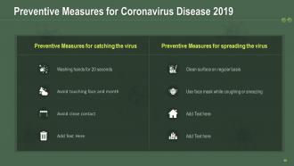
Slide 46: This slide acquaints you with the Preventive Measures for Coronavirus Disease 2019 like - Washing hands for 20 seconds, Avoiding touching face and month, Avoiding close contact, Cleaning the surface regularly, and Using a face mask while coughing or sneezing.
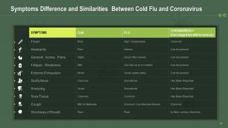
Slide 47: This slide mentions the Symptoms, Differences, and Similarities Between Cold Flu and Coronavirus.
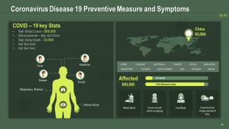
Slide 48: The following slide shows the Coronavirus Disease 19 Preventive Measure and Symptoms.
Slide 49: This slide illustrates the COVID 19 Crown Shaped Pink Virus.
Slide 50: This slide illustrates a Doctor Wearing Coronavirus Respiratory Protection Mask.
Slide 51: This slide illustrates a Man Wearing COVID 19 Personal Protection Equipment.
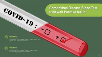
Slide 52: This slide shows the Coronavirus Disease Blood Test tube with Positive results.
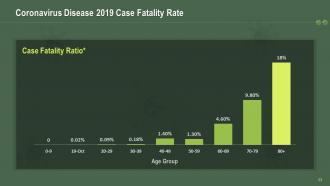
Slide 53: This slide is for displaying the Coronavirus Disease 2019 Case Fatality Rate.
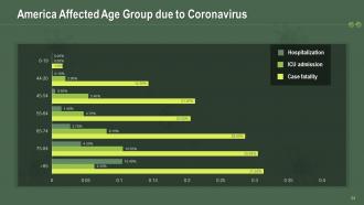
Slide 54: This slide particularly focuses on the Affected Age Group in America due to Coronavirus.
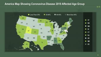
Slide 55: The following slide exhibits the America Map Showing Coronavirus Disease 2019 Affected Age Group.
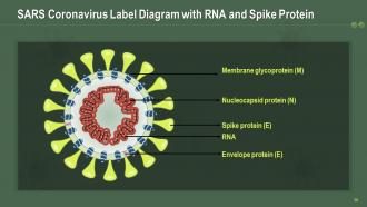
Slide 56: The following slide draws the SARS Coronavirus Label Diagram with RNA, Spike Protein (E), Membrane glycoprotein (M), Nucleocapsid protein (N), and Envelope protein (E).
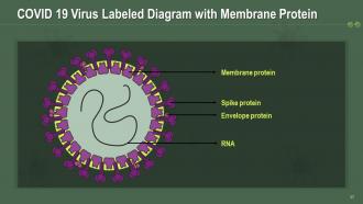
Slide 57: This slide outlines the COVID 19 Virus Labeled Diagram with Membrane, Protein Spike, RNA, Envelope protein.
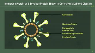
Slide 58: This slide outlines the detailed Coronavirus Labeled Diagram withSpike (S), Membrane (M), Nucleocapsid (N), Envelope(E), Hemagglutinin esterase (HE), and RNA.
Slide 59: This slide outlines the detailed Coronavirus Labeled Diagram withSpike (S), Membrane (M), Nucleocapsid (N), Envelope(E), Hemagglutinin esterase (HE), and RNA.
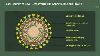
Slide 60: This slide displays the Label Diagram of Novel Coronavirus with Spike glycoprotein(S), Envelope small membrane protein (E), Hemagglutinin - Esterase (HE), Nucleoprotein(N), Genomic RNA, Membrane protein (M).
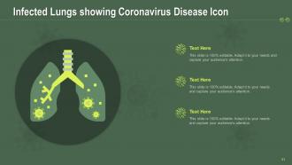
Slide 61: This slide incorporates the Infected Lungs showing Coronavirus Disease Icon.
Slide 62: This slide highlights the SARS- COVID 19 Icon showing Virus Membrane Crown.
Slide 63: This slide shows the Coronavirus Test Icon with Test Tube and Virus.
Slide 64: This slide highlights the Hand Sanitizer Icon showing Preventive Measure for Coronavirus.
Slide 65: The following slide showcases a Doctor Wearing Personal Protective Equipment as a precaution from the Coronavirus.
Slide 66: The purpose of this slide is to give an introduction to additional slides.
Slide 67: This slide introduces a coffee break in between for a breather.
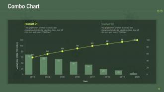
Slide 68: This slide displays the combo chart for your products.
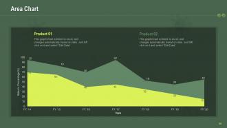
Slide 69: This slide exhibits the Bar Chart for comparison of your products.
Slide 70: This slide introduces your company's agendas in an organized manner.
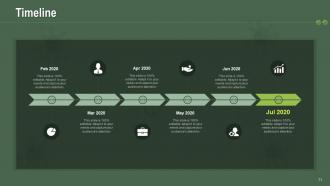
Slide 71: The following slide displays the Timeline to carry out a project efficiently.
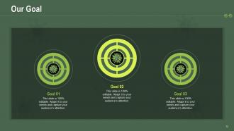
Slide 72: This slide conveys the various goals of a company or its projects.
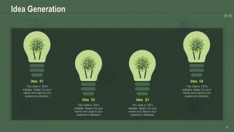
Slide 73: This slide shows the Idea Generation process.
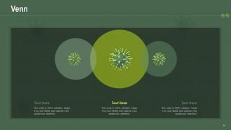
Slide 74: This is a slide demonstrating the Venn chart for focusing on the interrelationship between various elements.
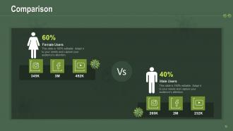
Slide 75: This slide draws a distinct comparison between male and female users.
Slide 76: This is a Thank You slide with contact, address, and email details.
Covid 19 template powerpoint presentation slides with all 76 slides:
Use our COVID 19 Template Powerpoint Presentation Slides to effectively help you save your valuable time. They are readymade to fit into any presentation structure.


FAQs for Covid 19 template
For your COVID slides, definitely go heavy on charts and graphs - vaccination rates, case trends, that kind of thing. Visual stuff just hits different than paragraphs of data. Stick with fonts that won't make people squint during video calls. I'd avoid red/green combos since some folks can't distinguish those colors well. Break it into sections: key stats, prevention tips, policy changes, and who to contact for more info. Honestly, dating everything is crucial because this stuff changes weekly. Oh, and create a template you can reuse - you'll thank yourself later when you're scrambling to update numbers for the next meeting.
Honestly, people's eyes just glaze over when you throw raw COVID numbers at them. Try timelines instead - show how everything unfolded. Infographics work great for breaking down those confusing health guidelines too. The before/after stuff really hits different because it shows actual impact. What really works though? Focus on the human stories behind your data. Recovery journeys, how communities stepped up - that's what people actually remember. I'd say figure out your main point first, then pick visuals that tell that story. Way better than just slapping charts everywhere and hoping something sticks, you know?
Stick with blues, greens, and whites - they feel way more trustworthy than reds which just stress people out. Simple health icons are fine but don't go crazy with virus graphics everywhere (seriously, some templates look like a horror movie poster). White space is your friend here. Make sure your data can actually breathe on the page. Interactive stuff like clickable charts keeps people awake during these presentations. Oh, and test it on your phone first - half the time these things look terrible on mobile. Keep it clean but not so sterile that it feels boring.
Yeah, color totally matters for Covid stuff! Blues and greens work great - they feel trustworthy and calm when you're talking health data. Red's tricky though. Makes people anxious (which, honestly, we've all had enough of that). I'd avoid it unless you really need that "urgent warning" vibe. So many presentations I've seen just go full sterile with whites and grays. Feels like a hospital waiting room, you know? Try adding some warmer touches - maybe soft orange or purple accents. Keeps things approachable without looking unprofessional. Just don't go crazy with colors. Two or three max, and definitely check how they look on different screens first.
Honestly, line charts are your best bet for showing trends over time - that's where COVID data really shines. Bar charts work well when you're comparing different regions or age groups. Maps are obvious for geographic stuff. Heat maps can look pretty slick for infection rates across counties or whatever. Just don't use pie charts - they're basically useless for this kind of data since you're dealing with changes, not static chunks. I've seen way too many presentations where people try cramming everything into one messy chart. Break it up instead. Interactive dashboards sound cool but they're honestly overkill unless you're presenting to data nerds.
Honestly, templates are a lifesaver because everyone stays on the same page instead of making up their own slides with who-knows-what information. Covid stuff changes so fast - having one person update the main facts means you're not scrambling to fix outdated guidance in twelve different presentations. Saves ridiculous amounts of time too since people aren't building everything from scratch. Your audience will trust you more when they see consistent, professional formatting whether it's from nursing or admin or whoever. Just don't forget to actually keep them updated (I've seen some truly ancient templates floating around).
Dude, infographics are a game-changer for Covid presentations. People just tune out when you bombard them with raw statistics - their brains can't handle it. But throw those same numbers into a clean chart or flowchart? Suddenly vaccination rates and infection trends actually make sense. Covid stuff is already pretty heavy and scientific, so visuals help break down that wall of intimidation. Your audience will remember way more from a good infographic than paragraphs of text. I always try to squeeze in 2-3 per presentation, maybe more if the content's really data-heavy. Trust me on this one.
Know your crowd first - that's everything. Healthcare folks? Go ahead with the medical terms and data-heavy charts. Regular people? Skip the jargon completely and use simple visuals instead. I swear, the worst presentations happen when someone throws clinical research at a PTA meeting or something. Make two versions from the start - saves you from panic-editing later. Oh, and focus on what your audience actually cares about. Doctors want protocols, but parents just want to know how to keep their kids healthy. Pretty basic stuff but so many people mess this up.
Good professional images are key - you want stuff that actually supports your message. Masks, vaccines, sanitization graphics work great, but skip the dramatic scary stuff that'll turn people off. Honestly, I've seen way too many presentations with random hazmat suit photos that just look ridiculous. Clean, simple graphics work best. Charts showing vaccination rates or clear safety protocol infographics are perfect. Oh, and definitely check your image resolution beforehand - nothing kills a presentation like pixelated images. Don't forget about licensing for stock photos either.
Okay so animations can literally make or break your COVID presentation. Use them to highlight key data or show vaccine progress over time - that stuff works great. But don't go overboard with bouncing virus graphics or crazy transitions because it'll make serious health info look silly. People will focus on the flashy effects instead of your actual message, which is annoying. I'd stick to simple reveals for stats or maybe subtle highlighting for important guidelines. Oh and let your content decide what animations you need, not the other way around. Less is definitely more here.
Definitely cite your sources on every chart - I learned that the hard way once. Health data can be super locked down with usage rights, so check that first. Don't cherry-pick stats even accidentally. Also, never put any personal info in slides, that's like rule
-
Use of different colors is good. It's simple and attractive.
-
Wonderful templates design to use in business meetings.
-
Easily Understandable slides.
-
Cool presentation