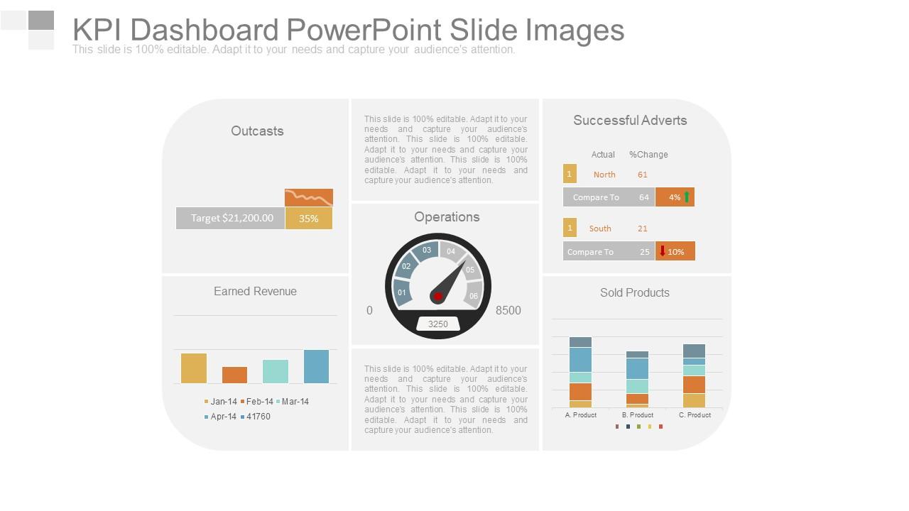
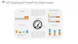
Kpi Dashboard Powerpoint Slide Images
Try Before you Buy Download Free Sample Product
Audience
Editable
of Time
You're probably used to bullet points and all that nonsense you see in presentations. Just let our Kpi Dashboard Powerpoint Slide Images remove all that clutter.
People who downloaded this PowerPoint presentation also viewed the following :
Kpi Dashboard Powerpoint Slide Images with all 4 slides:
Alter the dynamics with our Kpi Dashboard Powerpoint Slide Images. Create infrastructure to fulfill growing demands.
FAQs for Kpi Dashboard
Effective KPI dashboard PowerPoint slides include clear visual hierarchy, relevant metrics aligned with business objectives, intuitive data visualization through charts and graphs, consistent color coding for performance indicators, and concise labeling with actionable insights. These elements work together by enabling quick comprehension, facilitating data-driven decision making, and presenting complex performance data in digestible formats, with many organizations finding that well-designed dashboard slides significantly enhance stakeholder engagement and strategic discussions.
You can customize KPI dashboard templates by modifying metrics, color schemes, chart types, data ranges, and visual layouts to align with your industry requirements. Many organizations enhance these templates by incorporating their branding, adjusting measurement periods, and focusing on sector-specific indicators like customer acquisition costs or operational efficiency, ultimately delivering dashboards that drive strategic decision-making and performance monitoring.
Prioritize metrics that directly impact your industry's core objectives, such as revenue growth, customer acquisition costs, operational efficiency ratios, customer satisfaction scores, and market share indicators. Focus on 5-7 key performance indicators that align with your strategic goals, with financial services emphasizing risk metrics and conversion rates, while retail prioritizes inventory turnover and customer lifetime value, ultimately delivering actionable insights that drive competitive advantage.
Data visualization clarity requires consistent color schemes, clear labeling, appropriate chart types for specific metrics, and logical information hierarchy that guides audience attention. Through strategic design choices, presenters streamline complex data interpretation, minimize cognitive load, and enhance stakeholder comprehension, with many organizations finding that simplified visual frameworks ultimately deliver faster decision-making and improved meeting outcomes.
Best practices for integrating real-time data into KPI dashboard slides include establishing automated data connections, using cloud-based platforms, implementing API integrations, ensuring data validation protocols, and creating refresh schedules. These approaches streamline reporting by minimizing manual updates, enhancing accuracy, and delivering current insights, with many organizations finding that automated dashboards significantly reduce preparation time while improving decision-making speed and stakeholder confidence.
Balance aesthetics and functionality by using clean layouts, consistent color schemes, readable fonts, and strategic white space while ensuring data clarity and logical information hierarchy. Focus on visual elements that enhance comprehension rather than distract, with many organizations finding that well-designed dashboards improve stakeholder engagement and decision-making speed, ultimately delivering better business insights and competitive advantage.
Bar charts, line graphs, gauge charts, pie charts, and heat maps work best for displaying KPIs in PowerPoint slides, with each serving specific data visualization needs. These chart types enhance clarity by presenting performance metrics, trend analysis, and comparative data effectively, while maintaining visual appeal and readability that enables stakeholders to quickly grasp key insights and make informed strategic decisions.
Storytelling enhances KPI dashboards by transforming raw data into compelling narratives that connect metrics to business outcomes, strategic decisions, and organizational goals. Through structured data narratives, presenters can guide audiences from current performance to future opportunities, highlighting trends, causations, and actionable insights, ultimately delivering more persuasive presentations that drive stakeholder engagement and informed decision-making.
Effective KPI dashboard color schemes include blue-green palettes for professionalism, red-yellow-green traffic light systems for status indicators, monochromatic blues or grays for data-heavy displays, and high-contrast combinations for accessibility. These strategic color choices enhance visual hierarchy, reduce cognitive load, and enable stakeholders to quickly identify performance trends, with many organizations finding that consistent color coding across dashboards improves decision-making speed and accuracy.
Align KPIs with business objectives by mapping each metric to specific strategic goals, ensuring they measure outcomes that directly impact revenue, efficiency, or customer satisfaction. Start with your organization's primary objectives, then select corresponding KPIs that provide actionable insights, with many companies finding that quarterly alignment reviews help maintain strategic focus and drive measurable results.
Tools that enhance KPI dashboard PowerPoint slide creation include Microsoft Power BI, Tableau, Google Data Studio, Excel's advanced charting features, and specialized dashboard software like Klipfolio. These technologies streamline data visualization by automating chart generation, enabling real-time data connections, and providing professional templates, with many organizations finding that integrated analytics tools ultimately deliver more dynamic presentations and faster decision-making processes.
**INPUT**: How can I effectively present KPI trends over time using PowerPoint templates? **OUTPUT**: Effective KPI trend presentations combine line charts, bar graphs, and timeline visualizations with clear data labels, color-coded performance indicators, and comparative benchmarking elements. These templates streamline analysis by incorporating automated data connections, interactive drill-down capabilities, and standardized formatting, with many organizations finding that consistent visual frameworks ultimately enhance decision-making speed and stakeholder engagement across departments.
Common KPI dashboard mistakes include cluttered layouts, irrelevant metrics, poor color choices, lack of hierarchy, and missing context or benchmarks. These design flaws overwhelm users and obscure critical insights, with many organizations finding that streamlined dashboards featuring focused metrics, intuitive navigation, and clear visual hierarchy ultimately deliver faster decision-making and enhanced operational efficiency.
**INPUT**: How can I make my KPI dashboard more interactive during presentations? **OUTPUT**: You can enhance KPI dashboard interactivity through clickable elements, drill-down capabilities, real-time data connections, animated transitions, and embedded hyperlinks to detailed reports. These interactive features enable presenters to respond dynamically to audience questions, explore specific metrics on-demand, and demonstrate data relationships in real-time, ultimately delivering more engaging stakeholder experiences and strategic insights. [Word count: 58 words]
**INPUT**: What techniques can I use to engage my audience while presenting KPI dashboards? **OUTPUT**: Effective engagement techniques include storytelling with your data, interactive questioning, visual highlighting of key trends, strategic pauses at critical metrics, and connecting KPIs to specific business outcomes. These approaches transform static presentations into dynamic conversations, with many executives finding that relating dashboard insights to departmental goals, industry benchmarks, and competitive positioning ultimately delivers greater audience retention and actionable decision-making. [Word count: 60 words]
-
Top Quality presentations that are easily editable.
-
Presentation Design is very nice, good work with the content as well.