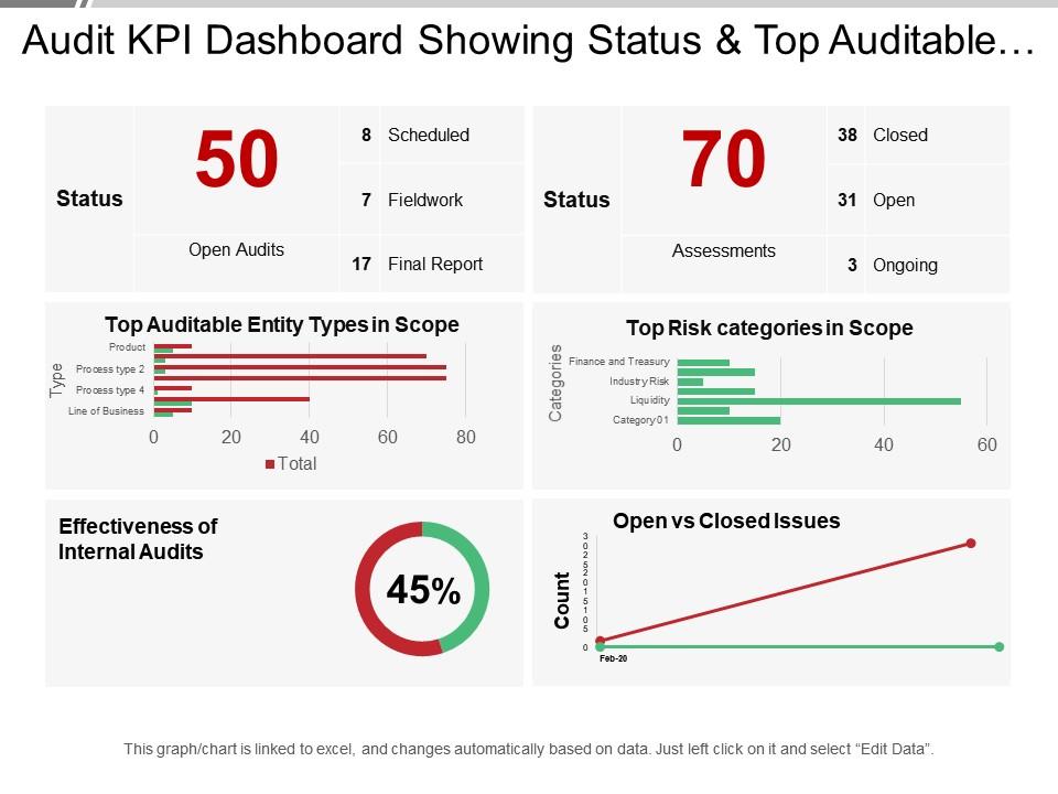
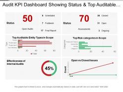
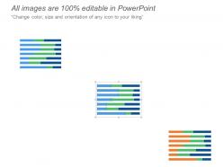
Audit kpi dashboard showing status and top auditable entity types
Try Before you Buy Download Free Sample Product
Audience
Editable
of Time
Our Audit Kpi Dashboard Showing Status And Top Auditable Entity Types enable geo-fencing. Enhance your control over defined areas.
People who downloaded this PowerPoint presentation also viewed the following :
Audit kpi dashboard showing status and top auditable entity types with all 6 slides:
Dwell on it with our Audit Kpi Dashboard Showing Status And Top Auditable Entity Types. Go ahead with an elaborate explanation.
FAQs for Audit kpi dashboard showing status and top
So for audit KPIs, you'll definitely want completion rates and how long it takes to close findings. Track your high/medium/low risk breakdowns too. Repeat findings by department are huge - honestly, some teams just never learn lol. Auditor utilization and client satisfaction scores matter if you survey people. Finance will bug you about cost per audit, trust me. Break everything down by audit type and business unit so you can catch patterns. Like maybe IT audits always drag on forever or accounting keeps screwing up the same stuff. Start simple with these basics, then add whatever your boss actually cares about later.
Honestly, it's a game changer for tracking your audits without going crazy. You get real-time updates on everything - no more hunting people down for status reports or manually building those tedious spreadsheets. Bottlenecks become super obvious, like when stuff gets stuck in review forever. The automated alerts are clutch for catching problems early. Plus you can actually see patterns in your findings and figure out where your team's burning time. I'd definitely set up milestone notifications first - trust me, it'll save your sanity when deadlines start creeping up.
Your audit management system is obviously the big one. Risk registers and compliance databases are solid picks too. For financial stuff, tap into your ERP systems. IT security logs help with tech controls, and HR systems work great for tracking training compliance. Document management systems are clutch since they show you audit trail gaps. Honestly, the real trick is making sure everything can actually connect - nobody wants to spend their day copying data between systems manually. GRC platforms are worth mentioning if you've got them. Just start with whatever gives you the cleanest automated feeds and build from there.
Weekly updates are your sweet spot for most audit KPIs. Daily might be overkill unless you're in the middle of something urgent. Monthly? Way too slow - you'll be chasing problems that happened weeks ago. Start with weekly and see how people actually use it. Some metrics honestly don't change that fast anyway. Set up automated refreshes so you don't forget (I've been there). Just make sure your data sources can handle whatever frequency you pick without breaking. You can always tweak the schedule later based on what your stakeholders need.
Honestly, keep it super simple with audit KPIs. Gauge charts are perfect for completion rates - they just make sense visually. Bar charts work well when you're comparing findings across departments or months. Those red/yellow/green traffic light indicators? Executives eat that stuff up, even if they're kinda basic. I'd definitely add trend lines to show improvement over time since that proves your audit work is actually making a difference. Don't get tempted by the flashy 3D charts though - they're more confusing than helpful. Focus on your biggest KPIs first and try fitting everything on one screen.
Start by figuring out what each group actually needs to see - that's the key. Executives want those high-level trends and summary stuff. Audit managers need to dig into specific findings and track remediation progress. Board members? They literally just want the traffic light colors most of the time. Set up different permission levels so department heads only see their own risk areas and scores. Filters and custom widgets help everyone focus on what matters to their role. The whole thing works better when you map out who needs what for decisions first, then build those views accordingly.
Look, benchmarking is basically your sanity check for whether those audit KPIs actually mean anything. Compare your numbers against industry standards or other similar organizations - otherwise you're just guessing. Like, a 95% completion rate sounds amazing until you find out everyone else is hitting 99%. That's honestly happened to me before and it was embarrassing. Find 2-3 peer companies or industry reports for your main metrics. Historical data works too if external comparisons are hard to get. Just don't set it and forget it - update those benchmarks regularly or they'll become useless pretty fast.
Automated data collection is a game changer - no more manual entry mistakes. Your systems pull info directly and update everything in real time. Built-in validation catches weird inconsistencies before they mess up your reports. APIs grab data from different sources at once, which honestly beats copying stuff between spreadsheets any day. Clean data governance matters though, otherwise you're just automating garbage. I'd start with whatever manual process annoys you most and automate that first.
Don't cram everything onto one screen - seriously, it's like visual overload. Skip the vanity metrics that look cool but won't actually help you make decisions. Your KPIs need to match what you're auditing, not just whatever's easiest to track. I've watched teams build these monthly dashboards when people needed daily updates (totally missed the mark). Oh, and data quality is huge - bad data makes everything useless. Stick to maybe 5-7 metrics tops. Test it with real users first before unleashing it on everyone.
So basically, these dashboards track stuff like audit findings, compliance gaps, and control failures across departments over time. You'll start seeing patterns pretty quick - like maybe IT always has security issues or procurement can't get their vendor compliance together. Honestly, the visual trends make it painfully obvious where your problems keep popping up. No more waiting around for annual reports either. Real-time visibility means you can actually do something about emerging risks. Then just use that data to figure out where to focus your audit schedule and throw resources at the worst spots first.
Start with completion rates and how long it takes to fix findings - super basic but crucial. Overdue stuff will totally screw you during reviews, so monitor that closely. I always tell people to track repeat findings too since it shows if you're actually fixing root causes or just slapping temporary fixes on everything. Risk ratings for open issues are key, plus maybe a timeline of upcoming deadlines. Honestly, compliance scores by regulation type are pretty standard but still useful. You can get fancier later, but these basics will cover most of what auditors actually want to see.
Track how many audit recommendations actually get implemented - that's your biggest indicator right there. Management response time matters too, plus whether you keep seeing the same problems pop up in follow-ups. Honestly, repeat findings drive me crazy because it means nothing's really changing. Cost savings from your recs are solid proof of value. Process improvements count too. Set up some automated reports so you don't have to manually pull data every time leadership asks what audits are accomplishing. Makes showing your impact on risk and efficiency way easier.
Honestly, executives hate messy dashboards, so keep it clean with 5-7 key metrics tops. Color code everything - red for high-risk stuff, yellow for medium, green when it's fixed. Your metrics should be simple: "% of findings remediated" or "days to resolution." Group things by business impact instead of audit categories since that's what leadership actually cares about anyway. Trend lines are crucial - nobody wants static snapshots that don't show progress over time. Oh, and set up automated alerts for overdue items. Trust me, things will slip through otherwise and you'll be scrambling to explain why that critical finding from three months ago is still open.
So basically, these dashboards show you what's happening with risks and compliance stuff right now instead of making you wait forever for reports. You can actually see problems as they pop up and figure out where to focus your team. Honestly, the visual aspect is huge - way better than boring people with long presentations. I'd probably start small though, like pick your top 5 things you need to track and build from there. It's pretty cool how you can spot patterns across different departments and show leadership that audit work actually matters. Makes resource planning way less of a headache too.
Honestly, I'd go with Power BI, Tableau, or Qlik Sense for audit dashboards. Power BI's great if you're already in the Microsoft ecosystem - which, let's be real, most audit teams are. Tableau's better for fancy visualizations though. Budget tight? Google Data Studio actually works pretty well for basic stuff. Just don't pick something super complex that'll sit there gathering dust because nobody can figure out how to update it. Start simple, then add bells and whistles later. Oh, and get your data feeds sorted first - that's usually where everything falls apart anyway.
-
Awesome use of colors and designs in product templates.
-
Wonderful templates design to use in business meetings.