J.K Rowling is the world's most celebrated author! A well-known fact and not a biggie for passionate fans who have been devouring the Harry Potter series like there’s no tomorrow.
But did you know? Harry Potter and its first book in the series (The Philosophers Stone), released in 1998, had an initial run of only 500 copies? And that it later became a smashing hit, selling over 120 million copies across the globe?
In fact, over 2.65 million copies of Harry Potter and the Deathly Hollows were sold in the first 24 hours cementing its place as the world’s fastest-selling book.
Since then, Rowling's seven-volume series has broken many world records, engraving every alphabet of her laurels in golden letters; on our hearts and world history!
This rags-to-riches story shows how explosive data has become in the last five years, carrying on yet another fascinating trend along with it: data storytelling.
Because as Gartner prophesied, “by 2025 data stories will be the most widespread way of consuming analytics” — Data Trends.
Are you ready to embrace data storytelling and explore its uncharted territory? If yes, here is your cue to get started.
Index (click to jump ahead)
- What is data storytelling?
- The future unfolds right before your eyes!
- A few examples to leverage the power of data storytelling.
What is Data Storytelling?
Data storytelling is the translation of data into a common language. At its core, rather than a spreadsheet full of numbers and charts (which can be tricky), it's about writing an engaging narrative with examples for better absorption of information — all without having the technical know-how! It is about delivering real value to the data with 3 essential elements:
Data (the foundation); Narrative( verbal or written) communicates insights about what happened; and Visual Representations can help share this information when used creatively.
Let us now consider the second more important question that might pop into your mind (no, we are not psychics, trust us :P).
Data Storytelling: why is it the future?
We are creatures of habit and stories will always be an integral part of our childhood (we know a trip down the memory lane must be making you emotional but bear with us.)
Theorists even suggest that storytelling was the primary launchpad for cultural transmission across large groups, allowing evolutionary success in generations.
After all, who else but someone trained with centuries-old tradition could tell an engaging tale? Isn’t it?
This is why now, when all this data is at our fingertips (and minds), it is our human responsibility to take the data storytelling route and make it less intriguing and more fascinating!
Ready to recite your tale with data visualizations? We have a big surprise in store for you that will make your data storytelling experience more memorable and exciting.
Should we give them a go then?
9 Examples to Recite Your Own Data Stories
With a variety of channels vying for attention, it's important to stand out with meaningful content that glorifies your brand pursuits. You need a strong story — one rooted in genuine emotions to lure customers who are bombarded by online campaigns from bigger and better, trying desperately just like you do! Without originality within — or even worse, a lack of it, you may miss an opportunity to evolve like Nike, Airbnb, and more start-up unicorns.
Therefore, here are 9 data visualizations worth exploring and getting your data storytelling game right in the first attempt. They are bold, compelling, and empowering to elevate what you have and become an even bigger name in the industry!
1. As small as a pie
Pie charts are the most commonly used diagrams to present data because they are very simple to create and implement. They also make the information easy and quick to comprehend.
How? Let the example given below be your solace.
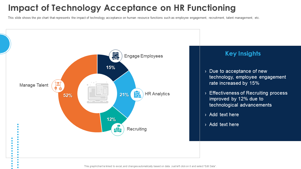
Which color occupies the largest chunk and has the highest impact on HR functioning (see the template)? The answer is simple, and with a single glance, you can conclude that managing talent is perhaps the most important aspect. Isn’t it?
This is how quick it is to draw inferences with a pie chart. We, therefore, suggest you either create one for yourself or download the design below for easy application.
Download Impact of Technology Acceptance on HR Functioning PPT Template
2. Leave a trail like Airbnb
Airbnb is one of the most successful data storytelling pioneers. They’ve mastered the art of creating interesting and compelling content that resonates with their audience.
This is a true example of becoming the best by getting educated by the best.
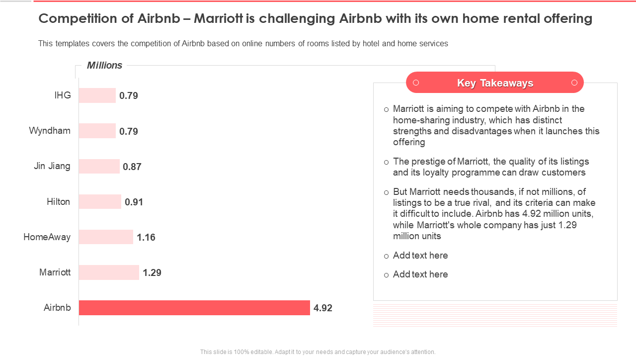
On similar grounds, we have created this (see the template below) Mariott and Airbnb competition PPT design showing what measures Mariott has to take for its listings.
It’s full of helpful tips and advice, assisting you in hitting the right road ASAP!
Download Airbnb Investor Funding Elevator PPT Template
3. Take a dip in Apple’s Universe
Apple is yet another name that is the best storyteller and let’s not forget who’s brainchild it is, after all. This goes without saying Apple’s storytelling power is top-notch. Its content is always engaging, touching the most important points near and dear to the audience.
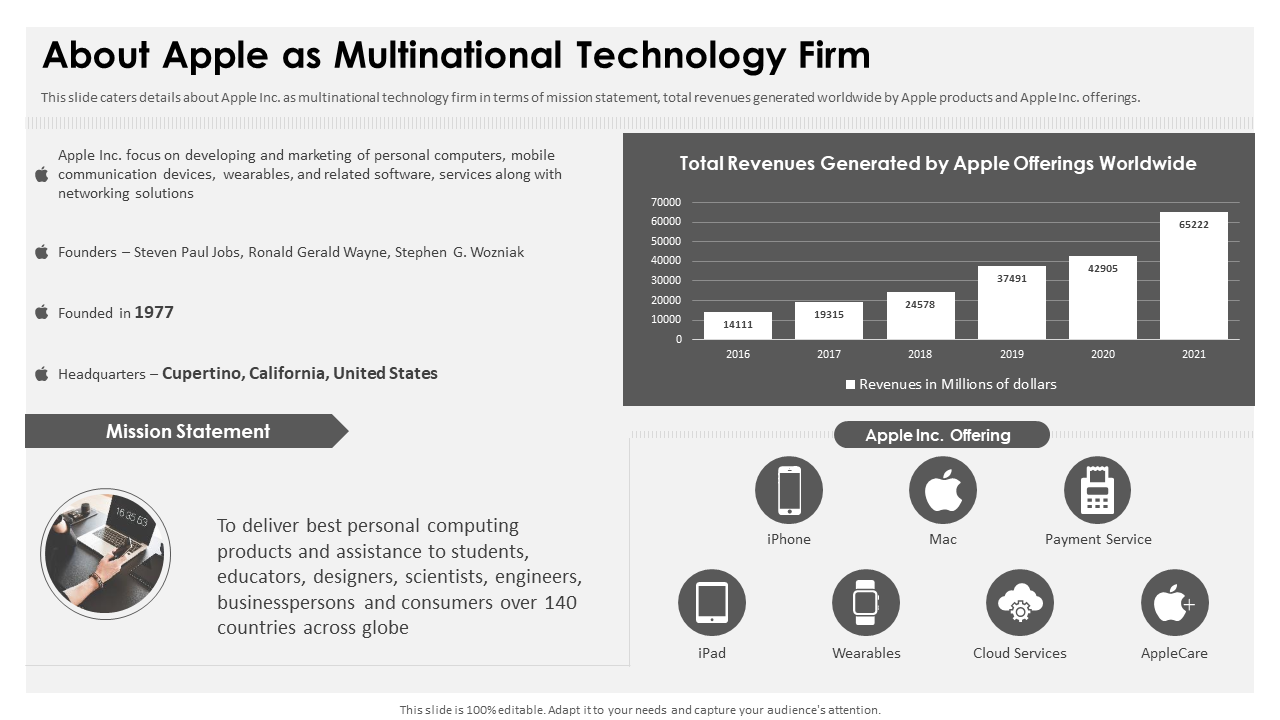
Check out this Apple as multinational technology firm template that highlights different products like iPhone, Mac, iPad, etc, with ease. This is a perfect example of data storytelling with digital dashboards at play. Leading to what? Attention-grabbing and powerful reinforcement of information.
Download About Apple As Multinational Technology Firm
4. Spotify to musify yourself
More than just being a radio station, Spotify is the ultimate destination for music enthusiasts like us. From discovering new artists to dancing to the tunes of your favorite songs and hearing what others are listening to — it's all there waiting patiently in one place.
A few years ago, they took their storytelling feature even further by letting you into someone else’s life through social media posts. It catered to all right from concert tickets, buying houses, car appliances, and more — and the teeny tiny details that can make your escape plan easily achievable.
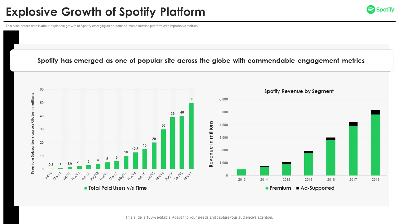
This is what is explosively captured in the PPT template below. It shows how Spotify has emerged as one of the most loved music platforms in the world. Relayed best by metrics like total paid users, Spotify revenue, and more.
This is why all you need to sprinkle on your business idea is a dash of luck and plenty of enthusiasm to take it to the next level, like Spotify!
Why don’t you download it now, then?
Download Explosive Growth of Spotify Platform PPT
5. A tweet is all you need
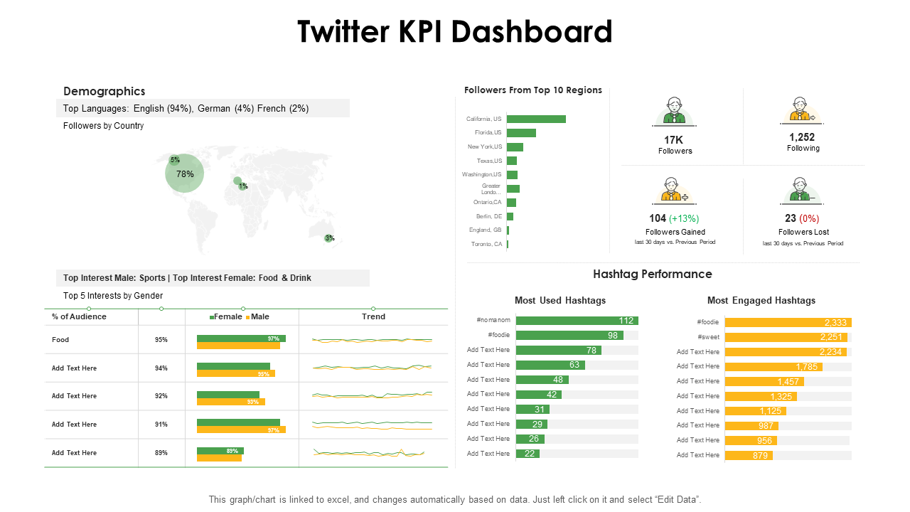
Looking at Twitter and its growth in recent years, one cannot deny that this platform is also something to learn from. And now, with competition heating up, creative visualizations are something that Twitter makes use of diligently (seemingly sidelined for some time).
This is shown in the Twitter KPI dashboard presented below. Consider it as the most striking visualization showcasing how followers from different regions and demographics overlap, making Twitter the best platform to Tweet your way in!
Download Twitter KPI Dashboard PPT
6. Uber to take you on a ride
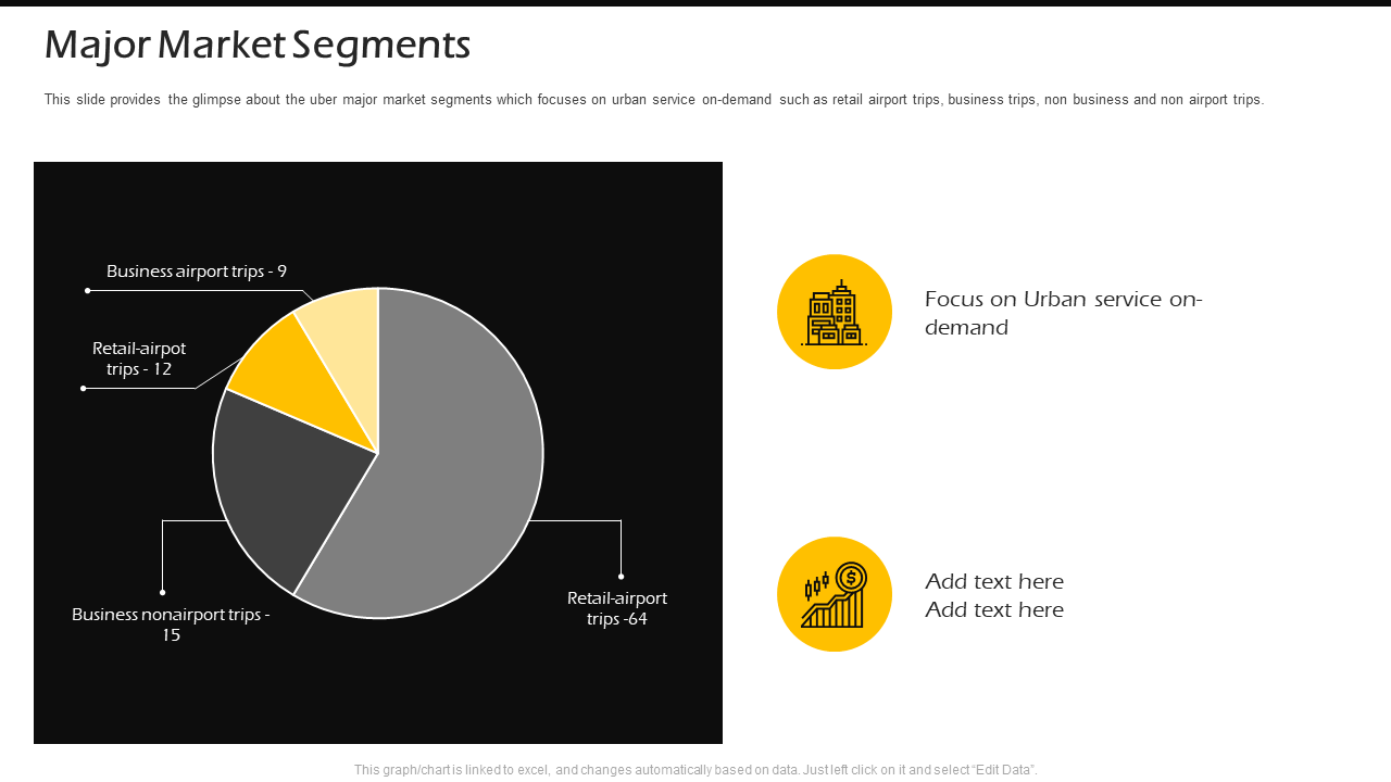
For a company that has been around for nearly 15 years, it's impressive how much information Uber is able to collect on its riders. They use their data storytelling abilities to showcase annual rides taken through their app.
But now, they're going one step further by giving you more insight into what makes them such an invaluable service provider year after year. And which airport service covers a major chunk of their business, be it airport trips, retail airport, and more. All of this can be understood using the pie chart template given below.
This is why we advise you to acquire one for yourself now. And guess what? The below PPT design comes in an editable format, helping you portray your stats with ease.
Download Uber Pitch Deck Major Market Segments PPT
7. Dashboard in style
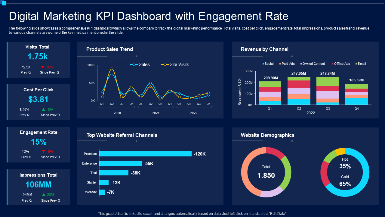
Dashboards give decision-makers a centralized location to review and analyze data. They allow the opportunity to gain an overview of things, but it’s up to you to decide how much detail goes into each piece of information and statistics so that they don't feel overwhelming or too long-winded (everyone has limited patience, after all).
They are great administrators for growth, much like the digital marketing KPI dashboard shown below. You can use it as a data-driven graphic with bold colors and excel-linked charts. Providing insights into important metrics like visits, website demographics, engagement rate, and more, this is a great tool to use for your business. You can either use it for internal team or external, depending upon your needs and requirements.
Download Digital Marketing KPI Dashboard
8. Slack and hack
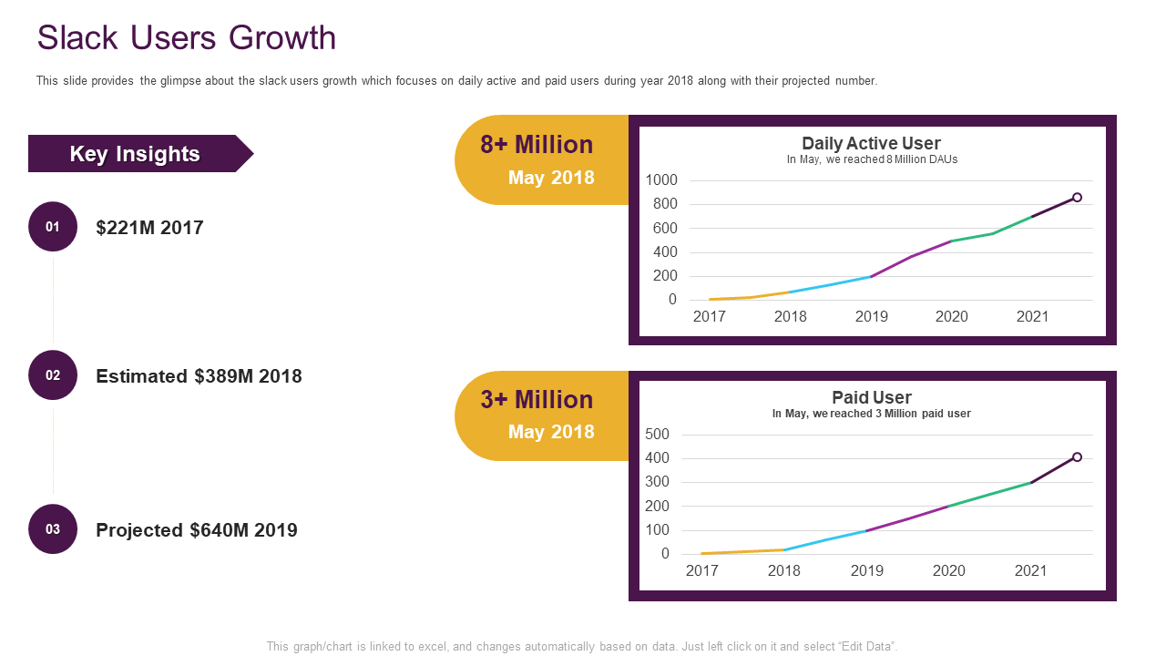
Slack, a company that has revolutionized the way we communicate with our colleagues and clients, is also using storytelling to create different dialogues and voice their opinions. In place of an email containing only information about the services, Slack is determined to present a powerful visual story that not only tells customers what they offer but also encourages them to take action. All thanks to its vast knowledge base and streamlined product lineup.
Similarly, the Slack channels’ user growth stats are shown creatively with the PowerPoint template given below. It conquers the true power of data handling with apt visuals to make it to the list of your favorites.
Without any further ado, grab it now.
Download Slack Pitch Deck Users Growth PPT
9. Line it up
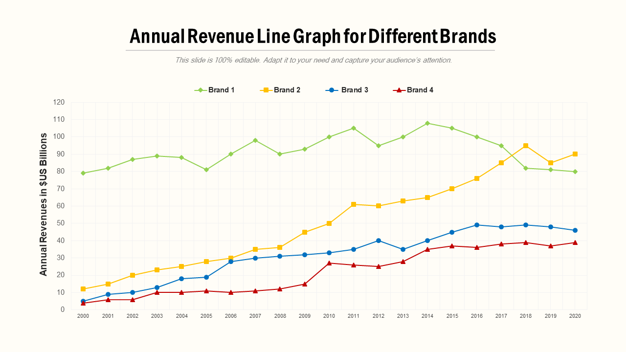
The line chart is a great way to show changes over time. It's also helpful for determining the correlation between two sets of values where one can never occur without the other being present first!
Although these charts have been there for a while, the one given below takes the form of an animated visualization that tells its tale with text and lines in perfect harmony to make data dish up some serious gravity on storytelling!
Editing this simple line chart PPT template is also easy since it comes with editable features, the biggest one being its excel-linked quality. Therefore, deploy it if you want to compare the steady trends in different brands and their respective needs.
Download Annual Revenue Line Graph
Last but not the least
You'll never kill storytelling because it's built into the human plan. We come with it. - Margaret Atwood, author of The Handmaid’s Tale.
Therefore, the data storytelling trend is here to stay!
With that being said, the list of benefits (and examples!) to show how data-driven stories can propel your business forward is covered in this blog, giving you what you need. Whether your’s is an industry or niche, prowess in the art of data storytelling with visual templates is a given with this practical guide.
P.S. You know what more we own to make you a top-notch storyteller? A mini-guide to tell your stories not only with data but with business presentations that are nothing less than amazing to scroll through. So why don’t you give it a read now!



 Customer Reviews

