 Customer Reviews
In an old survey involving data analysis, one of the questions that particularly caught people’s eye was where they had to rate their satisfaction in various aspects of their lives on a scale of 1 to 10. A scatter plot was created to see and judge if there was a relationship between people's ratings or if it was just a coincidence. It was presented with one of the scatter plot templates.
To everyone’s surprise, there was a very clear pattern in the data. Almost everyone who rated their satisfaction with their job as a 10 also rated their satisfaction with their life as a 10. In other words, people who were happy with their jobs were also happy with their lives.
This finding leaves a lasting impression on you because it goes against our common belief system. We often think of job satisfaction and life satisfaction as two separate things, but this data suggests they are closely linked. This finding makes us think differently about a successful career and happy life and how they are knitted together. Such a mild altering discovery from a simple scatter chart make us realize why it is so important to data analysis.
So what Is a Scatter Plot?
A scatter plot is a graph showing the relationship between two variables. The variables are plotted on a coordinate grid, and the points are connected with a line. Scatter plots are sometimes called scattergrams or x-y plots.
These are used to show how one variable affects another. For example, you could use a scatter plot to see how weather changes affect the growth of a plant.

Typical Scatter Plots and Correlation
What Are the Applications of a Scatter Plot?
Scatter plots can help analyze markets and anticipate fluctuations in sales or profits based on historical data about price, demand, and other factors. They can also track sales over time, show the distribution of customer demographics, and identify market trends.
Scatter plots can predict future sales during a holiday season or in a different region. They can also be used to spot data trends or see if there are any outlier data points.
For example, if you were tracking the number of hours of sunlight each day over a certain period, you might use a scatter plot to look for a trend of increasing or decreasing data points. The relationship between the two variables is called correlation.
What Are the Advantages of a Scatter Plot?
A scatter plot is a great way to visualize data sets with many variables. There are many advantages of using scatter plots to analyze data besides being quick and easy to make. These include:
- They can show if there is a relationship between two variables
- They can show the direction of the relationship
- They can show if the relationship is linear or nonlinear
- They can be used to make predictions
All these advantages make them a useful tool for quickly exploring data sets.
What Are the Disadvantages of a Scatter Plot?
While scatter plots have many advantages, there are also some disadvantages to using them.
The biggest disadvantage is that they can be difficult to interpret if there are a lot of data points. This is because the relationship between the variables may not be that obvious.
Another disadvantage is that they don't show relationships between variables well when those relationships are not linear. They can be rather misleading if the data is not randomly distributed.
Considering the importance of a scatter graph, let us know how to create one for yourself.
How to Design and Best Present Them: Scatter Plot Templates
To create scatter plot templates, you need two sets of data:
The first set of data is the independent variable. This is the variable that you are changing. For example, the independent variable would be the temperature in the temperature example.
The second set of data is the dependent variable. This is the variable that is affected by the independent variable.
When you have this data, creating a scatter plot is easy. Let’s take a look:
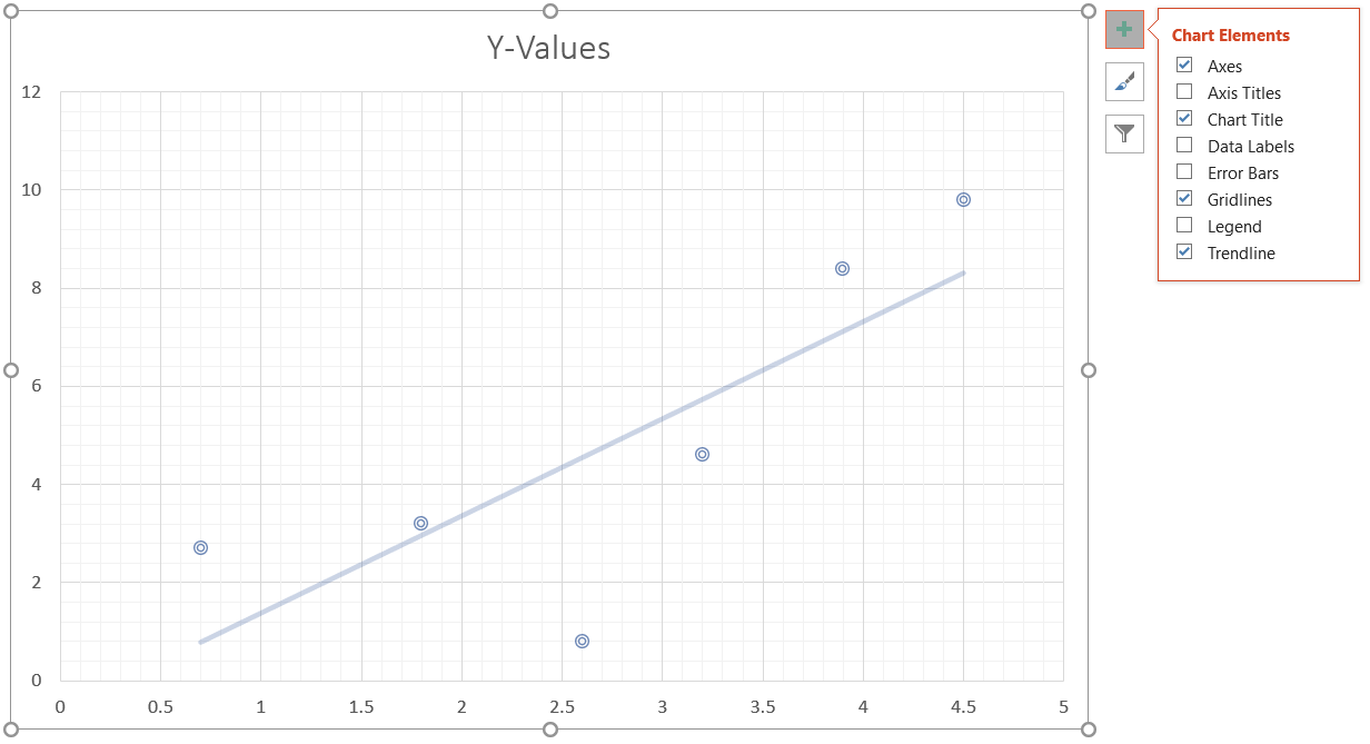
Step 1: Insert a Scatter Chart
Go to Insert > Chart > X Y (Scatter) and select the layout of the scatter plot.


Step 2: Enter Your Data
Insert the data in the Excel dialog box that appears in the slide. The X-values will be independent variables, and the Y-values will be the dependent variables.

Step 3: Create the Plot and Customize
The chart will change as you add the data in the Excel dialog box. You can customize the chart using the options on the chart's right-hand side, such as the chart elements (trendline), styles, and filters.
The use of scatter plot templates in your presentations and meetings would help you showcase your data and its results in a manner that is understandable to an average person.
However, designing an entire template is a time-consuming task. Hence, we have brought you 10 hand-picked templates from which you can choose depending on your needs. Let’s take a look.
Template 1: Scatter Plot Ratio Graphs for Satisfaction vs Revenue
With this PPT layout, you'll see how your satisfaction ratings impact the bottom line. And best of all, this PowerPoint design is easy to interpret and understand. In the example presented below, satisfaction increases with revenue, a positive correlation. Therefore, download it now.

Template 2: Scatter Investment PPT Infographic Template
This versatile PowerPoint preset will help you present your investment strategy clearly and concisely. With its creative scatter graph design, you can easily highlight the key points of your plan. And with its easy-to-edit slides, you can tailor the template to fit your specific needs. Select this PPT theme now!

Template 3: Data Collection Scatter Diagram PPT
This PPT deck makes it simple to collect qualitative and quantitative data. This PowerPoint slide is the perfect solution whether you need to gather data for market research, customer feedback, or any other type. Incorporate it now!

Template 4: Scatter Diagram PPT Graphics
This creative PowerPoint set is perfect for marketing professionals who need to quickly and easily present quantitative information. You only have a few seconds to capture your audience's attention and persuade them to listen to what you have to say. Therefore, employ this PPT template now!

Template 5: Scatter Bubble Chart PPT Summary
With this PPT design, you can easily create stunning visual displays. Use this PowerPoint layout to create stunning visual representations of your data to make a clear and powerful argument. The color-coded data bubbles will make it easier for the audience to understand the data. Get it now.

Template 6: Scatter Plot Chart Exhibiting Stakeholder Engagement Grid
This PowerPoint deck provides a visually engaging way to display how your stakeholders are engaged with your organization. The grid makes it easy to see which stakeholders are the most influential and where there is room for improvement. This includes the managers, team leaders, executives, etc. Download it now!

Template 7: Scatter Line Finance PPT Ideas
This versatile PPT design is perfect for small businesses or individuals who want to make a big impact by adding a personal touch to their presentations. The PowerPoint bundle is a great way to organize and display your financial information in an easy-to-understand format. Incorporate it now!

Template 8: Bubble Chart PPT Summary Background
This PowerPoint slide can display your financial data with different bubble sizes highlighting specific values. This proportional bubble chart PPT theme can be used to show various scenarios simultaneously and is fully editable, so you can easily customize it to meet your needs. Include it now.

Template 9: Single Page Multiple Scatter Charts and Graphs Infographic
The PPT layout is perfect for any business or academic presentation with its clean design. The sleek template makes it easy for your audience to follow along, and the included charts and graphs provide all the information they need. The infographic format makes it easy to increase your reach multiple times. Get it now.

Template 10: Multiple Scatter Plot Graphs Report Infographic
This PPT slide is editable in PowerPoint and provides a clear and concise view of your data. You can easily provide a comprehensive overview to your audience with minimal effort. This template will save you precious time and ensure that your message is communicated effectively to your viewers. Download it now!

Conclusion
So download the scatter plot PPT templates we have provided for you. We are sure they will come in handy when you want to showcase your data interestingly and understandably.
Let us also know how our powerpoint templates have helped you in the comments below!
And if you need any help with using these templates or creating your own, do not hesitate to get in touch with us. We would be more than happy to serve you!
P.S: Do you need help presenting the data in a more three-dimensional manner using a bubble chart? Check out this amazing guide full of pertinent templates!