

 Customer Reviews
Public health reporting is a key skill that needs institutionalizing as it is the only authentic resource for the public if a crisis strikes. The Covid-19 pandemic resulted in unprecedented levels of public health reporting as information was scarce, and people wanted to trust only one source. The pandemic’s size, speed, and scale were such that even governments, public health professionals, the media, and citizens sought current, accurate, and easily accessible information delivered thoughtfully. Facts mattered, and any public communication needed to stick to it; saying anything more than necessary was akin to creating panic.
These demands were partly met by creating and publishing Covid-19 dashboards to ensure a diverse audience could piece together the same meaning. Dashboards have grown in popularity as dynamic, visual tools for communicating COVID-19 data; these can help with decision-making and behavior change.
Data was described as the ‘new oil" a few years ago, but the pandemic meant that it proved to be life-saving and life-affirming. Dashboards and data trackers helped people make sense of everything, from Covid19 strains to preventive measures to vaccine options.
A typical Covid dashboard has a clean and modern interface as well as data visualization tools to help you better understand any change in status. It also displays new and confirmed cases, as well as deaths, with daily statistics.
What Are The Benefits Of a Covid Dashboard?
The most significant advantage of a dashboard is improved decision-making. It enables users to view aggregated data summaries to make informed clinical decisions. In this format, data is not only easier to consume, but it can also be analyzed more quickly.
As they collate and combine statistics from numerous sources and reveal the most important key performance indicators, clinical and other dashboards save users time. Without dashboards, one must manually compile and aggregate data. The manual approach requires more resources than an automated dashboard and increases the possibility of human error. Automation frees up valuable time for more in-depth analyses.
It is possible to create a dashboard and collect the necessary data. You can have real-time access to data that helps fight the spread of even a pandemic with SlideTeam’ss Covid Dashboard PPT Templates.
Explore these now!
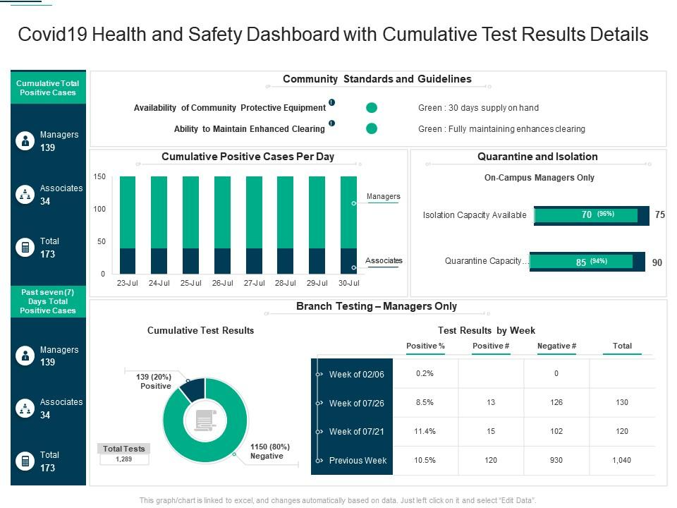
Template 1: Covid19 Health and Safety Dashboard PPT Template
The COVID burden is significant; it must be tracked and communicated to the wider population. Our content-ready PowerPoint Template will help you do so. This slide mentions up-to-date, sometimes up-to-the-hour, statistics. The template also mentions community standards and guidelines, positive cases per day, etc. Download now and ensure you are still aware of the menace and are forewarned.
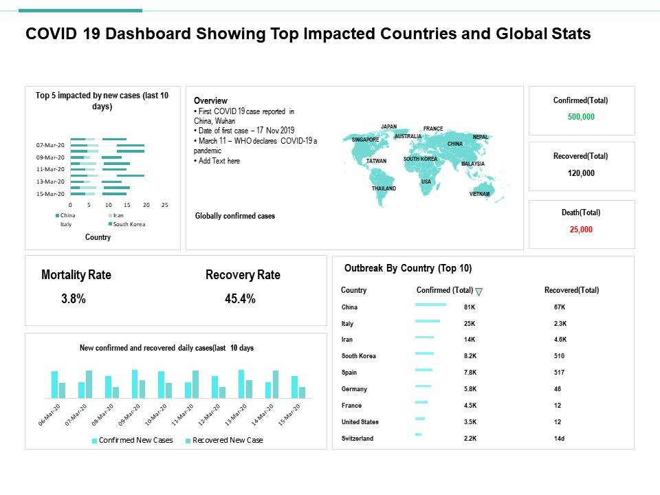
Template 2: Covid-19 Dashboard PPT Template
Presenting you our covid dashboard PPT Template that showcases the top impacted countries and global stats. This slide compiles data in an efficient manner. The parameters covered are mortality rate, recovery rate, confirmed rate, etc. The design is easy to edit at your convenience. Get it now!
Template 3: Covid Risk Assessment Dashboard PPT Template
It is essential to mitigate the risks of the Covid-19 pandemic now that we are finally getting rid of it. Therefore, we bring you our covid risk assessment dashboard template to have a clear overview of the health crisis's possible impacts. This slide evaluates everything, considering all necessary checklists and finally providing validated solutions. This is a must-have template to ensure we can rest assured that there will be no spurt. Download now!

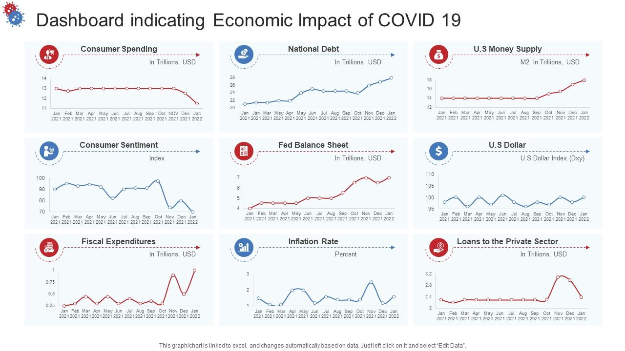
Template 4: Covid Dashboard Indicating Economic Impact PPT Template
A visible Covid impact, apart from the deaths, is the appreciable slowing down of the world economy. With the help of your dashboard template, you can access economic changes in the fields of consumer spending, national debt, and fiscal expenditures, to name a few. Use this template even to track Fed Balance Sheet and the money supply. Download this slide now!
Template 5: Covid Dashboard For Hospital Administration PPT Slide
A covid dashboard is required for hospitals that are still dealing with the pandemic. This slide will help hospital administrations track coronavirus cases to work more and more systematically to ensure the world stays safe. Everything is included in this design, confirmed cases, recovered cases, deaths, mortality rate, etc. Have the world’s health status in terms of Covid on your dashboard. Get it now!

Template 6: Post Covid Dashboard PPT Template
If you ever need concrete evidence to see how Covid impacted the industry, this PPT Template gives it to you. The case study taken is that of the automobile sector, which still has the most connections with other industries downstream. Use this slide to prove how its CAGR, projected at 8% for 2021-25, reduced to a painfully slow 1% in 2022. The Asia Pacific market virtually went off the map. This PPT Slide highlights the impact of covid on the automobile industry at the global level. It also shows forecasted growth, annual growth rate, key insights, etc., for five years. Easily editable, this slide is available for download. Get it now!

Template 7: Covid19 Dashboard PPT Template
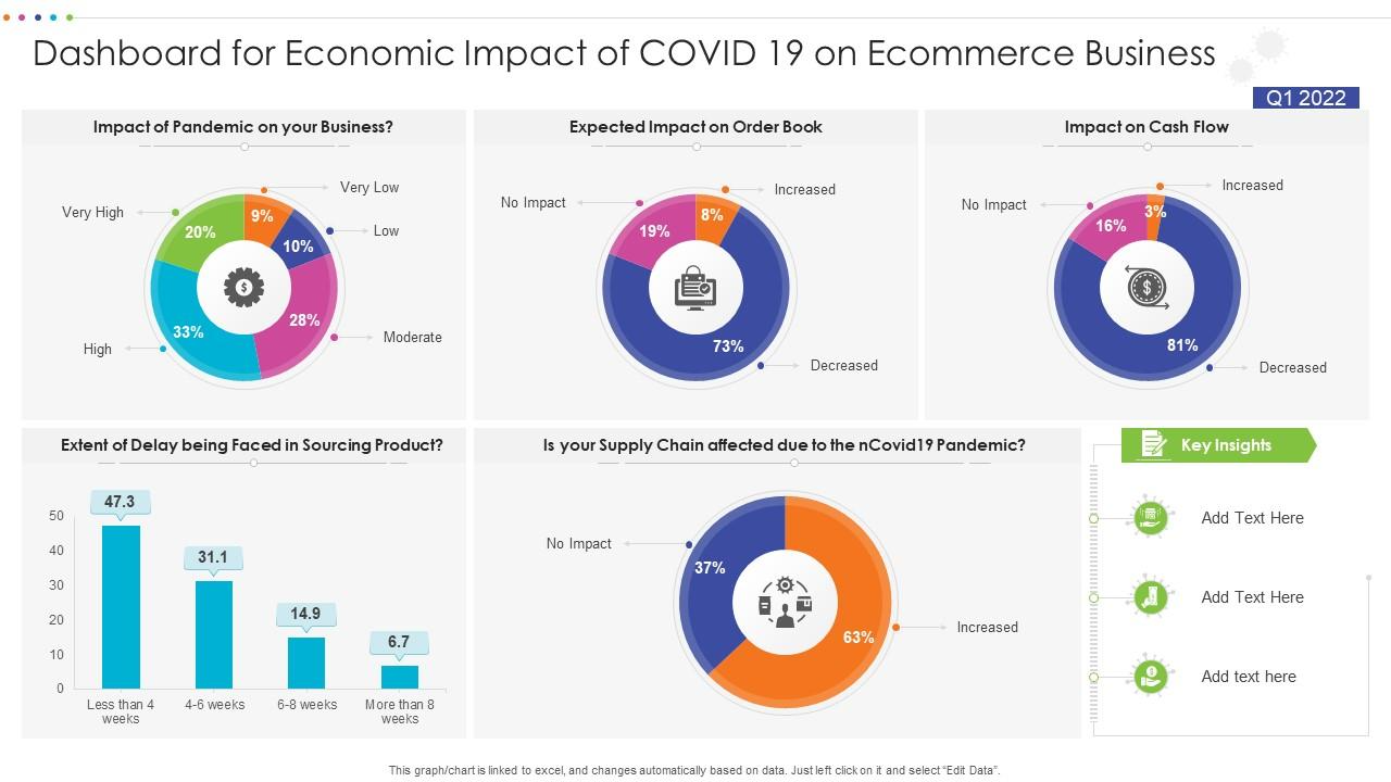
The COVID-19 pandemic sent tremors through the global economy, precipitating the world's worst economic crisis. Our dashboard layout emphasizes the economic impact of covid on e-commerce businesses. Impact on cash flow, delay in sourcing products, effects on supply chain, etc. Have all these insights at your access. Download now!
Template 8: Covid Dashboard Highlighting At Risk Employees PPT Template
The most prominent threat of covid was whether the employees would return to their jobs or not. This PPT Template highlights all the employees that might be at risk of getting infected. Have detailed data of age-wise employees at risk with this layout. Easy to customize, download it right away. This data can save lives. A metric can be worked out to ensure that once the figure of employees at risk by office crosses a certain pre-decided figure, an emergency process kicks in, and evacuation is started. Download now to ensure alertness, always!

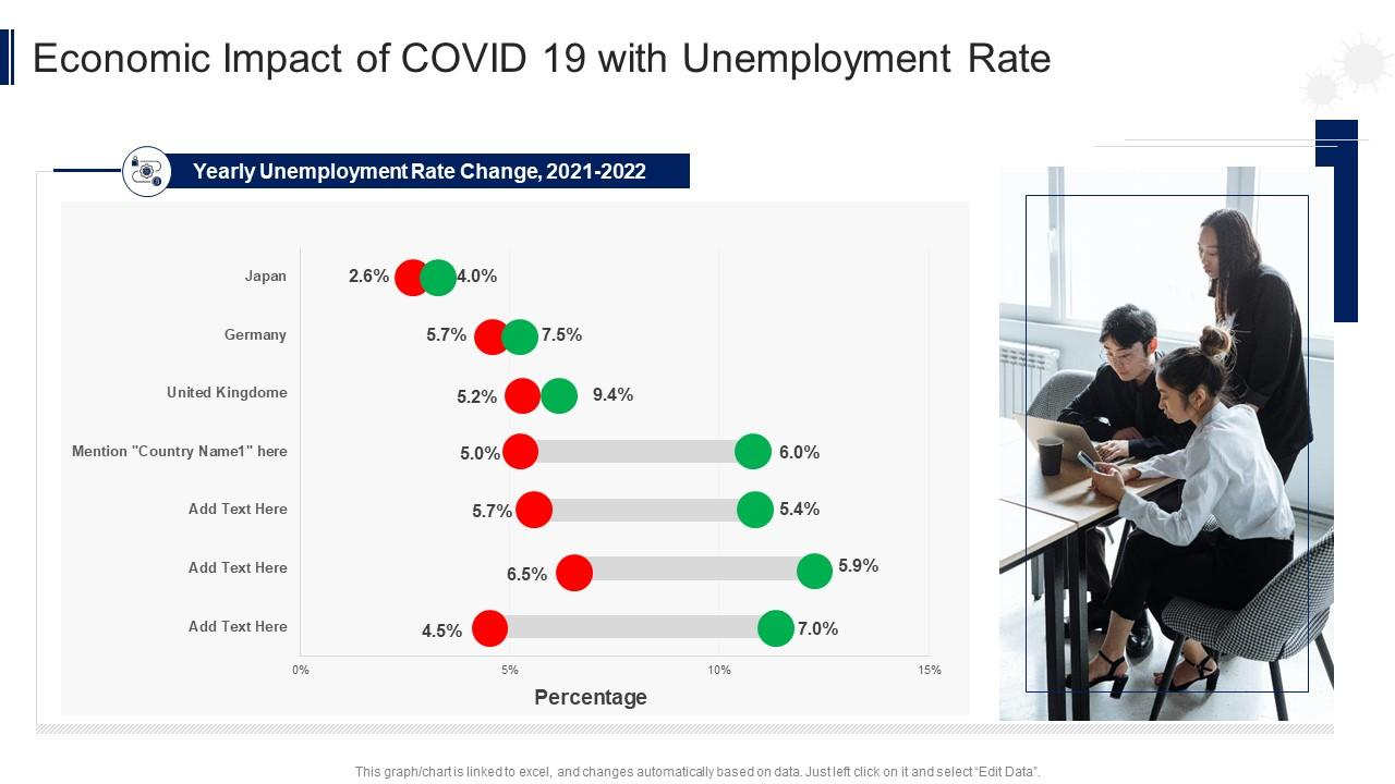
Template 9: Covid Dashboard With Unemployment Rate PPT Slide
Covid variants have resulted in higher global unemployment. With our covid dashboard PPT Slide, you can conveniently know the complete and accurate unemployment rate data at a glance. This template showcases unemployment from the year 2021 to 2022 in developed countries, such as the UK, Japan, Germany, etc. Get this layout instantly.
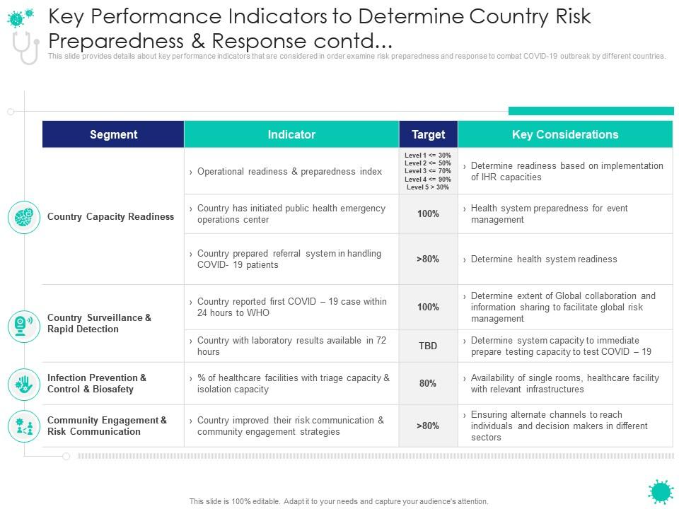
Template 10: Covid Dashboard Indicating KPIs in PPT Template
Give an amazing presentation showcasing details about key performance indicators used to assess countries' risk preparedness and response to the Covid-19 outbreak. The topics discussed are segments, indicators, targets, and key considerations. All of these are tracked on variables like capacity readiness, infection prevention capacity, etc. Present thorough information on the mentioned subjects with our slide. Download now!
Final Word!
The virus’s rapid and lethal spread has necessitated national lockdowns, which have devastatingly impacted countries' economies. A covid dashboard is a modern analytics tool for monitoring data in an interactive and dynamic manner. It enables professionals to gain real-time access to statistics to improve performance and satisfaction. A Covid dashboard is a great tool for helping you run your facility smoothly by analyzing the health crisis in each division and monitoring its nature. It’s time to get yours!
P.S- Manage your workforce in the perfect manner with our HR Dashboard. Check it out now!
FAQs On Covid Dashboard
What is the purpose of the dashboard?
A dashboard’s primary purpose is to display a comprehensive overview of data collated across reliable sources. . Dashboards are useful for monitoring, measuring, and analyzing important data. They take raw data and present it in a highly specific way to the viewer's needs, whether you're a business leader, line of business analyst, sales representative, marketer, or anything else. Remember, in a highly visual world; attention spans are just too low. Thus, we need to work on dashboards as a data source that delivers information dynamically and as and when needed.
What can you measure with a dashboard?
Dashboards can be used to track things like :
- Metrics for customers
- Financial details
- Information on sales
- Analytics for the web
- Manufacturing details
- Data on human resources
- Marketing effectiveness
- Logistics details
What is a health dashboard?
A healthcare dashboard is a tool that assists decision-making healthcare providers and healthcare organizations in reporting key performance indicators and healthcare analytics. Because healthcare marketing occurs across multiple channels at the same time, marketers must track all key metrics for their medical centers in order to assist healthcare professionals in making better decisions. It is, in fact, capable of being used as a significant tool to enhance and improve the productivity of work across countries where basic public health and hygiene still remain a concern.
What are the benefits of dashboards?
Dashboards are useful because they enable people to make better, more informed, data-driven decisions. They help you get a more precise, in-the-moment understanding of what's happening in the world around you and navigate rapid, sometimes difficult, changes because they're dynamic, interactive and show near real-time data.


![Top 15 Project Status Dashboard Templates to Pave the Way to Organizational Efficiency [Free PDF Attached]](https://www.slideteam.net/wp/wp-content/uploads/2022/03/Top-10-Project-Status-Dashboard-Templates_1-1013x441.png)