Financial Team Project Weekly Status Report

Rating:
100%
Financial Team Project Weekly Status Report
Slide 1 of 7
Favourites Favourites

Try Before you Buy Download Free Sample Product

Audience Impress Your
Audience
Editable 100%
Editable
Time Save Hours
of Time
The Biggest Sale is ending soon in
0
0
:
0
0
:
0
0
Rating:
100%
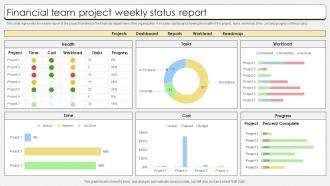
This slide represents the weekly report of the project handled by the financial department of the organization. It includes dashboard showing the health of the project, tasks, workload, time, cost and progress of the project. Presenting our well structured Financial Team Project Weekly Status Report. The topics discussed in this slide are Financial Team, Project Weekly, Status Report. This is an instantly available PowerPoint presentation that can be edited conveniently. Download it right away and captivate your audience.

FAQs for Financial Team Project

Okay so you'll want to cover the basics first - revenue, expenses, profit margins, that stuff. Then compare your budget vs what actually happened and explain any big differences (executives get weird when numbers don't match). Cash flow analysis is huge, plus whatever KPIs your boss obsesses over. I'd definitely add a forecast section because leadership eats that up. Charts make everything look more professional, honestly. Oh, and start with an executive summary - most people won't read past that anyway. Don't forget to mention any risks you're seeing and throw in some recommendations they can actually act on.

Dude, tell them the punchline first - like "yeah revenue's down 8% but here's why we're not panicking." Then just walk them through it like you're explaining to your mom, you know? Ditch the spreadsheet dumps for simple charts that actually make sense. I learned this the hard way - nobody cares about your beautiful formulas if they can't figure out what it means for the business. Oh, and always end with "here's what we need from you" so people don't just nod and leave confused.

Excel's honestly still the best starting point - everyone gets it and it works. You'll probably want Tableau or Power BI later for fancier dashboards, but there's definitely a learning curve there. I've seen people create stunning reports in plain old Excel that blow away some messy Tableau attempts. Google Sheets works too if you just need something quick and dirty. My take? Master the storytelling part in Excel first, then worry about the fancy tools once you actually know what story you're trying to tell with your data.

Build checkpoints throughout your whole process - it'll save you later. Get someone else to double-check your calculations and sources (seriously, fresh eyes catch everything). Document where each number comes from so you can trace it back. I always reconcile totals against the original systems because math has a way of going sideways when you're not looking. Set up automated checks if you can - they're lifesavers when deadlines hit. Also maybe this is obvious but establish your data sources upfront with clear validation rules. Trust me, nothing's worse than sending out a report with glaring errors that everyone notices.

Honestly, the two things that'll bite you are messy data and numbers without context. Double-check your revenue figures match everywhere - I've seen exec summaries with totally different totals than the breakdown sections, which just looks amateur. Don't just dump raw data on people either. They need to know what it actually means and why they should care. Period-over-period comparisons are clutch, and if something looks weird, explain it. Oh and definitely review everything twice because there's always something you missed. Your stakeholders aren't mind readers.

Monthly reports are usually your best bet - that's what works for most teams I've worked with. Leadership might want weekly updates since they're constantly making decisions, but board members? Quarterly is totally fine for them. Honestly, daily reports are just annoying unless something's seriously broken. I've watched companies burn people out with too much reporting. Start monthly and see what happens. Some stakeholders will ask for more frequent updates, others might even want less. The trick is not drowning everyone in numbers they don't actually need.

So narratives are basically your way of turning boring spreadsheets into actual stories people can follow. You're not just dumping numbers on them - you're explaining what's happening and why. It's like being a translator between the data and whoever needs to understand it. Executives want the big picture, department heads need specifics. Honestly, most people's eyes glaze over at raw numbers anyway. Structure it simple: give context first, then show your data, wrap up with what they should actually do about it. The whole point is helping them figure out their next move based on what you found.

So basically, grab like 3-5 years of data if you've got it. Trends are everything - seasonal stuff, revenue cycles, where expenses spike. Way better than just dumping current numbers on people. Compare year-over-year growth and flag anything weird that needs explaining. I learned this the hard way after presenting flat data once and getting grilled with "but what does this mean?" questions. Build your forecasts from those patterns. Honestly, stakeholders eat this up because it actually tells a story. Makes your recommendations feel solid instead of just random suggestions thrown at the wall.

Revenue growth, profit margins, and cash flow are your big three. Those basically tell the whole story. If you're burning through investor cash, definitely watch that burn rate too. Customer acquisition cost vs lifetime value is huge - honestly surprised how many people ignore this one. Industry-specific ratios matter, but don't go crazy with metrics. I've seen way too many founders drown in data that doesn't actually help them make decisions. Pick maybe 5-7 that you'll actually use and track those consistently month to month. Way better than some overwhelming dashboard nobody looks at.

Ugh, you know that email ping-pong nightmare with financial reports? Collaborative tools totally fix that mess. Real-time shared spreadsheets mean no more waiting around for people to send their changes back. Everyone just works in the same space - you can see updates instantly, assign stuff, drop comments wherever. The audit trail thing is pretty clutch too since it tracks who messed with what. I'd honestly start basic with Google Sheets (works better than you'd think) or maybe hook Slack into whatever system you're already stuck using. Way less headache than the old way.

Honestly, just watch their faces during meetings - glazed eyes tell you everything! Ask for feedback through surveys or quick Q&As after presentations. I also test if they actually get it by having them summarize key points or explain how the data affects their decisions. Follow-up questions are usually a good sign too. If you're sending reports digitally, track downloads and meeting attendance (though people are weird about showing up sometimes). Mix formal stuff with casual check-ins. Try asking "What would you want your team to focus on here?" Their answers show you what they understand and what they actually care about.

Honestly, you gotta follow what everyone else in your industry is doing or your reports will look weird. Use the same KPIs and ratios that other companies use - otherwise investors won't know how to compare you to competitors. I made this mistake once and created my own random metrics that just confused people lol. Reference industry benchmarks too, like average profit margins or growth rates for your sector. Oh and check what the big players are reporting on first. That'll give you a good template. Trust me, don't try to reinvent the wheel here.

Start by explaining your assumptions and how you got your numbers - people won't trust projections if they don't understand your process. Charts and graphs work way better than spreadsheet dumps (seriously, no one wants to decode tiny cells). Show uncertainty ranges too - best case, worst case, realistic case. Here's something counterintuitive: highlighting the biggest risks to your forecast actually makes you look more credible than acting like nothing could go wrong. Keep your data format consistent with historical reports so trends are easy to spot. Oh, and walk them through your reasoning, not just the final numbers.

Focus on your top 3-5 financial risks and get specific about each one. Skip the vague "market volatility" stuff - what's actually gonna hurt your bottom line? Then show exactly how you're tackling each risk. Leadership hates reports that just say "we're keeping an eye on things" (honestly, who isn't?). Throw in real numbers like your debt ratios or how long your cash will last. Don't forget any new risks that popped up recently. Your stakeholders need enough detail to grasp both the problems and your plan to handle them.

Know your audience first - that's everything. Executives want the big picture stuff upfront, like what's this gonna cost us and why should we care. Board members? They're all about risk and governance issues. Department heads just want their own numbers and where they stand budget-wise. Finance people obviously need all the detailed breakdowns and technical stuff. What I usually do is write different summary sections for each group but keep the actual data the same throughout. Oh, and use charts/visuals for anyone outside finance - trust me, they'll zone out looking at spreadsheets. Always throw in detailed appendices though for the people who actually want to dive deep.

Ratings and Reviews

100% of 100
Review Form
Write a review
Most Relevant Reviews
  1. 100%

    by Charlie Jackson

    Excellent Designs.
  2. 100%

    by Rodriguez Morgan

    Graphics are very appealing to eyes.

2 Item(s)

per page: