It operations dashboard with ticket resolving status

Rating:
93%
It operations dashboard with ticket resolving status
Slide 1 of 2
Favourites Favourites

Try Before you Buy Download Free Sample Product

Audience Impress Your
Audience
Editable 100%
Editable
Time Save Hours
of Time
The Biggest Sale is ending soon in
0
0
:
0
0
:
0
0
Rating:
93%
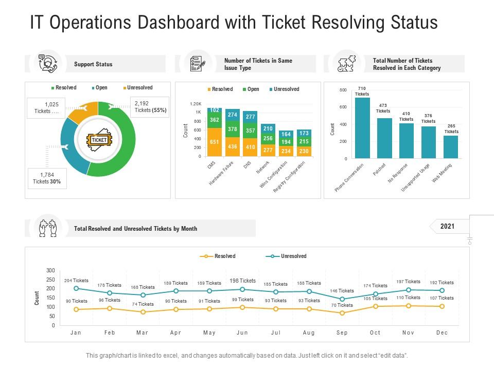
Presenting our well-structured It Operations Dashboard With Ticket Resolving Status. The topics discussed in this slide are Support Status, Number Of Tickets In Same Issue Type, Total Number Of Tickets Resolved In Each Category. This is an instantly available PowerPoint presentation that can be edited conveniently. Download it right away and captivate your audience.

People who downloaded this PowerPoint presentation also viewed the following :

FAQs for It operations dashboard with

Focus on the big four: system health (uptime, CPU, memory), performance stuff (response times, throughput), security red flags like failed logins, and business metrics - user satisfaction scores and whatnot. Trust me, don't dump everything on there. I've seen dashboards that look like a NASCAR car with all the sponsors. Your dashboard needs to tell a story fast. Red means broken, period. Start basic, then layer in your specific environment stuff. Each metric should make someone actually DO something when it tanks, otherwise what's the point?

Oh man, real-time data integration is a total game changer for IT dashboards. Instead of manually refreshing or waiting around for batch updates, you get instant alerts when stuff goes sideways. Honestly, it's like having x-ray vision for your systems. You'll catch problems before they explode into major incidents. The trick is making sure your data pipeline actually works - I've seen too many people think everything's fine when their integration is just busted. Minutes vs hours for response time? Yeah, that's the difference between keeping your job and... well, you know.

Look, if your ops team can't figure out your dashboard during a crisis, you've just made really expensive wallpaper. Make navigation dead simple and organize stuff by what matters most - not just throwing data everywhere. Colors should stay consistent, critical alerts need to scream at you, and honestly? The prettiest dashboards are usually the most useless when you're debugging at 2am with three coffees in you. Group things logically so people aren't hunting around. Test it with your actual team constantly - they'll tell you what sucks way faster than any design review will.

So you'll want to add some ML models that can crunch your historical data and spot patterns. Start with the obvious stuff - server performance, disk space trends, network capacity. Feed those models your existing monitoring data (CPU, memory, network traffic) and display the predictions as alerts or trend lines next to your current metrics. Honestly, predicting server capacity hits is probably your best bet for a first project. Don't overthink it though - pick one or two use cases and see how it goes. The whole point is catching issues before they turn into actual problems.

Start with the big picture stuff your team actually cares about, then let people dig deeper if they want. Stick to the same colors everywhere - red for oh-shit moments, yellow for heads up, green for we're good. Honestly? Most dashboards are complete disasters that try to show everything and end up showing nothing. Group similar stuff together, timestamps are clutch so you know the data isn't from last Tuesday, and please don't use pie charts unless you've got like 3 slices max. Test it with real people first - you'll catch weird stuff you never thought of.

Honestly, these dashboards are a game changer for incident management. You get everything in one spot - real-time alerts, system health, the whole nine yards. No more jumping between twelve different monitoring tools like some kind of digital ping pong ball. When something breaks at 3am (and it always does), you can spot the issue fast, drill down to see what's actually wrong, and assign tickets without losing your mind. The visual alerts are clutch too. Set up custom views for your most critical stuff so you're not wasting time when everything's on fire.

Honestly depends on your budget and what you're trying to do. Grafana + Prometheus is clutch if you want something free - super flexible for metrics. New Relic and Datadog are easier to set up but they'll definitely hit your wallet. For logs, Elastic Stack works great. Splunk does everything but costs a fortune (learned that the hard way). Oh, and if you've already got Power BI or Tableau licenses lying around, people actually use those too. I'd start by figuring out what data you're already collecting, then find something that connects easily.

Dude, customized dashboards are seriously worth setting up. Your network team gets bandwidth and latency right there, security sees threat alerts immediately. No more hunting through five different screens for basic info - I swear that alone saves like 20 minutes a day. Response times get way faster when people aren't missing stuff buried in random tabs. Each role sees what actually matters to them instead of wading through irrelevant data. Quick tip: ask everyone what three things they check first each morning, then build from there.

Start with access controls - figure out who actually needs to see what data, then set up role-based permissions. Most teams screw this up by giving everyone admin rights because it's easier. Encrypt everything in transit and at rest, especially if you're pulling from different systems. Set up proper authentication like SSO or MFA. Don't forget session timeouts either - people walk away from their computers way too much. Oh, and sometimes you can just show less sensitive metrics that tell the same story. Build your security around actual user needs, not convenience.

So dashboards basically give you x-ray vision into what's happening with your servers right now. You can track CPU, memory, all that stuff across everything and spot the bottlenecks before they wreck your day. The cool part is you get historical trends too - way better than just winging it or waiting for angry user emails. I always tell people to set alerts around 70-80% capacity because that's your goldmine for planning ahead. Honestly beats reactive firefighting any day. You can actually predict when to scale up or move workloads around instead of scrambling.

Data integration will absolutely wreck your timeline - nothing talks to each other like it should. Plus everyone wants completely different dashboards. IT cares about server uptime while the C-suite wants revenue impact, and good luck making those play nice together. Honestly, people hate learning new tools even when they're way better than the old junk. My advice? Map out your data sources first and get the key players on board early. Otherwise you'll be rebuilding everything halfway through when someone decides they actually need different metrics.

Dude, ML can totally transform your IT dashboard game. Your algorithms will spot patterns in old data and actually predict when servers are about to die or storage is getting full. Way better than just seeing current stats. It automatically sorts incidents too and cuts down on those annoying false alerts - learns what actually matters vs noise. Plus it suggests root causes based on similar stuff that happened before. Honestly the best part? Way less scrambling to fix broken things. I'd start with anomaly detection on your critical systems first, then expand from there.

Honestly, it's a total lifesaver for remote work. You get one place to see everything - server health, incidents, performance issues - instead of constantly bugging people for updates. No more "works fine for me" nonsense when something's broken either, since everyone's seeing the same data. My advice? Start with whatever systems would cause the biggest headache if they went down. You can always add more stuff later, but at least you'll catch the big problems right away. Way better than flying blind when you're not in the office.

Dude, automation is seriously worth it once you stop babysitting your dashboard constantly. Set up automated data pulls from APIs and databases so metrics refresh themselves. Scripts handle the boring stuff - updating widgets, deploying new versions, clearing old data. I'd honestly start small though. Pick one thing you're sick of doing manually and automate just that first. Maybe data pulls or alerts when something breaks? The performance optimization can wait (learned that the hard way). Real-time updates without lifting a finger... it's pretty sweet once everything's running smoothly.

Netflix's monitoring setup is insane - they handle crazy traffic spikes like it's nothing. Spotify's got this sweet dashboard that shows service health across everything instantly. You should definitely peek at Amazon's CloudWatch and Google's ops tools too, most teams copy their approach anyway. Oh, and Atlassian built something pretty solid for a smaller company - tracks incident times, performance metrics, all that stuff. The trick isn't making things look fancy though. Focus on data you can actually act on instead of just charts that look cool. GitHub's got tons of open-source examples if you want to see how they structure metrics and alerts.

Ratings and Reviews

93% of 100
Review Form
Write a review
Most Relevant Reviews
  1. 100%

    by Charlie Reed

    Nice and innovative design.
  2. 100%

    by Dane Harrison

    Top Quality presentations that are easily editable.
  3. 80%

    by Dave Shaw

    Graphics are very appealing to eyes.

3 Item(s)

per page: