

 Customer Reviews
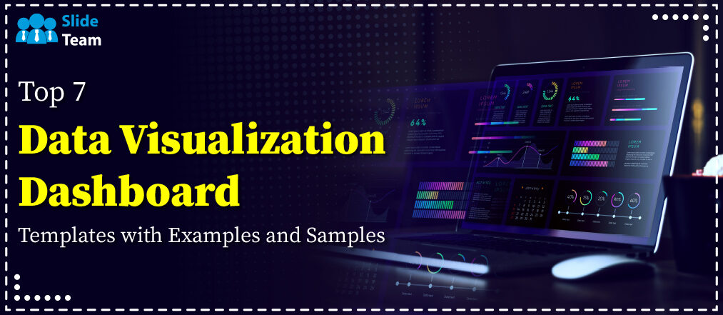
Research from the University of Minnesota shows that 65% of the population are visual learners, and the brain processes visual information 60,000 times faster than when processing text. As an irony and as a point that you will recall for some time whenever you present at parties, this blog piece will deliver the best Data Visualization Dashboard Templates to transform your presentations and meetings for the better.
Sales is pertinent to revenue, and sales analysis is important to make informed decisions to boost the bottom line. Collect and deliver sales analysis results with our templates accessible through this blog here!
A general feeling of uninterest tends to be a staple at meetings. This is where SlideTeam comes in. Our content-ready and 100% editable slides allow you to keep the audience engaged and make the presentation a productive session that generates actionable insights. The designs in this blog can be used to present information across all industries. To emphasize this feature, each template has been created with an example scenario in consideration.
Why data visualization and dashboards?
Information is dynamic. It brings forth trends, areas that need improvement, strategies and people that benefit the company, etc. These insights are impossible without ‘seeing’ the data as a visual. Get my point: See, not just Look. Even a simple table with numbers makes things more transparent to stakeholders. This information is essential for making the right data-driven decisions for the company.
This blog here is your one-stop shop for templates that help you deliver your project progress.
A dashboard is an essential tool that assembles all this information in an easy-to-follow and easy-to-understand format. It acts as a single point of reference for the key performance indicators (KPIs) that articulate the questions that the audience might have and answer them as well.
Well, enough text! Let us tour these well-designed PowerPoint Templates that will make your presentations a treat that everyone looks forward to!
Template 1: Data Visualization Dashboard Snapshot for Staff Salary
This presentation slide demonstrates a dashboard to evaluate employees' salaries. It contains charts and diagrams showing the salary distribution according to age, gender, and the company's department, as well as a reference to the review and approval process for individual salaries. Highlight using a donut chart that gives the total salary by department, horizontal bar graphs that compare the average salaries, and a dotted graph that traces the salary hike over a month. This is an effective tool in the monitoring and decision-making for salary structures and adjustments by HR and management teams. Download right away!

Template 2: Supplier Compliance Data Visualization Dashboard Snapshot
This PPT Layout segments the suppliers by partner status, highlighting the number of gold, silver, and bronze partners. Key metrics include total spending, savings, and a five-year trend analysis. The first is the procurement cycle time summary, which gives compliance rates on a categorized basis and average times for procurement cycles, breaking down the process from order to invoicing. The second is a segregation of suppliers concerning their lengths of procurement cycles. This tool is critical to supply chain management because it facilitates a quick evaluation of relations pertaining to supplier and operational efficiency. Grab it now.

Template 3: Financial Performance Data Visualization Dashboard Snapshot
Use this PPT Theme that includes a gauge chart that provides an overview of Revenue YTD (Year-to-Date) against target and liquidity ratios such as the Quick and Current Ratios and a Debt-to-Equity ratio, with appended targets for each. The chapter delivers an overview of the global financial performance across regions such as the US, Europe, and Asia with a focus on cash conversion efficiency. Also on the PPT Template is a bar graph illustrating short-term assets during the just concluded 12 months. This dashboard serves as an insight tool for financial health and trend performance for the attention of executives and finance professionals. Download now.

Template 4: Data Visualization Dashboard Snapshot with Net and Gross Profit
Use this PPT Slide to display a mix of charts and tables: A Quick Accounts table, comparative bar graphs of net profit and gross profit against the previous year, and a line graph for cash flow. Key indicators within the current ratio are accounts receivable/payable overdue and profit & loss statements. There are other bar chart sections for quarterly revenue against costs and expenses, top products by sales, top customers and Accounts Receivable turnover ratio, and a Debt Service ratio. It is a powerful tool for finance analysis and tracking performance. Make it yours today.

Template 5: Financial Data Visualization Dashboard Snapshot with Return on Investment
This PowerPoint Preset presents bar graph representations for Return on Assets (ROA) and Return on Equity (ROE), both denoting a 20% return on either type of investment in this example. A line graph presents the Working Capital Ratio across several quarters, while the Debt-Equity Ratio is presented using an area graph. Additionally, a visual balance sheet presents total assets, liabilities, and equity supplemented with figures. This dashboard gives investors and management an easy and clear insight into a firm's financial performance over time, using which they assess financial health and adopt strategies. Grab this template now.

Template 6: Data Visualization with Augmented Analytics Dashboard Snapshot PPT Infographics
This PPT Template is perfect for delivering the key business metrics of Sales, Spend Per Customer, Gross Profit, Unique Customers, and Unique Purchases. Each of these has line graphs next to them, denoting performance over time. It also contains a pie chart for category contribution and a bar graph representing category year-to-year growth consisting of a bar chart indicating top products. Such a dashboard drives as an instrument for monitoring and analyzing real-time performance, customer behavior, and sales trends of businesses to adopt decision-making based on data. Get it now.

Template 7: BigQuery Analytics Dashboard for Data Visualization
The slide presents a line graph on user interaction trends within the past 30 days. This chart includes a donut categorizing by type of actions such as queries executed, updates, and logins, amplifying the diversity of users' activities. Also present is a box with the user count and a listing of signups providing the numbers of people and their joining service. Another table is shown, which gives information indicating the usage of service by country, mainly the international activity. This dashboard depicts a brilliant way to track and analyze users' behavior, engagement, and adoption trends across platforms. Download now.

Template 8: Key Indicator Dashboard for IoT Data Visualization
This Dashboard Slide presents traffic data, which collects such statistics as the number of cars passing through traffic loops and cars' speed, along with visualization outlining daily fluctuations. It contains line graphs on the flows every week on an hourly basis, consisting of estimates, observations, predictions, and surprises. A gauge shows the average speed of cars, and a matrix reveals traffic density levels relating to time by sporting labels through specific times. It is helpful for urban planners and the personnel in charge of traffic management as they get real-time information about traffic flow and congestion in particular areas. This information is pivotal in decision-making and affects infrastructural improvements. Get this template now.

From Raw Data to Actionable Information
Making data-driven decisions is all a matter of correctly processing and interpreting the information. SlideTeam’s Data Visualization Dashboard Templates provide you with the tools you need to organize, understand, and use your data well in a package that visually appeals to the audience.
Access these slides with a single click and streamline your onboarding process more. You can choose one of our subscription services: monthly, semi-annual, annual, annual+ with a click here.
P.S. The templates in this blog are not ranked in any particular order. Pick the one(s) you like and download it!