Manufacturing Audit Team Inspection Dashboard
Try Before you Buy Download Free Sample Product
Audience
Editable
of Time
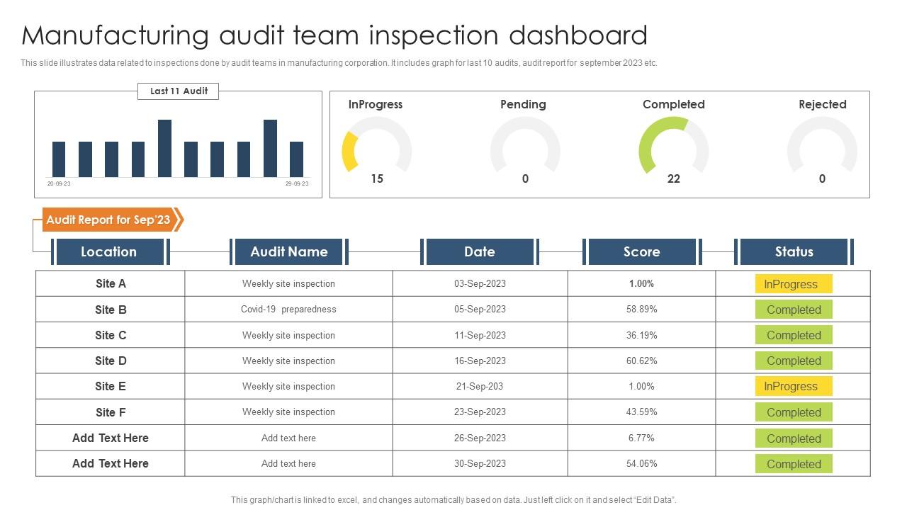
This slide illustrates data related to inspections done by audit teams in manufacturing corporation. It includes graph for last 10 audits, audit report for september 2023 etc.
People who downloaded this PowerPoint presentation also viewed the following :
Manufacturing Audit Team Inspection Dashboard with all 7 slides:
Use our Manufacturing Audit Team Inspection Dashboard to effectively help you save your valuable time. They are readymade to fit into any presentation structure.
FAQs for Manufacturing Audit
Start with OEE, defect rates, and equipment downtime - those are your bread and butter metrics. Quality stuff like first-pass yield and scrap rates matter too. Don't sleep on the compliance side either - audit findings, corrective actions, safety incidents. That's probably where your auditors will dig deepest anyway. Cycle times are solid for spotting bottlenecks. Customer complaints obviously. I'd say pick maybe 8-10 total? You can always add more later, but cramming everything onto one dashboard just makes people's eyes glaze over. Better to nail the basics first.
Dude, real-time dashboards are seriously worth it. You catch problems right when they happen instead of finding out three months later from some dusty report. Production issues, quality drops, compliance stuff - you see it all immediately and can actually do something about it. Way better than digging through endless spreadsheets (honestly, how did we survive that?). The patterns just jump out at you, and your team can finally understand what's going on without being data scientists. Oh, and don't try to visualize everything at once - pick your top 3-4 metrics first.
Think of compliance tracking as your safety net - catches regulation gaps before auditors show up at your door. Your dashboard needs to flag stuff like missed safety checks, expired certifications, anything not following procedures. Honestly, most people think it's tedious until they actually get burned by missing something obvious. Set up automatic alerts so you're not digging through endless spreadsheets like some kind of masochist. Show both current status and what's coming up deadline-wise. That way you'll stay ahead instead of scrambling to fix problems after they happen.
So basically you get this real-time view of everything happening on your production floor - cycle times, throughput, queue lengths, the works. Super helpful for catching bottlenecks before they get ugly. When you see one station consistently dragging behind the others, that's your problem area right there. The cool part is tracking patterns over time instead of just playing guessing games with random issues. Oh, and definitely set up alerts when cycle times go past your targets - saves you from constantly staring at screens all day.
Honestly, start with defect rates, first-pass yield, and customer returns - those three will tell you everything you need to know upfront. Track your inspection failures too since catching problems early saves you tons of money later. Rework costs are another big one. I'd throw cost of quality in there but sometimes finance gets territorial about those numbers, which is annoying. Don't just look at current snapshots either. You need trend analysis over time or you're flying blind. These basics should cover most manufacturing processes, then you can add weird specialized stuff if needed.
Honestly, if your dashboard isn't user-friendly, people just won't use it - and what's the point then? Clean layouts are everything. Make sure the navigation actually makes sense and critical metrics are right up front where you can't miss them. Short sentences help too. I've watched teams ignore perfectly good dashboards because they looked like spreadsheets threw up on a screen (brutal but true). When your crew can spot trends quickly and drill into problems without needing a manual, they'll catch stuff way faster. Don't overthink it - just make it scannable.
Honestly, the worst thing you can do is cram like 15 different metrics on one screen - nobody's gonna look at that mess. Stick to maybe 5-7 KPIs that actually matter for whoever's using it. Don't just grab some random template either, especially if you're in manufacturing. What works for the IT guys definitely won't fly with production managers. Oh, and skip the real-time data obsession - hourly updates work fine and won't break constantly. Keep your colors obvious (red = bad, green = good) and actually test it with real users first. Start basic, then improve it later based on what people tell you.
So basically, predictive analytics looks at your old data plus what's happening right now to catch problems before audits do. You can see equipment that's gonna fail compliance or quality numbers going south weeks ahead of time. Way better than getting blindsided during the actual audit, honestly. Short sentences work too. The system just flags stuff that's drifting from your standards, giving you time to actually fix things instead of panicking later. I'd start by figuring out which audit failures you've had before that probably had warning signs in the data.
Cloud stuff is perfect for this - you can check audit data from literally anywhere with wifi. Walking the factory floor? Pull up dashboards on your phone. Need to share reports with people working remotely? Done instantly. Your team leads don't have to drive in just to check compliance numbers anymore, which honestly saves everyone time. Everything syncs automatically so you're not dealing with outdated info. Way better than waiting around for IT to send those weekly report emails! Oh, and definitely set up mobile alerts for anything critical so problems don't sit there festering.
Your dashboard's gotta adapt when operations change - otherwise you're flying blind. Add temp metrics for new processes or equipment shifts since your usual KPIs won't capture everything. Honestly, I've watched so many dashboards become completely worthless because nobody updated them during transitions. Bump up monitoring frequency for critical stuff and set alerts based on current reality, not old baselines. Real-time change indicators help too. You'll want to review weekly until things settle down - sounds tedious but it's worth it.
Real-time stock levels are your starting point - can't build anything decent without that. Track your turnover rates and aging reports, plus variance between what you expect vs what's actually there. Stock movement tracking shows you exactly where things go sideways in your supply chain. ABC analysis is clutch for figuring out which items need your attention most (and honestly, it's never the obvious ones). Throw in low stock alerts and cycle count scheduling. The whole point is having everything in one dashboard so you're not clicking through a million screens trying to figure out why nothing adds up.
So basically you want to connect your environmental data straight to your audit dashboard. Set up feeds from your energy monitors, waste trackers, all that stuff - it'll pull automatically alongside your regular audit results. Then you're seeing carbon footprint and water usage right next to compliance scores. Honestly makes way more sense than having everything scattered across different systems. Map out which environmental metrics actually matter first (don't go crazy with too many). Configure those data sources to auto-populate, and boom - you can even get alerts when sustainability targets tank during audits.
Dude, you HAVE to get feedback from your floor people - operators, supervisors, whoever's actually using this thing daily. Trust me on this one. I've watched so many dashboards look amazing in conference rooms but then totally bomb when real workers try to use them. Your office view is completely different from what's happening on the shop floor. Those folks will catch stuff like wonky metrics that don't match reality or interfaces that suck during actual work. Quick 15-minute check-ins with users can honestly save you from rebuilding the whole thing later. They'll spot missing KPIs and confusing charts you'd never think of.
Honestly, dashboards are game-changers for continuous improvement. Instead of waiting weeks for reports, you'll see problems as they happen on the floor. Spotting bottlenecks becomes way easier. The visual format is clutch too - your whole team can quickly see what's going wrong and focus on the right stuff. Oh, and you can actually track whether your improvements worked instead of just hoping they did. My advice? Pick your biggest 3-5 headaches first and build around those metrics. Don't try to dashboard everything at once or you'll go crazy.
Three main things have worked for me. Set up automated validation rules that catch weird data in real-time - saves you from scrambling later when reports look wonky. Also do regular reconciliation checks, like weekly comparing your dashboard numbers to the actual source systems. Data drifts apart way more than people realize, it's annoying but unavoidable. Last thing - assign clear ownership for each metric. Someone needs to actually own data quality, can't just hope it stays clean on its own. I'd start with those weekly audits too.
-
Great quality product.
-
Keep doing the good work guys. Surpass the needs and expectations always!!