2017 is here. And it is going to be good, nay great, for presentations. Already by the end of 2016, presenters were expressing the desire to make their presentations better. They want their presentations to be visual, interesting and modern.
What stopped them from doing that in 2016? The management pressure to conform to the pre-existing color palette, company template and the excruciating difficulty to reduce the text from their PowerPoint slides. But it’s time to “break the mental walls” and not “build walls” in 2017. It’s time to embrace the cultures of others and reflect the same in their design. Basically, it’s time to…
Trump the Old Bullet-Point Design, Make PowerPoint Great Again (Tweet This)
The design trends that became popular in 2016 like flat design will continue to pick pace in 2017. At the same time, new trends will emerge that will try to bring presentation design at par with web design. For although the world of web design metamorphosed in the last decade, presentation design hardly so. In 2017, that gap is definitely set to reduce as PowerPoint design becomes a highly demanded skill for marketing and sales professionals and the academia.
Here are the 17 presentation design trends to look out for in 2017:
#1- Beautiful Animation is Back! Thanks to Morph
After some horrendous use of animations a few years back that led to “Death by PowerPoint”, animation (but a great one) will infuse new life into presentations this new year. Called Morph, this transition (yes, a transition) smoothly animates the movement of objects, shapes and text in slides to create a spectacular effect.
This new feature is available to those who have PowerPoint 2016 and an Office 365 subscription at the moment. With majority of PowerPoint users still using the PowerPoint 2013 version, they are yet to try out this feature. As more and more people upgrade to PowerPoint 2016 and if Microsoft rolls out this feature for all users, then the Morph transition/animation will take the PowerPoint world by storm. Check out the video below to see the magic of Morph in action:
Morph has great potential to transform Business Presentations too. Check out the video below to see what we mean:
The above two videos showed the morphing of objects on a slide. But you can also morph words and alphabets in your slides. Here’s a video showing morphing of words in PowerPoint 2016:
Access Beginner’s Tutorial on Morph Transition
#2- Action Pictures (Powerful & Unforgettable Images)
Many of the presenters have already been leveraging the power of visuals in their presentations. But with more and more websites offering high quality public domain images, the presenters can’t help but being spoilt for choice in 2017. With more options, however, also comes more responsibility- the responsibility to choose the best images and give themselves a break from stock photos. But what kind of photos will rule PowerPoint design in year 2017? We have a gut feeling these will:
Images That Mirror Real Life
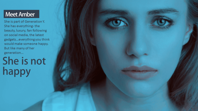
Stockphotos are impersonal. Audience just can’t relate to the gorgeous models sitting in front of their desktops doing programming or sitting oh-so-stylishly in the executive meeting deeply pondering over pie charts and numbers. Don’t you agree? Photos in real settings of “real” people strike the right chord with the audience. Most importantly, they impinge upon one of our raw emotions that are the key to persuasion and action.
“When dealing with people, let us remember we are not dealing with creatures of logic. We are dealing with creatures of emotion.” Dale Carnegie
Images pertaining to real-life incidents will lend more credibility to presentations this year like the one below (true picture of stock market crash of 2008):
Images That Inspire
Motivational presentations, sermons, self-help presentations, etc. will definitely use powerful, inspiring visuals so that the message gets imprinted in audience’s memory.
Images With Perspective
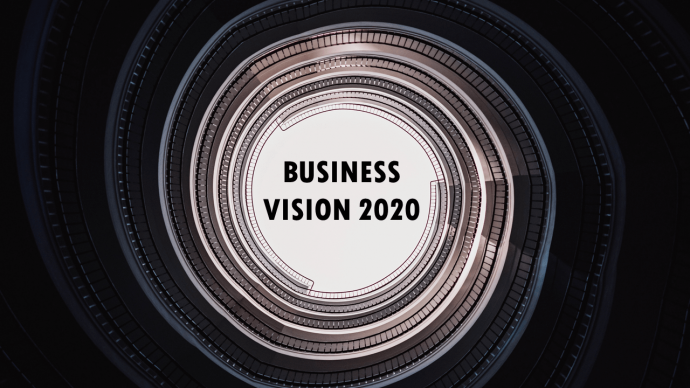
Different angles and perspectives are all set to provide a different experience to viewing slides. Images taken of high rise buildings from the bottom like the ones below evoke a sense of authority, power and superiority in the minds of the audience. That effect translates to your presentation and organization making you look more authoritative and credible:
Images That Amuse
Laughter is the best medicine and any audience would love to be entertained by a presentation. It’s time to shed the serious and boring attitude taken towards presentations and have fun once a while. Choose happy, quirky images that amuse the audience and cause those happy chemicals called endorphins to release in their brain. Images of animals are the most memorable images. You might as well think about leveraging one of the most craved emotions- happiness- to spice up your slides this new year.
Take a pledge to not create image blunders 2017 onwards (read pixelated images, watermark images, cliparts). Image sins ruin your presentation career like nothing else. Check out the:
11 Dos And Don'ts Of Using Images In Presentations
#3- Stories (Real Life Examples)
“Words are how we think, Stories are how we link.” Christina Baldwin
We all have stories to tell. Sadly, presentations are still not using storytelling techniques in their presentations to help audience connect with them. There is lot of potential for storytelling. Even a product launch presentation has a story- the dream or the experience that led to the idea, a Sales presentation has stories of customer experience, and so on. Case studies substantiating your claims are stories. Look at TED talks and you’ll notice how their presentations are interlaced with stories. The kind of connection that audience shares at TED talks can be achieved in your presentations too, if you learn the art of storytelling this year.
#4- Typography to Enhance the Power of Words
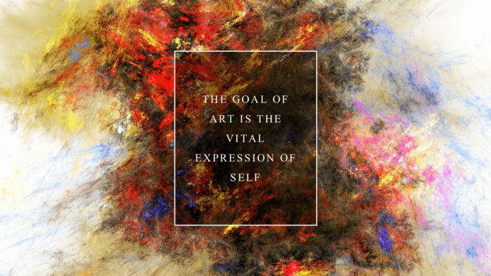
Typography- the art of designing the printed word- will definitely be seen playing a big role in the design of cover slides. A cover slide is the first impression on an audience and the words you put on it has to be impressive and powerful. Typography helps you evoke feelings through words. Imagine reading the word “Chaos” in a polished font versus a chaotic font. Add personality to your words by trying out customized fonts. If you save your text as image, then there is no worry of the font missing on a different computer system.
Plus, with more and more websites offering customized fonts and creating new font styles, presenters are duty bound to avail the same and make their presentation content a visual delight. Here are two examples of slides that use a custom font to match the personality of the word and the font, creating a powerful effect as a result.
Add typography skills to your presentation design skills this year. Becoming a typographic expert is easier than you think. It is all about understanding font types and applying text effects to leverage the power of words. Get started with typography and text effects in the new year 2017 by following the tips mentioned in the article below:
11 Typography Tweaks And Text Effects To Spice Up Your Presentation Content
#5- Battle of Big vs Small Font
Speaking of Typography, 2017 will have a typographic battle of big versus small. Give a shout out to your audience through your presentation with a font size screaming for attention. No harm in that if the announcement or fact you are sharing is worth a 120 font size. Or you just want to grab attention of a distracted audience.
Small is big in its own way. Not so small that one has to squint but a reasonable size like a 28 or 32 point, just sufficient enough to be read and not craving for attention. However, when standing alone in a slide with no other content competing for attention, this text in small font size lends a sophisticated, artistic look that makes people want to pay attention. Try this out in 2017- keep as less content as possible on your slide (audience will remember that more) rather than fill your slide with text and have audience remember nothing of it.
#6- Minimalist Design- White Space to Rule
Minimalism made a lot of noise last year, especially in the web design world. What does minimalism as a philosophy say? Just keep what you need, not what you want. In design, it implies removing all design elements that are extra- added perhaps to beautify the design- lines, shadows, reflections, 3-D shapes, and so on. That is what gave birth to Flat Design- which is our next point. But here, by minimalism we mean extreme minimalism that some presenters would try to achieve this year.
Take a look at the design below- just four words and an icon. This seems very difficult to achieve in presentation design, considering presenters’ love for filling up their slides with tons of text. But we are hopeful some will give this a try and embrace minimalism in design and lifestyle (interior designing for instance).
#7- Battle of Skeuomorphic & Flat Design
Flat Design is a type of minimalist design that became a rage in web and app design a few years back. It was a reaction to skeuomorphic design style that tried to mimic the real world and hence used 3-D, shadows, textures, etc. to create an exact replica of the objects in the real world. Skeuomorphic designs thus often became too complicated, decorative and visually distracting. The focus was being drawn more towards design and less towards the content.
Flat design was an offshoot of Minimalist design, the one we just discussed above. In the digital world of today, designers felt we no longer need to create 3-D shapes to mimic real life. The focus should be on usability (content) and not design. Hence, minimalist school of design advocated use of two-dimensional, flat shapes (sans shadows, textures, 3-D, bevel and so on). To make the design look appealing at the same time, the school advocated use of bright colors that make the design interesting and modern. Check out Microsoft Window’s interface, one of the first to move to flat design.
But will flat design rule presentation design too? Not yet. Skeuomorphism and flat design will both dominate in PowerPoint design in 2017. In fact, a mixture of these 2 designs will be favored (for example, flat icon + drop shadows). Which one would you go for this new year?
Skeuomorphic Design in PowerPoint Presentation
Here is an example of rich design used in creating a PowerPoint presentation. See the menu, background, shadows and blur effect used to mimic a real life restaurant table:
Web design may have said goodbye to rich design, but in presentation designing, it’s here to stay!
Flat Presentation Design
Flat design won’t remain typically flat in presentation designing, we believe. Presentations will combine elements of rich design (skeuomorphism) and flat design- for instance flat icons (2D) with drop shadows (3D). For instance, in the flat design below, you can still notice shadow given to the video game console to make it appear raised from the background:
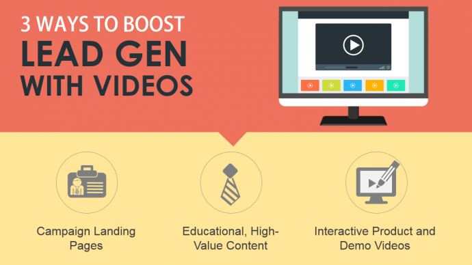
A typical flat design in presentation would be one like this PowerPoint slide design below:
Imagine the above slide as 9 bullet points? Urgh, right? Access readymade, editable flat design PowerPoint templates for your presentations this year by clicking the link below:
Complete Collection of Flat Design Templates for Presentation
#8- Warm, Cool Colors That Pull People
In 2016, many organizations were still hesitant to try out new colors in their presentations. The fear of appearing unprofessional and kiddish forced them to stick to the old color palette of blue and greys. In 2017, as competition between businesses grow, each organization will bring out multiple content types like infographics, PowerPoint presentation, brochure, etc. to maximise their content ROI. With that, the design will also overlap across these contents and presenters, unwittingly, will embrace modern, rich, warm colors that will change the landscape of presentation design.
Colors have an impact on our psychology and emotions. Warm colors like red, orange and yellow are inviting colors and make the design elements closer appear closer to the eye. Cool colors like blue and green have a soothing effect making the design objects appear farther from the eye. So choose a color scheme that gels with your topic, industry and emotion you want to evoke.
#9- Icons
Icons are already a part of every presenter’s design vocabulary. This trend will definitely hang around in 2017 as well for icons turn any ordinary slide into a professional one in seconds. These small visual representations of a concept are universally understood, take up no space, and are editable. Icons are definitely the new bullet points!
How to Transform Boring PowerPoint Designs with Icons (Part 1)
How to Transform Boring Slide Designs with Icons (Part 2)
#10- Gradient Backgrounds/ Pattern Backgrounds
White plain background is boring. Subtle design additions to background can enhance the meaning of the slide. A cuisine presentation, as you saw in Skeuomorphic example above, looks lively and inviting by using texture of a table as a background. Educational presentations can have green chalk texture as its background.
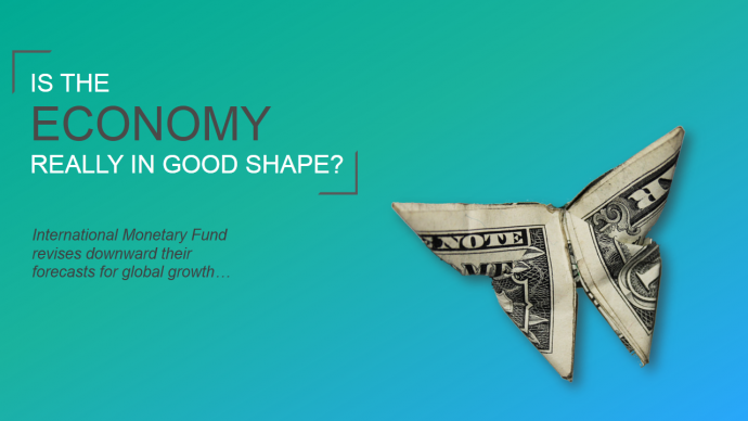
Beautiful gradient backgrounds can be tried out too. The only thing that has to be kept in mind while mixing gradients is that it should not affect the readability and legibility of content in foreground. Also choose colors that gel with each other (red and orange hues, teal green and blue) and not colors that blind the viewer. Here is a beautiful gradient background that can be applied to business presentations too:
Gradient Background
A professional designer would tell you that there are no bad color combinations, just color combinations done badly. So, you’ll have to rely on your aesthetic sense or your trusted friends’ to create the right gradient background.
Download 7 Awesome Gradient Backgrounds for Your 2017 PowerPoint Presentations
Pattern Backgrounds
Faded patterns in the background lend an artistic touch to your presentation and subtly enhances the impact of your slides. Use a pattern background related to your presentation industry to maximise the effectiveness of your ppt slides. A presentation on information technology or networking, for instance, would be more engaging if an interconnected pattern is used like in the slide below:
#11- Interesting Slide Layouts
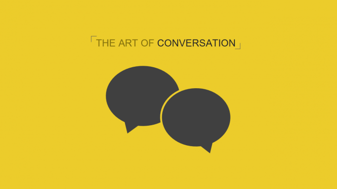
Time to make your audience go WOW! There are plenty of presentation design hacks that you can try to create outstanding slides. Go beyond the list slides having one dot point after another. Make each slide a visual delight for your audience.
Create cool image collages like the one below:
Or try out attention-grabbing design hacks like the split image hack as you see in the slide below:
Learn to Create This Split Image Effect in PowerPoint in Less Than 5 Minutes
#12- Creative Template Designs
2017 will be a busy year for presenters. You might want to master everything- typography, background styles, image hacks, and so on, but find yourself short of time to create creative slides. But since you have taken a pledge to trump the bullet-point slide design (I hope so), employ professional PowerPoint templates and diagrams to quickly create beautiful and impactful slides.
For us at SlideTeam, that means coming up with creative template designs (and fully editable) that will help you meet the presentation deadline and still create professional slides.
#13- Infographic Design
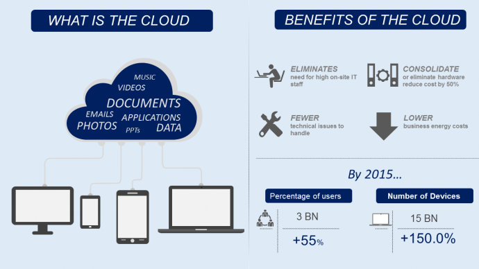
Infographics or information graphics are eye-catchy, graphic visual representation of your data or content. Infographics turn boring, mind numbing data into engaging content using data visualizations, typography, interesting color schemes and neatly arranged text. The purpose of an infographic is basically to turn complex data and information into appealing, simple graphics that can be easily consumed by the audiences in a short time. That should be the purpose of your presentations too, right?
If you have lots of numbers and statistics to tell in a short space, then infographic style is the design layout you need to follow in presentation design in 2017.
#14- Data Visualization
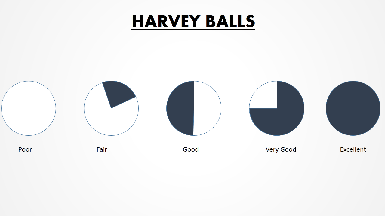
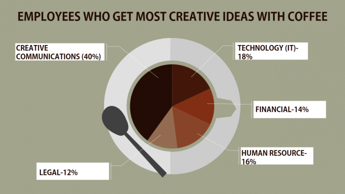
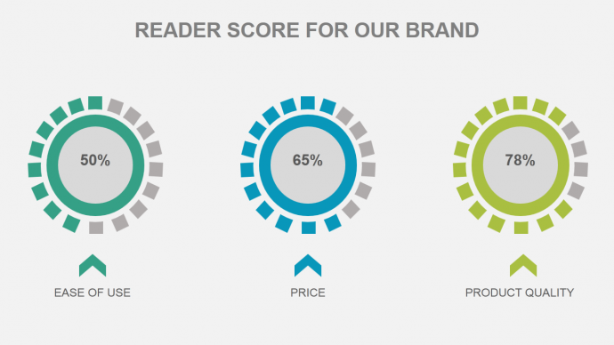
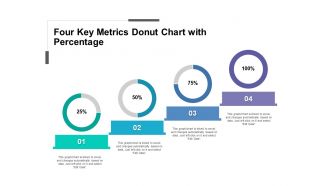
A logical after effect of infographic design trend is the increased use of data visualizations in slides. Rather than just say the numbers in the slide, try to show them. There are tons of data visualization tools you can use to show numbers. Graphs, tables, pie charts, for instance can be used for quantitative data and harvey balls for qualitative data. You can also use thermometers, speedometer dials and gauges, donuts, batteries, and more to creatively depict your data. Put magic in your numbers in 2017.
#15- Cleaner Charts & Graphs
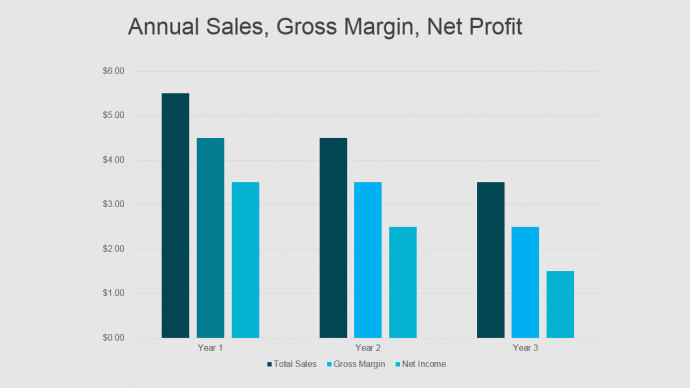
Graphs like bar diagrams and charts like pie charts are the most commonly used data visualization tools in PowerPoint industry. Whether it is a sales presentation, marketing PPT, educational presentation or any other, graphs are usually included to show change over time and pie chart to show survey results. The diagrams used, however, tend to be very crowded and complicated with legends missing, bad color schemes, too many categories, 3D angles and what not. That is hopefully all set to change in 2017 as a natural consequence of flat design and infographic trend.
#16- Vector Designs
Vector graphics are becoming very popular in videos, infographics and now presentation design too. Images can be a bit too busy with too much happening in background and the models in images taking attention away from the message. Vectors, however, are flat shapes that focus only on the message. It is better to create educational videos with vector graphics rather than images for this reason. Vectors are editable, so you can change the colors to match your branding needs which is not possible in images.
#17- Widescreen Presentations
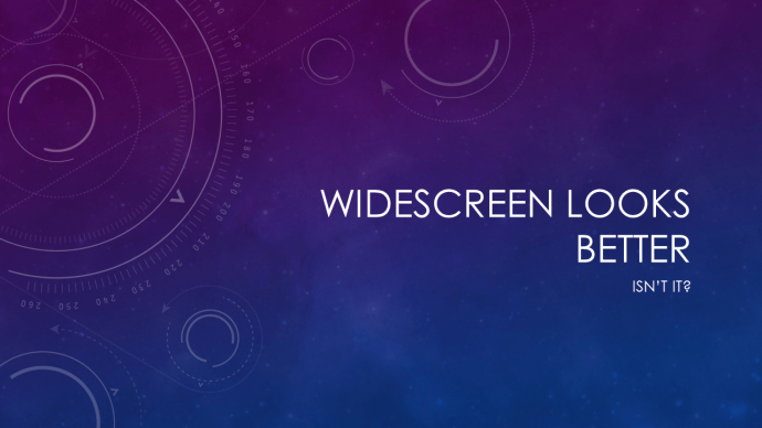
Many have already upgraded to PowerPoint 2013 and now PowerPoint 2016 is here too. The default slide layout in both these versions is the widescreen (16:9) aspect ratio. The difference between a video and a presentation is getting blurred and widescreen has a big role to play in that. You can narrate your PPT, convert it into video using PowerPoint “Convert to Video” feature and upload it to YouTube or create flipped classroom, training videos. Widescreen is the perfect design layout for all these uses and 2017 will see majority of presenters using this format.
Which of these design trends are you already following? Which new design style are you eager to learn and adopt in your PowerPoint presentations in 2017? Tell us in the comments below.
Tweet These 17 Design Trends To Your Followers
This post is part of a series that bloggers in the presentation space are writing on modern design. You can find the others in this series here.



 Customer Reviews














![[Morph PowerPoint Tutorial] Beginner’s Guide to Using the Morph Transition in PowerPoint 2016](https://www.slideteam.net/wp/wp-content/uploads/2016/12/Morph-Tutorial-PowerPoint-How-to-Use-the-Morph-Transition-Feature-in-PowerPoint-2016-335x146.png)






George Torok