Japan had the fewest number of childbirths in 123 years, in 2022. Some believe the country will ‘disappear’ due to its falling birth rate. As if to lend credence to this belief, the 2023 Oscar entry from Japan is also a dystopian film on a government plan to euthanize the elderly. How did Japan get here?
Our existence is fundamentally dependent on a population. It refers to the number of inhabitants of a nation, city, or other regions. A population chart pyramid is the most effective way to illustrate how, over time, population patterns and settlements change in a society.
What is a population pyramid?
A population pyramid is a visual representation of the population’s gender and age distribution. It illustrates population sizes and trends that are disproportionately prone to sudden world, historic world events like a war, high maternal mortality rates, or worker emigration. Natural calamities like the earthquake in Turkey also affect the population pyramid.
Need to analyze and simplify mind-boggling data and make sense out of information. Click here to this with a sense of flair, expertise and purpose.
You can learn tips and tricks for making a graphic representation of population pyramids from this blog. We at SlideTeam, have prepared a list of Population Chart Pyramids to assist you in visually displaying changing population dynamics for every country. These templates are a helpful tool to comprehend the population’s overall structure at any given time using essential metrics and variables on the horizontal X-axis and vertical Y-axis. Your basic hypothesis can also be tested with the use of these population charts.
The 100% customizable nature of the templates provides you with the flexibility to edit your presentations. The content-ready slides give you the much-needed structure.
Examine historical and current population trends with SlideTeam’s world-class PPT Templates!
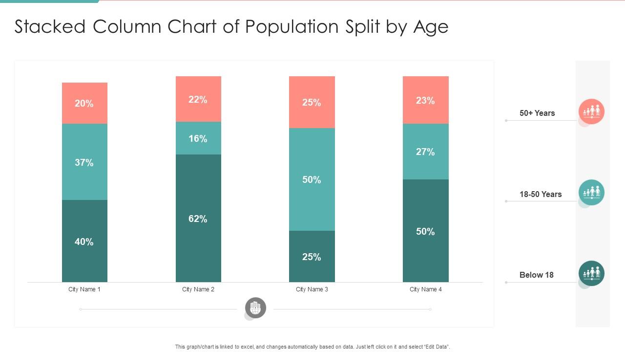
Template 1: Stacked Column Chart of Population Split by Age PPT
Do you want to compare numerical values between categorical variable levels? Create a stacked column chart of population split age using this PPT Template. This population pyramid will make it easier to see how much each age group contributes to the population by presenting information, and comparing it through horizontal data visualization tools. Employ the presentation to aid users in comprehending how each piece of data relates to the data set. Get it now!
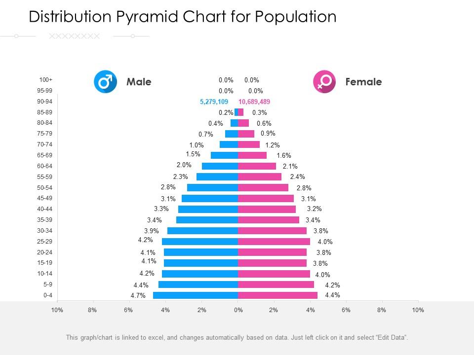
Template 2: Distribution Pyramid Chart for Population Template
Use this PPT Template to create a population pyramid that shows the distribution of a population across age groups and sexes. It will serve as a crucial demographic statistic for identifying population changes or variations. Employ this presentation to investigate the effects of climatic factors, resource availability, gender and age differences on population distribution. Download now!
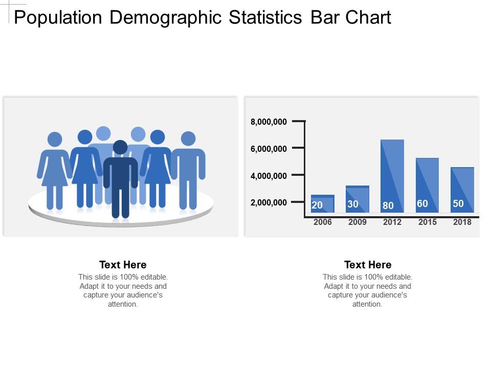
Template 3: Population Demographic Statistics Bar Chart PPT
Demographics help us understand population size, status, and behavior. Use this PPT Template to investigate population characteristics; the given population pyramid is an excellent resource for comprehending statistical variables that have a bearing on population growth or decline. It is beneficial for institutions and corporations to learn more about the characteristics of a population for policy development and economic market research. Save this presentation template now!
Template 4: Tornado Chart for Population Pyramid PPT
Create a tornado chart, also known as a butterfly chart, for a population pyramid using this PPT Template. This presentation is an analytical tool for tracking the population’s value propositions. It depicts a unique type of bar chart in which population data categories are listed vertically rather than horizontally. Employ this infographic to define how independent variable values affect a specific dependent variable, as well as a set of assumptions. Download now!
******
Understand the population dynamics.
This population representation based on gender and age provides a wealth of information about fertility, mortality, migration, and population dynamics. Use SlideTeam’s PPT Templates to investigate a region’s or country’s stage of demographic transition or level of development.
PS Check out our guide to explore the steps you need to follow to create a butterfly chart in PowerPoint.
FAQs ON POPULATION CHART PYRAMID
1. What are population charts?
Population pyramid charts (also known as ‘age-sex pyramids’) are popular for presenting and analyzing population data based on age and gender. It is shown in the form of bar graphs. Each bar graph represents an age group, with males to the left of the vertical axis and females to the right. Typically, a triangle represents these, but can take on other shapes. Since this data pertains to a population's age and gender, the proportion of people in the older age groups declines in relation to the average lifespan of the population. Hence, the age and gender composition of a population determines the shape of the population pyramid, with age represented on the vertical axis and gender represented on the horizontal axis.
2. Why are population charts important?
The population pyramid can be used in the following ways:
- It depicts the age-sex structure.
- It provides data on the birth rate, death rate, life expectancy, male-female migration, working and dependent population.
- It describes the demographic transition stage and demonstrates population growth pattern that helps in population projection
- It aids in demographic and economic planning.
3. What are the three types of population pyramid?
Expansive Pyramid
It is triangular, with each age group displaying a bar. A large population base indicates a high birth rate. The graph’s tapering top indicates a region’s lower life expectancy.
Constrictive Pyramid
It is the inverse of the expansive pyramid, with a slight decrease in the younger age group. Greater living standards and a higher life expectancy point to a large population of senior citizens. The population is still declining, as there are fewer births than deaths.
Stable Pyramid
It is rectangular in shape, indicating that people of all ages are evenly distributed. It shows that life expectancy in such areas is high due to improved living conditions and access to medical services.


![How to Graphically Represent a Population Chart Pyramid [Templates Attached]](https://www.slideteam.net/wp/wp-content/uploads/2023/03/Population-Chart-Pyramid-1013x441.png)

 Customer Reviews

