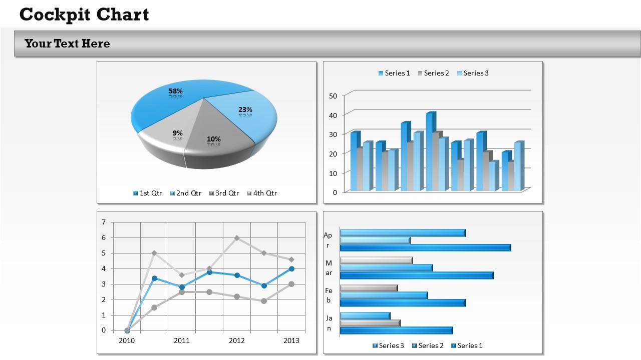
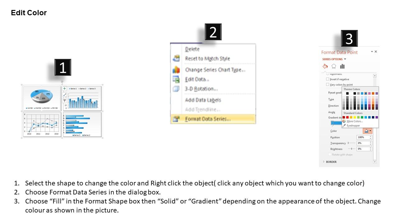
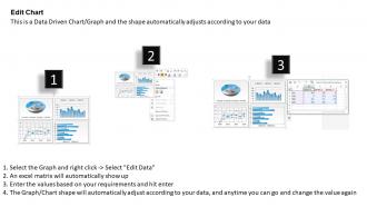
0314 Data Driven Dashboard Snapshot Design
Try Before you Buy Download Free Sample Product
Audience
Editable
of Time
Working on a project, is no way an easy task. To make it easy all you have to do is give a look on this amazing 0314 data driven dashboard snapshot design presentation and download it. Dashboard defines the sales or financial activities and the end results that will be performed and how the targets will be accomplished. The use of creative graphic icons offer its users to get a fascinating template. In fact, this template can be easily brought into use to make your presentation appealing and interactive at the same time. Use this example of PPT presentation for sales, marketing, management, finance related topics. Project planning is holistic and encompassing. There is full chance to incline your audience, investors and financiers towards you if you use this diagram. This PPT slide can be the heart of your presentation. Stakeholders and professionals can refer this PPT for assistance and can customize with editable graphics. Plan well, work well, and perform well for the customer. Our 0314 Data Driven Dashboard Design take your ideas forward. They get the eyeballs they deserve.
People who downloaded this PowerPoint presentation also viewed the following :
0314 Data Driven Dashboard Snapshot Design with all 3 slides:
Ride the surf with our 0314 Data Driven Dashboard Snapshot Design. They will keep you upright till you hit the shore.
FAQs for 0314 Data Driven
Honestly, most people go way overboard with dashboards - like they're trying to fit every metric ever invented on one screen. Stick to maybe 5-7 KPIs that actually matter for decisions. Conversion rates, revenue trends, user engagement, that kind of stuff. Your users need to act on this daily, not admire pretty charts. Start by asking what decisions they're making, then work backwards. Show current numbers AND trends over time - both matter. The whole thing should tell a story that connects to real business outcomes. Trust me, less is definitely more here.
Honestly, colors can make or break your dashboard. I've literally seen ones that are painful to look at - like someone threw a rainbow at a spreadsheet. Stick to 3-5 colors tops, and make sure there's good contrast so people can actually read stuff. Red for warnings, green for good metrics - you know the drill. The whole point is helping users spot what matters without their eyes bleeding. Test it with real people too, because what looks fine to you might be total chaos to someone else trying to find their KPIs.
Put your biggest metrics top-left - that's where people look first. I'd group similar stuff together and make your key numbers bigger than the detail text. Honestly, most dashboards I see are just chart vomit! White space is your friend here. Don't cram more than 5-7 main things on one screen or you'll lose people. Keep colors and fonts consistent throughout. Here's the real test though - for every piece of data, ask "what decision does this actually help with?" Can't answer? Delete it. Oh, and vary your chart types a bit so it doesn't look boring.
Honestly, interactive dashboards are so much better than static ones. Your users can actually dig into what matters to them instead of staring at boring charts. Add some filters and hover tooltips - suddenly people are exploring the data themselves. Think of it like... you know when you're shopping online and can filter by price? Same concept. Start with basic stuff like clickable charts. Don't go crazy with fancy features right away though. See what people actually use, then build from there. Way more engaging than just dumping all your data on them at once.
Tableau and Power BI are definitely your best bet for gorgeous dashboards - they make even messy data look professional. I've been using Tableau for years and it's crazy how good the visuals look with minimal effort. D3.js gives you total creative control if you can code, but that's a whole other beast. Google Data Studio is solid for basic stuff and won't cost you anything. Oh, and Figma's great for sketching out ideas first - I always forget about that one. Start by figuring out your budget and what data you're working with. That'll save you tons of time deciding.
Don't wait until the end to think about accessibility - bake it in from the start. High contrast colors are your friend for readability. Alt text on every chart and visual is non-negotiable. Everything should work with just a keyboard too. Here's something that blew my mind: way more people are color-blind than you'd expect, so patterns and labels beat color-only coding every time. Screen reader testing is clutch. Honestly, those basic accessibility checkers are a decent starting point, but nothing beats having actual users test your stuff. Multiple data formats help too.
Honestly, storytelling is what separates good dashboards from total messes. Map out the story your data's telling first - like, what's the main point you want people to walk away with? Then arrange everything so it flows logically. Big picture stuff goes up top, then you can drill into the details below. It's kinda like writing an article where the headline hooks you and everything else supports it. Without that flow, people just stare at random charts wondering what they're supposed to think. Trust me, I've seen way too many dashboards that look like someone just threw charts at a wall.
Function first, then make it look good. Put your biggest metrics up front and keep the less important stuff visible but not screaming for attention. Those flashy animations? Honestly, they just annoy people who want answers fast. Stick with colors that mean something - red for problems, green for good stuff. Give everything room to breathe with white space, and pick fonts people can actually read on their phones. Most importantly, watch someone else use it. If they're squinting or clicking randomly, you've overdone the pretty stuff and buried what they actually came for.
Don't cram everything onto one screen - biggest mistake I see everywhere. Pick the metrics that actually matter to your users instead of showing off your entire data catalog. Skip the fancy 3D charts too, they're just confusing eye candy. Load times matter more than you think. Stick with colors and fonts that don't make people's eyes bleed. Oh, and please test it with actual humans first! I can't tell you how many "obvious" design choices completely baffled real users. Focus on answering their specific questions rather than creating some beautiful dashboard that nobody understands.
Honestly, it totally depends on what kind of data you're dealing with. Financial trading stuff? Yeah, that needs to update constantly. But monthly sales reports? Daily or weekly is fine. Here's what I'd do - just ask your users how often they actually look at the thing. Most people have a natural rhythm for checking dashboards based on when they make decisions. You don't want to spam them with updates every five minutes if they only care about weekly trends (learned that the hard way once). Start somewhere reasonable, then tweak it based on how people actually use it.
So for comparing stuff side by side, bar charts are clutch. Line charts? Perfect when you want to show how things change over time. Pie charts work for showing parts of a whole, but they get super messy once you hit more than 5 slices - learned that the hard way. Scatter plots are great for showing if two things are related. Oh, and heatmaps are awesome for big datasets, especially location stuff. Honestly though, just think about what you're actually trying to show first. Are you comparing things? Showing a trend? Looking at relationships? That'll tell you which chart to pick.
User personas are seriously your best friend when designing dashboards. They show you exactly what data matters and how to lay it out. Busy executives? Give them clean, scannable KPIs they can digest fast. Analysts though - totally different story. They want to dig deep into granular data with drill-down options. Honestly, I tape persona cards right to my monitor during design work because it's way too easy to build what YOU think looks cool instead. Map out each persona's main questions and daily routines first. That roadmap will basically design the dashboard for you.
Dude, mobile responsiveness is huge because everyone's checking dashboards on their phones constantly. Executives especially - they want those quick updates while they're between meetings or whatever. Nobody wants to squint at microscopic charts or do that annoying horizontal scrolling thing. They'll literally just stop using it. Your design needs to work with touch properly and keep navigation simple. On mobile you've got way less space, so your most important KPIs better be front and center. The data hierarchy thing becomes super critical - people need to grasp the key stuff immediately.
Honestly, user feedback is what separates useful dashboards from pretty paperweights. People will tell you straight up if your metrics are garbage or if you're missing filters they actually need. What you think matters vs. what they care about? Usually totally different things. The cool part is users come up with ideas you'd never think of - like, stuff that seems obvious once they say it but completely flew over your head. I always set up regular check-ins because otherwise you're just building in a vacuum. Oh, and actually listen when they complain about cluttered visualizations!
So basically, operational dashboards are for stuff happening right now - like when your website crashes or sales are tanking today. You need that data updating constantly because you're literally putting out fires. Analytical ones are different though. They're about spotting patterns over months or quarters, so daily updates work fine. Way more complex charts and deep-dive features too. Honestly, I'd keep operational dashboards super clean with obvious alerts. Nobody wants to hunt for problems when everything's breaking. Analytical can get fancy since people have time to actually think through the data. Just pick based on whether your team needs to panic or plan.
-
Very unique, user-friendly presentation interface.
-
Appreciate the research and its presentable format.