“What does the human eye look at first on a page” asked many a curious designer, more so a web designer. As presenters, have we ever asked the same? Why not? We need to be curious about our audiences’ reading behavior too. Don’t we want our slides to be read and seen the way we want them to? Won’t knowledge of their behavior help us take better decisions as to what to put on slides and where?
So we come back to the question- where do people look at first on a printed page or web. A quick research on eye-tracking studies throws up these findings:
Eye Tracking Studies: What Do They Tell Us
Eye-tracking studies are very fascinating. It’s so enlightening to know what readers read first, second, third and so on, and where their eyes stay fixed for the longest duration. How do we know that? Well, participants have to face a little discomfort in wearing head gear (pretty expensive equipment) and asked to go about reading their websites the way they normally do. The software generates a heat map that reveals it all.
Although most eye-tracking studies have been conducted for websites and Google search results (which are mostly heavy on text), we can still glean valuable information from these studies. Agreed that slides are an altogether different ball game. A PowerPoint presentation is a visual aid and is supposed to be visually heavy rather than text heavy. But we can take advantage of the universally set reading patterns, break the rules like a pro and make our slides more impactful. So here we go:
1. Top Left Corner of the Page is the First Seen
Where do people look first? Studies have shown that people start reading from the top left corner of the page. That is the reason most websites keep their logo on the top left corner.
What does it mean for your slides: Keep the most important element in the slide- say your headline- on the top left. You are free to break the rule but for that you need to know the next findings too.
2. Text Preferred Over Images
There is a lot of debate as to what is first seen on a page- text or images. While it is generally believed that images are seen first, a 2000 study by the Poynter Institute on newspaper sites revealed that of users’ first three eye-fixations, 22% were graphics and 78% were text. This was contrary to popular opinion and the 1990 study by Poynter. It was a good news for businesses (especially newspapers since the study covered that). Good News being your content is read.
But let’s remember that the people were reading a newspaper website where people went to read news and it’s a study conducted 17 years ago when audience wasn’t text-saturated. Hearteningly, the audience isn’t text-saturated today too. A 2016 study by Pew Research Centre found that 42% younger adults prefer words over images when it comes to news.
CAUTION: What does it mean for your slides: Experience with terrible, text-heavy slides suggest the opposite. Viewers of slides are text-saturated. Presenters should not take wrong message from the Pew and Poynter Research and start filling their slides with text. It’s a visual medium and should be treated that way. Text is important but keep it minimal.
3. Upper Fold is the Longest Viewed
The Eyetrack III research by The Poynter Institute, the Estlow Center for Journalism & New Media, and Eyetools found, "The eyes most often fixated first in the upper left of the page, then hovered in that area before going left to right. Only after perusing the top portion of the page for some time did their eyes explore further down the page."
What does it mean for your slides: Keep the most important message in the top half. Of course, the layout determines the reading behavior of the audience. If you are horizontally splitting the slide, keeping the important information in the top half makes sense. If you are vertically splitting the slide, then keep it to the left as the eye-tracking studies also reveal the finding below.
4. Left Half of Page is Dominant
Western society is habituated to reading from left to right since most written languages were created in this way. Study by Nielsen Norman Group finds that web users spend 69% of their time viewing the left half of the page and 30% viewing the right half. The Nielsen Norman Group also discovered the F-Pattern of Reading- readers start from the top-left corner, move horizontally to the right, move down a little and read horizontally again, and finally reading vertically from top left to bottom left.
Is this 2006 study still relevant today? A recent study on reading gaze on smartphones found the F-pattern still present.
What does it mean for your slides: If you are vertically splitting the slide, keep the most important message on the left. The dilemma comes again- text or visual on the left? Remember that presentation should focus more on visuals as they are remembered more as compared to text. Therefore, keep images to the left without any worry!
5. Big, Bold Headlines Catch the Eye
The Eyetrack III research also quotes, “Dominant headlines most often draw the eye first upon entering the page -- especially when they are in the upper left, and most often (but not always) when in the upper right.”
What does it mean for your slides: Use Contrast, Emphasis and the power of Font Combinations to add power to your title in presentations. You can even replace alphabets with icons to make your text a visual feast for the audience.
6. People Don’t Read Pages, They Scan Them
All eye-tracking studies have shown that people scan pages to find the stuff useful to them. They are ruthless in ignoring details. But when the most relevant information for them has been found, they dive into the same and read in full detail.
What does it mean for slides: Don’t have running paragraphs. Break it into chunks with headings. Make the important word in a sentence bold or italic to break the eye movement and draw in the audience’s eye.
Breaking All Eye-Tracking Rules in Presentation Design
A very important concept in design- ANY design- is Visual Weight. Visual weight is the idea that certain elements in design appear to be heavier than other elements. We need design elements of varying visual weight to establish a visual hierarchy. A headline in 60 point size will be visually heavier than a headline in 24 point size. Dark red will be visually heavier than light grey on a white slide. Element with maximum visual weight will attract eye the first- that appears obvious.
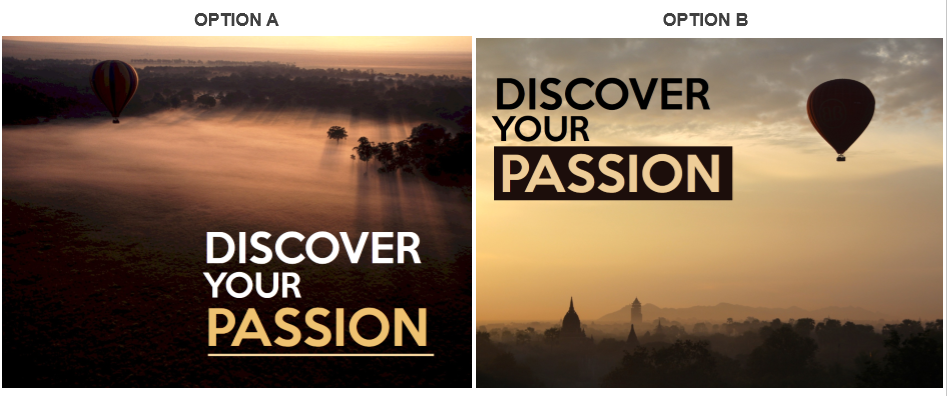
When you use this concept in presentation design, you can break all the above findings and direct the audience eye to place where you want it to go. You can place an 80 point size heading on the bottom-right in your slide and the audience will notice that first. But there should be a logic behind that. You could have placed the headline on the top-left too as the eye-tracking studies suggest. Which slide design would you choose between these two? (We would go for Option A even though it does not follow the top left corner headline rule. What about you?)
Eye Flow in Presentation Design: How Easy Is It
We all have to agree that every design has a flow- even if it is haphazard. There is a pattern in which our eyes move from one piece of information to the other. As presenters or creators of slides, we have a moral duty to ensure that our audience is able to consume the bits and pieces of information on our slide in the shortest time and without any cognitive strain.
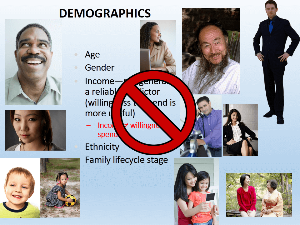
Sadly, many slides are not just a cognitive strain but an eye strain too. Have you ever come across terrible slides that had so much information screaming for attention that you didn’t know where to start; let alone go through all of it. Here’s a slide that despite best intentions is making the eyes roll way too fast in the sockets:
What do you notice first? The title “Demographics” or the man in the top left looking at God-knows-who? What next? Do you read the bullet points but leave that in midway to look at the cute Asian girl on the left? Does the man in the beard on the right draw your attention too with his beaming smile? Not a minute into reading this slide and the eyes want a break!
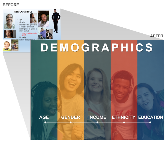
For a change, the slide is not stuffed with text. There are visuals which speak a thousand words each. Yes, the choice of images is wrong- some have a busy background, while some are transparent. There is no uniformity in the dimensions of images too. But taking care of these factors still wouldn’t save the slide. As you have already guessed, the fatal flaw is the irregular placement of design elements. The flow in this slide design is crazy left-right, top-bottom, diagonal..culminating in spinning of eyeballs! I am sure you have already fixed the slide in your mind and probably decided to go for a single image like we did in the slide makeover below:
The left to right placement of each demographic variable and the splitting of slide into 5 colored boxes makes the eye movement so easy and information so easy to grasp. This is called Compositional Flow in design- composing the design in such a way that eye flows from one design element to another in the way you want it to be. So, let’s see ways in which we can manipulate and create designs to make eye movement easier and helpful in attaining our presentation objective.
Strategies to Incorporate Eye Movement in Design of PowerPoint Slides
Strategy #1- Leverage the Power of Eye Gaze
If you see a group of people looking towards something, we automatically tend to look in that direction. We can’t help doing this. Call it curiosity, survival mechanism or herd instinct, we are wired to follow the eye gaze. Take advantage of this in designing slides. You just need to do two things:
- Choose an image that has people (yes, it’s their eye gaze that we follow the most) looking in some direction (best being- looking at the white space in your slide).
- Place the most important element of your slide on the area where the person is looking at.
Take a look at the slide below-
In the slide above, it was best to place our presentation title in the direction of the man’s gaze and the banana. Thanks to the size of the banana and its striking color, banana has a lot of visual weight and hence attracts immediate attention. The man’s expressions make the image quite interesting and attention grabbing.
The photographer who composed this image, must have mastered the principle of movement in design for he keeps plenty of whitespace to the right of the person. Such images are God send for presenters- follow the Rule of Thirds and have movement. But it’s important that you also appreciate the beauty of the image and place text accordingly. That’s why we tilted the text a bit to imitate the curve of the banana. Next, we also chose a customized font (a cursive font) for the title so that it matches the personality of the words and the image. But the very next statement “Does it really pay off” demands seriousness and is therefore given a regular font.
Note: White Space is Essential for Eye Gaze to Work
Now, take a look at the slide below to realize how important white space is while using eye gaze. In the image below, white space was barely there. So, we had to put the key word “Deadline” over her head. It would have been much better to place that word in the direction of her eye. Making the best use of whatever space we had, we put the number of hours remaining near the eye gaze. So, the eye movement of the slide will most probably go like this- Top (read Deadline) - Look at the image and follow the woman’s eyes - see the number of hours left causing her so much stress.
Strategy #2- Use Objects to Show Movement (if human face not available)
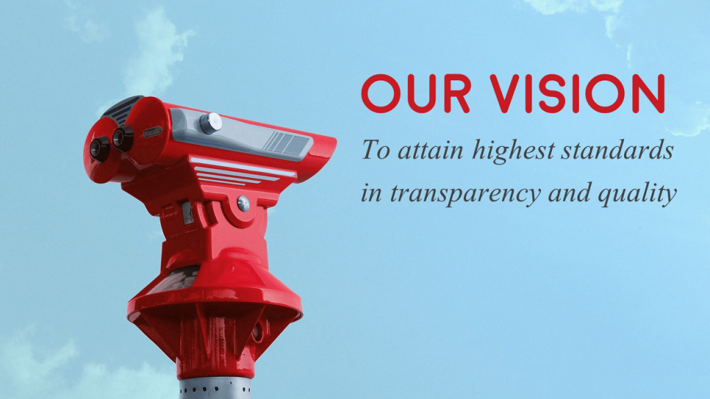
It’s not so easy to find images that incorporate eye gaze into the image composition. If you can find objects that are facing a particular direction, that will do too. For instance, here’s a slide on Company Vision that uses the direction of object to throw more emphasis on the vision statement.
Here’s another slide that uses the opposite directions of the flags to show the Brexit Breakup in numbers. The directions add more meaning to the presentation content i.e. the “leave” and “remain” percentages in this case.
Strategy #3- Imitate the Inherent Movement in the Image
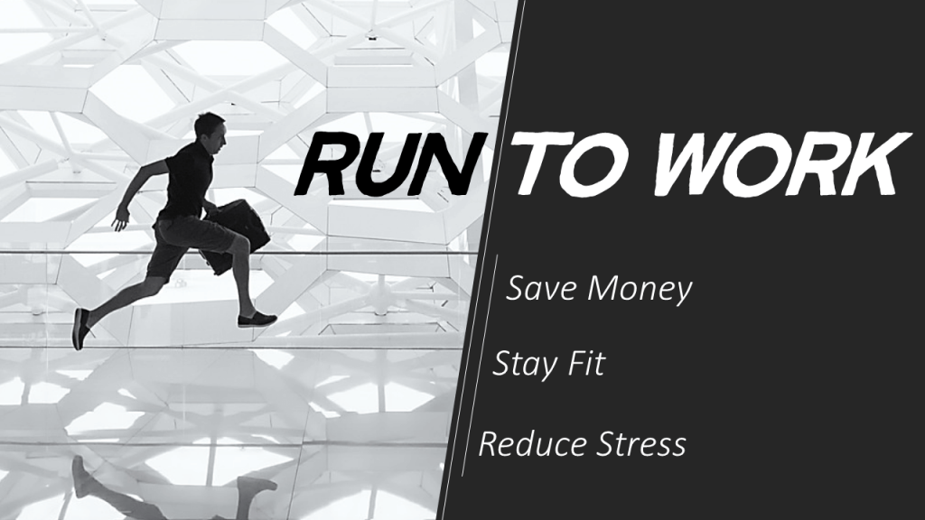
Although images are static, the inherent movement inside the images make them dynamic. We perceive an image on running or swimming to be in action rather than stationary. We fill the missing action based on our knowledge of the outside world. For instance, we can easily identify whether a man is jogging or sprinting based on his body tension and facial expressions.
Take advantage of this action in images while designing your slides. For instance, in the slide below, you can see a man running with his briefcase. You can place your content in ordinary, static fashion as a regular Arial or Calibri font but the text in regular style will put a halt to the action in the slide. Or you can download a customized font or simply make it italics so that your content appears “to be on the run” too!
The body content was also given a similar treatment. The placement of lines from top to bottom next to the content also add subtle movement to the slide.
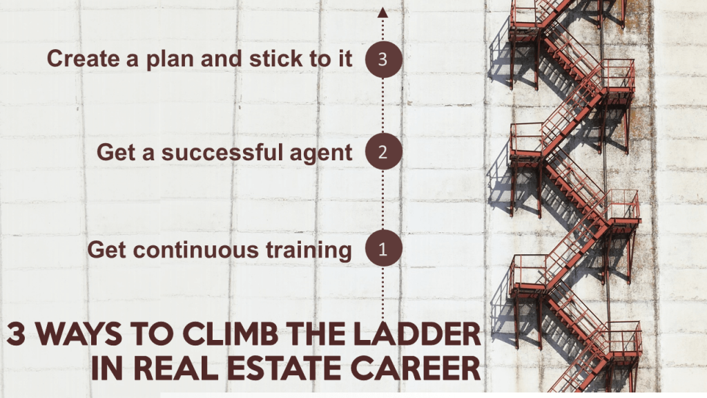
We read in the beginning that the top left corner is where most people are habituated to begin reading. Using design principles like contrast and emphasis, we can reverse this direction of movement in the way we want. For instance, in the slide below, the image of steps would most probably be traced from top to bottom. But since we want it to symbolize a ladder of success, we want the movement from bottom to up.
Therefore, departing from the normal tradition, we placed the headline in caps at the bottom and placed the body text ascending upwards. The arrows and numbers further force the audience to reverse their reading behavior. Ideally, one should follow the habitual reading style to make it easier for the audience, but we can break the rules if that adds meaning to the design, which we did in the slide below:
Strategy #4- Play Around With Image Elements
Try to find the action in the image you choose and see you can manipulate that action to add power to your presentation content. In the image below, no fancy designing has been done- simply the word “Hurdles” was kept below the woman’s foot. This simple placement adds even more movement to the image composition- the word “hurdles” itself becomes a hurdle that the woman is trying to overcome. The viewer can also imagine her next step falling over the word “Overcome” and finally step on to the next hill without any trouble.
How do such ideas come? As presenters, such tricks do not automatically come to us. We have to train our eye to look deeper. We have to choose images that have action in them. Once that is chosen, see how that action can add power to your content and finally mould your content to create the right impression. Slowly, you will train yourself to think out-of-the-box and make impactful slide designs:
Strategy #5- Use Images with a Different Perspective
Images taken from different angles creates a unique movement in the composition. Such images force the audience to look at the object the way the photographer looked while composing the image. In the image below, you tend to crane your neck upwards to look at the tall building. Placing text in the similar direction simply adds to that movement.
These images are more powerful than standard images of objects or persons taken at the eye level. Images with a different perspective change the dynamics- for example images taken from below, like the image of the building you saw above, exude authority and commanding position.
Next we come to visual cues. Certain images are composed in such a way that all visual cues tend to point towards one area of interest. Like in the stunning image of Golden Gate Bridge below. The buildings seem to lead towards the towering bridge in middle. So, rather than placing your text at the bottom where it can still be read easily thanks to contrast offered by buildings, you should be putting it on the open sky. This won’t obstruct the natural movement present in the image.
Strategy #6- Add Text to Picture Elements
You’ll find plenty of images on stockphoto websites where a business professional is holding an empty placard. The image might look cliche and boring but you can make it interesting depending how you use it. In the “Contact Us” slide below, the contact details easily stand out on the empty space. The viewer’s eye is naturally drawn to that area and like a sign on roadway, the image gets printed on the mind.
Here’s another example that uses creative use of the blank document space to place the content. The advantage of using such images is that content becomes a part of the image itself, rather than two separate elements on a slide. The eye then looks it as one design element and quickly grasps the message.
Strategy #7- Choose Templates That Make Eye Movement Easy
The biggest advantage of using professional PowerPoint templates is that they bring order out of chaos. Whether the content in your rough presentation is minimal or a lot, a presentation template offers interesting layouts that are neatly arranged and are easy on the eye.
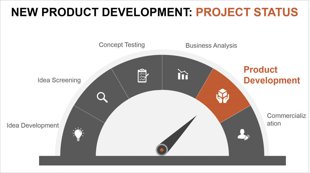
The type of PPT template you choose dictates the eye movement of the audience. If you choose circular PowerPoint template, the readers will read the process clockwise. If you choose a semicircle template like the one below, the eye will move systematically from one end to the other. You can, however, change the eye movement by changing the visual weight of certain design element- change the font size and color- to break the reading habit.
For instance, in the slide below, the audience will be forced to notice the word “Product Development” first - which is the current status- and then go back to their habit of reading a semicircle from left to right.
You can use this editable design for your next presentation by simply downloading it from here.
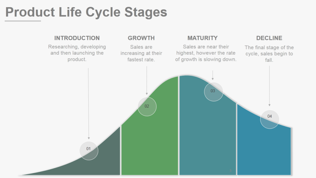
Here’s another professional PPT design on Product Lifecycle that is easy on the eye. A few seconds are enough to read the four stages and see the corresponding visual.
Download the above Product Lifecycle Stages Template for your future presentation.
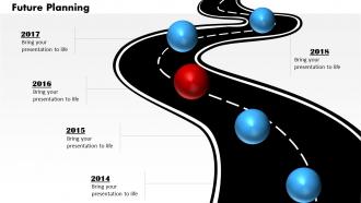
A Zigzag template like the one also guides the eye movement of the audience. You can also insert the hurdles faced between any two tasks without the slide looking complicated. Here’s a Zigzag Roadmap Template used to showcase a product roadmap.
Strategy #8- Split the Slide into Half
Not everything in a slide is important. Whatever is the most important message in the slide should be designed such that it gets more importance. Since we know that audiences scan information, we should ensure that their eye rests on the important piece and quickly scans the less important stuff.
To achieve that, you can split the image into half- the top half revealing the most important message and the lower half giving the less important details. The eye is then able to grasp the information quickly and without cognitive overload. Here’s an example:
Strategy #9- Divide the Slide into Grids
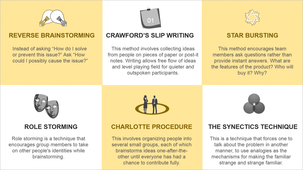
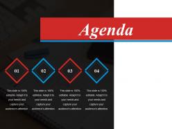
If you choose to have lots of content on your slides, then split it into digestible chunks so that there isn’t any sensory overload on the eyes. A good way to do that is to divide the slide into grids and allocate one message to each square.
This design makes it easy for the audience to navigate across multiple pieces of information and consume it in orderly fashion. Here’s an example of one such slide layout:
Any other creative strategy that comes to your mind? Tell us in the comments below.
In the beginning of this post, we had raised the question ““What does the human eye look at first on a page” I think the more important question as a presenter is “What do we want the audience to look at first?” When you have the answer to that question, then design it accordingly- use the eye-tracking findings and the power of visual weight to draw the audience’s eye there first and then use the creative layouts to make eye movement across the slide as easy as possible.
If you learnt something useful, please share it with your followers. Here’s a pre-populated tweet to spread the word:



 Customer Reviews















Previously I've learned about usability for websites, and one criterion is readability (which means the 'F' pattern of scanning should be considered when creating information).
I've a question though, and that is:
Should we:
1. Use animations to slowly reveal different groups of information or,
2. Use no animations and leave all information on the screen at one go?
Thanks!