Data speaks volumes, but visualization gives it a voice.
- Christine Khoury, Writer, Marketing & Brand Integration Manager
In today's data-driven world, organizations constantly seek effective ways to analyze and interpret complex statistical and analytical data. A heat map is a powerful tool that has emerged as a favorite among professionals. Heat maps provide a visually appealing and intuitive representation of data, enabling businesses to extract valuable insights and make informed decisions.
According to a recent survey, 82% of businesses believe that data visualization plays a crucial role in their decision-making process. Heat maps have become indispensable for professionals in diverse fields, including web analytics, market research, UX design, and more. Heat maps have revolutionized how we analyze and interpret information with their ability to transform complex data sets into easily understandable visual representations.
In this blog, we will explore the top fifteen heat map templates designed exclusively by the experts at SlideTeam that can help professionals across various domains unlock the true potential of their data. Whether you're a director, project manager, marketer, or biologist, these templates will empower you to visualize your data like never before.
Unleash the power of Heat Map visualization with our exceptional collection of pre-designed PowerPoint slides. These meticulously crafted templates empower you to effortlessly implement Heat Maps, transforming complex data into visually captivating insights. With seamless customization options and a vast array of structured content-ready slides, our templates offer you an unrivaled advantage in managing your tasks like a seasoned professional. Step into the realm of data mastery and elevate your decision-making prowess by downloading one of these transformative templates today. Embrace the future of data visualization and embark on a journey of unparalleled success.
Let's delve into the top fifteen heat map templates designed to enhance your data visualization experience.
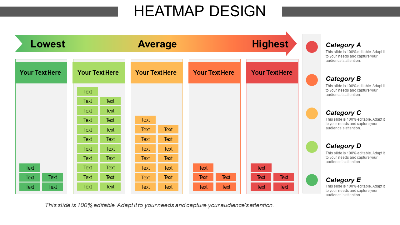
Template 1: Heatmap Design
The Heatmap Design layout is a versatile tool that allows you to create stunning heat maps tailored to your requirements. With its user-friendly interface and customizable features, this template effectively lets you visualize data patterns, trends, and correlations. Whether you're analyzing website traffic, user behavior, or sales data, the Heatmap Design preset provides a comprehensive solution for your data visualization needs.
Template 2: World Map Heatmap
The World Map Heatmap theme is an invaluable asset for professionals dealing with geospatial data. It allows you to overlay heat maps on world maps and visualize data distribution across different regions. Whether you're analyzing population density, market penetration, or customer demographics, this Heatmap provides a powerful visual representation of your data on a global scale.
Template 3: Heatmap Table
The Heatmap Table template combines the power of heat maps with the structure of a table, making it ideal for organizing and analyzing data in a structured format. This template allows you to assign color gradients to cells based on their values, facilitating quick identification of patterns and outliers. Whether you're tracking key performance indicators, survey responses, or financial metrics, the Heatmap Table template provides a comprehensive and visually appealing solution. Optimize your data analysis with this Heatmap Table —download now.
Template 4: Heatmap Bar Graph Analysis
The Heatmap Bar Graph Analysis template combines bar graphs' versatility with heat maps' power. It allows you to represent data using the length of bars and color gradients, providing a rich visual representation of information. This deck is handy when comparing data across multiple categories or variables. Whether you're analyzing sales performance, customer satisfaction, or market trends, the Heatmap Bar Graph Analysis layout enables you to uncover valuable insights effortlessly. Enhance your analytical capabilities with the Heatmap Bar Graph Analysis —get it here.
Template 5: Business Heatmap Analysis
The Business Heatmap Analysis is specifically designed to meet the needs of professionals in the business domain. It offers comprehensive tools and rankings to analyze and visualize various business metrics, such as sales, revenue, and customer satisfaction across products. Whether you're a business leader, project manager, or analyst, the Business Heatmap Analysis template will revolutionize how you understand and leverage your business data. Improve your business analysis with the Business Heatmap Analysis —download now.
Template 6: Marketing Channels Review Heatmap
The Marketing Channels Review Heatmap preset is a valuable resource for marketers seeking to analyze and optimize their marketing efforts across different channels. With this layout, you can visually represent the performance of various marketing channels using color gradients. By identifying the weaknesses and strengths of each channel, you can make data-driven decisions to allocate resources effectively and maximize your marketing ROI. Whether you're evaluating social media platforms, email campaigns, or advertising channels, this set provides a comprehensive graphical representation of your marketing data.
Template 7: Heatmap Graph
The Heatmap Graph template offers a visually appealing representation of complex data relationships and patterns. This template combines the power of heat maps and graphs, allowing you to visualize data trends, correlations, and outliers in a single view. By assigning color gradients to data points on the graph, you can quickly identify areas of interest or focus. Whether you're analyzing sales trends, market fluctuations, or user behavior, this Heatmap Graph provides an intuitive and informative graphical representation of your data.
Template 8: Heatmap Covering Quarterly Information (Sub-Industry)
This unique set is designed to provide a comprehensive overview of data trends and performance in a specific sub-industry. This template allows you to organize data based on quarterly time periods and visualize it using a heat map. By assigning color gradients to data points, you can identify quarterly variations, spot emerging trends, and assess the overall performance of the sub-industry. Whether you're analyzing financial data, market share, or customer satisfaction, this template offers a powerful tool for periodic heatmap analysis—download here.
Template 9: Heatmap Bar Analysis
The Heatmap Bar Analysis template combines bar graphs' simplicity with heat maps' power to visualize data comparisons and trends. This template allows you to represent data using both the length of bars and color gradients, providing a comprehensive and visually appealing analysis. Whether you're analyzing sales performance or market research data, the Heatmap Bar Analysis offers a powerful graphical representation to derive insights and drive decision-making.
Template 10: Demand Planning Simplify Focus Statistical Modelling Leverage Scale Heatmaps
This preset is a valuable resource for businesses aiming to optimize their demand forecasting and planning processes. This template leverages the power of heat maps to simplify and focus on statistical modeling. By visualizing demand patterns and variations using color gradients, you can gain a deep understanding of customer preferences, seasonal trends, and market dynamics. This template helps you streamline your inventory planning efforts and make data-driven decisions to ensure adequate inventory management, efficient resource allocation, and order management. Simplify demand planning and leverage statistical modeling with the Demand Planning Heatmap —get it now.
Template 11: Periodic Heatmap Analysis
The Periodic Heatmap Analysis offers a comprehensive approach to analyzing data trends and patterns over regular intervals. This theme allows you to represent data using a heatmap, where color gradients indicate the intensity or value of the data points. You can identify recurring patterns, seasonal variations, and trends by organizing data into periodic periods. Whether you're analyzing impact, likelihood, or data potential, the Periodic Heatmap Analysis provides a powerful visual representation for data analysis and decision-making. Analyze periodic data trends effectively with the Periodic Heatmap Analysis presentation—download here.
Template 12: Heatmap Yearly Based Advertisement Business Intelligence Security
This Heatmap is designed explicitly to analyze and optimize advertising strategies and security measures over the course of a year. This template combines the power of heat maps with yearly timeframes, allowing you to visualize the performance and impact of advertisements and security measures using color gradients. By assessing the effectiveness of different campaigns, identifying potential risks or vulnerabilities, and evaluating the overall business intelligence, this presentation help you make data-driven decisions to enhance your advertising efforts and strengthen security protocols across different sub-industries.
Template 13: Heatmap Covering Probability (Insignificant, Minor, Major, Critical)
The Heatmap Covering Probability offers a visual representation of data that categorizes events or scenarios into different probability levels, ranging from insignificant to critical. This template utilizes color gradients to indicate the probability levels, allowing you to identify areas of concern (Extreme, high, moderate, and low), prioritize actions, and allocate resources accordingly. Whether you're assessing risk factors, evaluating project outcomes, or analyzing customer preferences, this template effectively represents the probability impact using a heatmap graphically.
Template 14: Heatmap Showing High, Medium, and Low Probability Impact
This PPT layout visually represents the probability impact of events or variables using color gradients. This template allows you to classify data points into high, medium, and low probability impact categories, helping you identify areas of significant influence and make informed decisions. Whether you're analyzing risks, evaluating market trends, or assessing project outcomes, this template offers a clear and concise graphical representation to understand the probability impact and take appropriate actions. Visualize probability impact quickly with this Heatmap —download here.
Template 15: Financial Products Risk-Return Heatmap
It is a valuable tool for financial professionals and investors seeking to assess different financial products' risk and return profiles. Using color gradients, this template utilizes a heatmap to visually represent the risk and return characteristics of financial instruments or portfolios. By analyzing the placement of each financial product within the Heatmap, you can evaluate the potential rewards and risks associated with different investments. Whether you're managing a portfolio, conducting risk analysis, or making investment decisions, this template provides an effective graphical representation of risk and return using a heatmap. Discover investment opportunities with this financial Heatmap —get it now.
Conclusion:
In the era of big data, extracting meaningful insights from complex statistical and analytical data is crucial for better decision-making. Heat maps serve as powerful tools that enable professionals across various domains to visualize their data effectively. Using the top fifteen heat map templates described in this blog, you can unlock the true potential of your data (refined) and gain a competitive edge. So, why wait? Click on the links above, download the templates, and begin visualizing your data like never before. Empower yourself with these invaluable tools and watch your data come to life.
Remember: With heat maps, you can turn data (refined) into actionable insights and make better decisions for your projects, businesses, and organizations. Let these heat map templates be your guiding light in the realm of data visualization.
FAQs on Heat Map
What is a heatmap used for?
A heatmap is a powerful tool used for visualizing data in a graphical representation. It allows users to quickly analyze and interpret complex data patterns using color gradients to represent values. Heatmaps are commonly employed in various fields, including web analytics, business intelligence, and data visualization, to identify trends, patterns, and hotspots within a dataset.
What is a heat map in data visualization?
In data visualization, a heat map is a visual representation of data where colors represent values. It uses a color spectrum to encode numerical values, allowing for quick and intuitive interpretation of the data. Heat maps are particularly effective in highlighting high or low-concentration areas, enabling users to identify patterns, correlations, and outliers within datasets.
Why use a heat map in data visualization?
Heat maps offer several advantages in data visualization:
- They provide a visually appealing and intuitive way to represent complex data sets, making identifying patterns, trends, and relationships easier.
- Heat maps enable quick identification of areas of interest or concern by using color gradients to highlight variations in data.
- They also facilitate effective communication of data insights to stakeholders, helping to support better decision-making processes.
- Using heat maps in data visualization, organizations can unlock valuable insights, improve data-driven strategies, and gain a competitive edge in today's data-driven landscape.


![[Updated 2023]: Top 15 Heat Map Templates to Visualize Complex Statistical and Analytical Data](https://www.slideteam.net/wp/wp-content/uploads/2021/06/02_1013x4411-1011x441.png)

 Customer Reviews

