A study conducted by BuzzSumo concluded that the information offered through images renders 2.3 times more attention than any other form of data delivery. And what’s better than graphs to deliver said information?
Whether it is the realm of any profession or the education domain, graphs have paved the way for themselves right from the inception of their concept. Businesses have been making the most out of graphs to deliver crucial information to their clientele and audience.
There are multiple ways to generate and create any graph. However, generating one from scratch can be a real head-scratcher.
Thankfully, SlideTeam’s 100% editable graph templates are here to help you. Instead of diving into the critical aspects of graph development, it's better to use a pre-designed alternative to deliver the required information in a simple manner. We bring to you multiple alternatives for graph templates to try. Don’t forget to check them out below.
Looking for some inventory graph templates for your business? Don’t forget to check out this blog.
Template 1: Growth Graph PPT Template Bundles
This PPT template is a collection of multiple slides that offer growth-centric graphs for you. With the help of this collection, you can get your hands on different types of graphs depicting the rate of growth of revenue, sales, GDP, digital marketing transformation, and more. The template also houses a sales revenue tracking dashboard. With the help of this dashboard, you can showcase the total number of new customers in a year, the total sales revenue of the business, and the percentage of targets achieved. You can download this PPT template to check out the rest of the rate of growth graphs.
Template 2: Quarter Bar Graph PPT Template Bundles
Like the previous template, this one is also a collection of multiple slides that allow you to showcase your business’s quarterly reports and data in the form of bar graphs. Using the smart slides in this PPT template, you can showcase the region-wise and product-wise reports. Furthermore, there’s also a slide to showcase the trend of quarterly funding for any start-up. Similarly, the quarterly analysis graph of production also allows you to showcase the quarterly data for raw materials, labor, production overheads, and non-production overheads. These comprise the total production for any business. Thereafter, you can also list the key insights derived from the data presented. Download this template to check out other useful slides in this deck.
Template 3: Stacked Graph PPT Template Bundles
These slides allow you to showcase different information related to the business in a stacked bar graph. There are multiple slides for monthly stacked graphs for user subscriptions, sales comparisons for multiple cities, product strategies graphs, and so many others. The stacked graph for the comparison of respective marketing strategies for different products. Using the information derived from this graph, you can analyze the performance of different marketing strategies. So, download this template and check out everything that it has to offer.
Template 4: Yearly Mobile App Comparison Graph
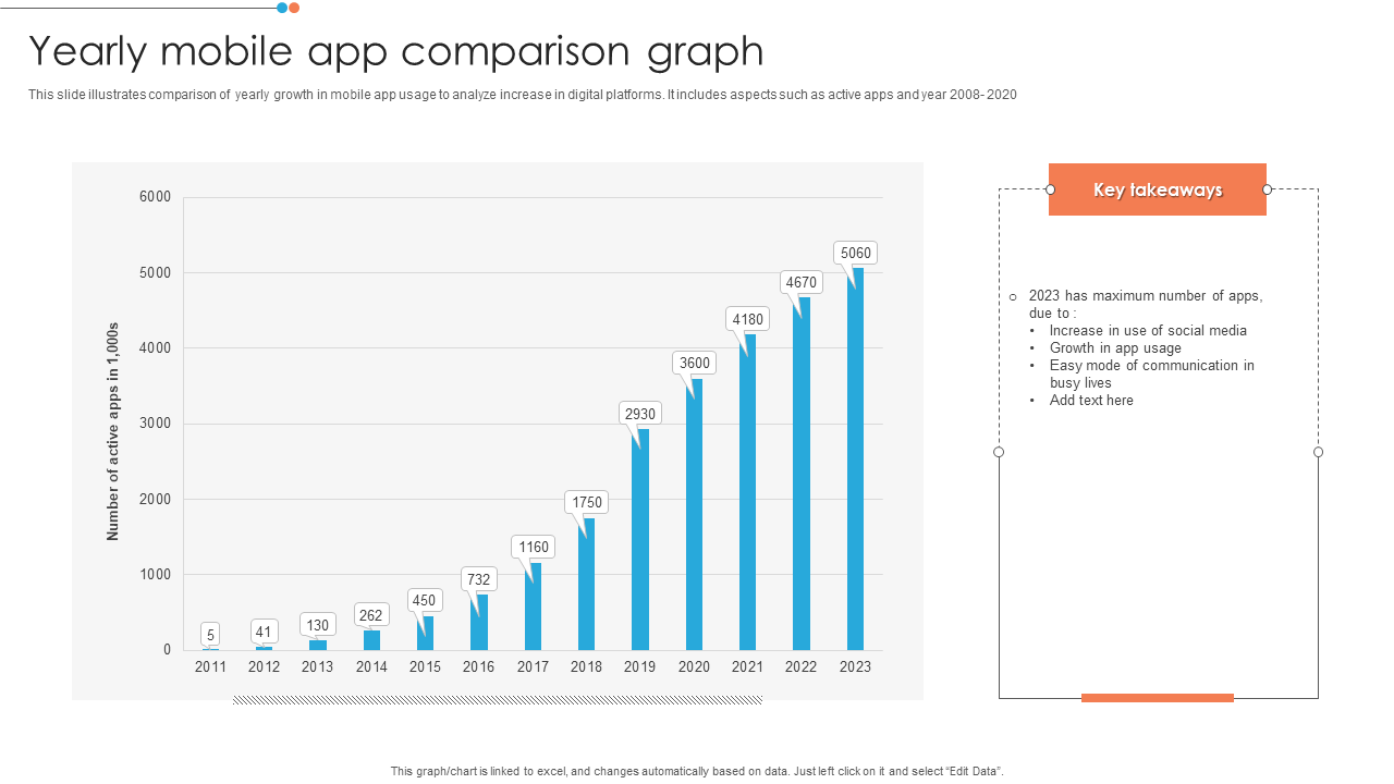
The Present is the age of technology. So, this graph can be really useful for you as it allows you to showcase the year-wise rate of growth or change in the annual usage patterns of apps from the year 2008 to 2020. The bar graphs make it feasible for your audience to understand the usage patterns. The right part of the slide contains the section for key takeaways from the data. You can state that 2023 has the maximum number of apps because of an increase in the use of social media apps, easy mode of communication in busy lines, and others. Download this template to check out the pattern of the PPT Slide.
Template 5: Company Turnover Ratios Graph Comparison
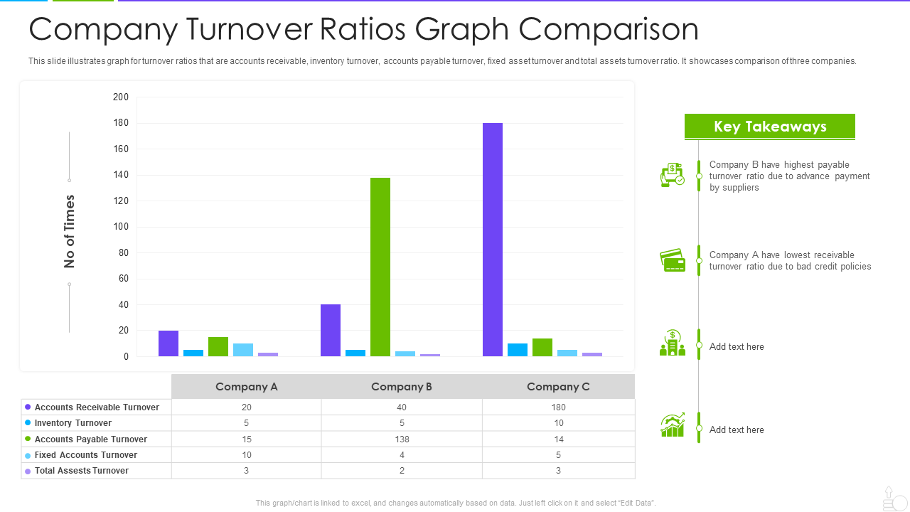
Turnover ratios are one of the most important facts related to a business that helps in understanding the volatility of turnover. This template allows you to showcase various turnover ratios in a comprehensive manner. The bar graph structure makes it easy to understand the difference in turnover ratios for various companies. In this slide, you can showcase the ratios related to accounts receivable turnover, inventory turnover, accounts payable turnover, fixed accounts turnover, and total assets turnover. You can also enlist the key takeaways from the data in this template. To know how the key takeaways are presented, download this template.
Template 6: Sales Comparison Graph of Top Clients
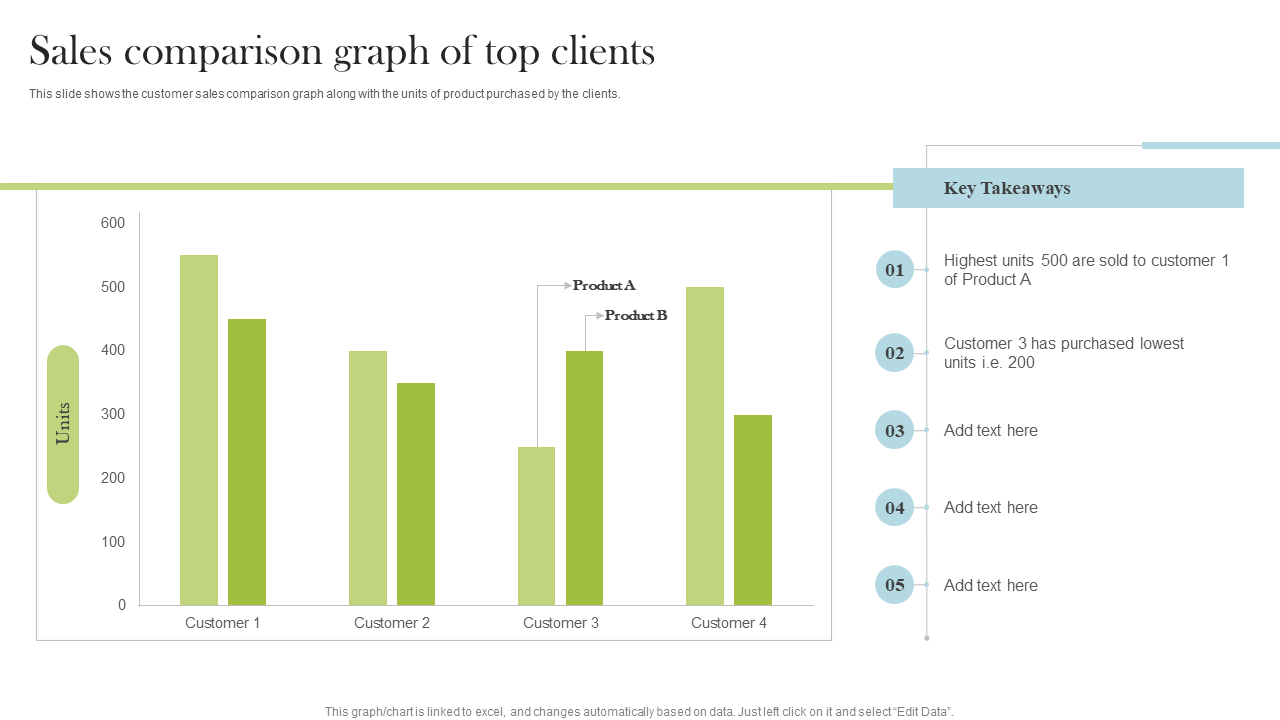
Here’s the next template for sales comparison. Using this template, you can showcase the sales volume for different clients for two products. The y-axis represents the units of products sold to different clients and the x-axis represents the names of customers buying the said products. The key takeaways part of the slide showcases the important insights derived from the data. You can state that the maximum number of units sold to any customer was of product A. You can download this template to check out the rest of the layout.
Template 7: EBITDA Graph with Gross Profit and Margin
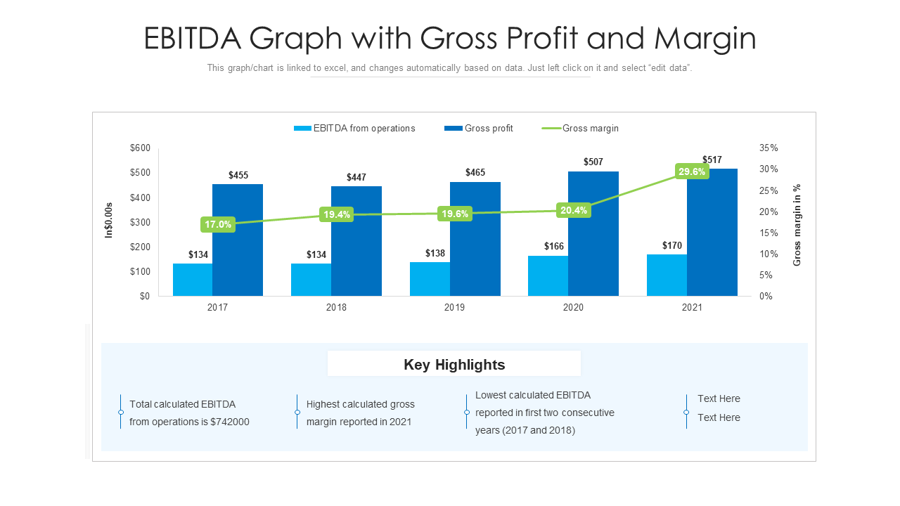
If you are looking for a graph to showcase the total gross profit and the profit margins for your business, then you can try this template. This graph is directly linked to an Excel sheet and hence, every change introduced in the Excel sheet is reflected in the slide as well in real time. The graph showcases the EBITDA from operations using a cyan blue bar, the gross margin in % using a dark blue bar, and the profit margins using a green linear graph. Right below the graph, you can list the key takeaways. Download the template today to see what you can enlist under the key takeaways.
Profit and loss graphs are quite beneficial for your business as well. You can have a look at some of the templates in the blog here.
Visualize With Graphs; What Numbers Just Can’t
Graphs make it easy even for a novice individual to understand complicated facts and figures. So, why don’t you put the above graph templates to use and showcase the required information to your audience with ease? These graphs can tackle different tackle and requirements of your business and hence, the perfect choice for any business. Try and judge for yourself.
Here’s a blog containing some graphic design proposal templates for you.



 Customer Reviews

