I know it is too good to be true but 2019 means we are entering into the last and the final chapter of the decade. The year 2018 showed us that the presenters are not afraid of experimenting with something new, so we consider 2019 to be a year of breaking old traditions and stereotypes and coming up with new and exciting surprises in the world of PowerPoint.
PowerPoint is a ubiquitous platform and is being used since last two decades. However, with the addition of powerful new functionalities in the new versions of PowerPoint and the awareness of need for visually rich designs, the face of presentation is changing. Presenter is no more just a presenter, but a capable designer too.
The revitalization of old and classic styles, artificial intelligence, emergence of 3D world shakes our designer’s creative aesthetics to the core.
Hence, we have gathered these 9 presentation design trends which will be dominating our creative PowerPoint world in the year 2019. Take a look at these!
Trend #1 Typography- Go Big, Go Bold!
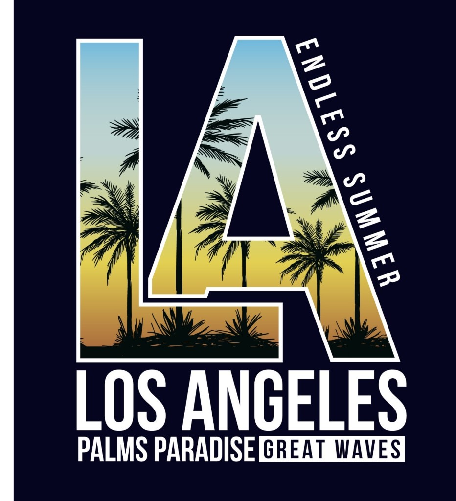
Typography- the art of mixing up fonts, gets bigger and bolder. The paramount tool of visibility shuns its conventional font size and adapts larger than life size.
Therefore, the Big, the Bold, the Beautiful is all you should aim for in 2019.
This year is all about larger than life fonts and unconventional font sizes, arrangements, text formatting, bleeding etc. to get your message out there in the most creative way possible. The arrangement of the font and its size have a very powerful impact on the audience. Hence, consider choosing a font that is not only bigger but also readable.
Pro Tip- If you plan on using more than one font, keep in mind that the personality of the font should match the content. For instance, for authoritative content like “power and leadership”, use a regular bold font while for informal content like “beautiful stories” use a cursive font. See that using multiple fonts do not affect readability. It is better to stick with one font especially in a sales presentation because using two fonts may make the design look quite busy.
This trend has already been adopted by some of the well-known brands. For instance, consider the older and the newer logo of Mail Chimp.
11 Typography Tweaks And Text Effects To Spice Up Your Presentation Content
Trend #2 Make way for Duotone!
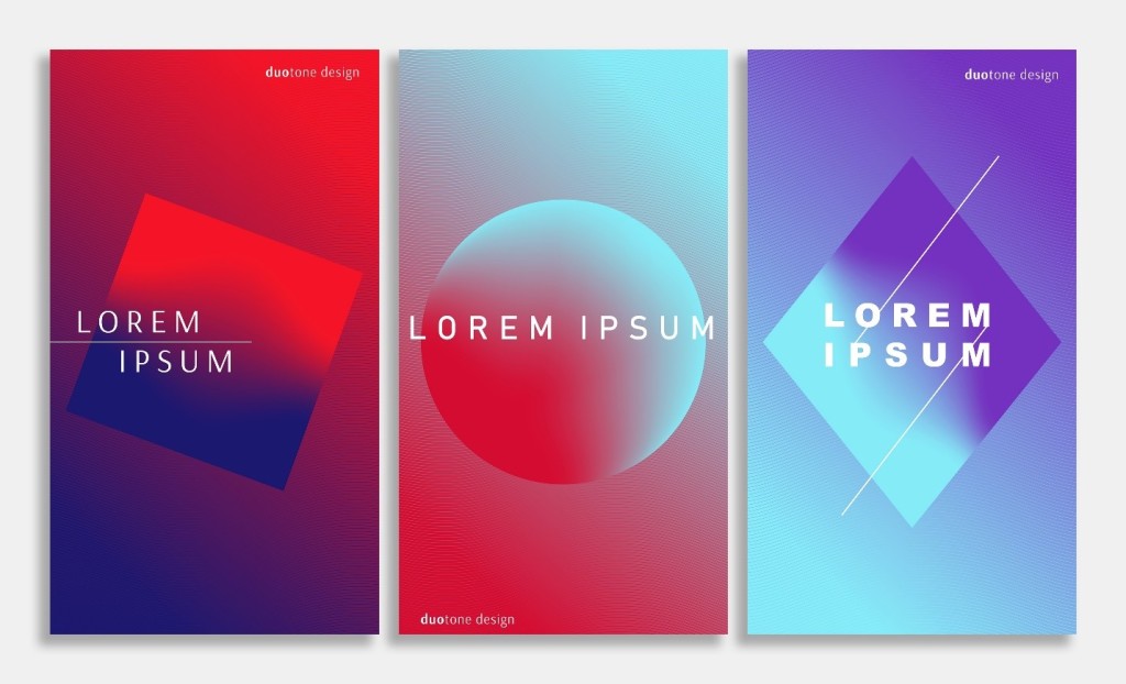
Duotone is made up of two words “duo” means two or double and “tone” means color. Therefore, accord an aesthetic appeal to your presentation by using two colors rather than using blacks and whites.
These design tactics fit well with other trends of 2019 and may appear quite futuristic and colorful. They may also act as a hero of your presentation as they help bring any boring and unduly presentation to life with its colors and aesthetics. Also, inspite of using only two colors, numerous incarnations can be created using this trend ranging from understated to eclectic and so on and so forth.

Trend #3 Be Realistic, Be Minimalistic!
Minimalism is probably the most classic and timeless presentation design which continues to make way in 2019 also. Focusing only on what is needed rather than filling up your slides with unnecessary text and color has to be given up in 2019. White space still rules our presentation design this year making the design look more modern and sophisticated.
Fewer elements will reduce the confusion that the audience had after seeing a busy slide.
Therefore, be a minimalist by avoiding too many distracting elements in your presentation design.

Trend #4 3D Emulates 2D
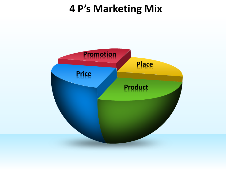
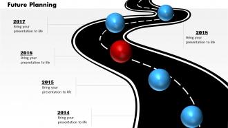
Just as we thought our future is flat and boring, here comes the new design sheriff 3D with its larger than life aesthetics. The 3D trend is definitely getting bigger and better this year as the year 2019 is all about making your presentations look realistic in every sense possible. Presentation designers will definitely create masterpieces which give us a glimpse of the real world by making use of depth.
With technological advancement, let us also bring a shift in our presentation by using 3D design elements to add that oomph factor.
So, jump on the bandwagon of the 3D world to make your presentations stand out from the rest of the crowd.
Grab this 3D 4 P's Marketing Diagram
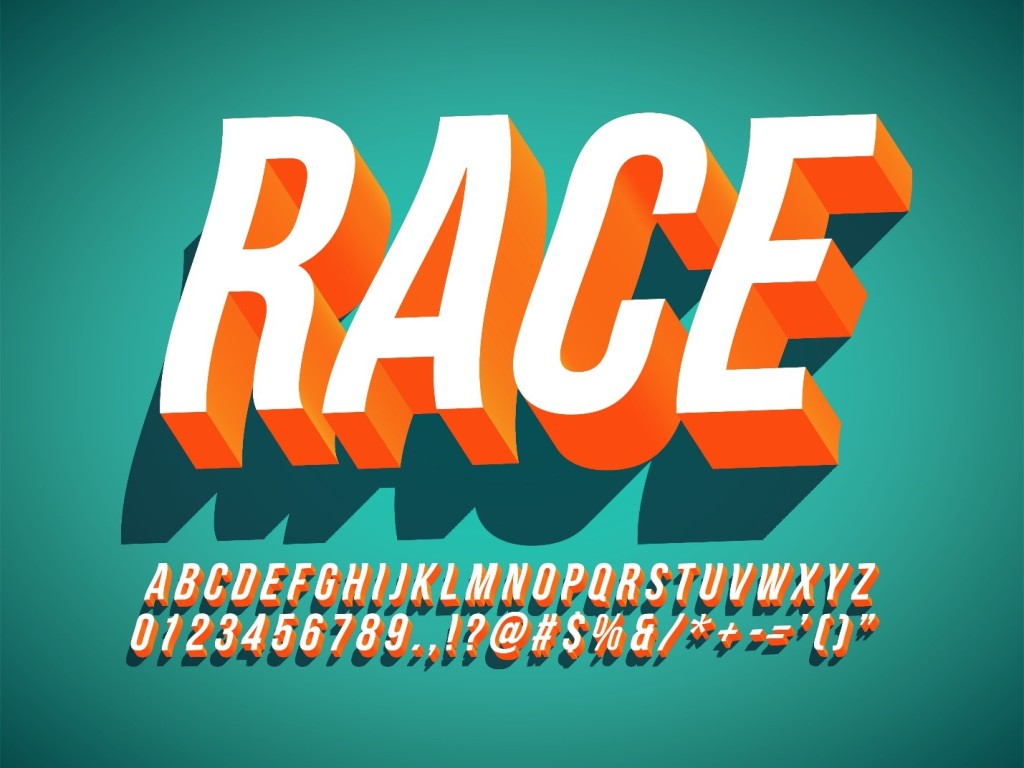
This 3D trend can also be merged with typography to create some spectacular typographical effect such as the one shown below-

Trend #5 Nostalgic Retro Style
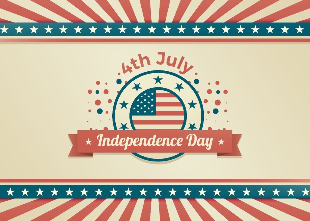
Old is Gold! What was earlier considered as old in previous years is new again in 2019. As 2019 is all about experimentation which has no limits, the time seems right to bring back the old vintage retro style with some nostalgia.
You can include the 80’s and 90’s retro font in your slide or you can choose a retro and a vintage looking background for your slide. You can also create a retro effect in your slide using Picture Effects and Artistic Effects provided in PowerPoint. Change the color of the image and give it a sepia tone or black and white look using Picture Tools Format > Color.
Trend #6 Organic, Fluid Shapes
Thinking of inserting a circle or a rectangle to your 2019 presentation?
Nahh! Those are the things of past. Let bygones be bygones! It is time to adopt some new organic and natural shapes.
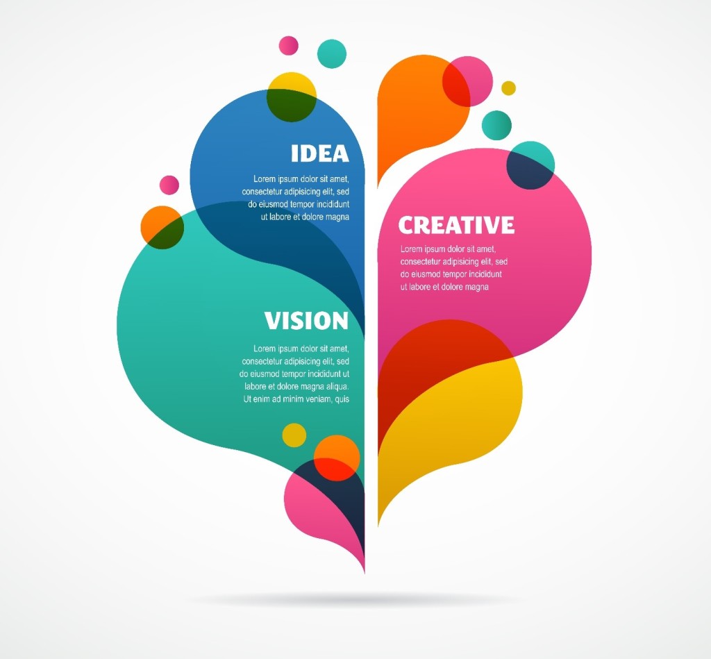
Deviate from those old geometrical shapes and smooth lines and go with something which is imperfect and asymmetrical to make your presentation stand out. As we move in 2019, the typical geometrical shapes that we have been taught in middle school have taken a backseat. And newer customized shapes are used to bring about a whole new design element. Colorful and fluid shapes in any presentation design help convey a sense of creativity and playfulness. With their irregularity they appear more humanistic and thus add a personal touch to any presentation per se.
Download this Organic and Fluid Butterfly Chart PowerPoint Shapes Diagram
Trend #7 Humorous Images-
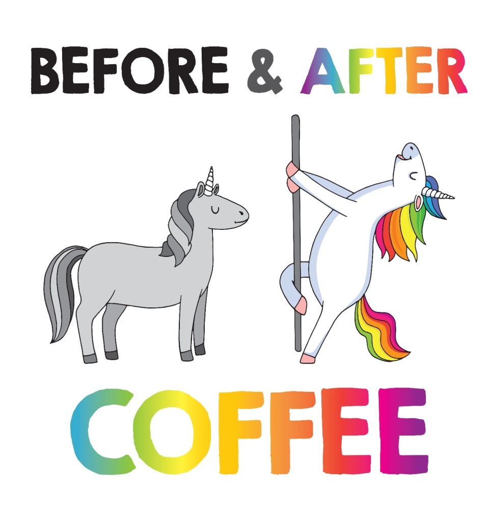
As it is rightly said “Humor is mankind’s greatest blessing” so why shouldn’t we use it in our presentations too. Life is so stressful nowadays so adding a little bit humor to our presentations won’t hurt anybody, rather you will end up with more enthusiastic audience ready to listen to you for longer hours.
It has generally been seen and researched that an adult has an attention span of not more than 20 minutes. Therefore, add a bit of punch to your presentation using humorous images as shown below.
11 Dos And Don'ts Of Using Images In Presentations
Trend #8 Isometric- the new Metric
As our world is becoming 3D, why should we stick to those monotonous and flat charts and graphs! Let us opt for something that gives us the best of the both worlds - which is none other than isometric designs.
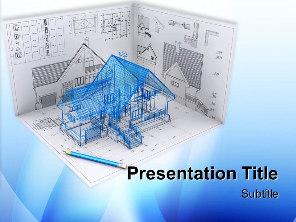
Now the word isometric may appear quite fancy to you. However, it is just as simple as one could imagine. Isometric design is simply a method of drawing 3D objects in two dimensions giving it a lot of depth without too much of an extra clutter.
Isometric designs act as a perfect metaphor for those businesses who provide more options to their customers, or whose products and services look more appealing in 3D rather than 2D.

Download this Isometric Design
Trend #9 Patterned Backgrounds
It is time to say goodbye to those monochromatic backgrounds and go for something more artistic and creative. It is time to go for exciting, new patterned backgrounds.
Skilled presenters can elevate their simple looking slides to visually stunning slides by injecting pattern backgrounds which matches their theme.
As long as the background does not interfere with the readability of the text, adding it can be quite appealing to your audience’s eyes.
For instance, see these images-

7 Awesome Pattern Backgrounds For Your Slides And How To Create Them In PowerPoint
Even though these are the design trends of 2019, we aren’t claiming that no other trend could be included in this list.
2019 is all about experimenting and there are plenty of designs out there waiting to be explored and used.



 Customer Reviews


