


 Customer Reviews
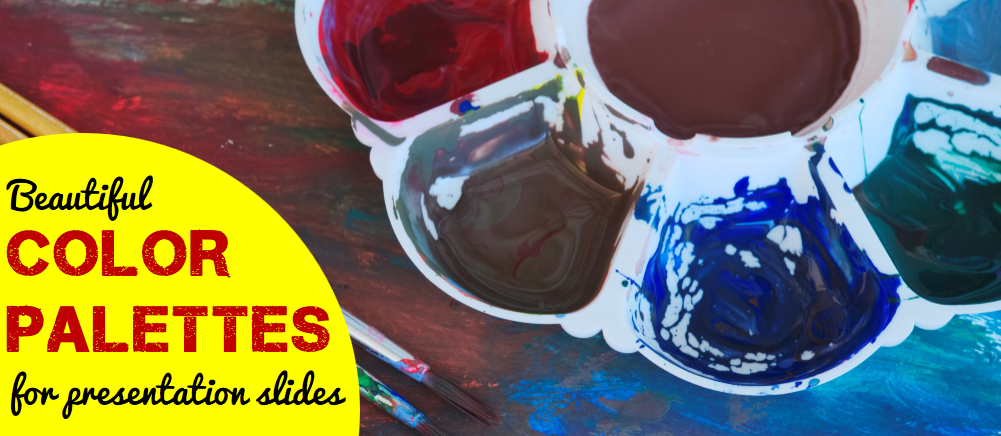
Color is fascinating. It is stimulating. It is like the universe itself- Infinite.
No matter how much you read on colors and their meanings, color theories, color wheel and types of color schemes, importance of color in design and what not, it still appears fresh and enlightening. Such is the power of colors- it makes you hungry for more knowledge, more thinking, more feeling and literally more hungry if you use warm colors like the exciting yellow and orange at an eating place. Even more romantic: just recall the abundance of colors and the romantic energy they evoked in La La Land!

Source- YouTube
So when we say, “Color plays an important role in design”, it is actually an understatement. It plays a huge role. It evokes a range of emotions, helps our eye navigate smoothly across the design, and sets the tone for the overall message you want to convey.
Unfortunately, as much as colors and their combinations are put to a wonderful use in web design and graphic design, they are grossly neglected in the presentation business. Half of the presentations are still reminiscent of stone age- dot points and essays thrown on white slide. The other half uses the safe blue (nothing wrong in that as blue represents professionalism) but all the time blue, seriously? Audience begins to feel blue.

P.S. Did you know Blue is the world’s favorite color! It is! But I can place a bet of million dollars (not that I have it) that it is not the above blue. This is PowerPoint’s default color when you insert a shape or SmartArt.
It’s time to get creative while using colors in presentation slides! Forget about your brand colors if they are not exciting. Change them too. We desperately need to use this powerful design element and nonverbal communication tool to bring our presentations to life! But how?
We have done the hard work and found 9 awesome color palettes that would work wonders for presentations. Many are a beautiful combination of warm and cool colors (warm colors being red, yellow and orange that seem to approach us while cool colors being violet, blue and green that appear to recede from us). Also sharing the inspiration behind these color palettes. Let’s devour them one by one:
Also Read: A Super-Fast Guide to Business Plan Templates

9 Creative Color Combinations You Can Steal for Your Slides
Color Palette #1- Powerfully Memorable (Red and Grey)
This color palette comprises basically 2 colors- red and grey and shades of them. This high contrast color scheme is applicable to all types of presentations, especially where you need to pitch your products or services. Red adds energy to the content and the slide, while grey grounds the slide, makes it look professional and lets red be the centre of attraction.
Red is also a great color for a brand since it signifies warmth, confidence and energy. Being such a memorable, emotionally intense color and having high visibility, it boosts brand recognition, and hence, is an integral part of bold color palettes. Here’s the color palette for you:

We have also provided the darker variations of each color (called as Shades in color terminology) and lighter versions (called tint) in case you need to highlight or tone down a certain color based on your requirements and company branding.
P.S. To use such color palettes, simply save them and use the Eyedropper tool from the Color menu in PowerPoint:

If you want the exact color code in case you are using an older version of PowerPoint, you’ll have to manually enter the RGB color values for each hue. Simply click the More Colors… option given above the Eyedropper option and manually enter these values:
-
- Color 1- Red (Red- 224, Green- 69, Blue- 86)
- Color 2- Dark Red (Red- 43, Green- 21, Blue- 21)
- Color 3- Grey (Red- 242, Green- 242, Blue- 242)
- Color 4- Dark Grey (Red- 127, Green- 127, Blue- 127)
Inspiration Behind this Color Palette:
DDB Canada created a heartfelt campaign for The Historica Dominion Institute and in support of The Memory Project to pay tribute to its soldiers on 11/11/11. The sombre grey and lots of white space evokes the vacuum caused by the absence of those soldiers. The use of a single bright color- red- creates a dramatic effect and evokes awe in the viewers. Here’s the brilliant print ad:

Source- bestadsontv.com- The Historica-Dominion Institute: Remember 11/11/11
Do not draw the meaning that this combination is for special occasions. Every presentation is special for you. You want your message to be remembered. So use light grey as background and red in the foreground to highlight the most important phrase, icon..basically the core of that slide. Here’s a real estate PPT slide that applies such color palettes beautifully:

Also notice how dark grey has been used for text instead of the standard black. It creates a harmonious look and feel, and the slide overall looks creative and professional at the same time.
Give a Red-Carpet Look with this Color Scheme:
When following color palettes, you can switch the background and foreground colors- red as background and white or light grey as foreground. That will give a red-carpet look to your presentation:

Presentation Rule To Remember: Have High Contrast for Easy Readability
By and large, this rule will save you from making color disasters:
- Light Background Colors- Dark Foreground
- Dark Background Colors- Light Foreground
There was another color in the color scheme- dark red, almost resembling brown which is a very masculine color. You can use that too where you need to use color other than red; as we did in the slide below:

Alternatively, we could replace the serious dark red with the happy bright red in the above slide and use a shade of grey for the remaining 28% as we do not want to highlight that portion. We want to highlight 82% and since red is a perfect accent color (accent colors are colors used for emphasis); let’s use the same:

Which slide would perform better? Tell us later when you are done with this article; let’s move on to our second color palette:
Color Palette #2- Vibrant and Young (Plum, Orange, Teal & Grey)
Why do presentations have to look “old”? Why have they become synonymous with draining life out of audience? Too much text. Check. Bad design and layout. Check. Devoid of color or dull colors. Check, check. Well, for those who cannot chop off content due to some reason and have limited design and layout knowledge, we published an article on 15 Ways To Turn A Very Text-Heavy, Bullet-Ridden Slide Into Amazing! For the last problem i.e. dull colors, we are publishing this article. This color scheme (comprising plum, orange, teal and grey) screams young and is in no way less professional than any other color scheme:

Color codes for the hues:
- Color 1- Plum (Red- 184, Green- 13, Blue- 72)
- Color 2- Orange (Red- 242, Green- 151, Blue- 36)
- Color 3- Dark Teal (Red- 43, Green- 106, Blue- 108)
- Color 4- Dark Grey (Red- 64, Green- 64, Blue- 64)
Inspiration Behind this Color Palette:
The beauty herself and icon of the young generation- Emma Watson- stuns in a color-oozing ad by Lancôme, owned by L'oreal. She is the brand ambassador of Lancôme and her vibrance is matched by the beautiful spring colors in the ad below which you would have surely looked even before reading all this text.

Courtesy: Lancôme
Warm orange, seductive plum, innocent pink, mysterious dark teal- the above ad has all the face-turning colors. Doesn’t look relevant to presentations? That’s what I thought too before I extracted the colors and applied it to my slides. Boy, they look so vibrant!

The dark grey adds a professional touch while the plum and orange colors inject interest into the slide. Plum, very similar to purple, is a rich color that is associated with royalty and romance. Orange is the color of joy and creativity while Teal is the color of sophistication, confidence and serenity. If you feel combining these colors is creating a color riot, just choose any 2 contrasting colors from this palette and make your slides rock like these:

Color plays a very important role of grouping elements here. The reader can easily read the content alternatively as the process goes, or read the dark teal group and orange group separately. A picture will form in his head and if asked to recall the process later, he will remember the color blocks and quickly recall the content too.
The color palettes you choose depend on your preferences totally. That said, try using the brightest color sparingly or else it would overwhelm the audience and overpower everything. In the slide below, we reserved the plum color for the title alone:

Have you ever seen any Human Resource presentation so vibrant before? I never had. Let’s move to color palette 3:

Color Palette #3- Retro Rocks (Dark Blue, Tan & Green)
As conflicting as it may sound, your presentations can look old but it has to be stylishly old! Yes, I mean retro. Who doesn’t like the retro look and feel whether it is fashion, art or presentations for that matter. Here’s a color palette (comprising dark blue, tan and green colors) to give that retro vibe to your presentations!

Here’s the color code for each hue:
- Color 1- Dark Blue (Red- 4, Green- 37, Blue- 58)
- Color 2- Tan (Red- 225, Green- 221, Blue- 191)
- Color 3- Green (Red- 76, Green- 131, Blue- 122)
Inspiration Behind this Color Palette:
“Home is wherever you park.” A beautiful vintage poster I came across on the web immediately caught my attention thanks to its classic and nostalgic color scheme.

It’s dreamy quality comes from the dark blue sky, the green ground and the moon and the stars. The best color palettes mirror real life- they are relatable and thus more “human”. Since Dark Blue signifies power and knowledge, it is a perfect color for corporate presentations. Let’s apply it to our slides and see how it looks:

The slide looks a poster, doesn’t it! What better do you want. Each PowerPoint slide should be worthy of sharing on social media networks like Facebook, Twitter, Pinterest and LinkedIn. Since the look is so classic, your presentations also get the timeless look and feel. Here’s another presentation slide that is so poster-ish and larger than life:

Color Palette #4- Dominating Duo (Teal & Red)
This brings two of my favorite design colors together- Teal and Red. Color experts, interior designers and graphic designers can’t get enough of Teal. It is trendy and unique- neither blue nor green. It appears as if it has been discovered only recently, especially where presentations are concerned. I see Teal dominating infographics but can’t recall even one in presentations!
Teal, as we said before, signifies trustworthiness, serenity and reliability. Complementing it and conflicting it is the energetic and sexy red. Use the lighter version of Teal which is Aqua as your slide background and you have a soothing, calm effect while red grabs the audience eyeballs.

Use the Eyedropper tool to extract these colors or apply the following color code:
- Color 1- Aqua (Red- 131, Green- 211, Blue- 212)
- Color 2- Dark Teal (Red- 45, Green- 129, Blue- 131)
- Color 3- Dark Red (Red- 145, Green- 12, Blue- 7)
- Color 4- Orange (Red- 244, Green- 129, Blue- 83)
Inspiration Behind this Color Palette:
A movie poster. Didn’t know my search for comedy movies would land me to the colorful and lively movie poster of Nacho Libre. The red flowing cape is understood and nothing out of the box but the hero’s teal tights surely caught my attention. Red looks all the more ravishing thanks to the ample teal in the background. Have you watched this movie? If you judge a book by its cover and correspondingly a movie by its poster, then the movie surely appears interesting.

Well, presentation mostly is not a comedy affair or a showbiz. But like any other visual communication, it has to attract audience attention and sustain it. Let’s replicate this color combination in our presentation slides and see how it looks:

The font is awesome but even an ordinary italic font in bold red could hardly go unnoticed. The darker shades of teal and red add mystery to the look and feel making one curious to see what comes next. This scheme is great for your Title slide and Section Header slides.
If you are using images in your text slides like in the one below, you can use just one color since the image already contains its own colors and adding teal and red would make the slide look busy. So you can use shades of teal and create a beautiful slide like the one below:

Color Palette #5- Authoritative Punch (Dark Green & Tan)
It’s said that age also influences your color preferences. Probably, the audience of your presentation is not the millennials but the investors and C-suite executives. You do not want to risk using orange and reds and appear non-serious. You want to look dead-serious and super-professional. Blue is a safe choice as I said. However, color palettes like this comprising 2 colors- Tan and Dark Green- are a better alternative and makes your slides look different from others:

Use this Color Palette Template
Here’s the color code for each hue:
- Color 1- Dark Green (Red- 42, Green- 50, Blue- 46)
- Color 2- Tan (Red- 216, Green- 203, Blue- 187)
- Color 3- Blue-Gray (Red- 33, Green- 36, Blue- 39)
- Color 4- Brown (Red- 141, Green- 128, Blue- 111)
Inspiration Behind this Color Palette:
We have all searched for breathtaking wallpapers for our laptops and phones. What makes them breathtaking? Amazing landscape and colors. Here’s one such wallpaper I found on Pixabay. It is magical and mysterious. The forest dark green evokes awe, especially when it is surrounded by plenty of white space and light colors.

Let’s apply this color scheme to a serious presentation topic such as Customer Relationship Management:

Since dark green is an established army color as it camouflages with surroundings, you can leverage this association to your advantage. Use shades of green and tan in the slides that follow and give an authoritative look and feel to your presentation:

Color Palette #6- Crystal Clear (Turquoise, Teal & Blue)
If you have been using sky blue in your presentations, you can continue doing that. It is a refreshing and calming color that instantly brings to mind images of sky and sea. Also want to add a touch of sophistication to your presentations? Choose the Turquoise color instead. It is a combination of pale blue and green and brings to mind the turquoise gemstone.
Like blue, it is also refreshing and calming and symbolizes depth, stability and wisdom. More importantly, it’s crystal clarity signifies open communication, healing and emotional stability. A shade of turquoise is Teal that we used a little while back along with red. A lighter version of turquoise is aqua which when contrasted with white looks all the more pure and relaxing.
Color palettes like this one however puts turquoise against its darker shades like dark blue, teal and green to add authority, wisdom and sophistication to your presentation.

Grab this Beautiful Color Scheme
Here’s the color code for each hue:
- Color 1- Turquoise (Red- 39, Green- 195, Blue- 243)
- Color 2- Dark Teal (Red- 12, Green- 113, Blue- 133)
- Color 3- Dark Teal (Red- 5, Green- 112, Blue- 145)
- Color 4- Dark Blue (Red- 3, Green- 52, Blue- 83)
- Color 4- Black (Red- 0, Green- 0, Blue- 0)
Inspiration Behind this Color Palette:
One can watch marine life for ages. The colorful beings inhabiting the crystal clear waters are a treat to watch. So, when I stumbled upon this BBC One documentary on tiny Japanese fish “pufferfish” designing a sculpture on the seabed, I was awestruck. It proved useful for my color palettes inspiration too. Here’s the cute fish:

Source- Youtube (BBC One Documentary)
Imagine this is as the background for your presentation- Lovely! The fish’s piercing black eye, dark blue shadow, the specks of green on its tail and skin wonderfully complement to create this natural color scheme. Let’s steal it for our PowerPoint presentation:

White looks the perfect contrasting color for blue. But the Teal color lends more power to the word “grow”. Of course, the typography also plays its part in reinforcing the message. By the way, if you want to add typography to your skill arsenal, do check out these 11 Typography Tweaks And Text Effects To Spice Up Your Presentation Content.
There is a lot of blue in this color palette but it won’t make anyone feel the blues. Take a look at this business slide to adapt to the right color palettes:

Color Palette #7- It’s American-ish (Red & Blue)
Fourth of July is around the corner. So why not use a color palette inspired by it.
There’s a reason America adopted red and blue along with white for its national flag. Red symbolizes courage and sacrifice, blue symbolizes vigilance and justice while white represented innocence and purity. The beloved American superheroes wear their patriotic colors with pride. See Spiderman's suit- red and blue. What about Superman and WonderWoman! Their traditional outfits too had dominantly red and blue combination.
That does not mean you have to be an American to use the color palette that we are sharing. We are using a totally different variation of red and blue. So use the following color palette without any hesitation:

Download this Dynamic Color Palette
RGB values for each hue:
- Color 1- Rose (Red- 255, Green- 86, Blue- 87)
- Color 2- Dark Teal (Red- 55, Green- 108, Blue- 138)
- Color 3- Light Orange (Red- 242, Green- 217, Blue- 187)
- Color 4- Blue-Grey (Red- 99, Green- 143, Blue- 169)
Inspiration Behind this Color Palette:
Never knew surfing on Facebook during office hours could also be productive. A video on my timeline “7 Signs You Are Perfect For Each Other” by FilterCopy got me glued with its beautiful color scheme.

Let’s apply this dynamic color scheme to our slides. Here is a slide which looks bold and powerful. There is a beautiful balance of masculinity and femininity too with dark blue and soft red.

White is a perfect contrasting color for easy readability, whether you take red and white combination or blue and white. Blue on red doesn’t look bad either. It scores a little less on readability as compared to white but if font size is not too small, you can carry off red and blue together with style like in the slide below:

Color Palette #8- Opposite Attraction (Blue & Yellow)
Opposites attract. So let’s take 2 opposite color forces- one that is attention-grabbing and one that is conservative. One that represents summer and the other winter. Yellow and blue. A warm and cool color in one single slide gives you the perfect balance- the youthful energy and the professional touch.

Color 1- Dark Blue (Red- 2, Green- 81, Blue- 150)
Color 2- Orange/Mustard (Red- 253, Green- 179, Blue- 56)
Inspiration Behind This Color Palette:
A newsletter from an online shopping portal in my inbox coaxing me to shop for Father’s Day definitely convinced me (to steal the color palette for this article). It was perfect for the occasion as blue is considered the color of men and yellow calls for celebration.

So, if you love using blue for your presentations, please do. But try yellow or mustard this time as in the color palette and breathe life into your corporate presentations! Yellow is also the color of innovation; so we felt the color palette was perfect for this slide:

The yellow used here is not the bright yellow or the bright orange that professionals detest using. It is soft orange or mustard that does not look childish from any angle. Use shades of blue and yellow to avoid making the slides look too colorful. Notice how dark blue has been used for human face instead of a new color:

Color Palette 9- Down to Earth vs. Royal (Brown & Gold vs. Dark Purple)
How about using earthy colors for our presentation that gives an impression we are grounded in our roots! Earth tone color schemes include combination of browns and tans. The soil, clay, dirt and rocks give us neutral colors that can be used to give a down-to-earth look to our presentation. Here’s such a scheme that contains all the neutral colors except one- dark purple that is a color of royalty:

According to your choice of color palettes, here are the values to get the exact hue:
- Color 1- Gold (Red- 254, Green- 174, Blue- 2)
- Color 2- Brown (Red- 110, Green- 54, Blue- 42)
- Color 3- Light Yellow (Red- 241, Green- 226, Blue- 160)
- Color 4- Dark Purple (Red- 32, Green- 12, Blue- 37)
Inspiration Behind this Color Palette:
An image of a yellow excavator on a construction site on Pixabay had all the feel-good earthy colors. You could also extract the sky blue color from this image although it is mostly covered by yellowish clouds. Wonder where we got the purple from? See the excavator’s shadow and the front portion where vehicle number is displayed:

Source: Pixabay
Let’s take the first 2 colors from such color palettes and apply this to a presentation slide- golden background and brown foreground. The gold color adds spark and prestige to the slide while the masculine brown gives power to the content:

Now, let’s apply the last 2 colors from this palette- pale yellow and dark purple. It’s a high contrast scheme and gives a royal look and feel to the slide. Let’s use the pale yellow as the background on the same slide and replace brown with purple. Which looks better?

Want to make your presentation look more royal and sophisticated? Use purple as the presentation background and use the soft yellow for your content, shapes and icons:

That’s all we had to share on color palettes with you for today. As we said in the beginning, color combinations can be infinite. Hope you exploit the power and psychology of color palettes to inject vitality into your PowerPoint presentations and other designs!
And hey, which color palette(s) did you like the most? Please give us your valuable feedback in the comments below. And if you found the article useful, spread the word. Here’s a pre-populated tweet to get you started:


