


 Customer Reviews
Do you know a line chart was published in 1991 in The New York Times? The chart showed the percentage of people who said they had a "great deal" or "quite a lot" of confidence in the police, with data gathered from Gallup's annual Crime poll.
The interesting part about this chart was that the percentage of people who had confidence in the police dropped sharply after 2001. This could be due to a number of factors, including the 9/11 attacks and the subsequent wars in Afghanistan and Iraq.
That is one of the many instances where a line chart conveyed important information. Let’s learn about them in a bit more detail.
What Is a Line Chart?
A line chart or line graph displays information in a series of data points called 'markers' connected by straight line segments. It is one of the oldest types of charts and has been used for centuries to show everything from population growth to the rise and fall of empires.
What Are the Applications of a Line Chart?
Line charts are one of the most popular and commonly used business charts. They are often used to track data over time, such as sales figures or stock prices. They can also be used to show relationships between different data sets, such as the relationship between price and demand.
Line charts are often used to display time-series data, i.e. data that changes over time. This could be something as simple as a line chart for monthly sales figures of a product, or more complex data such as the stock price of a company over time.
Sounds like a line chart could really come in handy in a lot of cases. Let’s take a look at some of its benefits now.
What Are the Advantages of a Line Chart?
There are many advantages to using a line chart, which is why they are so popular. They are easy to understand, even for people who are not familiar with data visualization.
A line chart can be used to communicate complex data in a simple way. It can also be used to spot trends and patterns over time, which can be very useful for making business decisions.
They are also highly versatile and can be used to show a wide variety of data.
What Are the Disadvantages of a Line Chart?
One of the main disadvantages of line charts is that they can sometimes be misleading. This is because it is very easy to manipulate line charts. For example, if you want to show that a company's stock price has increased over time, you could simply start the line at a low point and end it at a high point. This would give the impression that the stock price has increased when in reality it may have only fluctuated slightly. In other words, it can make it appear that a trend is developing when in reality there may be no significant change.
They can also be difficult to interpret if the data sets are very large or complex.
Now that we have learned a bit about line charts, let’s learn how to make them ourselves.
How to Design and Best Present Them: Line Chart Templates
Let’s look at the steps needed to make a line chart chart strategy design in PowerPoint.
Note: You may need to make some adjustments to the chart depending on your specific data, but this should not be difficult.
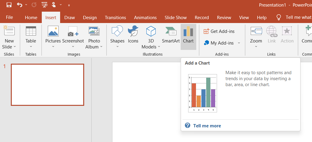
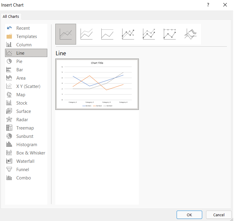
Step 1: Insert and Select Chart
Go to Insert > Shapes > Chart and format it to your desired size and color.
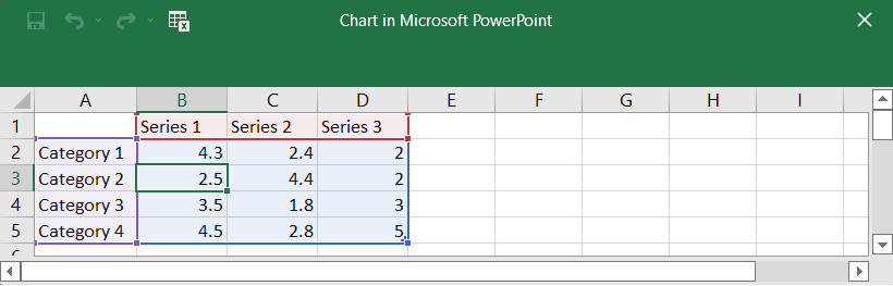
Step 2: Enter Your Data in the Excel Pop-up
Insert the data in the Excel pop-up that appears on top of the chart.
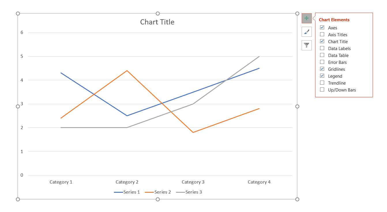
Step 3: Create the Plot and Customize
Allow the data points to connect to get something like the screenshot shown below. The chart will change as you add the data in the Excel dialog box. You can customize the chart using the options on the right-hand side, such as the chart elements (trendline), styles, and filters.
Now that you know how to create a line chart, you can use this tool to evaluate your business plan and identify areas for improvement.
If you need to present line chart data to an audience, then it is important to use PowerPoint templates that are specifically designed for this purpose. This will make it easier for your audience to understand the data and also help to prevent any misunderstandings.
Designing a line chart model is a time-consuming task. Hence, we have brought you 10 hand-picked templates that you can choose depending on your needs. Let’s take a look.
Template 1: Line Graph PowerPoint Bundle
This creative PPT bundle includes everything you need to create stunning line graphs and slides, making your data easy to understand for your audience. Plus, with a range of templates and designs to choose from, you can be sure to find the perfect look for your presentation. Download it now.

Template 2: Line Chart PPT Visual Aids
This PowerPoint layout is easy to use; just insert your data into our pre-made charts and you're ready to go. Take a look at the template and it shows profits made for two products over the period of one year. Get it now.

Template 3: Annual Competitive Analysis Line Chart
This PPT theme is the perfect way to track your competitors' movements and strategies over the course of a year, so you can adjust your own plans. With our easy-to-use PowerPoint template, you can quickly and easily see how your competitors are faring month-by-month. Employ it now.

Template 4: Line Chart for Global Marketing Analysis PowerPoint Slides
This PowerPoint layout provides a comprehensive overview of global marketing trends, analysis and strategy. Perfect for marketing professionals who need to present a clear and concise picture of the current market landscape, these slides will help you make an impactful presentation that will leave your audience informed and impressed. Download it now.

Template 5: Line Chart of Company Revenue Trend
This PPT preset will help you see how your business has been doing year after year, and identify any patterns in your growth. Whether you're hoping to increase your profits or just keep track of them, this line chart is the perfect tool for you! Incorporate it now.

Template 6: Line Chart PowerPoint Templates
Our PowerPoint design is the perfect way to illustrate a comparative study of two or more products. With this PPT theme, you can easily visualize the data points affecting product sales. Use it to discuss trends and predictions with your employees, or compare data sets. Download it now.

Template 7: Line Chart PPT Outline Mockup
What makes this PPT layout so great is its flexibility. You can easily change the colors, fonts, and layout to match your brand or presentation style. And best of all, it comes with everything you need to get started, including placeholder text and images. Assimilate it now.

Template 8: Line Chart PowerPoint Show
With this line chart PowerPoint show, you can easily depict a series of data points. This makes it perfect for discussing the significance of chronological data or illustrating financial information over different years. Use it to pinpoint the key execution issues and suggest strategies to your teammates. Get it now.

Template 9: Line Chart PowerPoint Slide Clipart
This PPT design is perfect for any business or academic presentation and is sure to make your data look its best. Whether you're showing growth over time, trends, or comparisons, our line chart clipart will help you get your point across in a clear and visually appealing way. Download it now.

Template 10: Line Chart PPT Professional Graphics Tutorials
Whether you're a beginner or a seasoned professional, this PowerPoint set is the perfect way to create stunning line charts that'll help you make your presentation pop. Our easy-to-follow, tutorial slide will show you everything you need to know, from choosing the right data to designing and animating your chart. Choose it now.

Conclusion
A line chart is a valuable tool that should not be overlooked. When presenting it to an audience, it is always important to use high-quality PowerPoint templates. This will ensure that your line chart looks professional and is easy to understand.
So download our communicative templates to ensure that your line chart data is presented in the best possible way. This will make it much easier for your audience to understand and will help you to get your message across effectively.
P.S: Are you looking to find correlations between two variables. Well, we have the perfect scatter plot guide for you, with templates included!


![The Superfast Guide to Waterfall Chart [PPT Templates Included] [Free PDF Attached]](https://www.slideteam.net/wp/wp-content/uploads/2022/05/Waterfall-Chart_1-1013x441.gif)


