Let’s assume you take home $3000 a month (after taxes) sparing $1200 for rent, $600 for groceries, and a few hundred dollars for savings.
Such numbers can be mind-boggling and overwhelming at times, especially when you are spending money in single or double digits. That’s where you can use Sankey diagrams. But what are they exactly?
What Is a Sankey Diagram?
A Sankey diagram is a data visualization tool that displays how different groups of things are related.
The first known Sankey diagram was actually created by French civil engineer Charles-Joseph Minard, in 1861. But they are named after Captain Matthew Henry Phineas Riall Sankey, who popularized the use of flow diagrams in 1898. Sankey diagrams are, therefore, often called flow diagrams or river graphs.

Typical Sankey Diagrams
Now, let’s see where they are used.
What Are the Applications of a Sankey Diagram?
Sankey diagrams can be used to show all sorts of information, from energy use to website traffic. They can be used to show how energy is transferred between different systems, or how money flows through an economy.
One of the most popular applications of Sankey diagrams is visualizing energy flow. For example, it can show how energy is transferred between different parts of an electrical system. This type of information can be used to improve the efficiency of the system.
Sankey diagrams can also be used to show how money flows through an economy. This type of information can be used to understand economic trends and make better investment decisions.
What Are the Advantages of a Sankey Diagram?
Sankey diagrams are a great way to visualize data because they show both relationships and magnitude between distinct topics. Often, other data visualization tools will only show one or the other.
Here are some of the other advantages of using Sankey diagrams:
- They can help you see patterns that would be difficult to spot in other types of data visualizations.
- They can be used to show both quantitative and qualitative data.
- They can be customized to fit your specific needs.
- They can be used to create interactive visualizations.
If you're looking for a way to visualize data in a way that is both informative and visually appealing, then a Sankey diagram may be the right choice for you. Like any other thing in the world, these diagrams are also not without their disadvantages. Let’s study them now.
What Are the Disadvantages of a Sankey Diagram?
One of the main drawbacks of a Sankey diagram is that it can be difficult to read and interpret, especially if there are a lot of data points. It doesn’t work well for small data sets, especially when you're just starting out with data visualization. Sankey diagrams can also be time-consuming to create, so they may not be the best option if you're working with limited time and resources.
We have learned a lot about Sankey diagrams, let’s check out now how to create them!
How to Design and Best Present Them: Sankey Diagram Templates
Creating a Sankey diagram requires two pieces of information: the nodes and the links. The nodes are the groups of things that you're interested in, and the links are the relationships between those groups.
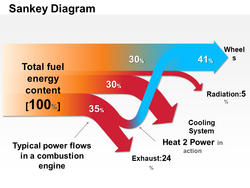
Once you have your nodes and links, you can start creating your diagram. Here we will enlist the steps to create a Sankey chart in PowerPoint for the distribution of the total fuel energy content in a thermomechanical apparatus:
STEP 1: Add Gradient Box
The first step is to visualize the origin of the data. We shall take a simple colored gradient box to represent the total value, i.e. total fuel energy content.
STEP 2: Add Branches to the Flow
Next branch out the nodes according to the value distribution. You'll want to put related nodes close together and make sure there's enough space for all of the links. Once you have your nodes laid out, you can start to draw the links between them. The thickness of the link represents how much flow there is between the two groups.
STEP 3: Label the Elements in the Flow
Add labels to the links to show what kind of relationship they represent. The final design will look something like this:
You now have a basic understanding of how Sankey diagrams work. With a little practice, you'll be able to create your own diagrams to visualize all sorts of data.
The use of Sankey diagram templates in your presentations and meetings would help you showcase your data and its results in a manner that is understandable to an average person.
However, designing an entire model is a time-consuming task. Hence, we have brought you 10 hand-picked templates from which you can choose depending on your needs. Let’s take a look.
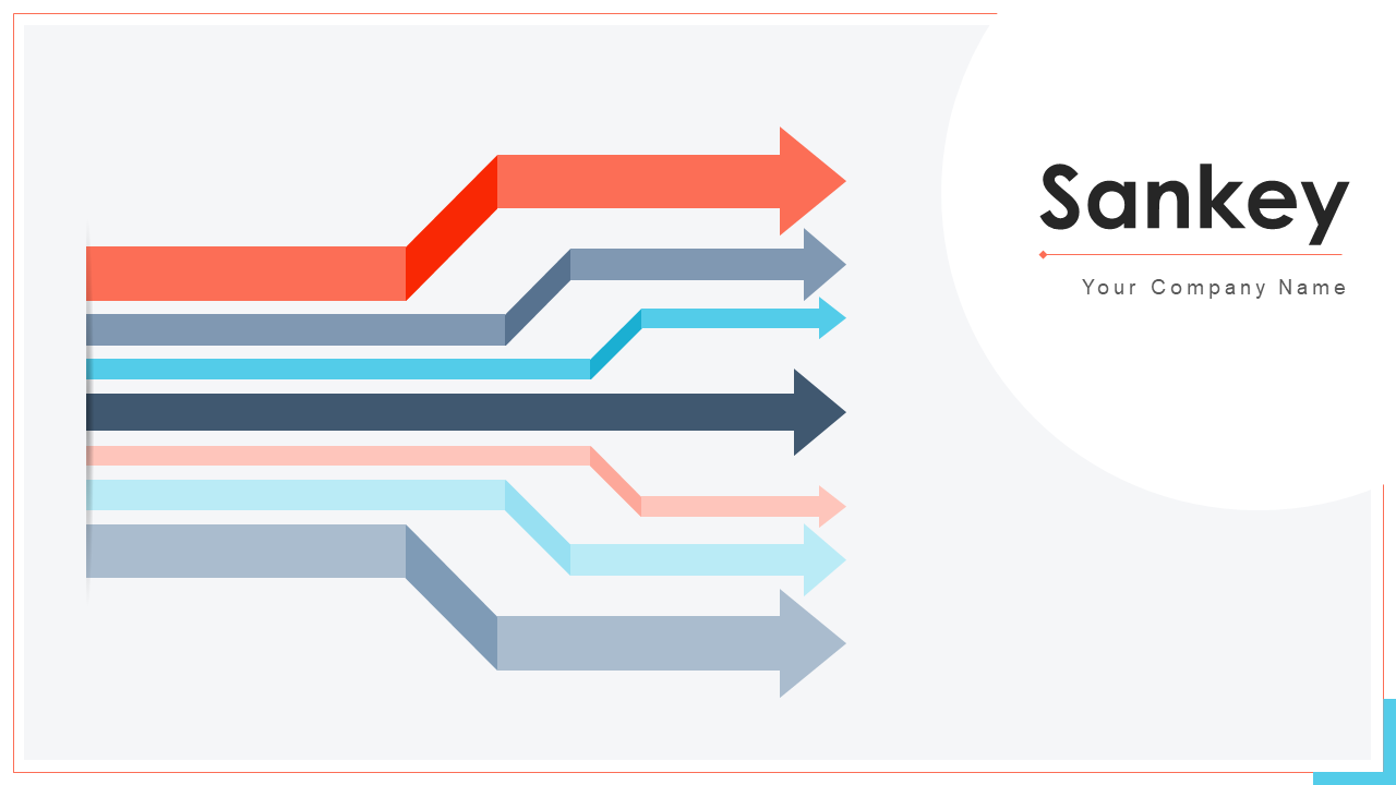
Template 1: Sankey PowerPoint Bundles
With over 6 unique slides, this PPT layout will help you take your presentations to the next level and create a cohesive look that reflects your project’s flow. And because all of the slides are fully editable, you can easily tailor them to fit your subject matter. Download it now.
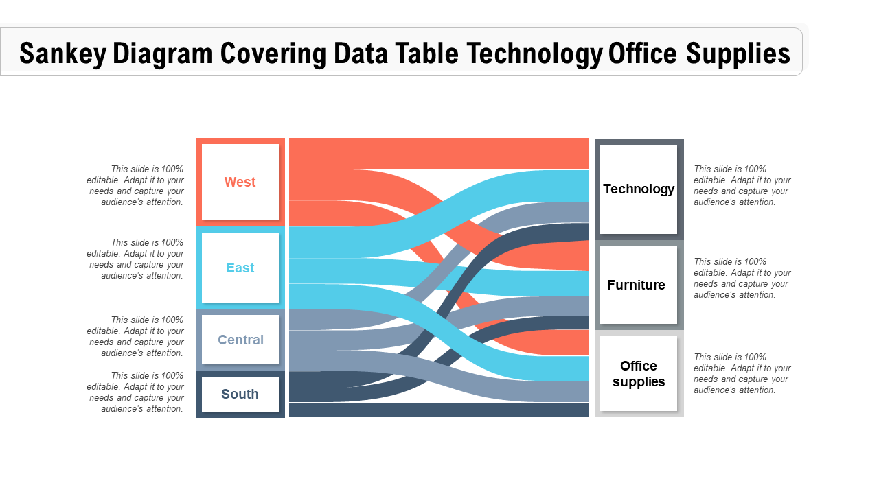
Template 2: Sankey Diagram Covering Data Table PPT Slide
If you're looking for a way to organize your office and ensure that everything is running smoothly, then check out this PowerPoint theme. This is the perfect way to keep track of all your office supplies on all ends of your office (East, West, South, or Central) and for all types (technology, furniture, etc). Get it now.
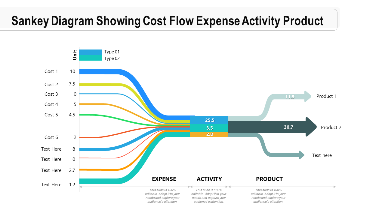
Template 3: Sankey Diagram Showing Cost Flow
This PPT design is perfect for visualizing the flow of money in and out of your business. It makes it easy to track how funds are being used and identify areas for cost savings. It covers the costs and the process stages (expense, activity, and product). Incorporate it now.
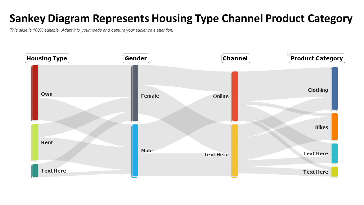
Template 4: Sankey Diagram Represents Housing Type Channel
This PowerPoint set will help you visualize all the different housing types and their corresponding channels (offline, online, etc). With this information at your fingertips, you'll be able to make an informed decision that's perfect for people’s needs (clothing, bikes, etc). People can be categorized based on their gender, needs, and type of housing (own, rent, etc). Download it now.
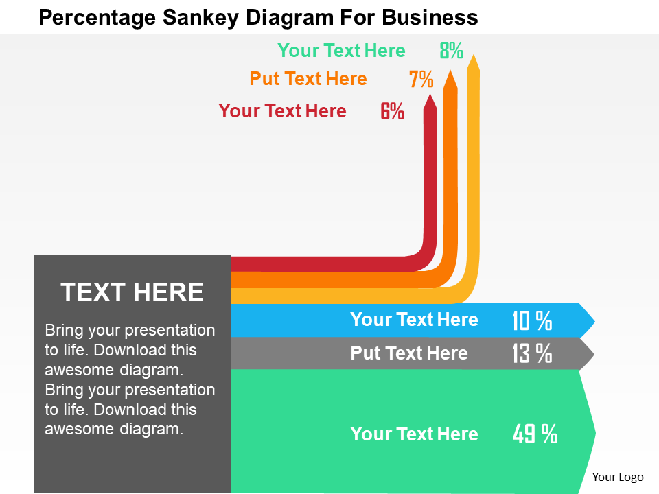
Template 5: Percentage Sankey Diagram for Business
This PPT preset is perfect for any business presentation and is sure to impress your audience. It is a great way to visualize data and relationships between different elements. You could use it to show sales data, customer satisfaction levels, or project milestones. Incorporate it now.
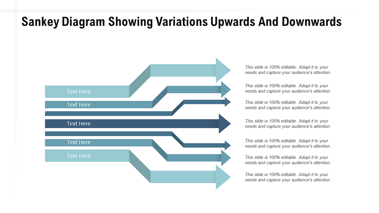
Template 6: Sankey Diagram Showing Variations
By tracking the variations upwards and downwards, you can see at a glance where improvements have been made and where issues remain. This PowerPoint theme can help you troubleshoot and optimize your products or processes, making your business more efficient and productive. Download it now.
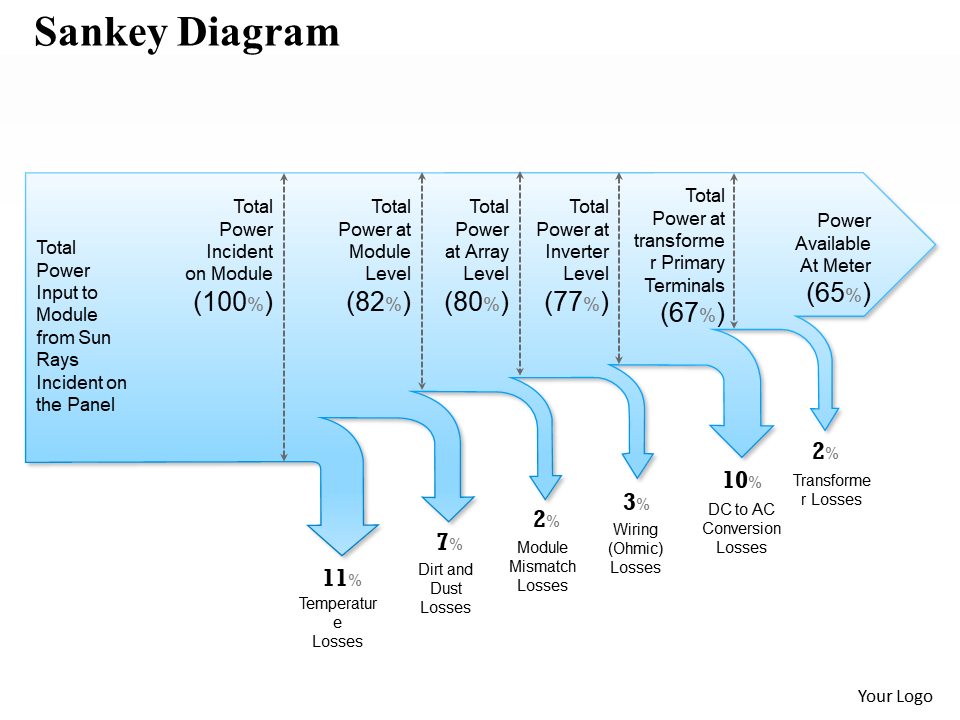
Template 7: Sankey Diagram PowerPoint Presentation
This PPT layout is useful for demonstrating relationships between different factors. It makes it easy to create beautiful and effective Sankey diagrams, with customizable colors, fonts, and layouts. With our drag-and-drop interface, you can easily add or remove elements from the power input from the sun to the power available at the meter. Download it now.
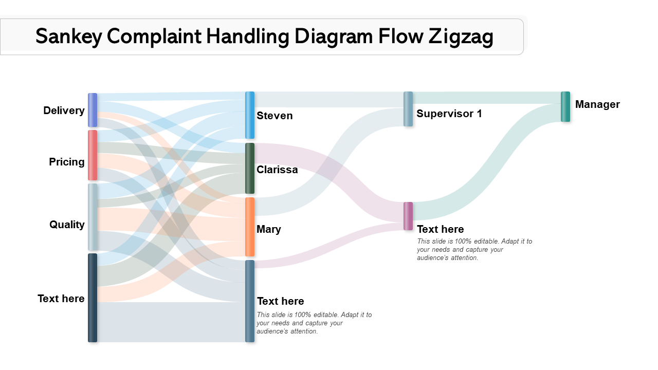
Template 8: Sankey Complaint Handling Diagram Flow Zigzag
This engaging PowerPoint design is perfect for capturing attention and communicating complex information in a clear and concise manner. It contains information to track a customer complaint (for delivery, pricing, quality, etc,) from the delivery people to the manager. Get it now.
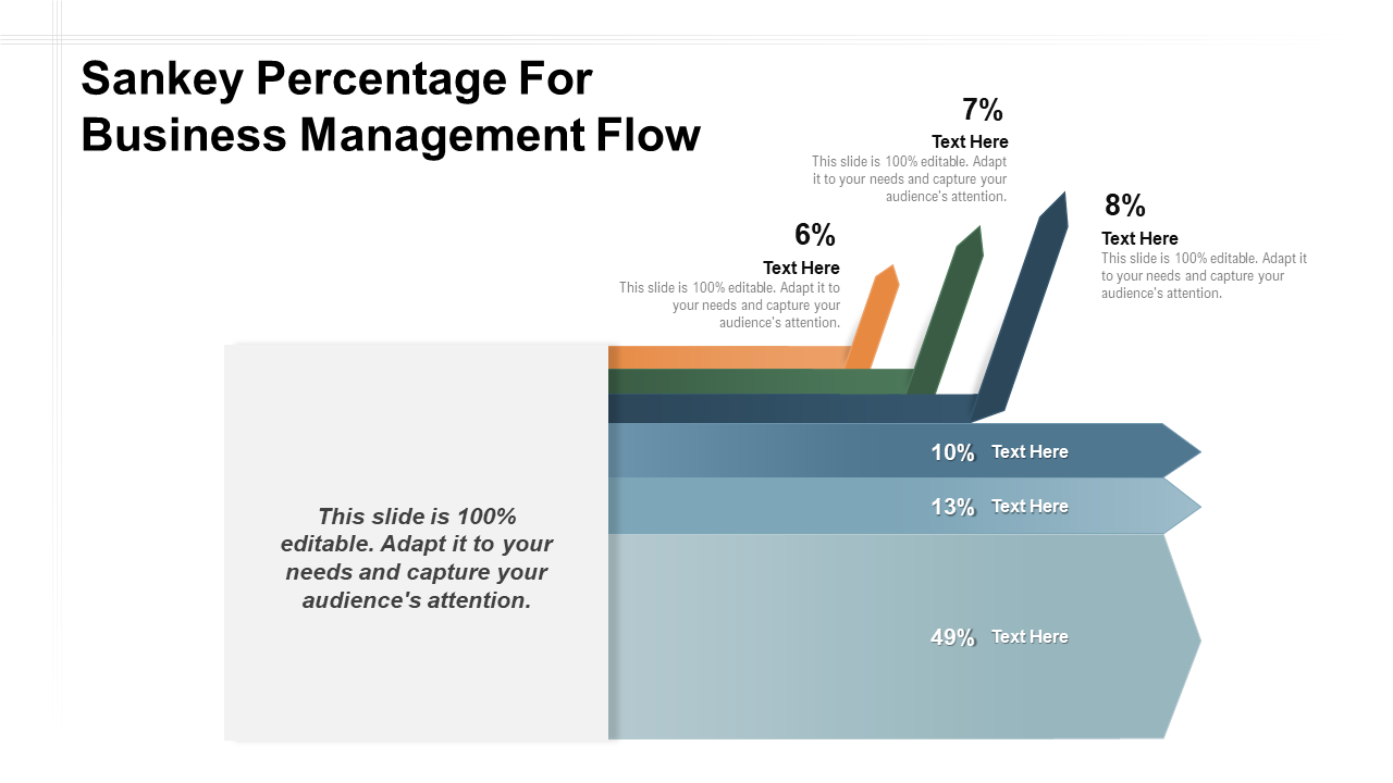
Template 9: Sankey Percentage for Business Management Flow
This PPT theme is an innovative new tool that makes business management easier than ever before. Using percentages instead of numbers makes it simple to see where the company resources are being used. It is also highly customizable, so you can tailor it to your specific business needs. Get it now.
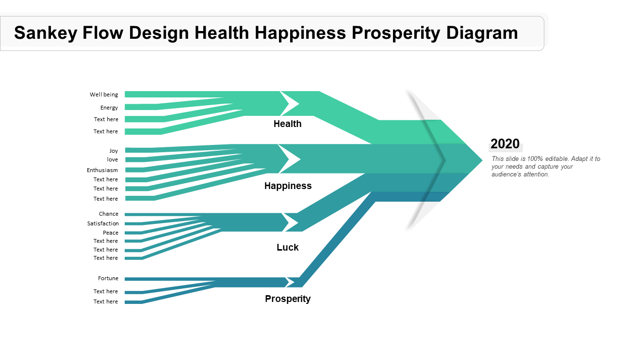
Template 10: Sankey Flow Design Prosperity Diagram
This PPT design shows you how to optimize your health, happiness, and prosperity by following the flow of energy. By aligning your actions with the natural flow of energy, you can create lasting positive change in all areas of your life. The diagram is easy to follow and provides step-by-step instructions. Download it now.
Conclusion
Sankey diagram templates can be very helpful for those who need to create complex outlines, but do not have the time or expertise to design them from scratch. Templates are also helpful for those who want to give a consistent look and feel to their designs.
If you are looking for a more custom approach, you may want to consider hiring our presentation services team. This can be a great option if you need a very specific Sankey diagram or a completely unique one to communicate your thoughts.
Download them now.
P.S: If you wish to restructure and revamp your sales model, you can use our amazing templates from this handy sales process flowchart guide. Read it now.
Download the free Sankey Diagram Templates PDF.


![The Superfast Guide to Sankey Diagram [PPT Templates Included] [Free PDF Attached]](https://www.slideteam.net/wp/wp-content/uploads/2022/05/Tree-Diagram.gif)

 Customer Reviews





![The Superfast Guide to Waterfall Chart [PPT Templates Included] [Free PDF Attached]](https://www.slideteam.net/wp/wp-content/uploads/2022/05/Waterfall-Chart_1-1013x441.gif)


